Year: 2012
Type: Design mockup
Project roles:
• UI design
This originally appeared on my blog in Dec 2012.
After installing iTunes 11, I quickly developed a sour opinion of the design of the expanded/open “folders” of TV shows. Bothered enough by these issues, I attempted to fix them.
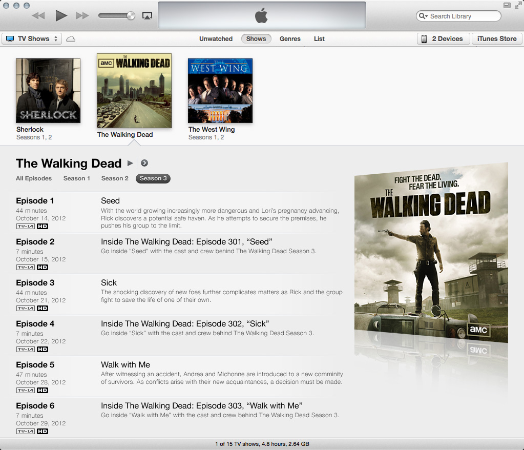
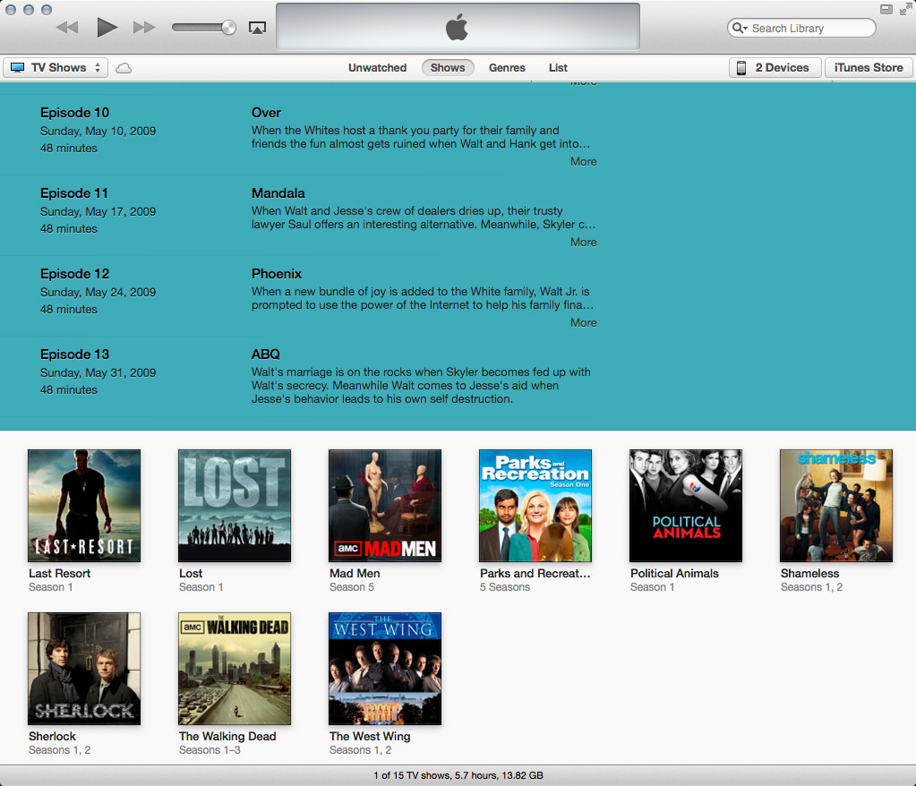
This is what an open folder for content purchased on iTunes looks like:
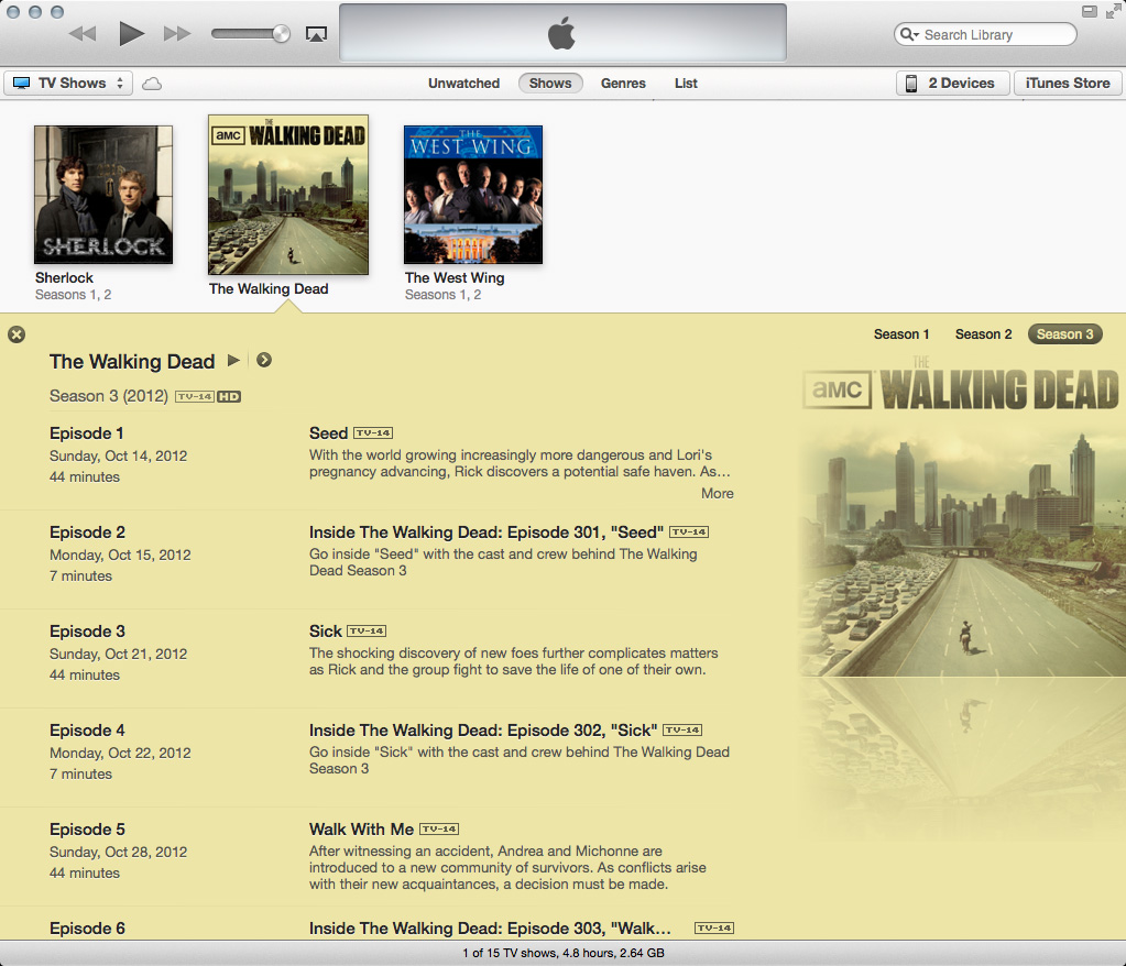
And this is what an open folder for content that was digitized and imported (sorry, Library of Congress) looks like:
Here are some of my issues:
- What’s with all the colors? I’m sure an iTunes engineer is extremely proud of the algorithm he or she developed to lift colors from album art and assign them to text and backgrounds (and rightfully so), but yikes! iTunes preferences offers a checkbox to disable the colors, but then you lose the big album art.
- Speaking of album art, yikes! Why the edge fades and decreased opacity?
- Why are the season buttons tucked away in a corner almost blending into the album art? As they serve a kind of important function (you know, showing more content), shouldn’t they be in a more prominent place?
- Why why why when switching seasons does the album art for that season not display? In this expanded view, only the art for the first available season of the show is displayed.
- Is the close button really necessary? And why is the spacing to the right of the season buttons different than the spacing to the left of the close button?
- How about all that text? For imported content, there’s not much, so compared to purchased content, the text is drowning in negative space. And those horizontal divider lines between episodes? They’re so transparent they might as well not even be there.
- Purchased content displays the episode’s air date between the episode number and episode length. But for imported content, this data cannot be entered (so far as I know), so we’re left with a hole between the episode number and length.
What I propose: chuck the colors, move the season buttons, create a better album-art display, and reformat the text.
Imported content would look like this:

Switching seasons would display the proper art:
Purchased content would look like this:
I think these changes offer a cleaner, better organized display of content. And the design elements here (the bars, “3D” album art) fit in with existing iTunes design elements. (Thanks to Neven Mrgan for inspiring the art.)
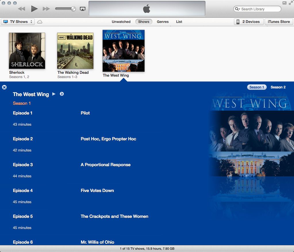
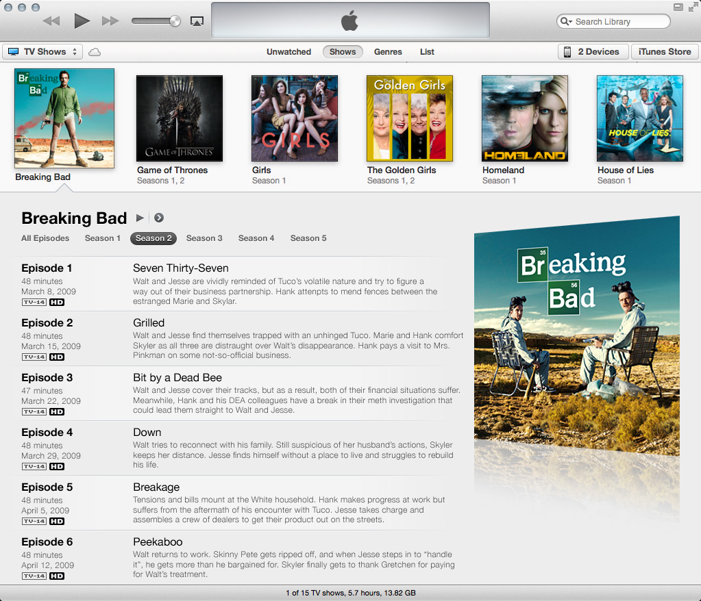
In addition to design nitpicks, I have a functionality nitpick, too, with TV shows. Season two of Breaking Bad in its current iTunes display looks like this:

When I scroll down, I lose a way to quickly identify what I’m looking at:
What season is this again? When I scroll down, why not have the show/season header lock to the top of the screen until the last episode pushes it out of view? Just like headers in scrollable lists on iOS devices work.
The redesigned Breaking Bad season two:
What it would look like after scrolling with the title/season bar locked to the top:

In addition to giving a quick visual identifying what season I’m browsing, I can also quickly switch seasons. That episode I was looking for wasn’t in season two? No problem. I can click another season in that locked header, and iTunes would scroll to the top of the expanded view and switch to that season. In the current setup, I’d have to scroll back up myself and find those tucked-away season buttons over by the album art to switch to another season.
Overall, the expanded views of TV shows feel like they were rushed to completion. The design needs improving, and there are numerous bugs when viewing and editing info in seasons other than the show’s first available season (in building these examples, I experienced many WTF moments in iTunes). Here’s hoping we get some improvements soon.
(P.S.: Yeah, I like the Golden Girls. Thank you for being a friend and not judging me.)