Year: 2015
Type: Design mockup
Project roles:
• UI design
This originally appeared on my blog in Dec 2015.
My friend is coming into town, and he messaged me to see about meeting up. So I start typing a response. Type type type. While I’m typing, I’m suddenly interrupted, I lose control of my screen, and I can’t finish what I was doing. What happened? I received a phone call.
Or maybe I’m looking up which train I need to take home to leave me enough time before I have to be on my way somewhere else. And bam. Incoming-call screen.
Or maybe I’m editing a video and trying to precisely trim the end of it. And bam. Incoming-call screen.
Whatever the task, the incoming call commandeers my screen and forces me out of the task I was performing.
Because the device is a phone and making and receiving calls is a primary function, let’s assume the incoming-call screen is here to stay. So how can the screen be just a bit less intrusive? I have an idea.
Let’s say my friend John Appleseed is coming into town and wants to meet up. A text conversation might go something like this:
JA: Hey, I’m in town tomorrow. Care to meet up? I should have time in the afternoon.
Yeah, so I just checked, and I’ll have the afternoon free. So I’m up for meeting if you are.
JH: Of course! I can let you know when my appointments wrap up. And then we can grab some food. Perhaps a movie too?
JA: Yeah, that all sounds good. What time are you thinking?
I begin typing my response:
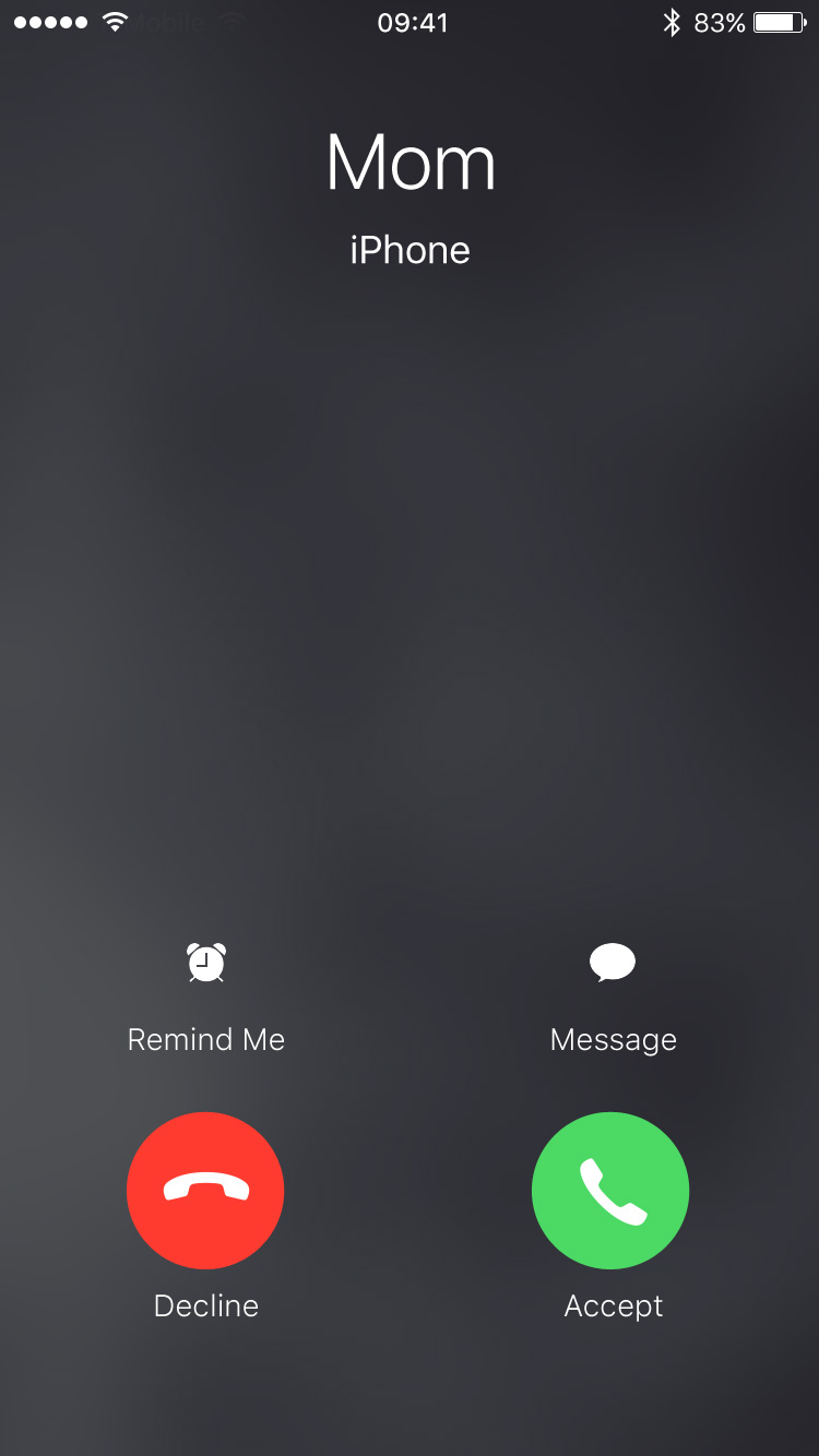
…and bam. Incoming-call screen. Mom is calling:
On the incoming-call screen, I have a few options to deal with the call. I can accept the call, I can decline the call and send the caller straight to my voicemail, I can send the caller a text message, and I can set a reminder (with the last two requiring further steps). With the hardware side buttons, I have another option: silence the ringer. Although my phone stops sounding or vibrating, the call continues and after a period of time automatically goes to my voicemail.
When I receive a call I can’t (or in some cases don’t want to) take, I choose the latter. With the ringer-silencing option, the caller may think I’m unavailable. Or if the caller is an unrecognized number like from a marketing call, the caller may think the number isn’t actively used. If I decline the call, it sends the caller directly to voicemail letting them know I’m on the other end and deliberately ignoring them.
Choosing the latter, though, means I have to stare at the incoming-call screen until the call automatically goes to voicemail when I just want to get back to the task I was performing.
But what if I could dismiss or minimize the incoming-call screen without taking or declining the call? That’s what I propose.
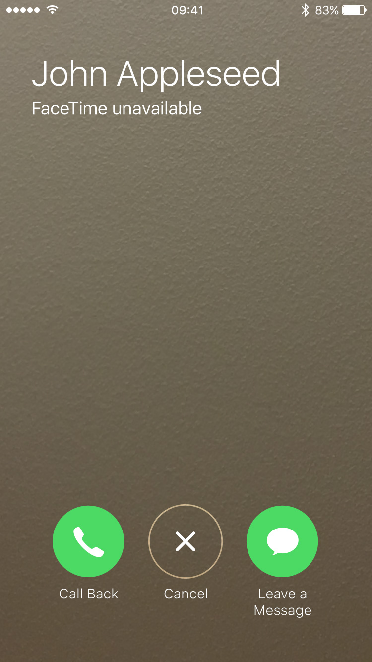
When a FaceTime call fails, iOS presents a screen with three buttons: “Call Back”, “Cancel”, and “Leave a Message”:
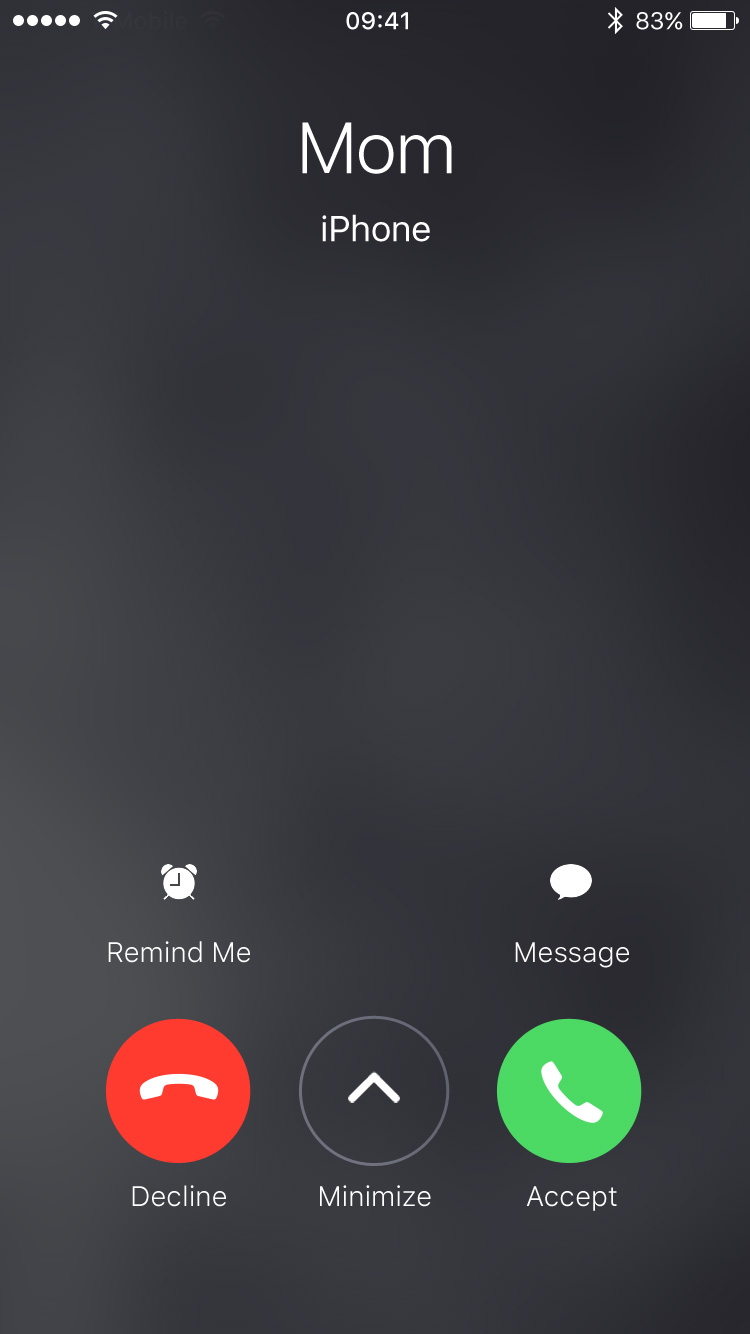
Let’s take that middle button and add it to the incoming call screen. So now when someone calls, the screen would look like this:
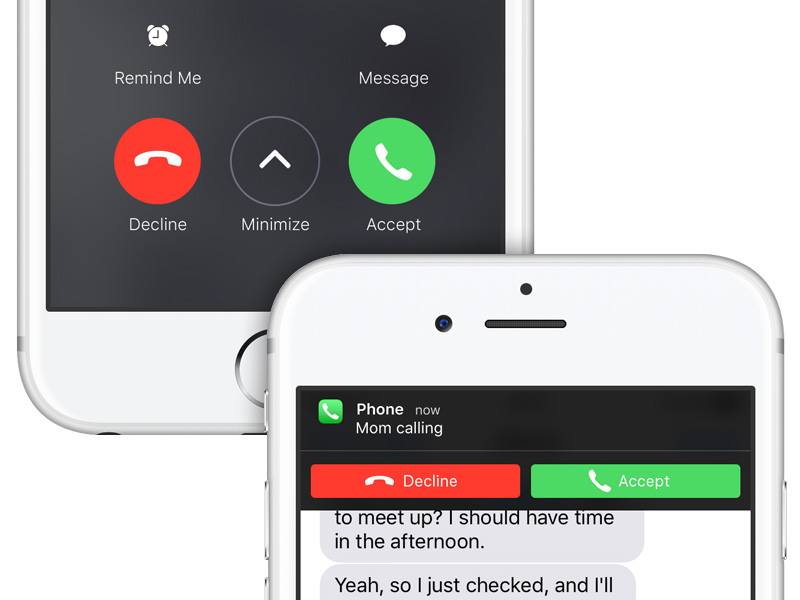
If I tap the new “Minimize” button, the screen would animate out of view while a notification banner would animate on:
Like when I press the volume buttons on the side of my iPhone, the ringer would silence, and the call would continue until it automatically went to my voicemail. But unlike when I press the volume buttons, I could resume the interrupted task.
Because phone calls—and the incoming-call screen—get an intrusive level of priority, the banner notification would as well. While the call continued until it automatically went to my voicemail, the banner would remain at the top of the screen.
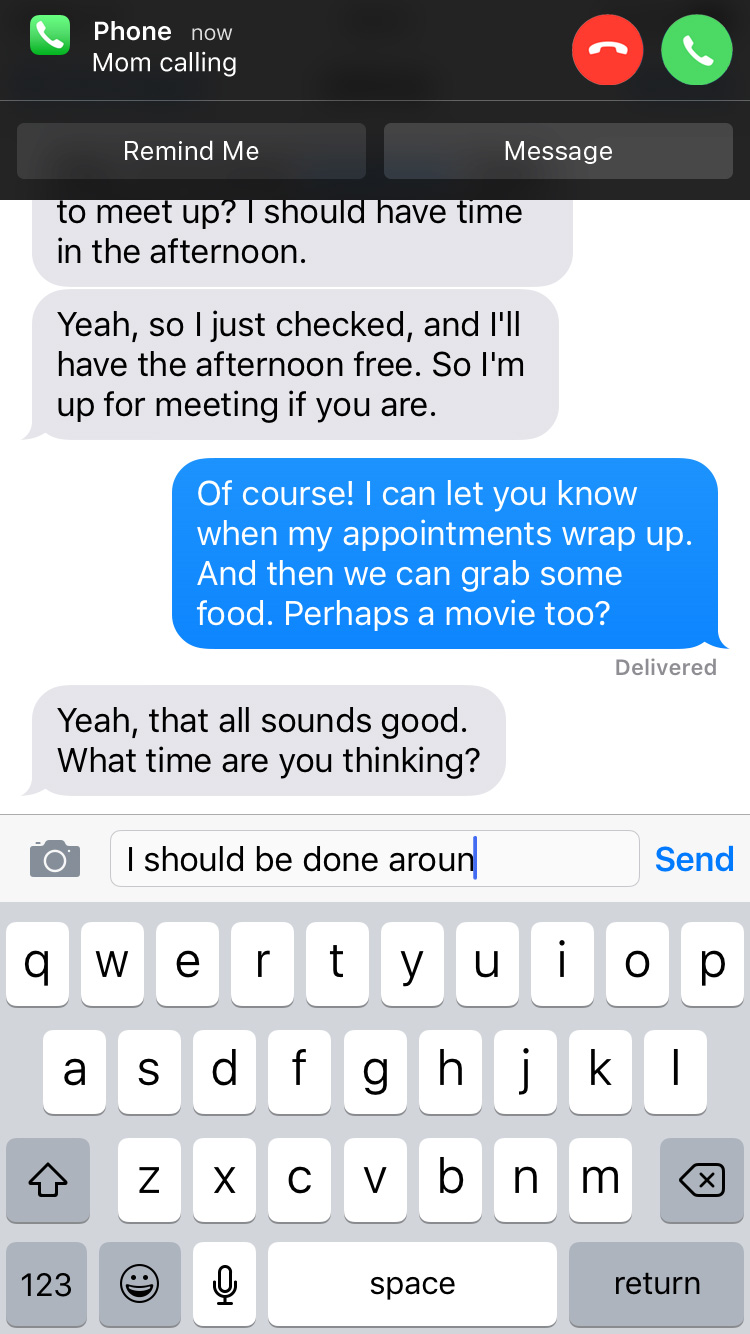
While other banner notifications can be swiped up to dismiss them, this one would remain pinned to the top. If I tapped the notification, I would return to the incoming-call screen. Though I wouldn’t be able to swipe up on the notification to dismiss it, I would be able to swipe down on it to reveal action buttons:
Once the call automatically went to voicemail, the banner notification would disappear like normal as I continued my task.
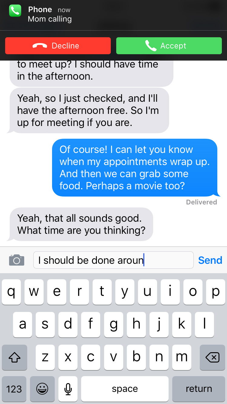
Ideally, I would like iOS to ditch the incoming-call screen altogether and just present an actionable banner notification when I receive a call (like other notifications, it would be customizable to appear as an alert box instead). Maybe the banner would look something like this:
This way, there’s a far smaller interruption of my task. More of a distraction rather than a full interruption. The decline or accept buttons on the banner would do exactly that. If I couldn’t or didn’t want to take the call, I could still press the volume buttons on the side of my iPhone to silence the call and let it automatically go to voicemail. And if I swiped down on the banner, I could chose to be reminded or send the caller a message:
But assuming the incoming-call screen is here to stay and an actionable banner notification isn’t in iOS’s future, this new workflow could be a way to dismiss the screen without telling the caller I’m ignoring them.
Because I promise I’m not ignoring you, mom.
