Country First

Jon Huntsman gave his speech tonight in New Hampshire in front of a giant banner with these words: “Country First”. At first, I was miffed. “He’s using John McCain’s vapid, petty slogan from four years ago,” I thought. Ugh.

But then I realized “country first” aptly describes Jon Huntsman. Huntsman, who was a popular Republican governor, put his political career on hold to what? To serve in a Democratic administration as the ambassador to China. That’s putting country first.

During Sunday’s GOP debate, Huntsman said:

I was criticized last night by Governor Romney for putting my country first. And I just want to remind the people here in New Hampshire and throughout the United States that I think…

He criticized me while he was out raising money for serving my country in China, yes, under a Democrat, like my two sons are doing in the United States Navy. They’re not asking who what political affiliation the president is.

I want to be very clear with the people here in New Hampshire and this country: I will always put my country first. And I think that’s important to them.

And what did Mitt Romney say in response?

I think we serve our country first by standing for people who believe in conservative principles and doing everything in our power to promote an agenda that does not include President Obama’s agenda.

Translation: Politics first. Huntsman:

This nation is divided […] because of
attitudes like that.

It’s unlikely that Jon Huntsman will secure the GOP nomination, and that’s a shame. I would love to see the debates between Huntsman and Obama. They have very different political beliefs but are also intelligent, intellectual men. Theirs could be the Lincoln-Douglas debates of the 21st century where they could have lively discussions on the merits of their different political philosophies rather than trying to out-soundbite each other. Talk about putting country first.

My Top-Five Seven-Favorite Film Scores of 2011

2011 came and went but left several great film scores. Below are my favorite scores of the year. These aren’t necessarily the best scores of the year, but they’re the scores I had on repeat throughout the year.

5. Thor by Patrick Doyle

The Zimmer-ification of film-score land continues. 2010 gave us a Zimmer-inspired Daft Punk score. 2011 gave us two Zimmer-inspired Patrick Doyle score (the other Rise of the Planet of the Apes). These scores layer Zimmer and Zimmer-clone mannerisms and styles (power anthems and string ostinatos) with an added musical sense not heard in most Zimmer Group works. Patrick Doyle skillfully merges his traditional orchestral talents and sound with the Zimmer-Group sound and propels it beyond the capabilities of the Zimmer Group. I’m not a Patrick Doyle fan, but, like the film, this score is surprisingly very enjoyable.

5. Soul Surfer by Marco Beltrami

Yes, there are two number fives. This is my list; I’m allowed.

Another surprise for me was Marco Beltrami’s Soul Surfer. Beltrami usually hangs out in the horror genre but occasionally makes waves elsewhere. The score is heartfelt and melodic and beautifully integrates Hawaiian chants to create an inspirational whole.

4. The Greatest Miracle by Mark McKenzie

I’m far from being a religious person, but even I can appreciate and admire the majesty and the power of this score. Like Mychael Danna’s The Nativity Story a few years back, this music is beautiful and impressive even if it accompanies religious fare.

3. Your Highness by Steve Jablonsky

This score does nothing to advance the art of film music nor will it win any awards. But damn is it fun to listen to. Even in film-score land, guilty pleasures exist—and boy is this score a guilty pleasure. Like most things in life, when someone is inspired and having fun doing what they do, the evidence is plainly seen—or heard in this case. Steve Jablonsky saw something in this critically-derided film that inspired him to write a rollicking score. He combines the sensibilities of his Steamboy score with the Zimmer Group sound of his original Transformers score and wraps both up in an epic-sounding package.

2. Kung Fu Panda 2 by Hans Zimmer and John Powell

No favorite-scores-of-the-year list of mine would be complete without a score from John Powell. While both Hans Zimmer AND John Powell were credited, many of the tracks are decidedly John Powell material with his zany musical style featured abundantly. This score makes up for the disjointedness of the first film’s score as the themes and styles are presented in a more cohesive and more enjoyable package.

1. War Horse by John Williams

For Steven Spielberg’s best dramatic film since Saving Private Ryan, John Williams writes his best dramatic score since Schindler’s List. The man is nearly 80 years old, but with War Horse and The Adventures of Tintin, he proves he’s still the master composer and is untouched by the Zimmer-ification of film scoring. The two main themes are soaring and majestic, the action music is stirring, and emotions evoked are powerful. This film showcases Spielberg at his best. This score showcases Williams at his best.

1. The Adventures of Tintin by John Williams

Speaking of Tintin, this score makes my list, too, after seeing the film and hearing how excellently the music works in context. As I write this, Williams’s score is on repeat. This score couldn’t be more different than War Horse. And while there is nothing stylistically new here, Williams provides orchestral and technical mastery not heard by most if not all film composers today. This score is a little Indiana Jones, a little Harry Potter, and a little Hook with a splash of the jazzy Catch Me If You Can opening. This 79-year-old proves he can still out-compose the rest of the industry. While War Horse is a slightly superior effort, this score is more fun to listen to.

While this list is composed of my favorite scores of 2011, it also includes what I consider the best score of 2011: War Horse. No other score reached the emotional and orchestral heights both in and out of the film like War Horse did. I hope to say the same about Williams’s Lincoln this year.

Ho Ho Ho

I took the lazy, err green, err economical route this year and didn’t send paper holiday cards. Instead, I created a digital holiday card. You can view it here:

http://www.joehribar.com/card/

Wishing you a wonderful holiday season and a happy and healthy new year.

Bluebird Blues

I don’t have much to add to what’s already been said about the Twitter.com and Twitter for iPhone redesign/restructure; I don’t often use either (I do most of my tweeting from Tweetbot).

But while I was looking around the new Twitter.com last night, something jumped out at me. Looking at the Twitter logo, the verified logo, the compose-a-tweet button, the following button, the home button, and the follow-this-person button, I noticed almost all of those elements use a different blue a blue other than the official Twitter blue. Here they are for comparison (click for larger version):

twitter blues

Was this on purpose? Or was someone just being lazy? If this wasn’t a mistake, it sure looks like one.  I’m assuming Twitter has an internal identity guide that their designers are supposed to follow. And if the designers didn’t have that guide, they could have easily gone to Twitter’s public logo page, downloaded the bird, grabbed the RGB color, and designed the buttons using the official Twitter blue.

Details matter. The consensus is that Twitter struck out with the redesign/restructure. They even seem to have struck out with their own color. Twitter has the blues. And they’re using too many of them.

iOS Linen and Other Grip(e)s

iOS linen doesn’t really bother me; it’s Apple’s favorite texture right now, and that’s fine. What does bother me is inconsistency in visual and interaction design.

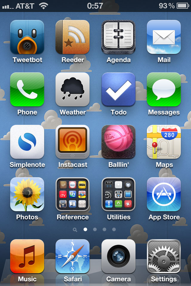
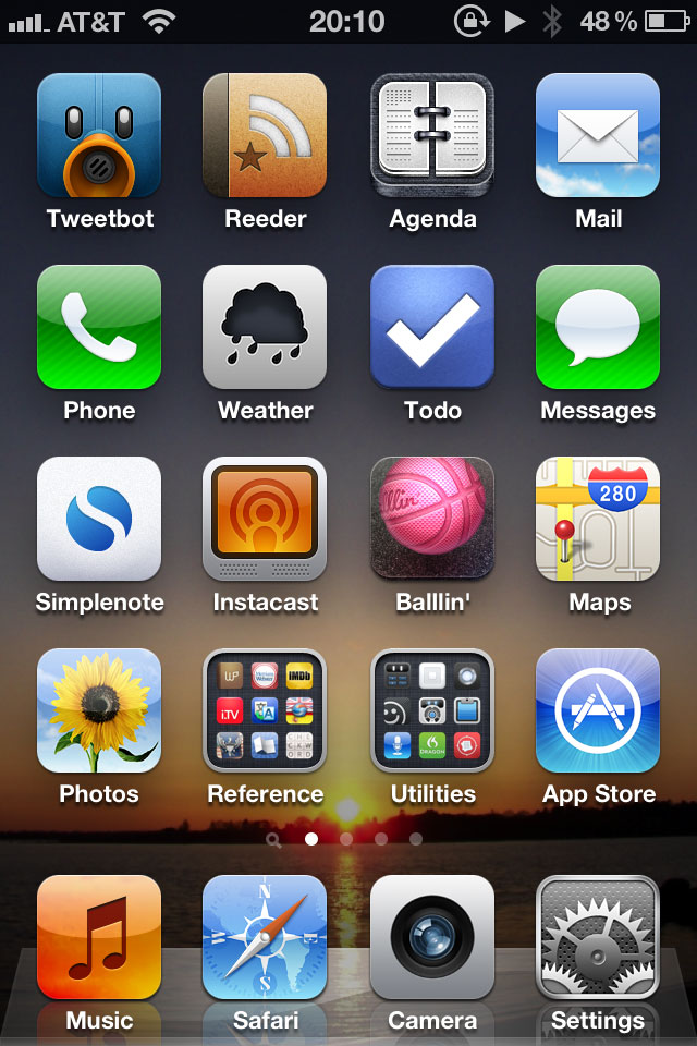
Say this is my home screen with one of my photos (click on any photo for a larger version):

current iPhone home screen

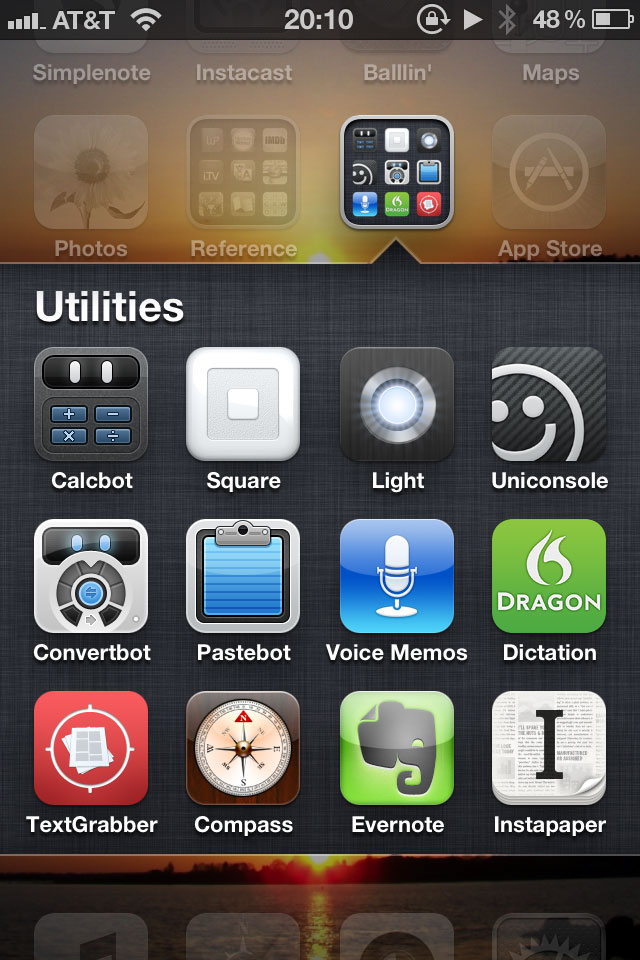
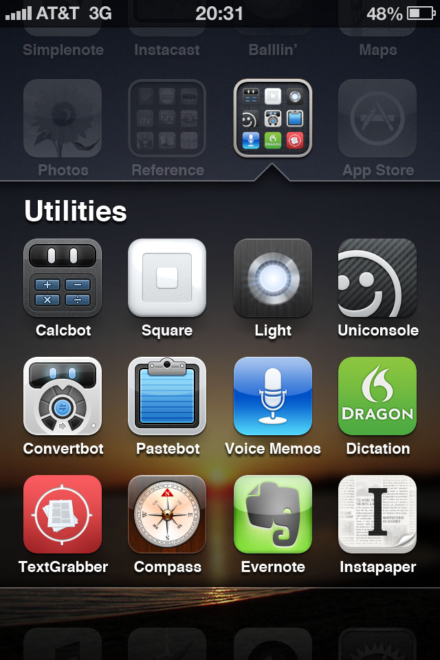
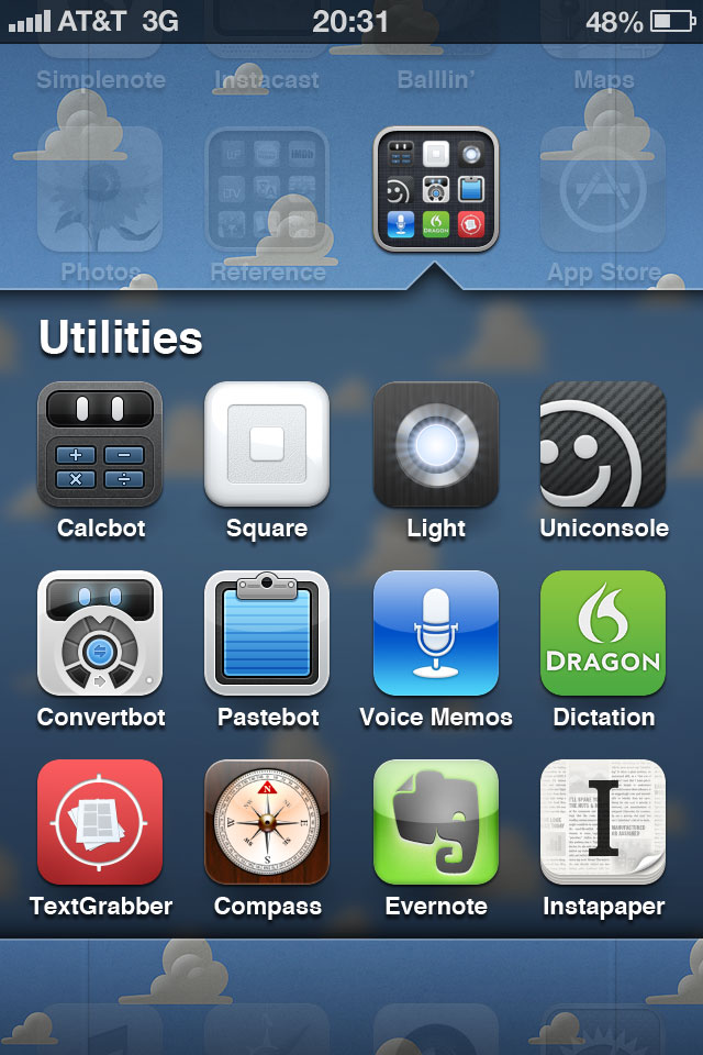
When I open the Utilities folder, something heinous happens:

current iPhone folder

My wallpaper gets split and filled with linen. Because my wallpaper and my apps are treated as the same layer in the home-screen hierarchy, both the wallpaper and the apps divide and split apart when opening a folder; revealed underneath is the layer with the folder apps and linen.

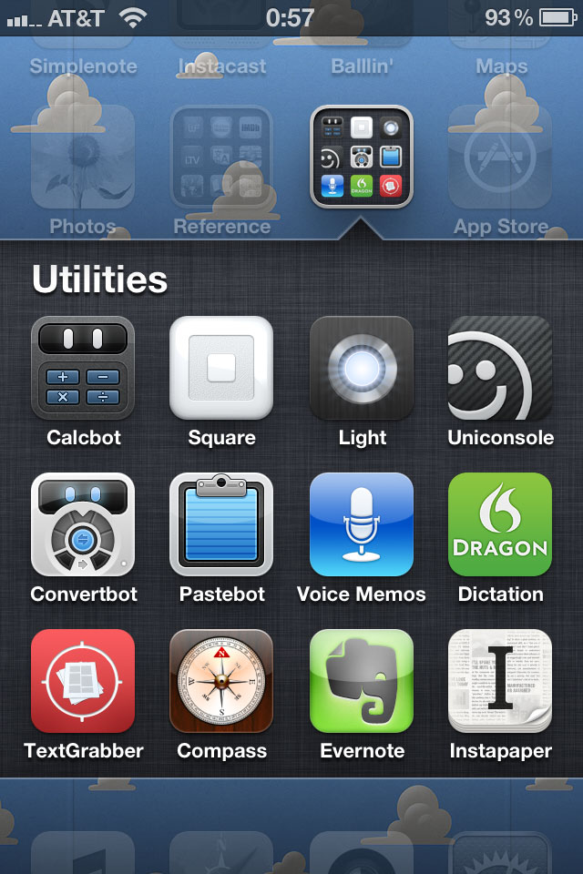
Here’s another example with a nice wallpaper by Louie Mantia:

current iPhone home screen

Folder opened:

current iPhone folder

Visually, I have two issues with this. First, I don’t want my wallpaper split in two. Second, I don’t want additional colors (or texture) introduced behind my apps. I want a consistent wallpaper behind my apps.

So here’s what I propose: introducing three layers instead of two and saying goodbye to linen. Instead of the top layer consisting of the home-screen apps and wallpaper and the bottom layer consisting of the folder apps and linen, the top layer will consist of home-screen apps, the middle layer folder apps, and the bottom layer wallpaper.

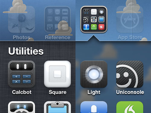
When a folder opens, instead of the wallpaper splitting and moving up and down from the break, the wallpaper will remain stationary. The apps will still split as they do now to reveal the folder apps, but replacing the linen behind the apps will be a blurred section of the wallpaper:

proposed iphone folder

With this functionality, the wallpaper doesn’t split in two, and the wallpaper color scheme stays intact.

proposed iphone folder

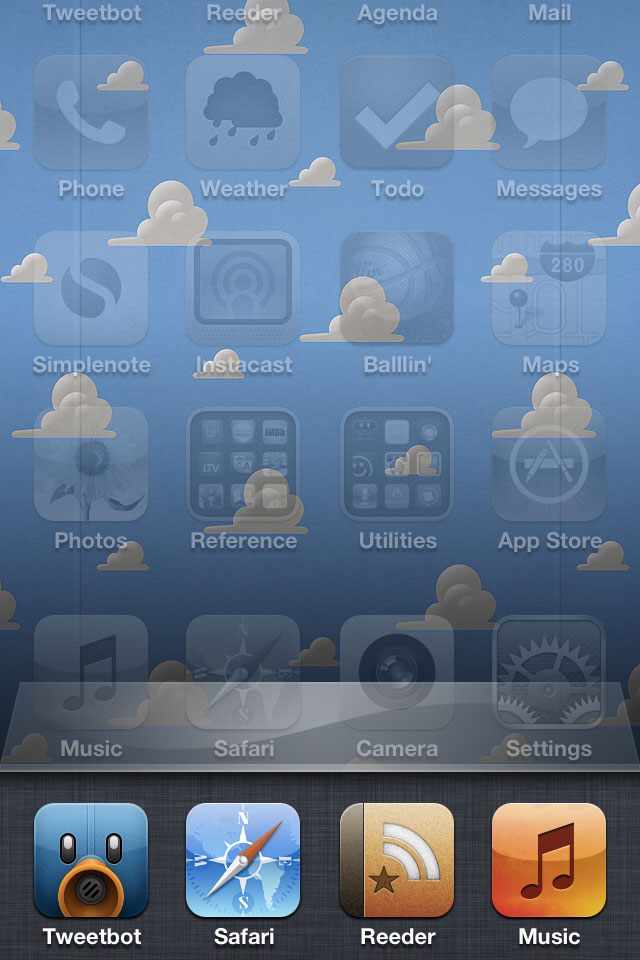
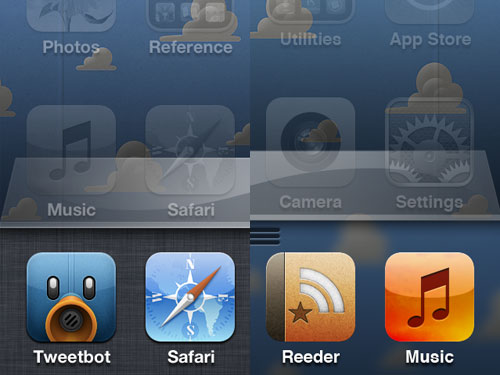
But what about other instances of linen? This solution works with both the multitasking drawer and Notification Center. Currently when the multitasking drawer opens, everything above it slides up to reveal the apps and, of course, more linen:

current iPhone multitasking drawer

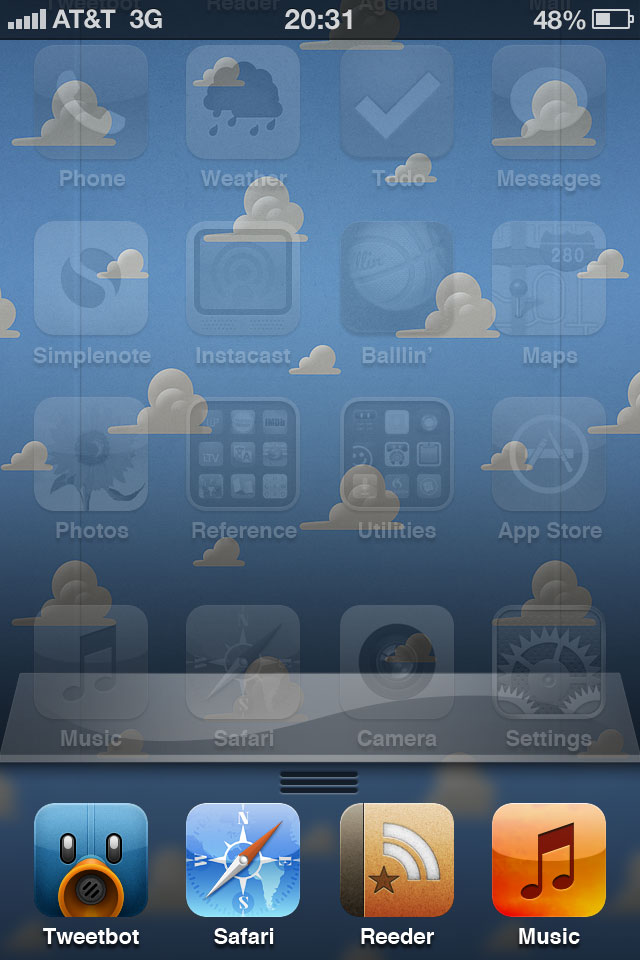
In my proposal, when the drawer opens, the apps will slide up, but the wallpaper will remain stationary just like when a folder opens. And instead of linen behind the drawer, there will be a blurred section of the wallpaper.

proposed iphone multitasking drawer

(What’s that grip for? I’ll come back to that shortly).

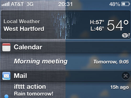
Notification Center will display similarly. Instead of linen in the background, you guessed it: blurred wallpaper.

proposed iphone notification center

But this treatment for Notification Center only works if the functionality of Notification Center changes as well. Instead of pulling down over the home screen, Notification Center will push down the home screen just like how the multitasking drawer pushes up the home screen. Just as I do now, I will swipe down from the top bar to open Notification Center, and all the home-screen apps will move down with Notification Center. (As Neven Mrgan pointed out, the current Notification Center grip needs some work; I used his solution.)

And since I can swipe down to open Notification Center, I should be able to swipe up to open the multitasking drawer hence the grip above. Max Rudberg has an example video of this. Swiping up takes far less effort than double clicking the home button and will be consistent with how to open Notification Center. (One additional note, for consistency, I also propose to keep the top bar visible when the multitasking drawer is open. Currently, when the multitasking drawer is open, the top bar slides up with the apps and wallpaper and is not visible, but when a folder is open, the apps and wallpaper slide under the top bar keeping it visible.)

So there’s my proposal: greater visual consistency in the wallpaper and improved behavioral and gestural consistency in the multitasking drawer and Notification Center. As a result, no more linen.

But if you really like that linen texture, you could always make it your wallpaper; it might even look nice blurred.

Some side-by-side comparisons:

folder comparison

multitasking drawer comparison

notification center comparison

(Many thanks to Teehan+Lax and their iOS 5 GUI PSD for help with the Notification Center and multitasking drawer images.)

Zzzzz > Buzzzzz

I love Notification Center in iOS 5. I love not missing any notifications because a new one came in. And I love periodically pulling down to open Notification Center just for the sake of opening it (I love me some touchscreen gestures, too).

I don’t love that my iPhone goes off at all hours of the night. When I go to sleep, I toggle silent mode on. While I don’t hear notification sounds during the night, because I have my iPhone set to vibrate while on silent mode, it still vibrates at all hours of the night.

Missing from Notification Center is a sleep option where you specify a block of time where the notifications will still roll in, but iPhone won’t make any sounds. Some apps like Tweetbot and Boxcar have this option in their settings, but not all apps do and certainly not the Apple apps.

So here’s what I do: When I go to bed, I toggle my iPhone to silent mode like usual, and in the Sounds settings, I turn off vibrate in silent mode

vibrate off

Notifications will still accumulate, but my iPhone won’t make a sound and won’t vibrate all through the night.

If I am using my iPhone as an alarm, the alarm will still play its sound even when the phone is in silent mode (this works for the Clock app but not for third-party alarm apps).

Having an actual sleep option for Notification Center would be great in a future iOS release. Until then, this is my workaround. Maybe you’ll find it useful, too.

Education is the Silver Bullet

Not only does more education decrease a person’s chance of being unemployed and increase their average pay, more education increases life expectancy, decreases obesity, and reduces crime.

So why is the Department of Education’s budget nowhere near the size of the  Department of Defense’s budget?

Apple iPhone Invigorate A6 4G Turbo Deluxe SmartPhone

With all the chatter about iOS 5.1 hinting at the next generation of iDevices—and specifically the next iPhone—I started wondering about the iPhone naming convention and what, if anything, is Apple’s master plan for naming their flagship product.

This naming-convention conundrum is only found in two of Apple’s product lines: iPhones and iPads. Whenever a new Mac is released, the previous model is removed from the sales floor. You can still get a refurbished previous generation product, but not from the sales floor.

But with iPhones, previous models are still available. So how should they be named?

The most obvious convention would be the iPad route. The first iPad is iPad 1; the second iPad is iPad 2. But that’s not possible with the iPhone (I’m looking at you, iPhone 3G).

So, how about a different idea: name the phone using the year it was released. This year’s model? The iPhone 11. Next year’s model? The iPhone 12. Or even the iPhone ’12. And for consistency, why not the iPad ’12?

Apple only releases one iPhone per year, so this could work. This naming convention is what the car industry uses. You want a new car? Which year’s model do you want?

And gone are the silly G and S names. And the “oh I really wanted an iPhone this year, but I was hoping it would be the iPhone 5”. No. You get this year’s model or next year’s model.

So what’s wrong with this idea? Well, this naming convention assumes Apple will only release one iPhone per year. What happens if they release two? Yeah, I don’t know. iPhone ’13A? iPhone ’13S (for Spring)? No.

And perhaps this naming convention calls too much attention to the age of the device. Hey, it’s 2011. I think I’ll buy the iPhone ’09. Manufactured two years ago. Prior to this year’s iPhone 4S release, the iPhone 3GS was still a popular phone. Would that have changed had the name of the phone called attention to its age? I don’t know, but not including the manufacturing year right in the product’s name does mask its age at least on first glance. A customer in the Apple Store looking at a comparison chart of the three available iPhone models now sees 4S, 4, and 3GS. Seemingly, they could all just be variations of this year’s technology (even though they aren’t). But that mask is lifted when the comparison chart shows ’11, ’10, and ’09. Perhaps this is a small issue, but something to consider nevertheless.

I guess something else to consider is just going with the industry norm and naming the next iPhone the Apple iPhone Invigorate A6 4G Turbo Deluxe SmartPhone. That works, right?

If Apple did name the next iPhone that, it would still set sales records because in the end, perhaps what we’ve learned is the name of the device doesn’t matter. An iPhone is an iPhone, and people know what they’re getting no matter what it’s named.

I’ll be getting next year’s iPhone whether it’s named the iPhone ’12, the iPhone 5, or the Apple iPhone Invigorate A6 4G Turbo Deluxe SmartPhone. I’ll say WTF is this name and then not be able to take my hands off the phone. Just like everyone else.

“Save a Pretzel for the Gas Jets”

Bad Lip Reading takes on Rick Perry and Barack Obama. Brilliant.

Pennsylvania Double Dutch

After reading about the plan  Pennsylvania is considering that would change how the state allocates electoral votes, I was going to write up something explaining how the plan was a very bad idea like I did when Massachusetts signed on to the interstate compact.

But Nate Silver wrote something much better than I could. He highlights five problems the switch could create for Pennsylvania Republicans:

  1. The Electoral College split could work against Republicans and cost their candidate the election.
  2. The plan could undermine the integrity of the Electoral College, which is probably not in Republicans’ long-term best interest.
  3. The plan could motivate Democrats and lead to higher Democratic turnout both in Pennsylvania and nationally.
  4. The plan would significantly reduce Pennsylvania’s influence in the election campaign.
  5. The plan would probably become unpopular in the state over time, potentially costing some Republican office-holders their jobs.

I would only add that in a scenario where a state with a large amount of electoral votes swings an election because of a real—or perceived—partisan decision, popular sentiment might actually be strong enough to change the Constitution and eliminate the Electoral College. Americans still remember the last time that happened. But after the 2000 Electoral College debacle, any talk of changing the Constitution died out. If there is another controversy so soon after, though, perhaps that talk would resurface and would spill over to action and kill the Electoral College. And as Mr. Silver points out, that’s not in the long-term interests of the Republican Party.

The Six Ways You’ll See Your Dad

The View from Here

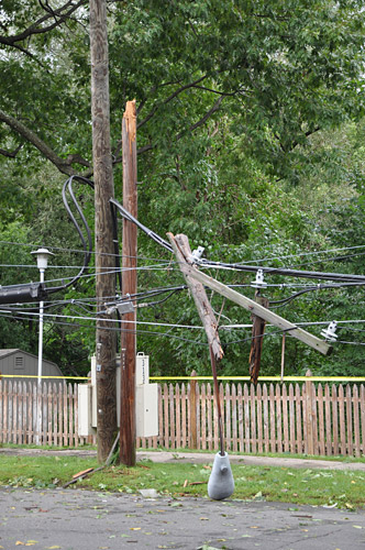
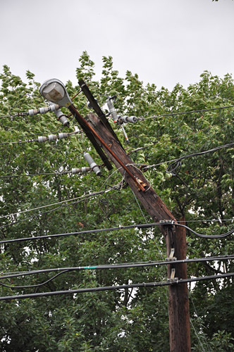
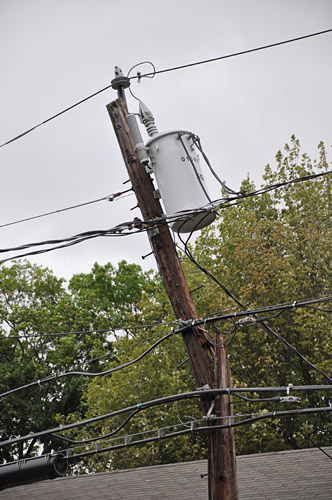
Hurricane (and then Tropical Storm) Irene came and went, and with it my power as did the power for almost 722,000 other customers in Connecticut. Here in West Hartford, the storm didn’t seem that bad: steady rain and moderate winds with a few gusts. But apparently a tree and several utility poles along my street couldn’t handle Irene.

irene damage

irene damage

irene damage

irene damage

irene damage

irene damage

irene damage

So yeah, I imagine I’ll be without power for a little while. Good thing I prepared.

Amazing

046

Hurricane Irene: MTA Metro-North Railroad closed Grand Central Terminal as the hurricane approached. Photo by Metropolitan Transportation Authority / Marjorie Anders.

Mariachi Whale

Who doesn’t love a Mariachi band?

(Via @leeunkrich)

Browsing Refresh

Henrik Eneroth reimagines the web browser in the era of widescreen monitors and fullscreen apps:

Of course, screen sizes do still mat­ter when browsing the web. Since many web sites will be longer than your screen is tall, the less user inter­face we put vertically, the bet­ter. But most screens today are widescreens, so why are we not put­ting the left- and right-hand sides of the screen to better use, instead of for­cing everything into a bar on the top of the window?

His solution:

eneroth_browser

(Via Cameron Moll)

Apple Employees: It Gets Better

You know all those adjectives Steve uses to describe a new Apple product? They work just as well for this video.

After seeing Adobe’s video, my buddy Jon Nagle tweeted:

You know what company should put together
one of these videos? ESPN.

“U as in Eunice”

…or why you should hide your phone from yourself when you plan on drinking.

(Via Devour)

Academy Award for Least Deserving Score

I knew going into last night I would be disappointed about the outcome of the Best Original Score award. Last night’s outcome is added to the long list of the Academy awarding a lesser-deserving score.

Can you hum the theme from Midnight Express? No? But what about Superman?

Certain scores, like certain films that went undeservedly unrecognized, are now more appreciated as time has passed. That they weren’t Oscar-winning scores now seems like a mistake. Here are a few:

1978: Midnight Express over Superman
1979: A Little Romance over Star Trek: The Motion Picture
1980: Fame over The Empire Strikes Back
1981: Chariots of Fire over Raiders of the Lost Ark
1986: ‘Round Midnight over Aliens, Hoosiers, and The Mission
1995: Il Postino over Apollo 13 and Braveheart
1998: Life is Beautiful over Saving Private Ryan and The Thin Red Line
1999: The Red Violin over American Beauty, Angela’s Ashes, and The Cider House Rules
2000: Crouching Tiger, Hidden Dragon over Gladiator
2005: Brokeback Mountain over Memoirs of a Geisha
2006: Babel (a mind-boggling back-to-back win for composer Gustavo Santoalalla) over everything else
2010: The Social Network over How to Train Your Dragon and Inception

How to Train Your Social Network 127 Hours after Inception of the King’s Speech

Five film scores are up for the Academy Award for Best Original Score. One is a safe-and-nice-yet-ultimately-throw-away score, one is a solid-effort-but-there’s-no-way-it’s-going-to-win score, one is a very-smart-and-not-a-surprise-it-was-nominated score, one is a slightly-more-useful-than-a-hangnail-on-a-hobo score, and one is a delightful surprise.

Let’s start with The King’s Speech, composed by Alexandre Desplat.

This is exactly the type of score that gets nominated every year by the Academy. The music is safe, undemanding, from a dramatic film, and driven by piano performances. The best thing I can say about this score it that it’s nice. Is that a compliment? Maybe. Is that a back-handed compliment? Probably. Desplat can write good music. This is okay music, but the Academy had to fill its piano-music quota with something.
/swf/audioPlayer2.swf

Really, though, this score probably shouldn’t be nominated. Or even eligible. The last two tracks encompassing pivotal scenes in the film are scored not by Desplat but instead by Beethoven. It’s always my fear that Academy voters get swayed by nice-sounding classical music. “Hey! Classical music! I will vote for this score! I will feel sophisticated!” Lame.

I imagine if The King’s Speech is sweeping all its other categories, Desplat will be going home with an Oscar, too—as in, Oscar voters won’t be voting for the music but instead for the movie. Also lame.

Moving on to A.R. Rahman’s 127 Hours.

Thus far known only for his Oscar-winning score and songs to Slumdog Millionaire, Rahman is still something of a newcomer to the Hollywood composing scene but no stranger to Bollywood. I suppose that makes him somewhat “exotic” to Academy voters something else they like. “Hey! Diversity! I will feel sophisticated!”

Rahman’s score brings a fresh voice to Hollywood film scores. This particular score is decent, sometimes difficult to listen to, but has some solid moments.
/swf/audioPlayer2.swf

A solid effort, but Rahman won’t be taking his third statue home.

But Hans Zimmer could walk away with his second. In a no-brainer move, the Academy nominated Zimmer’s Inception score. Absolutely deserving.
/swf/audioPlayer2.swf

Zimmer created a smart, driving, sometimes bombastic score with its roots firmly planted in the style he has been developing over the last several years with his scores from The Da Vinci Code, The Dark Knight, and others. Did the 2010 Zimmer go back in time and plant an idea in the mind of the 2007 Zimmer? BWAAAAARRRGH.
/swf/audioPlayer2.swf

I’m not saying his Inception score uses material from his other scores, but he’s been developing a particular style, and in this score, his style coalesced into something unreached in his previous efforts.
/swf/audioPlayer2.swf

Zimmer’s Inception score is smart and definitely worthy of a nomination.

Neither of which are true for Trent Reznor and Atticus Ross’s The Social Network score.

I cannot for the life of me understand why this score is even for a fleeting moment considered one of the best scores of 2010. Impossible. Ridiculous. Inconceivable. This score is the film-music equivalent of Sarah Palin: An undeserved, controversial hack mucking up the landscape while mind-blowingly winning attention and a following of supporters that makes me say “what the fuck.”

This score, and I use that term very lightly here, is nothing more than ambient electronica. I have no doubt this music has a place somewhere. In a film is questionable. Nominated for best score is dumbfounding. This is nine-inch nails on a chalkboard. It’s the music you might hear in your head after you are mugged, beat over the head, dragged behind a car, dropped from a bridge, and left for dead as buzzards are picking your eyes out.
/swf/audioPlayer2.swf

A musical theme is nothing more than a collection of notes strung together in a coherent musical fashion. The theme from The Social Network really is nothing more than a collection of notes strung together.
/swf/audioPlayer2.swf

I can’t imagine this music was composed specifically for scenes in the film. There’s just no way. More plausible is that Reznor watched the film, started composing some ideas afterward, and that music was then edited into scenes in the film.
/swf/audioPlayer2.swf

I don’t think I would have as much hate for this score if it hadn’t been nominated for Best Original Score by the Academy just after winning the Golden Globe for Best Original Score. As with The King’s Speech, if The Social Network sweeps the Oscars, Reznor and Ross will be Oscar-winners—undeservedly so.

Perhaps I’m being too harsh. Music, after all, is highly subjective. But my point is this: the Oscar for Best Original Score should in fact be decided amongst the best original scores. This score is nowhere near the best and nowhere near original when tracks from the score are reworkings of previous Reznor material. If this music wins Best Original Score, I will set my hair on fire.

The good thing, though, is that I wouldn’t need to actually light my hair on fire. I’ll be so angry from John Powell’s How to Train Your Dragon score losing that I’ll likely combust automagically.

I’ll combust from rage because Powell’s score is so good, so original, and so deserving.

John Powell has a knack for composing scores for animated films. He crafts music that is as frenetic as it is heartwarming, as serious as it is jovial. Because of the layered complexities and frenzied nature of his compositions, I often wonder if he has a touch of ADHD. Unlike most everyone else who graduated from the Hans Zimmer school of composing, he has been able to branch out on his own and forge his own style. And with How to Train Your Dragon, he brought all this together to construct a masterpiece of a film score. The score’s opening:
/swf/audioPlayer2.swf

Powell created a musical world with a rich thematic integrity throughout. While certainly not short on heroic music, the score also includes some lighter fare.
/swf/audioPlayer2.swf /swf/audioPlayer2.swf

But it’s the big, bold bombast that makes this score. Not only is Powell’s How to Train Your Dragon my favorite film score of the year, it contains my favorite track of the year.
/swf/audioPlayer2.swf

You can listen to the whole track here.

How to Train Your Dragon is easily the best score of John Powell’s career, and surely one of the best animated scores in some time. Given its originality, its thematic cohesiveness, and its likeability—no, lovability—this is easily the best film score of 2010.

Will John Powell go home with his first Oscar? I won’t hold my breath, but I’ll be sure to keep a bucket of water handy to extinguish my hair. But when I douse my head, I guess I will have to hold my breath.

There are a few composers that won’t be holding their breath either on Oscar night. Because their names aren’t in an envelope. Because their scores weren’t nominated. But they could have been. No, should have been.

For starters, there’s James Newton Howard’s score for The Last Airbender.
/swf/audioPlayer2.swf

It’s a shame that the movie was so awful that it tainted the score’s chances at a nomination. This is a score that doesn’t get written much these days, and it evokes fantasy scores of the past.
/swf/audioPlayer2.swf

Howard created a vivid and thematic score for The Last Airbender, and it’s easily one of his best scores.
/swf/audioPlayer2.swf

Then there’s James Horner’s surprise score for The Karate Kid. He was a replacement composer, but he created a masterful work. I wrote more about the score  last year.
/swf/audioPlayer2.swf

But one score deserves to be on the list if only because of how well it worked within its film: Daft Punk’s Tron: Legacy score. The film really should have been billed as “Tron: Legacy, starring Digital Domain and Daft Punk (and also starring everyone else).” Daft Punk’s score was an additional character in the forefront of the film driving the narrative.
/swf/audioPlayer2.swf

Just like Trent Reznor, Daft Punk are novices in the film-score world. But unlike Trent Reznor, Daft Punk competently scored their film and brought a fresh yet somehow retro sound to their film.
/swf/audioPlayer2.swf /swf/audioPlayer2.swf

Any of these three scores could have replaced one or more of the nominated five. But they didn’t. And life will go on.

I just hope life for John Powell goes on with a shiny, golden statue. Perhaps then he can say, “Hey! An Oscar! I feel sophisticated!”

Huzzah!

espn creative services layer tennis

This week, the ESPN Creative Services department held a development day giving employees opportunities to share, learn, and develop new skills, techniques, or ideas. One of the sessions was an all-day creative development session called “Layer Tennis.”

Layer Tennis mashes-up the excitement of organized competition with the skill and precision of graphic design. Participants volleyed with an opponent throughout the day using Photoshop and wit as their equipment. If you haven’t seen the real Layer Tennis, check out Coudal Partners http://layertennis.com/.

The ESPN Creative Services Layer Tennis proved equally creative, funny, witty, and full of smack-talk.

Check out all four matches: http://outsidethecage.org/.

(Image by Justin Linde in Match 1)

Dean Walton’s “Oscar Nominated 2011” Posters

…are beautiful.

Dean Walton the social network poster

Dean Walton True Grit Poster

Check them all out here.

(via /Film)

“Are You Fond of Ukrainian Ladies?”

From my spam box:

Hello honey!! I am for a good mature man.

As for myself, I am a pretty Ukrainian lady.
Are you fond of Ukrainian ladies??

We are not just pretty and clever, but very tolerant as well..
Ukrainian ladies? esteem family and tend to be with their beloved ones a great deal of right time..

It’s right time to meet each other!
I’ll be waiting for you on international marriage site. Bye dear!!

Hmm, she could be my dream girl… if only she knew ellipses had three periods and not two.

“Give My Regards to King Tut”

President Obama this week gave a speech in Schenectady NY. And apparently he also opened the Stargate?

(Photo: http://www.timesunion.com/).

Re: WORDS

Everynone’s original video:

…and their follow-up using only clips from YouTube:

(via Devour)

She’s Always a Woman

(via Devour)