Shot and Killed

(I posted this on Twitter earlier and am cross-posting it here.)

In the last day and a half…

Two firefighters were shot and killed responding to a fire in West Webster, NY.

A 30-year-old man was shot and killed in a bar in Bellevue, WA.

A 48-year-old man was shot and killed in York, PA.

A man was shot and killed in Placentia, CA.

A man was found shot and killed in a car in Washington, DC.

An 18-year-old woman was shot and killed by her friend who was “recklessly playing” with a gun in West Dallas, TX.

A teenager was shot and killed after a restaurant fight in Poughkeepsie, NY.

The NRA would have you believe these people would all still be alive if they, too, were armed.

Because the only solution is more guns.

So more money flows to gun manufacturers.

And the NRA.

And more people are left dead.

Merry Christmas, everyone.

Improving iTunes 11 Expanded View

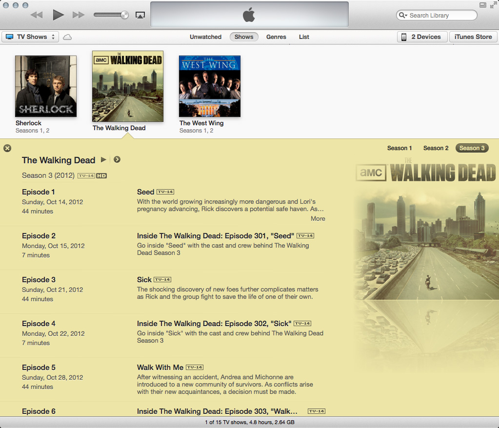
After installing iTunes 11 this past weekend, I quickly developed a sour opinion of the design of the expanded/open “folders” of TV shows. Bothered enough by these issues, I attempted to fix them. (Click any photo below for a larger view.)

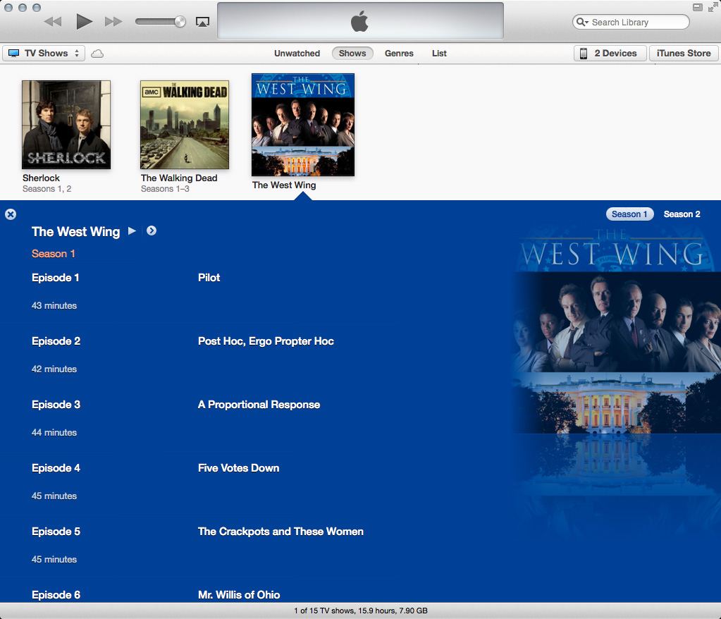
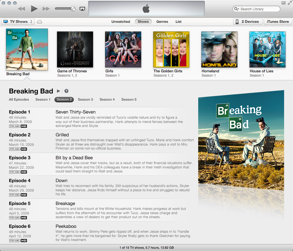
This is what an open folder for content purchased on iTunes looks like:

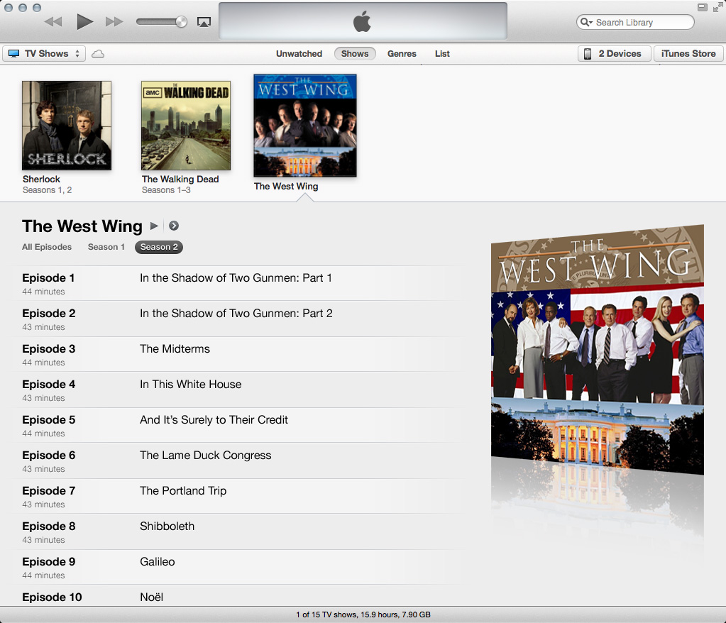
And this is what an open folder for content that was digitized and imported (sorry, Library of Congress) looks like:

Here are some of my issues:

  • What’s with all the colors? I’m sure an iTunes engineer is extremely proud of the algorithm he or she developed to lift colors from album art and assign them to text and backgrounds (and rightfully so), but yikes! iTunes preferences offers a checkbox to disable the colors, but then you lose the big album art.
  • Speaking of album art, yikes! Why the edge fades and decreased opacity?
  • Why are the season buttons tucked away in a corner almost blending into the album art? As they serve a kind of important function (you know, showing more content), shouldn’t they be in a more prominent place?
  • Why why why when switching seasons does the album art for that season not display? In this expanded view, only the art for the first available season of the show is displayed.
  • Is the close button really necessary? And why is the spacing to the right of the season buttons different than the spacing to the left of the close button?
  • How about all that text? For imported content, there’s not much, so compared to purchased content, the text is drowning in negative space. And those horizontal divider lines between episodes? They’re so transparent they might as well not even be there.
  • Purchased content displays the episode’s air date between the episode number and episode length. But for imported content, this data cannot be entered (so far as I know), so we’re left with a hole between the episode number and length.

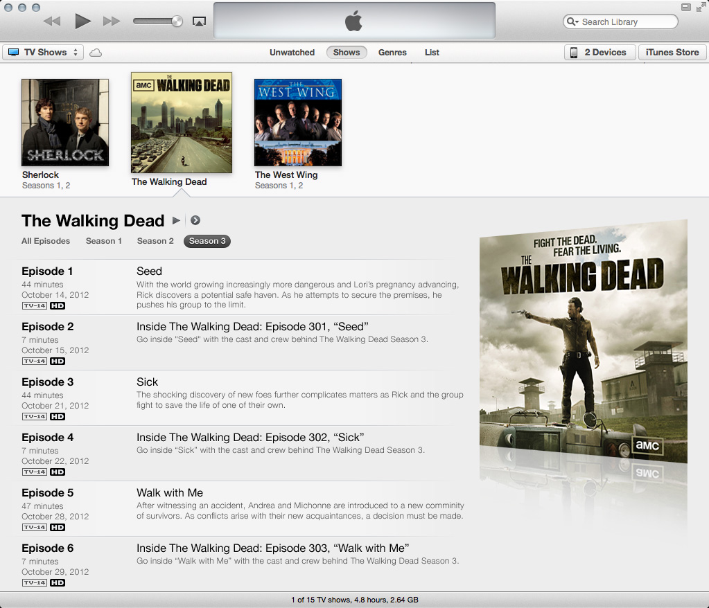
What I propose: chuck the colors, move the season buttons, create a better album-art display, and reformat the text.

Imported content would look like this:

Switching seasons would display the proper art:

Purchased content would look like this:

I think these changes offer a cleaner, better organized display of content. And the design elements here (the bars, “3D” album art) fit in with existing iTunes design elements. (Thanks to Neven Mrgan for inspiring the art.)

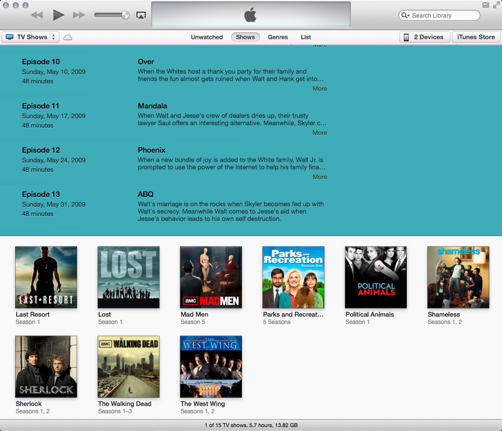
In addition to design nitpicks, I have a functionality nitpick, too, with TV shows. Season two of Breaking Bad in its current iTunes display looks like this:

When you scroll down, you lose a way to quickly identify what you’re looking at:

What season is this again? When you scroll down, why not have the show/season header lock to the top of the screen until the last episode pushes it out of view? Just like headers in scrollable lists on iOS devices work.

The redesigned Breaking Bad season two:

What it would look like after scrolling with the title/season bar locked to the top:

In addition to giving a quick visual identifying what season you’re browsing, you can also quickly switch seasons. That episode you were looking for wasn’t in season two? No problem. Click another season in that locked header, and iTunes would scroll to the top of the expanded view and switch to that season. In the current setup, you’d have to scroll back up yourself and find those tucked-away season buttons over by the album art to switch to another season.

Overall, the expanded views of TV shows feel like they were rushed to completion. The design needs improving, and there are numerous bugs when viewing and editing info in seasons other than the show’s first available season (in building these examples, I experienced many WTF moments in iTunes). Here’s hoping we get some improvements soon.

(P.S.: Yeah, I like the Golden Girls. Thank you for being a friend and not judging me.)

Pull-to-Refresh in iOS Safari

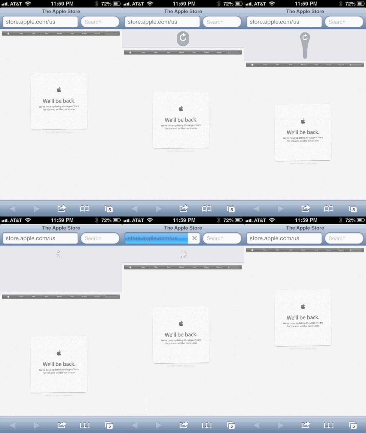
Based an idea my friend Jon Nagle tweeted, here’s a mockup of how pull-to-refresh could work in iOS Safari:

(And for those times where obsessive refreshing is necessary, this would certainly be more fun than feverishly tapping a tiny button.)

Hroad Trip Photos

I finally got around to uploading some photos from my Hroad Trip from OH to LA a few months back.

You can view them on Flickr.

Enjoy!

Lincoln

Is it presumptuous of me to say this film will win a River-Queen-load of awards? From acting to directing to writing to costuming, this film, which both entertains and educates, is expertly and lovingly crafted.

Part of the expertise exhibited by Steven Spielberg is crafting a film that is remarkably restrained. Given the subject matter—the greatest American president—one might expect a grand, historical epic charting how a tall-in-stature but short-in-experience man becomes that great president and how the trials and tribulations of the events he was thrust into defined the man. Instead, we are treated to a smaller, more scope-focused, and more intimate film about how the man defined the events thrust upon him. And the film is all the better because of that focus and restraint.

Restrained, too, is John Williams’s score. Often heard are complaints his music dominates—negatively—scenes it accompanies. But in Lincoln, he, like Spielberg, gets out of the way of sorts. Large parts of the film are left unscored. And when his music is heard, it is to gently and, in many cases, elegiacally reinforce the moment on screen—until the end when the score lets loose.

That focus and restraint from Spielberg and Williams allows something else to shine through: the acting. Daniel Day-Lewis has been called the “greatest living actor” for good reason. On display in this film is proof why. From his mannerisms to his wit to the way he physically carries the character on screen, Day-Lewis is every bit as good as expected. And then some. He breathes life into a historical force we only know from photos and text in history books in a way that made me think, “Gee, I wouldn’t mind having a White House Honey Ale with this man.”

Day-Lewis’s isn’t the only great performance. Also great were Sally Field and Tommy Lee Jones. Her shared time with Day-Lewis and his time apart were notable and not to be overlooked. (A side note about casting. The supporting cast is a treasure trove of b- and c-list television actors. One in particular—a certain British accountant playing a certain U.S.General—entirely caught me off guard to the point I missed everything he said when he was introduced. After the initial shock wore off, I determined I wouldn’t mind seeing him in his own film.)

What I saw in this film were parallels to our time. Besides the political horse-trading and bitter divisiveness—and abject name calling!—legislation had to be passed to course-correct the legal status of a particular set of people. Almost 150 years later, the story hasn’t changed. Furthermore, both times feature a president, from Illinois, who, as he looks at the long game, is accused of being overly deliberative and not adequately leading.

These parallels give the film an almost timeless feeling. So too does the title character. While the film takes place in a time when the United States was ruled by men of whiskers, the moral fortitude of its title character is bound by no age. And as that title character, Daniel Day-Lewis gives a masterful performance—a performance that, like Lincoln, now belongs to the ages.

Skyfall

At one point during the film, James Bond quips his hobby is resurrection. That may be true for the character, but it’s even truer for the franchise. Now going on 50 years, the James Bond franchise has gone through twenty-three films (a few of them remarkably terrible), six actors in the title role (some better than others), a changing—and shrinking—world stage (not to mention the changing technology), and the influence from other film franchises (most notably Nolan’s films and the Bourne films).

Yet the franchise lives on. Whenever one might count Bond out, he comes roaring back louder than the MGM lion preceding his adventure. A hokey Diamonds Are Forever gave way to Live and Let Die and an uncharacteristic role for Bond. A tired A View To a Kill gave way to The Living Daylights and an uber-serious Bond. A weakLicence to Kill (and a six year hiatus) gave way to GoldenEye and a fresh, new direction. An atrocious Die Another Day gave way to Casino Royale and its refocused, reinvigorated approach to the character and franchise.

Skyfall continues the trend of resurrection. Not only does the film do penance for the sub-par Quantum of Solace, it sets up the franchise for many more films to come. And while the film looks to the future, it makes sure not to forget the past with several nods to staple Bond elements.

That future-and-past theme appears throughout the film. The future of MI6 is tested while Bond’s and M’s pasts surface. The first two acts were superb with their expected action and unexpected amount of sleuthing. Dame Judi Dench is marvelous as M in a very expanded role, and Javier Bardem is wicked, wily, and tremendous fun (Anthony Hopkins’s Hannibal Lector and Heath Ledger’s Joker meet Julian Assange and Anonymous). Had the third act contained the same amount of vigor,Skyfall would have easily found a spot in my top-five Bond films. But the third act fell apart for me as it descends into a more generic action film that feels considerably less Bondian than the two preceding acts (and there’s a preparation montage during which all I could think of is Home Alone). The first two acts have so many people and so much going on that the third act seems desolate and disconnected. And afterward is an epilogue of sorts that, given the events of the third act, seems almost tacked on and inappropriate—but it was necessary to complete the franchise’s resurrection.

What else is disappointing about the film is the role females play. The female role achieved a high-water mark in Casino Royale with Vesper being a strong, intellectual equal to Bond and with M being a smart, capable leader. But in Skyfall, the female roles are, umm, resurrected to their “traditional” roles.

Not disappointing is the work from director Sam Mendes. Mendes isn’t known for rollicking action sequences, but with Skyfall, he proves he’s no slouch either. He deftly handles the action as well as he does the more dramatic side of Bond.

With Mendes comes his sometimes cinematographer Roger Deakins. His work inSkyfall is unquestionably my favorite part of the film. The use of light and shadow and the abundance of striking silhouettes throughout the film is inspiring.

And along with Deakins comes Mendes’s composer of choice: Thomas Newman. When Mendes was announced as director, I was curious if his usual collaborator would be brought on to score the film or if David Arnold, who scored Tomorrow Never Dies through Quantum of Solace, would remain. When Newman was announced as composer, I was one part frightened and one part intrigued. Frightened because at the time nothing in his past suggested he could pull off a high-octane action score. Intrigued because everything in his past shows he has enormous talent. And the end result is something quite satisfying. As with his director, Newman proves he no slouch at action either. All the familiar Thomas Newman mannerisms are present. But so is a new, and welcomed, side of Newman.

Not welcomed is the absence of a generous amount of interpolations of the title theme throughout the score. As what usually happens when the film’s composer is not involved in creating the title song, the song disappears after the title sequence ends. When given proper treatment, the song’s melody becomes more than a disjointed musical addendum and serves as a unifying identity for the film. Adele’s terrific and very Bondian song is beautifully quoted to accompany the mesmerizing visuals as Bond arrives at the casino but is otherwise absent from the film. This wasn’t the case with Casino Royale as David Arnold co-wrote the title song with Chris Cornell thus allowing him to weave several orchestral fragments of the song throughout the film.

So to enjoy Adele’s song (which is probably my second-favorite part of the film), we have to look to the title sequence. And that sequence is designed by series regular Daniel Kleinman who returns—thankfully—after being noticeably absent fromQuantum of Solace when Marc Forster brought along MK12, his title-sequence creators of choice. Kleinman’s Skyfall sequence expertly mirrors the film with imagery and symbolism carefully plucked from events in the film. And at the same time, it mirrors the franchise. Throughout the sequence, there’s a constant forward motion. The sequence propels forward unfazed and unhindered—just like the franchise does.

And that’s what the franchise will continue to do—especially after an entry that will be seen as successful as this one where the directing, acting, story, music, and visuals all come together to create one hell of a Bond film. There are faults with the film but not enough to derail the franchise’s forward motion. And certainly not enough to derail the franchise’s resurrection. You picked a good hobby, Mr. Bond. Here’s to 50 more years. But let’s fix those faults.

The Nightmare Before Christmas

(This was my first time seeing this film. I know. I’m a terrible person.)

I hate musicals. Let me get that out of the way. All the spontaneous, choreographed singing? Hate it. I mean, how realistic is it that all the towns folk of Halloween Town simultaneously burst out into song and…oh…Halloween Town. A skeleton man. A living rag doll. And a ghost dog. Right. This is a fantasy world.

Yes, a fantasy world. And a remarkable one at that. The imagination and creativity that went into the character and set design for the film is astounding. Immensely inventive. (And the stop motion adds a special quality not achievable if this were a traditionally animated film.) If Halloween actually had its own town, this is exactly what it would look like.

Is this what it would sound like, too? I don’t know, but I can’t imagine The Nightmare Before Christmas sounding like anything else. Danny Elfman’s work for this film is absolutely spectacular. Strong themes, sharp lyrics, and terrific performances—including Elfman as Jack Skellington’s singing voice—really make this film into the classic it is. (That Elfman never took on a similar project is somewhat disappointing. No other film project of his has matched the level of musical variety and creativity achieved in this film. The closest he came was for Charlie and the Chocolate Factoryand its four highly varied and highly enjoyable songs for Augustus Gloop, Violet Beauregarde, Veruca Salt, and Mike Teavee.) From the opening song “Halloween Town” to the film’s highlight song “What’s This?” to the summation of each theme in the end credits, Elfman adeptly supplied the film’s striking visuals with striking music that perfectly matched Tim Burton and Henry Selick’s eclectic vision.

The film itself is probably a three-star or perhaps a four-star effort. Things I was curious about weren’t explored (like why was Oogie Boogie a gambling man or why weren’t the portals ever discovered by someone in any of the holiday worlds). But Danny Elfman’s work makes up for the film’s shortcomings.

And one of those shortcomings is that the film’s still a musical. And I hate musicals. But The Nightmare Before Christmas is so much more. A charming concept. Monsterous visual creativity. And a stellar Danny Elfman soundtrack. If only more musicals were made like this one.

Launch Center Pro

I started using Launch Center Pro by App Cubby several months ago, and since then, the app has become indispensable for me. Rarely does an app disrupt my dock arrangement, but Launch Center Pro did. Perhaps the app isn’t for everyone, but below I’ll share how I use it and what for.

What is Launch Center Pro? Through custom URL schemes, developers can allow users and other apps to deep-dive into features or sections of an app. For example, with the tap of a single button, you could search in the Yelp app what restaurants are nearby instead of finding the app, launching it, bypassing the occasional splash screen, tapping the Search tab, typing in “restaurants”, and finally hitting the search button.

The same idea applies to Messages. Rather than launching Messages, possibly having to back out of a message thread from someone else, searching through the list of message threads to find the person you want to send a message to, selecting the thread, and then typing and sending your message, Launch Center Pro can use a URL scheme to send a message to a particular person much faster.

Here’s Launch Center Pro in action:

The speed at which I can accomplish normally-several-step actions is what makes Launch Center Pro so useful for me. And that the app is completely customizable (including what icons are used) makes it useful for many, many workflows. Here’s mine.

When I launch the app, this is what I see:
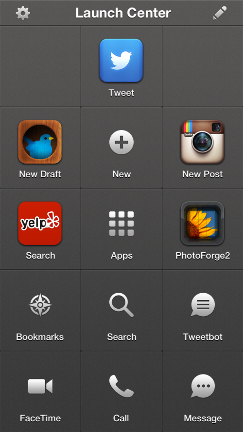
The app supports “Groups” and “Actions”. Groups are folders of actions. Actions are the specific task to perform (whether it’s launching an app or calling someone).

Tapping the Edit button (the pencil in the upper-right corner) places the app in edit mode (love the blueprint theme) where you can add, delete, or rearrange groups and actions. Tapping on a group enters that group for editing.

My main screen has five actions and eight groups. Here’s what the actions do.

Tweet
This launches the OS-level tweet sheet to compose and send a tweet. Most of my tweeting that isn’t a reply to someone else’s tweet happens here. I don’t have to launch an app, wait for it to load, and then post a tweet. (Why am I not using the tweet button in Notification Center? Because my workflow for getting places in apps is tied to Launch Center Pro, and I decided to include tweeting in that. I consolidated.)
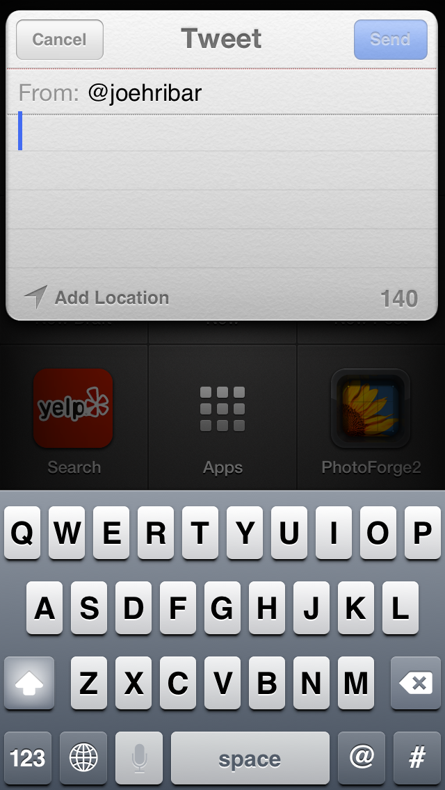
New Birdhouse Draft
birdhouse://draft?text=[prompt-twitter]

This shows a window inside Launch Center Pro where I can compose—with the Twitter keyboard—a tweet draft and save it to Birdhouse app. Launch Center Pro supports Apple’s custom keyboards; when composing an action, you can select the default keyboard ([prompt]) and add the additional directive.

New Instagram Post
instagram://camera

This deep-dives into Instagram’s camera. Rather than launching the app and tapping the camera button, this is a shortcut to bypass loading my feed.

Yelp Search
yelp4:///search?category=[prompt]

Like the new-draft action, this launches the keyboard prompt where I can enter a search term and jump right to searching that term in the Yelp app. If you always wanted to search for a specific thing—like “restaurants”—in the example URL you could replace “[prompt]” with “restaurants”.

PhotoForge2
Launches the app so I can edit a photo.

Those are the five main-level actions. Here are what I have in each of my groups. To open a group, you tap and hold on the group to reveal its contents and drag your finger to the action to launch it. As a result, I keep my more-frequently-used actions closer to the group’s center (if you were wondering about my arrangement inside each group).

New
This group contains actions to create a new event in Agenda (my calendar app of choice); create a new email in Mail; create a new note in Simplenote (my note-taking app of choice); create a new timer in Timer; and add an app, movie, album/song, or “other” to Recall app (useful for when someone says, “Hey, you should see ‘Reservoir Dogs’”, and I don’t want to forget).
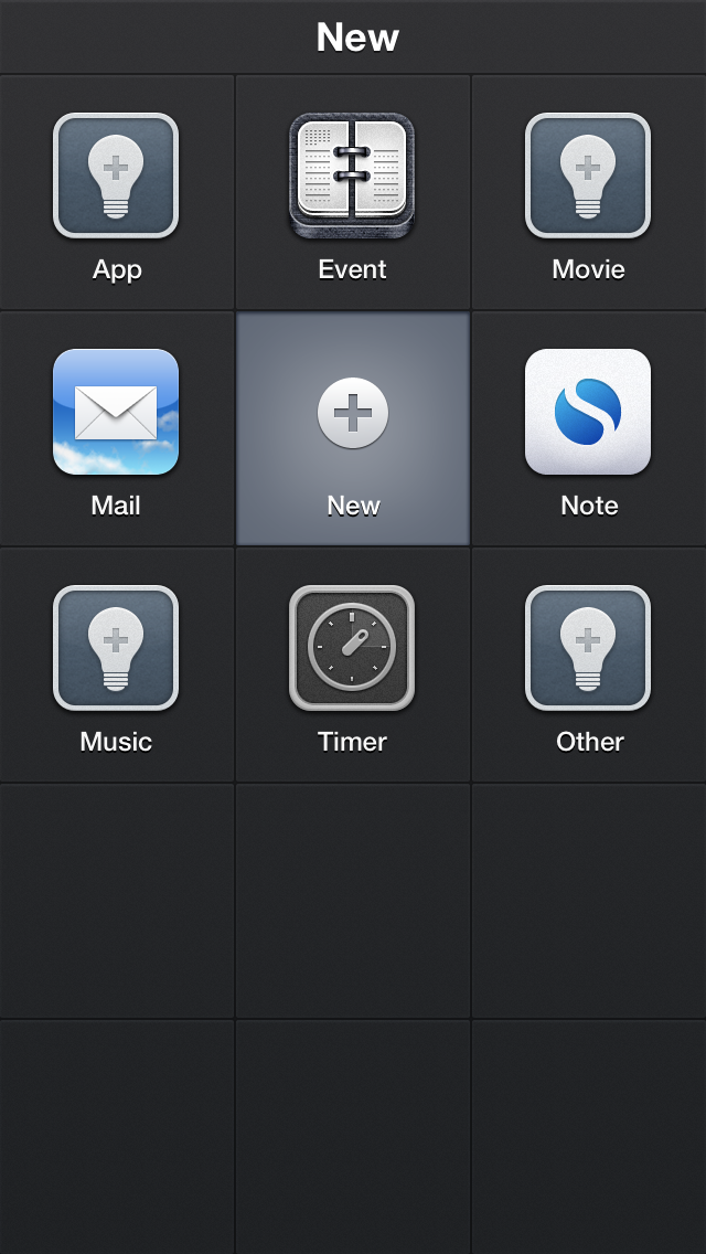
The URLs:
agenda://event?title=[prompt]&location=[prompt]
mailto:?subject=[prompt]&body=[prompt]
simplenote://new?content=[prompt]&tag=Home
launchtimer://[prompt-num]
recallapp://apps?search
recallapp://movies?search
recallapp://music?search
recallapp://other?add

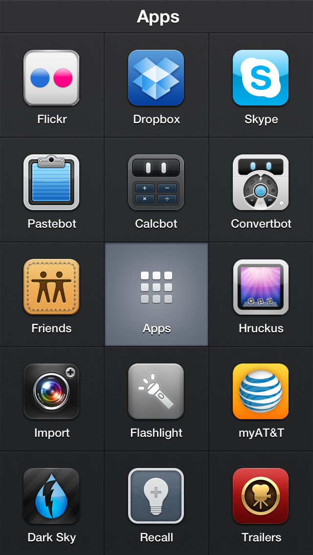
Apps
This group contains shortcuts to launching apps. These actions give me easy access to apps I use but don’t use often enough to warrant them not being buried inside a folder. No special URLs here; just URLs to launch these apps.
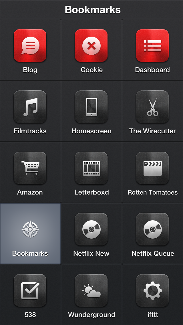
Bookmarks
This group contains Safari bookmarks for sites I might want to quickly jump to.
Search
This group contains actions to search or translate text I enter in the keyboard prompt.

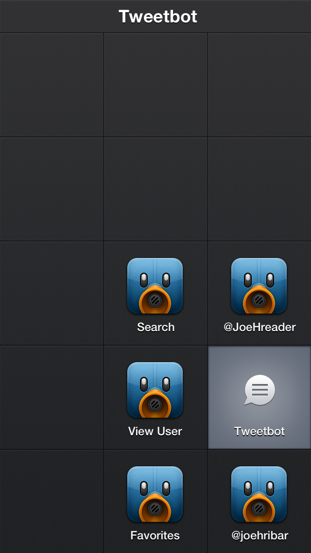
Tweetbot
This group contains actions to jump to specific sections in Tweetbot (my Twitter app of choice).
FaceTime
This group contains shortcuts to FaceTime specific contacts.

Call
This group contains shortcuts to call specific contacts as well as a keypad button and a contact-search button.

Message
This group contains shortcuts to send a message to a specific contact as well as a generic new-message button (I use this when composing a message to multiple recipients; Apple doesn’t have a URL scheme for a multi-recipient message).

So, that’s my Launch Center Pro workflow. If you only use a few apps or call/message a few people, perhaps this app isn’t for you. If, though, you enjoy having quicker, easier, and more efficient ways to perform frequent actions, give Launch Center Pro a try. After using it since July, I can’t be without this app.

Get Launch Center Pro on the App Store for $4.99.
The Old New iPad

Apple broke the rules today. Well, Apple broke its rule today. Since the release of the original iPhone, Apple followed a yearly release cycle with both its iPhones and iPads. Apple had an unwritten rule stating consumers were safe to purchase an iOS device knowing the next model wouldn’t be released for another year.

But that ended today with the refresh of “the new iPad” that was released in March. Seven months after it was released, it was not only made obsolete, it was retired. It didn’t become the cheaper, previous model for sale; it was dropped entirely.

How is that supposed to make those of us who bought “the new iPad” feel? Angry? Confused? Duped? I feel all of the above. I’ve read numerous tech writers exclaim I have no right to be upset that Apple released something better and I have every right to buy that new thing or not.

I don’t think this situation is that simple. Again, the “old” “new iPad” is no longer for sale. Gone. Apple is selling the iPad 2, the iPad 4, and the iPad mini—not the 3, 4, and mini. The 3 is dead. Apple sold us a device they had every intention of discontinuing several months after it was released.

So here’s what I propose. Just months after the original iPhone was released, its price was dropped $200 for the holidays. Early adopters, rightfully upset at this, were given a $100 credit. Apple should do something similar for iPad 3 owners—whether they bought it seven months ago or last month. Perhaps an Apple or iTunes credit isn’t the best route. So how about the option to trade in iPad 3 for iPad 4 plus an upgrade fee? I’d pay $100-$150 to upgrade my iPad. Plus, Apple could then sell my iPad 3 as a refurbished device. Everyone wins!

Wishful thinking. I know. Especially since there hasn’t been, to my knowledge, much uproar over this situation. In his letter after the original-iPhone incident, Steve Jobs wrote, “We need to do a better job taking care of our early iPhone customers as we aggressively go after new ones with a lower price. Our early customers trusted us, and we must live up to that trust with our actions in moments like these.”

Apple should extend that same spirit of goodwill to iPad 3 owners.

Microsoft Acquires Perceptive Pixel

Microsoft today announced the acquisition of the multi-touch-pioneering company Perceptive Pixel. This is a big get for Microsoft. Couple this with Microsoft now producing its own hardware, and these are exciting times for the company.

This news was striking to me because of my connection with Perceptive Pixel. While at ESPN, I worked with Perceptive Pixel multi-touch technology for three-and-a-half years creating broadcast touchscreen graphics for SportsCenter. On the SportsCenter set is a 103-inch multi-touch touchscreen for anchors and analysts to use during live broadcasts.

So why is this a big get for Microsoft? Two reasons: technology and customers.

First, the technology. When company founder Jeff Han gave his Perceptive Pixel demo at TED back in 2006, multi-touch technology was groundbreaking. The iPhone and its multi-touch technology wouldn’t be unleashed until the following year. And remember CNN’s Magic Wall during the 2008 presidential election? That was Perceptive Pixel technology.

Jump to 2012, and Microsoft is lagging behind Apple in the consumer space. Acquiring Perceptive Pixel marks a more concerted effort by Microsoft to keep up—not necessarily catch up—with Apple. No doubt the Surface will make use of Perceptive Pixel technology—if it already doesn’t. Why should Microsoft sink money and time into developing their own—perhaps not as good—multi-touch technology when they can use tried, tested, and successful technology from a company dedicated to producing said technology.

Second, the customers. Take a look at Perceptive Pixel’s customer list. The big industries on that list? Government, broadcast, and education. Microsoft just gained huge inroads with all those industries.

Microsoft hasn’t yet announced what their plans are for Perceptive Pixel, but the acquisition alongside their new hardware ventures make for interesting speculation. If nothing else, Steve Ballmer can take notes from Jeff Han on giving presentations.

Hroad Trip: Zion

The list of favorite places I’ve been to has a new member: Zion National Park. Red sandstone canyons, turquoise snow-melt waters, imposing mountains, and grand vistas. While we didn’t have time to see and do everything, this park with much to offer is worthy of a return visit.

We spent most of our day hiking the Zion Narrows following the Virgin River through the canyon. There is no trail on this hike; the river is the trail.

For about 70% of the hike, we were in water anywhere from ankle deep to waist deep.

I don’t like to describe things too often as amazing or awesome because those are two overused words, but hiking the Zion Narrows was both.

360° view of the river (click for larger version):

And what visit to water would be complete without this:

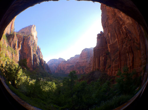
Afterward, we toured some of the stops along the scenic drive. The view under the Weeping Rock:

Evening shadows:

If you ever have a chance to visit Zion, do it. You won’t be disappointed. We weren’t.

Today, we’re headed to Los Angeles. One more state, one more time zone, and one more destination.

Hroad Trip: Bryce Canyon

With only a couple hours to spend in Bryce Canyon National Park, we took the auto tour. No hiking yesterday. Here are a few shots:

Panorama (click for larger):

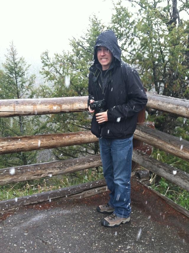
Hey hey, I’m in a photo:

And today, we’ll be exploring Zion National Park:

Hroad Trip: Arches & Hikes

arch (noun)
a curved symmetrical structure spanning an opening and typically supporting the weight of a bridge, roof, or wall above it.

hike (noun)
a long walk, esp. in the country or wilderness.

pooped (adjective)
exhausted

Those three words described Day 7 of the “Hey Joe, Where You Goin’ With That Camera In Your Hand” Hroad Trip as we hiked 15+ miles around Arches National Park in Moab, Utah and its magnificent sandstone structures.

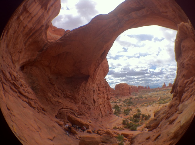
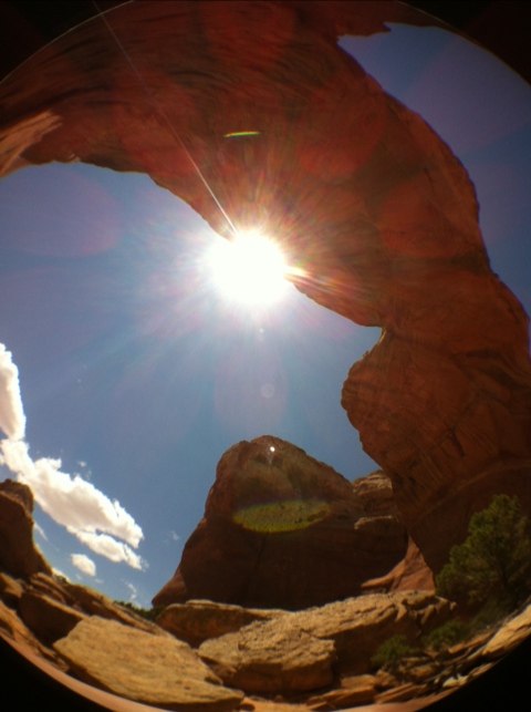
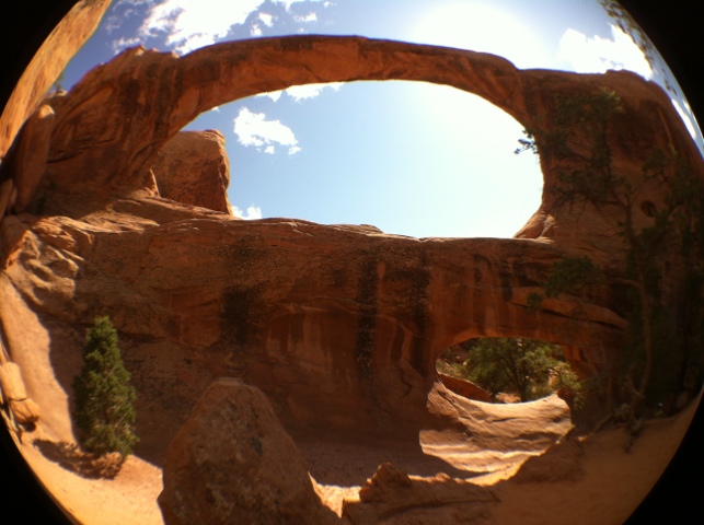
We started the day with Double Arch:

Inside:

Outside was a lone, little prickly pear cactus. So of course I took a picture:

Or two:

Out hiking:

…to Broken Arch:

Underneath:

We hiked the 4-mile-round-trip “trail” to Double O Arch:

I say “trail” because most of the trail is climbing up, down, and over rocks and steep paths with drop-offs on both sides:

A break from the arches:

Back to arches. Partition Arch:

We ended the day with perhaps the most famous arch in the world and the arch I wasn’t leaving the park without a photo of: Delicate Arch:

People lined up (me included) to take turns going under the arch. When one couple took their turn, the guy dropped to one knee and proposed to his girlfriend under the arch for all of us to be a part of.

Today was exhilarating—and exhausting. But all the miles and all the sweat were worth the magnificent sights we saw.

Tomorrow, we’ll have a little rest as we drive to Zion National Park by way of Bryce Canyon National Park. And more picture taking.

Hroad Trip: Grand Teton? Nope.

Day 5 of the “Hey Joe, Where You Goin’ With That Camera In Your Hand” Hroad Trip turned out to be a bust.

We were concerned last night that the roads out of Yellowstone would be closed because of the snow. Fortunately, they were open. But this was the scene when we entered Grand Teton National Park:

Throughout the park, we had low clouds and a mix of rain and snow. That led to views like this:

…and this of the mighty Tetons:

Unfortunately, all the majestic beauty of the Tetons will remain hidden to us. But we did see a moose:

Instead, we did a little walking around Jackson, Wyoming (which reminded me of Old Town Scottsdale (for the few of you reading this who know what I’m talking about)):

But it was raining, and we’re not much of shoppers anyway. So we went to see
The Avengers.

Tomorrow, we leave the cold and head for warmer lands of southern Utah and Arches National Park on Sunday.

Until then, gunslinger squirrel says, “I’m your huckleberry.”

Hroad Trip: Yellowstone, Day 2

Hello again from sunny and snowy Yellowstone National Park. Most of today was spent exploring some of the park’s thermal features as well as the park’s Grand Canyon.

The Grand Prismatic Spring:

Upper Falls:

Lower Falls and the Grand Canyon of Yellowstone:

Panorama (click for larger version):

Mud Volcano (that smelled like rotten eggs):

And we ran into more snow:

What do you do with snow? Build snowmen!

…down by the lake:

And what else do you do down by the lake? That’s right, stick your feet in. Add this to my collection:

Yes, the water was cold. Very cold.

Back to thermal features. Black Pool:

Detail:

Needle drop (not a thermal feature):

Morning Glory Pool:

And if we didn’t have our Phil of thermal features, here’s another with a little less Fury. S.H.I.E.L.D. Shield Spring:

(Sorry, mom, you won’t get that joke.)

And finally, while this wasn’t a park attraction, I couldn’t pass it up:

Tomorrow is Grand Teton National Park—provided the pending snow doesn’t close roads!

Hroad Trip: Yellowstone, Day 1

Day 3 of the “Hey Joe, Where You Goin’ With That Camera In Your Hand” Hroad Trip was in Yellowstone where we experienced a variety of weather: sun, clouds, rain, sleet, and snow. What follows is a sampling of our day (still only iPhone photos until my laptop gets internet).

Sunshine down by the Firehole River:

And sunshine by Gibbon Falls:

This is a common occurrence (yes, that’s the mirror on my car):

And then we hit some snow:

But we were back to sunshine at Mammoth Hot Springs:

And when we arrived at Tower Fall, we found more snow:

Back to sunshine for some more bison encounters:

(We did also see elk and a black bear, but those photos are on my DSLR camera.)

And finally, we ended with some clouds at Old Faithful:

See you tomorrow!

Hroad Trip: Quick Update

Yello from Yellowstone! 27 hours and 1700 miles of driving in seven states brought us here.

Monday was all driving (save for the stops I had to make because I was sick—the first time in I can’t remember how long), and yesterday was mostly driving with a stop at Mount Rushmore.

I don’t have Internet access on my laptop, so I can’t upload camera-camera photos, so here are a few from iPhone camera.

Driving through South Dakota:

Mount Rushmore:

Driving through Bighorn National Forest:

Entrance to Yellowstone:

They have snow here:

More later.

The “Hey Joe, Where You Goin’ With That Camera In Your Hand” Hroad Trip

(My thanks and/or apologies to Jimi Hendrix for the title of my
road trip, err, hroad trip.)

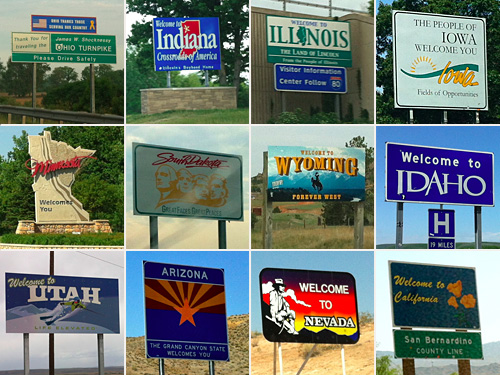
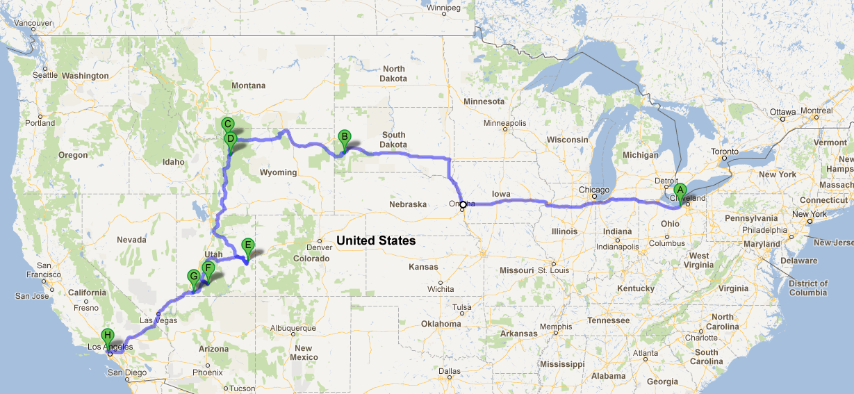
After driving from Connecticut to Ohio to spend a week with family and friends, I start the next part of my journey to Los Angeles tomorrow. But instead of driving straight through in the three days it would normally take from Cleveland to LA, my dad (who’s driving with me) and I are taking 10 days—and making several stops along the way. Here’s the route (click for larger):

A. Cleveland
B. Mount Rushmore
C. Yellowstone National Park
D. Grand Teton National Park
E. Arches National Park
F. Bryce Canyon National Park
G. Zion National Park
H. Los Angeles

I’ll be keeping this space along with my Twitter and Instagram feeds (@joehribar on both) updated along the journey if you’d like to follow along.

Two things are certain on the “Hey Joe, Where You Goin’ With That Camera In Your Hand” Hroad Trip. I’ll be taking a boat load of pictures, and my butt will be sore from driving. Huzzah!

How To Set Up Gmail As an Exchange Account on iOS to Enable Push Access

Today, I learned Gmail can be set up as a Microsoft Exchange account in the iOS Mail app to enable push email-access. With push, you’re instantly notified when a new email arrives—no more having to wait for Mail to poll the Gmail server every 15 minutes.

Megha Bassi at Simon Blog posted a tutorial back in March 2011, and that’s where I learned how to set up Gmail Exchange. Below, I’ve updated the screenshots for iOS 5 and included a couple extra steps (like a fix for Mail to delete emails instead of archiving them). (Note: I only sync my mail from Gmail, not contacts or calendars, so this tutorial only covers mail.)

Setup Instructions

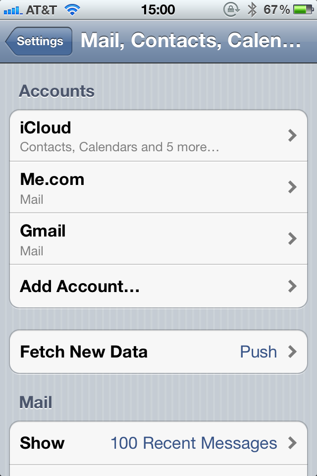
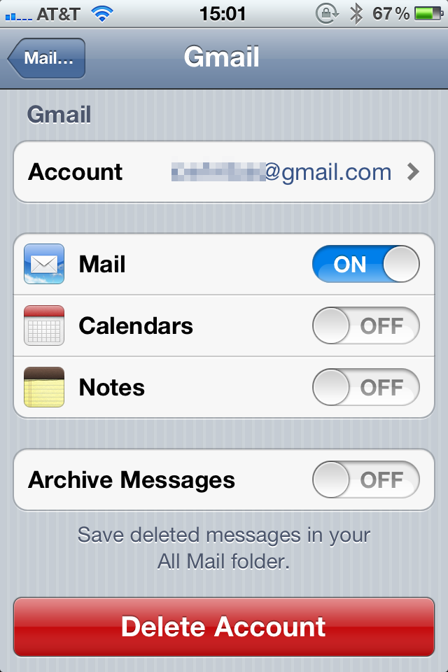
On your iOS device, launch the Settings app and go to Mail, Contacts, Calendars:

If you’ve previously set up your Gmail account with the Gmail option, go ahead and delete the account:

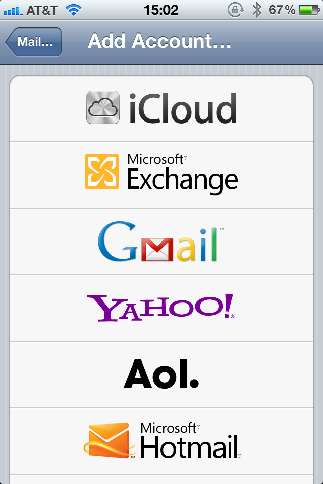
Next, on the “Mail, Contacts, Calendars” screen, tap “Add Account…” and select Microsoft Exchange:

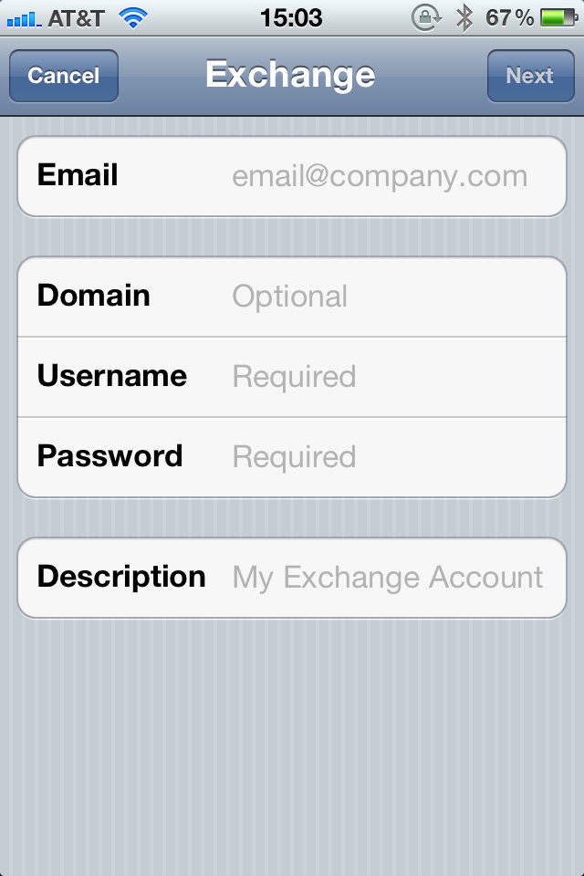
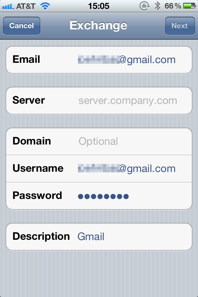
You’ll be brought to the Exchange screen:

Enter the following credentials:

Email: your Gmail address
Domain: leave this blank
Username: your Gmail address
Password: your password
Description: the label for this account

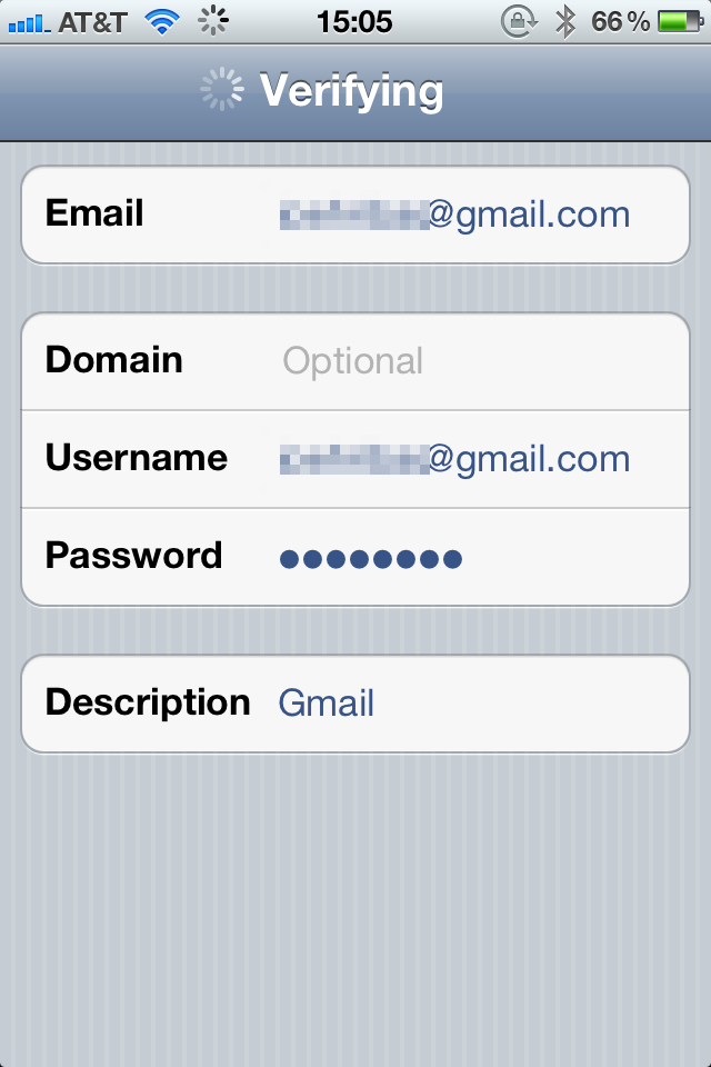
Tap Next. After your account is verified, an additional “Server” field will appear:

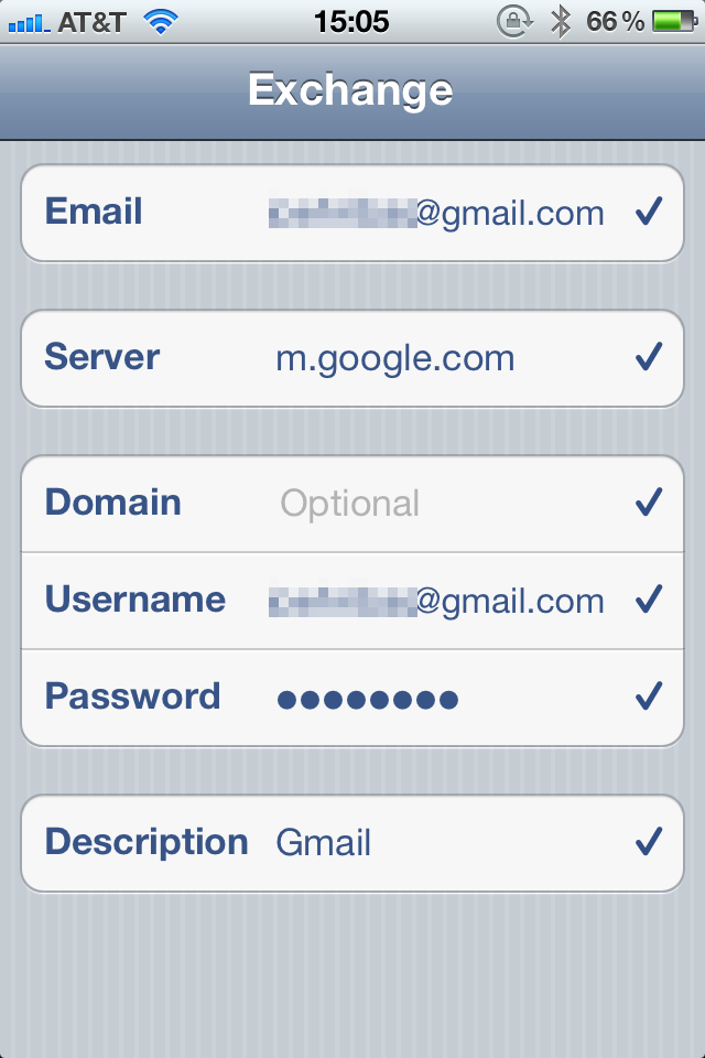
In the Server field, enter: m.google.com. Tap Next, and you should see a bunch of checkmarks:

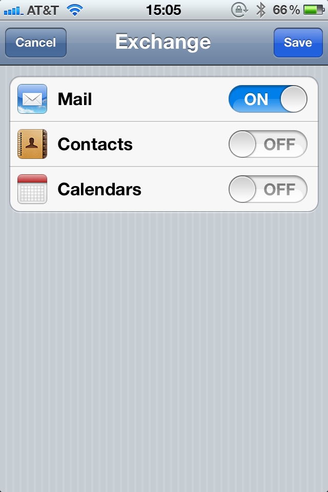
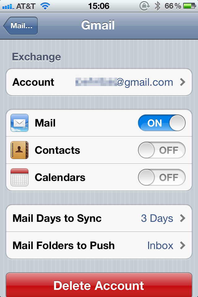
Next, select which services you want to sync:

Tap Save, and your Gmail Exchange account will be added.

In the settings for the account, there’s one more option you may wish to change: “Mail Days to Sync”.

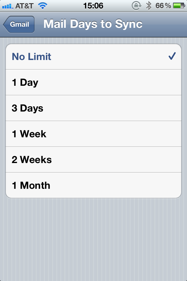
By default, the Exchange account only syncs the last three days of mail, but there are other options. Tap “Mail Days to Sync” to select a new sync range:

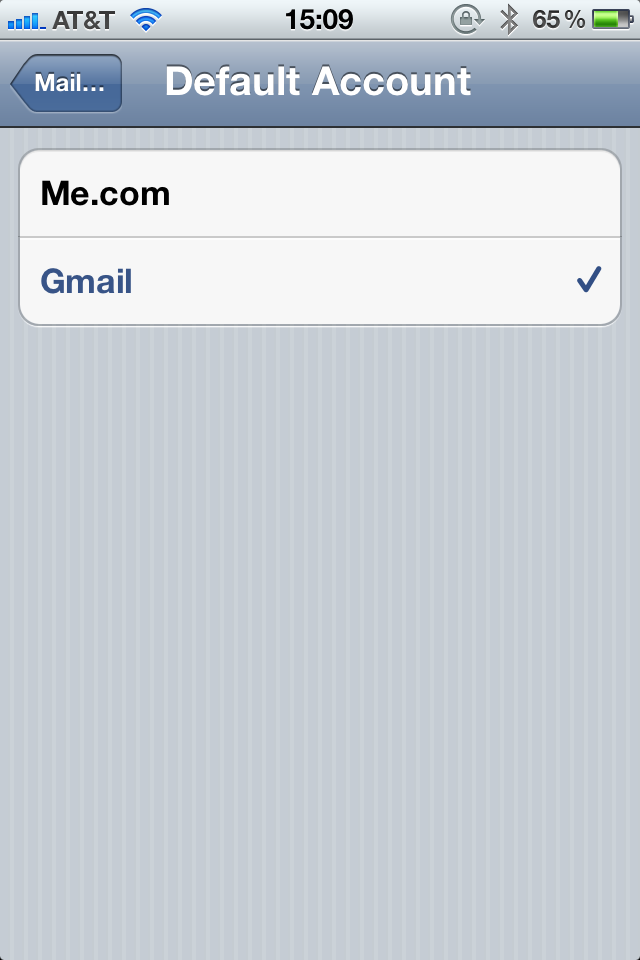
If your Gmail account is your default mail account, back in the “Mail, Contacts, Calendars” screen, scroll down to “Default Account” and reselect your Gmail account:

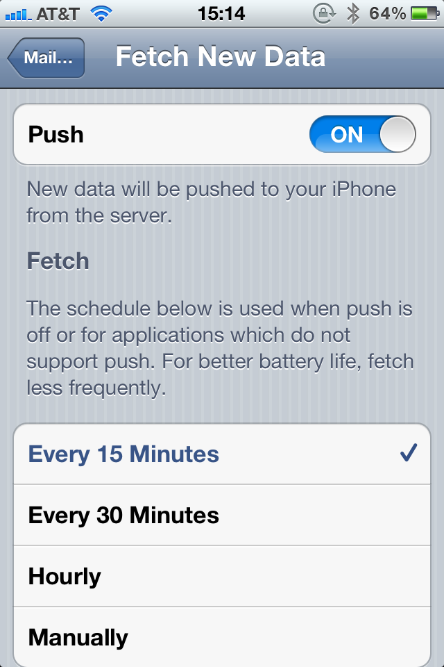
Also, make sure you have push activated (it should be by default). In the “Mail, Contacts, Calendars” screen, under the list of accounts is “Fetch New Data”. Tap this option and make sure push is on:

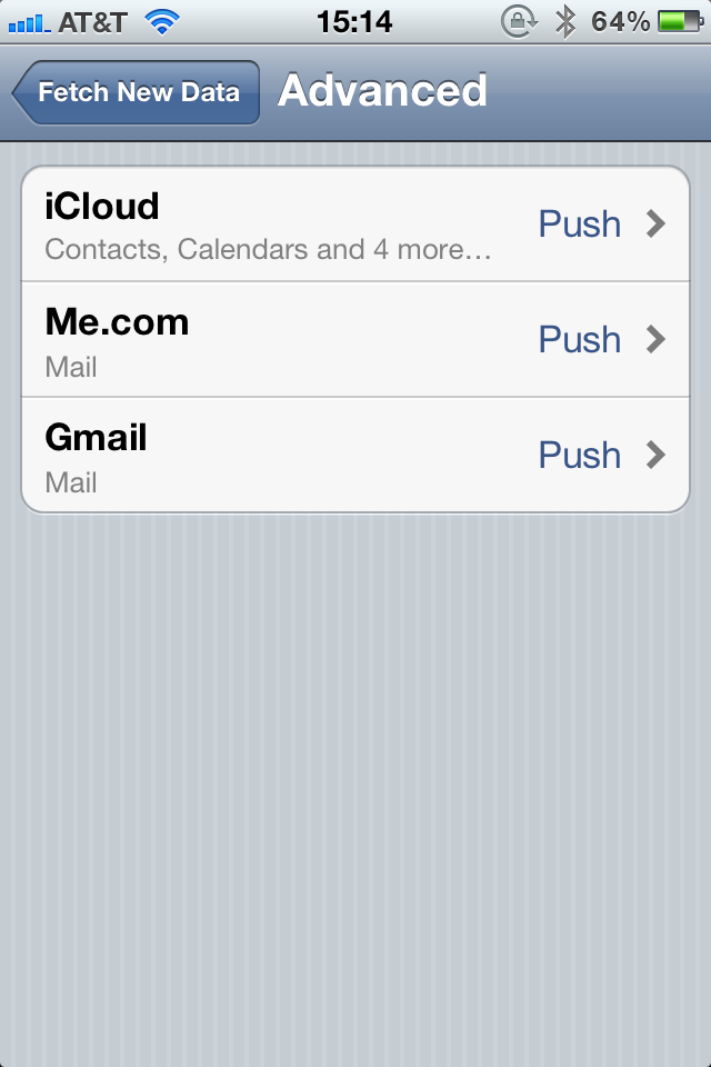
To verify your Gmail Exchange is using push, scroll down, and tap on “Advanced” to see what each account is using:

So now Mail is set up to use Gmail through an Exchange account. In this setup, the delete button in the Mail app by default archives your mail to your “All Mail” folder instead of moving the mail to the trash. If you’re okay with that, then you’re done. Enjoy your push Gmail. If, though, you want to fix that and be able to actually delete emails, there’s one more step.

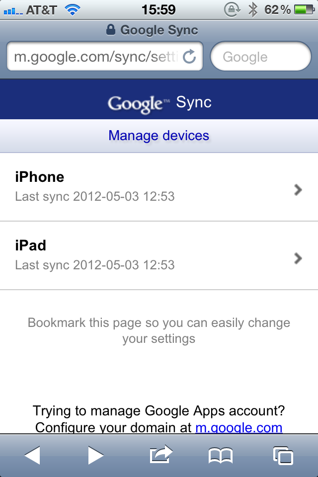
Launch Safari and browse to m.google.com/sync. If you aren’t logged in, you’ll be prompted to. Next, you’ll a list of your iOS devices that use Google services:

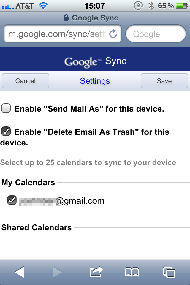
Select the device you’re on. On that device’s settings page, check the box to “Enable ‘Delete Email As Trash’ for this device”:

And that’s it. Now your Gmail uses push, and the Mail app delete button deletes. Enjoy!

A is for Avengers, and A is for Awesome

Joss Whedon is to the Avengers universe as Christopher Nolan is to the Batman universe. This film is everything you could want in a superhero film and so many things you could want in any other film: likable characters, snappy dialogue, plenty of laughs, memorable moments, killer special effects, and loads of action. The last act of the film is relentless with its propulsive action sequences—but never overbearing as Whedon skillfully manuevers through each sequence.

What else Whedon skillfully does is bringing all these characters—most of them with their own movie or movies—together in a cohesive and successful way. Mashing this many strong personalities together could be a disaster for a not-too-careful writer and director. But Whedon—and the cast—make this work.

And work the characters do. The underlying plot is fairly simple, but never is that a detraction as it allows the characters to really shine throughout the film. No Avenger is relegated to the sideline; all are given adequate screentime making them all seem equally important. Giving each character his or her due also means giving pairs and groups of characters so many rich and humorous moments together. I was expecting all the action the characters bring, but I wasn’t expecting all the laughs.

Equally rich was the music. Alan Silvestri delivers a roaring, macho, and heroic theme and score. While not as blatantly—and laughably—heroic as his Captain America theme, Silvestri’s Avengers theme excellently fits the group: strong, stated, and fit for the challenge without ever taking itself too seriously.

But what should be taken seriously is how great a film this is. A is for Avengers, and A is for Awesome. And that’s exactly what The Avengers is.

Backboard Dribbble App Is Good But Could Use an Assist

(Note: I think this is the first time I’ve really reviewed an iPhone app. I don’t plan on making this a habit, but I had a few things to say that didn’t fit in a tweet or two.)

If you aren’t familiar with Dribbble, it’s a website/network for designers to showcase small screenshots (called “shots”) to get feedback (and depending on your popularity large amounts of praise, too) from others. In addition, the site is a great source for inspiration and for seeing what cool things others are working on.

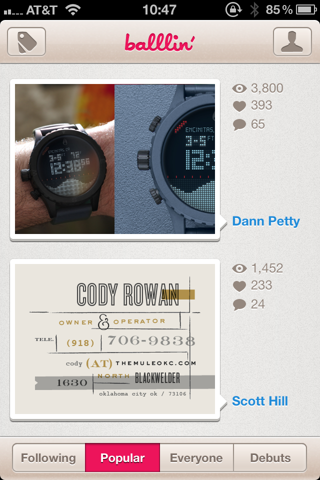
Dribbble doesn’t have its own native iPhone app, so numerous third-party developers have stepped in to fill the void. The Dribbble app I’ve been using is Balllin’; the app looks great and is easy to use.

This week, I tried out Backboard. Like Balllin’, the app looks great. Backboard also makes some improvements on user interaction with its reliance on gestures over buttons (I’m a sucker for gesture UI).

What I like about Backboard:

THE DESIGN. (I’m a sucker for minimal design, too.) The design of the app is simple and flat and as a result allows the artwork it features to shine with no distracting or unnecessary chrome.

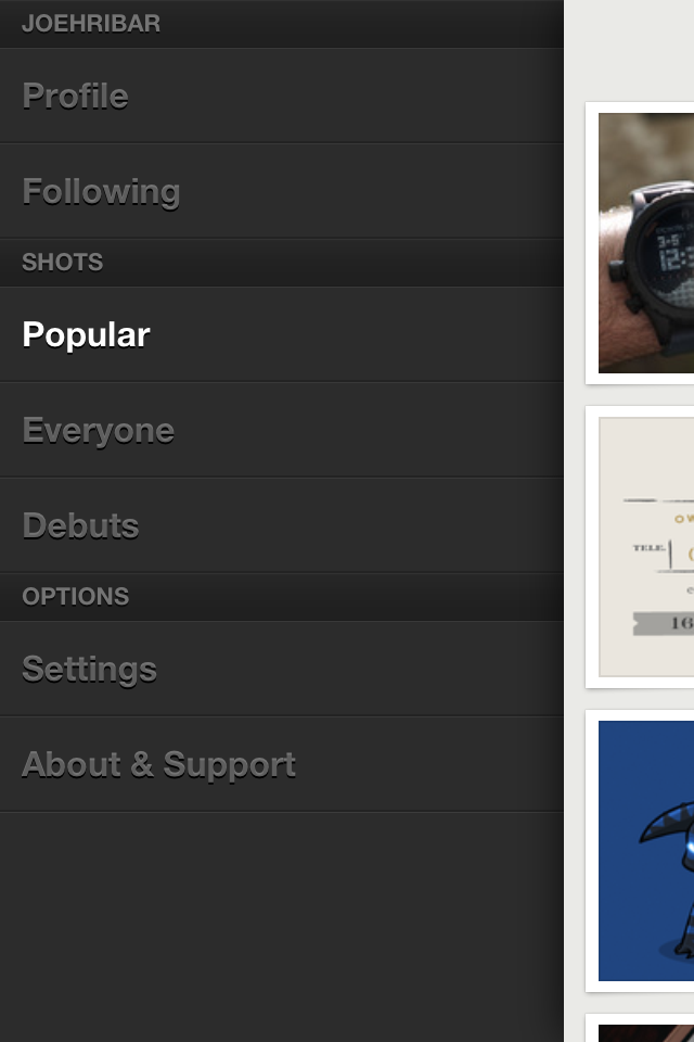
THE GESTURES. When in a list, swipe right to reveal the menu of lists. When on a shot page, swipe right to return to the list. No buttons taking up precious screen real-estate and browsing time (like in Balllin’).

THE LARGE SHOT. Tap a shot in a list to see a larger version on the shot page (much larger than is available on the shot page in Balllin’). (In both apps, rotating iPhone displays the shot fullscreen.)

What I don’t like about Backboard:

ALL THE TAPS. With simplicity exuding from so many other aspects of the app, liking or commenting on a shot is anything but simple. When in a list, if I want to like a shot, I have to tap FIVE times to like it. 1: tap the shot in the list to go to the shot page. 2: tap the shot image on the shot page to reveal the iOS arrow-actions button. 3: tap the action button. 4: tap “View on Dribbble” from the slide-up menu to launch the in-app browser. 5: tap like on the mobile page. If Dribbble ever opens their API to allow third-party apps to access liking and commenting, this process could be simpler. But it could be simpler before that as Balllin’ demonstrates: liking a shot in Balllin’ only takes THREE taps.

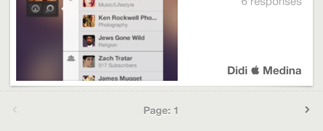
PAGINATION (aka more taps). There is no continuous-scrolling in a list. Instead, at the bottom of a list are buttons for the previous and next pages. Again, if the app is otherwise touting simplicity, this seems out of place. Or if the pagination must stay, why not continue with the gesture theme and allow swiping left or right on the page bar to switch pages?

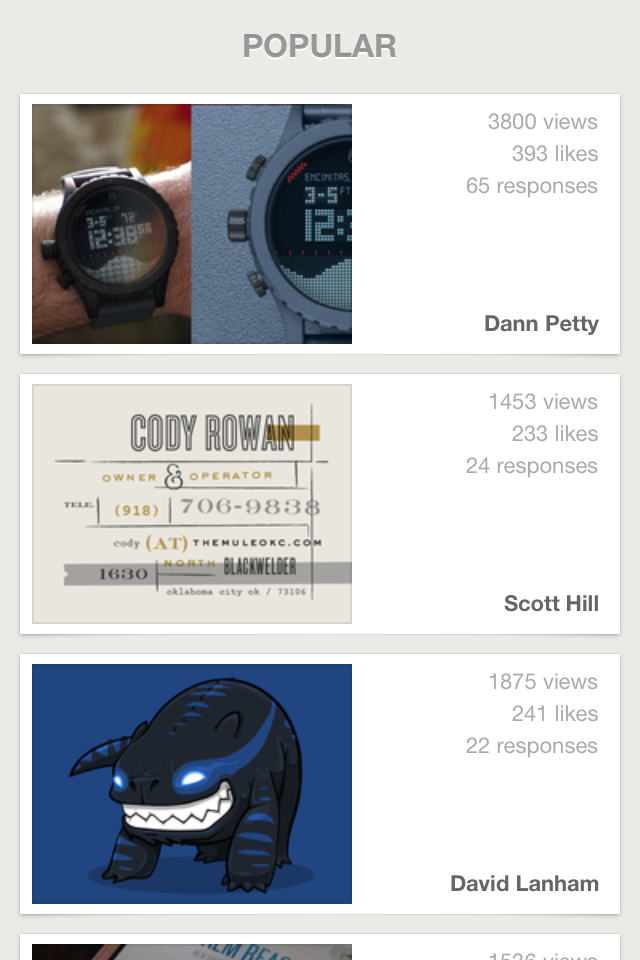
ICON INCONSISTENCY. When in a list, views, likes, and responses are written out:

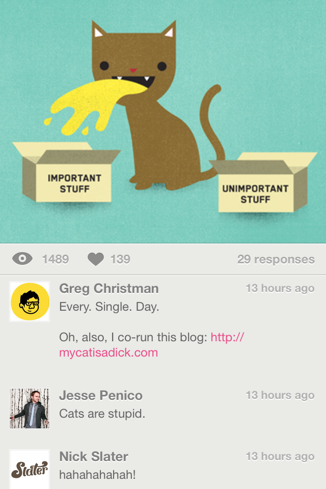
When on a shot page, views and likes are icons:

Why not have the icons on the list view, too (again for simplicity)?

In the end, the app’s minimal design and gesture-based UI allow me to overlook the annoyances for now, and I hope future updates make this a slam-dunk Dribbble app. If you’re looking to draft a new iPhone Dribbble app and you appreciate clean design and gestures, take a shot at Backboard.

Moving On

Four years ago tomorrow, I started at ESPN. Today, though, is my last day. Next month, I’m heading west to Los Angeles for a new job with Reality Check Systems.

My departure from ESPN is bittersweet as I am saddened to leave many of the people I met here. Over my four years with the company, I have met and collaborated with a great number of talented, enthusiastic people—developers, designers, producers, directors, studio crew, and on-air personalities. Together, we achieved successes on-screen and behind the scenes—from integrating touchscreen graphics in live SportsCenter broadcasts to creating efficiencies in the graphics-development process that saved developers time and improved our on-air product.

As I look back on what I accomplished and how I grew at ESPN, I remain proud of what I achieved and pleased to have worked with so many great people. As I depart for new experiences and new challenges, I sincerely thank those I worked with for all their hard work and for challenging me to stay hungry and stay foolish.

Apple TV Needs the Jiggles

Along with yesterday’s announcement of the third-generation iPad came the announcement of the third-generation Apple TV. And with this new Apple TV comes a new interface—an interface available to second-generation Apple TVs as well.

apple tv menu

Apple TV has been inspired by iOS app icons. Something else it can be inspired by is app rearranging.

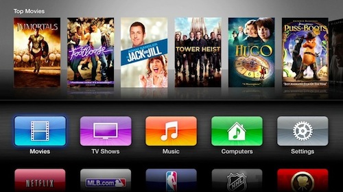
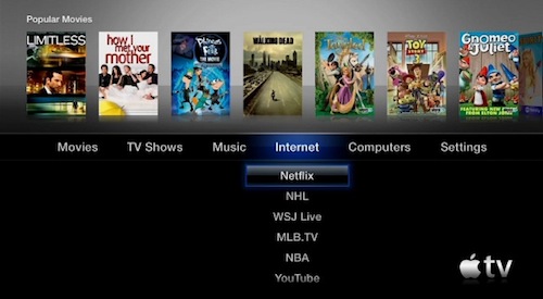
Previously, the Apple TV main menu looked like this:

apple tv menu

I primarily use my Apple TV for two things: streaming content from my iTunes library and streaming content from Netflix. Since Apple TV remembered the last menu I used, whenever I started up Apple TV, either my iTunes library or Netflix was selected. Navigating to the other was simple. If my iTunes library was selected in the Computers menu and I wanted to watch something on Netflix, using the Apple TV remote, I pressed left to navigate to the Internet menu and then select to launch Netflix. Two clicks.

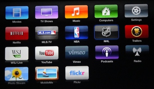
Here’s what the full Apple TV main menu looks like now:

apple tv menu

The scenario I described now has more steps. If my iTunes library is selected (the Computers app now) and I want to watch something on Netflix, I press down, left three times, and then select to launch Netflix. Five clicks.

What was press, move thumb, press is now press, move thumb, press, press, press, move thumb, press.

This is now my use case. But yours is likely different. Which brings me to my feature request. So just like in iOS, Apple TV should allow for rearranging apps. I’m not an iTunes Match subscriber, so the Music app is useless to me. I’d like to replace it with the Netflix app to return to two-click Netflix launching. And since I rarely use the Settings app, maybe I’d like to replace it with the Trailers app.

I can see this working two ways. First, the harder way: the Apple TV remote. When in the main menu, clicking and holding the menu button on the remote makes the apps jiggle. Then, I can use the directional buttons to navigate to an app, click the select button to select the app, and the use the directional buttons to move the app around. If I’m done rearranging, I click the menu button again and the apps stop jiggling; otherwise, I click the select button again to deselect the app, and I can select and rearrange another app.

Second, the easier way: the iPhone and iPad Remote app. In the app is a grid of Apple TV apps. If I tap and hold on an app, they all jiggle, and I can rearrange them—just like how I rearrange documents inside Pages for iOS, and just like how I rearrange apps in iOS.

So now that Apple TV has iOS-like apps, Apple TV needs iOS-like app rearranging—and with it iOS-like jiggles.

And the Oscar for Best Picture Goes To

(I wanted to title this post “At Midnight in Paris, Hugo rides War Horse Extremely Loud & Incredibly Close past The Tree of Life to meet The Artist, The Descendants, and The Help for a game of Moneyball” but it wouldn’t have fit in a tweet.)

A tradition my friend @nagle has is to watch all the films nominated for Best Picture prior to the Oscar telecast. This year, I joined in. As I watched each film, I posted a review on Letterboxd, a gorgeous website to share ratings and reviews of movies and to track films you want to see. The site is still in beta, but try to get an invite if you can (I may have one for you).

Here are my reviews of the nine nominated films ranked from what I thought was the worst to what I thought was the best.

9. Extremely Loud & Incredibly Close:

A mother and son with a fractured relationship learn how to connect after the untimely death of the father. This could be the makings of a decent film.
But add in some 9/11 exploitation and a kid who is extremely loud and incredibly annoying, and you have this film. Without last year being the tenth anniversary of 9/11 (I wonder how this film fared with people who regularly watch Fox News), this film would not be nominated—and that it was nominated over 50/50 and Drive is absurd.

The whole film is irritating (why didn’t Max von Sydow’s character use both sides of the paper to write notes and thus use half as many notebooks?) and exploitative—which is sad given that at the film’s core is something that could have blossomed into a decent—and perhaps nomination-worthy—film.

8. Moneyball:

A nicely made film about America’s pasttime—baseball—and not America’s pasttime—math—with excellent performances from Brad Pitt and Jonah Hill. Nicely made, but ultimately boring.

7. The Artist:

Hugo, a love letter to cinema, is art for a purpose. The Artist, also a love letter to cinema, is art for a gimmick. Everything in this film is a gimmick. The silence. The performances. The aspect ratio. The flecks on the film. The dog. And, of course, the music. Ludovic Bource will win the Oscar for Best Original Score. While it isn’t the best score of the year, it’s good and is surely is the most important to its film. But that doesn’t make it any less gimmicky—just like George Valentin’s used-car-salesman smile didn’t make him any less gimmicky.

6. The Tree of Life:

My eyes said, “Wow. This film is beautiful.” My brain said, “Wow. I have no idea what the hell is going on.”

The film is confusing, slow, and jarring, but it looks amazing. During some parts of the film, I wasn’t sure if I was still watching this film or if my television somehow switched over to Planet Earth.

Dazzling visuals aside, for a large portion of the film, I was either indifferent (is this film done meandering yet?) or lost (did Sean Penn wake up one morning questioning his existence or did he stumble around for years with a stupefied look on his face?).

Perhaps someone can explain to me the meaning and significance of the film. Or maybe I should just go watch Planet Earth.

5. Hugo:

There’s much to marvel at in this film: the visuals, the tasteful 3D, the childlike wonder and curiosity, Howard Shore’s score, and Martin Scorsese showing us he can excel outside his comfort zone (one thing that had me wondering the entire film, though: why did everyone in Paris have British accents?).

Even if you aren’t a fan of 3D (I’m not), see this in 3D in a theater. Scorcese shows how 3D can be a treat. And that’s something else to marvel at: a film celebrating cinema’s past is embracing its future.

4. The Help:

If you’re looking for a stirring historical drama that effectively addresses the civil rights struggle, keep looking. If, though, you’re looking for an inspiring story of bravery and righteousness in the face of an unsettling and despairing society and a film that is believable and extremely well acted, look no further. The characters and performances are both convincing and likable—especially those of Viola Davis and Octavia Spencer. Give these two ladies an Oscar!

3. Midnight in Paris:

I think this movie was made for me. Love letter to Paris? Check. Romantic comedy? Check. Charming story with a clever hook? Check. Enchanting female love interest? Check. Another reason to dislike Rachel McAdams? Check.

The film’s opening is a moving postcard of Paris highlighting the magic of the city. And after I spent over a week there a few years back, I learned Paris is indeed a magical place. Even in the rain.

2. War Horse:

A touching story of friendship, loss, and perseverance beautifully shot by Janusz Kaminski and magnificently scored by John Williams. This is Spielberg’s best dramatic film since Saving Private Ryan and John Williams’s best dramatic score since Schindler’s List.

Part of what makes the film so successful is the film, like the horse it follows, never takes sides. There aren’t good guys and bad guys. Just people. People who pass in and out of Joey’s life. People who all speak English: the British, the French, and the Germans. I would normally complain that the French and the Germans should be speaking in their native tongues with superimposed subtitles, but not in this film. Joey doesn’t hear tongues; to him, everyone speaks the same language, and that’s what the film presents.

Part of what makes Spielberg so successful is his ability to effortlessly move from depicting the horrors of something to depicting the beauty of something. In the no-man’s-land scene, the film juxtaposes the frightfulness of war with the triumph of camaraderie.

And the Spielberg magic continues through the end of the film with a closing movingly supported by Kaminski and Williams. This Spielberg ending is amongst his best.

1. The Descendants:

The parody poster for this film was titled “George Clooney Is Good At Acting”.

Yes, yes he is. I have no idea if acting is hard, and I certainly have no idea if acting in this kind of role is hard. But George Clooney makes it look so easy. Easy in that he makes his performance look so real—that he becomes the character and not just George Clooney, and that we, the audience, embrace him in this role, we sympathize with him, and we are fully with him on his journey.

Even if we haven’t been through a similar ordeal and thus able to relate with his character and his performance in that way, we can still relate in our own ways and admire the pain, the joy, and the life he goes through.

His life—and our lives—are part funny, part painful, part crazy, and wholly unpredictable—but the love of family and friends will bring us together in the end.

And that’s how we all can relate.

Of the nine films nominated, I thought The Descendants was the best. But there was one film that I enjoyed more than any of these nine:

50/50:

Don’t let the multitude of laughs throughout the first act of this film confuse you into thinking this is a comedy. This is not a comedy. This is a story of acceptance. This is a story of friendship. And of family. And of love. This film is heartbreaking at the same time it’s heartwarming. And if you’re like me, the film will make you wonder how your life and the people in it would play out if you were in a similar situation.

Watching and reviewing these films has been a fun journey, and I look forward to doing it again next year.

In honor of the Oscars today, I leave you with this: John Williams’s 2002 musical tribute to the Oscars. Enjoy.

Siri Should Tame the Mountain Lion

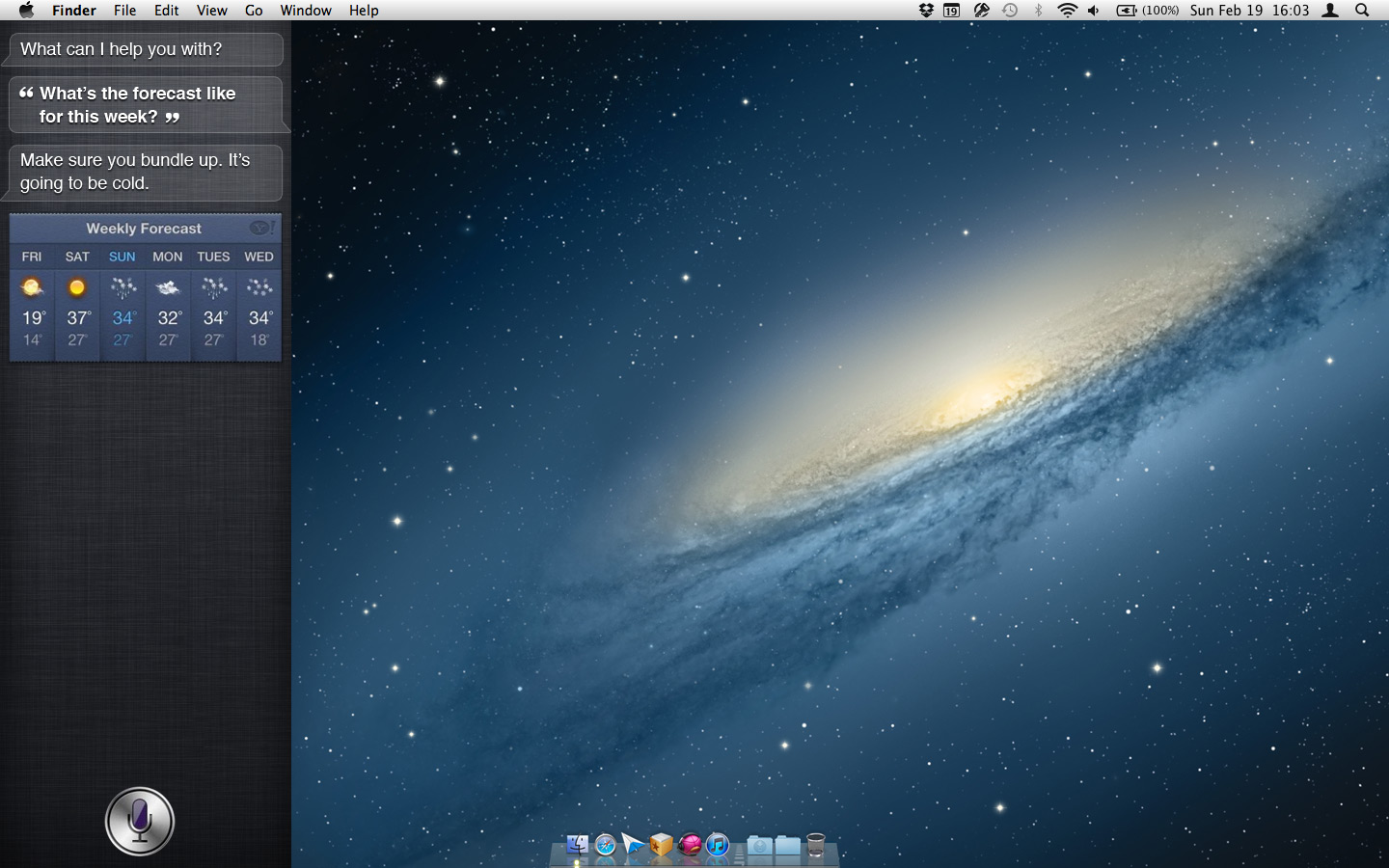
OS X Mountain Lion roared into existence this week featuring many smart additions inspired by iOS. One addition I would like to see in the final build of Mountain Lion is Siri.

But where would Siri live? Easy. Notification Center is hiding under the right side of the desktop wallpaper. Why not have Siri hiding under the left side of the wallpaper?

siri_mac

Here’s a mock-up (click for larger version):

siri_mac

Just like with Notification Center, a trackpad gesture can slide the wallpaper and activate Siri. And perhaps a menu bar icon and a keyboard shortcut (or even a dedicated key) could as well.

I have to imagine someone in Cupertino has Siri running on their Mac today. Let’s hope we all will this summer.