Don’t Be the Product

Nicole Nguyen at BuzzFeed writes about the Uber/Unroll.me news and more generally on free apps and services.

The Unroll.me/Uber fury is a good reminder of the ol’ Internet adage, “if you’re not paying for it, you’re not the customer, you’re the product.”

But some sites are much more egregious than others. So here are some ways you can assess an app’s trustworthiness and find out if your free faves are problematic.

I don’t use either, but the Uber/Unroll.me news has me thinking about the “free” apps & services I do use.

If there’s only one thing you take away from this article, let it be this: there’s no such thing as a free lunch.

NFL Network Draft Coverage

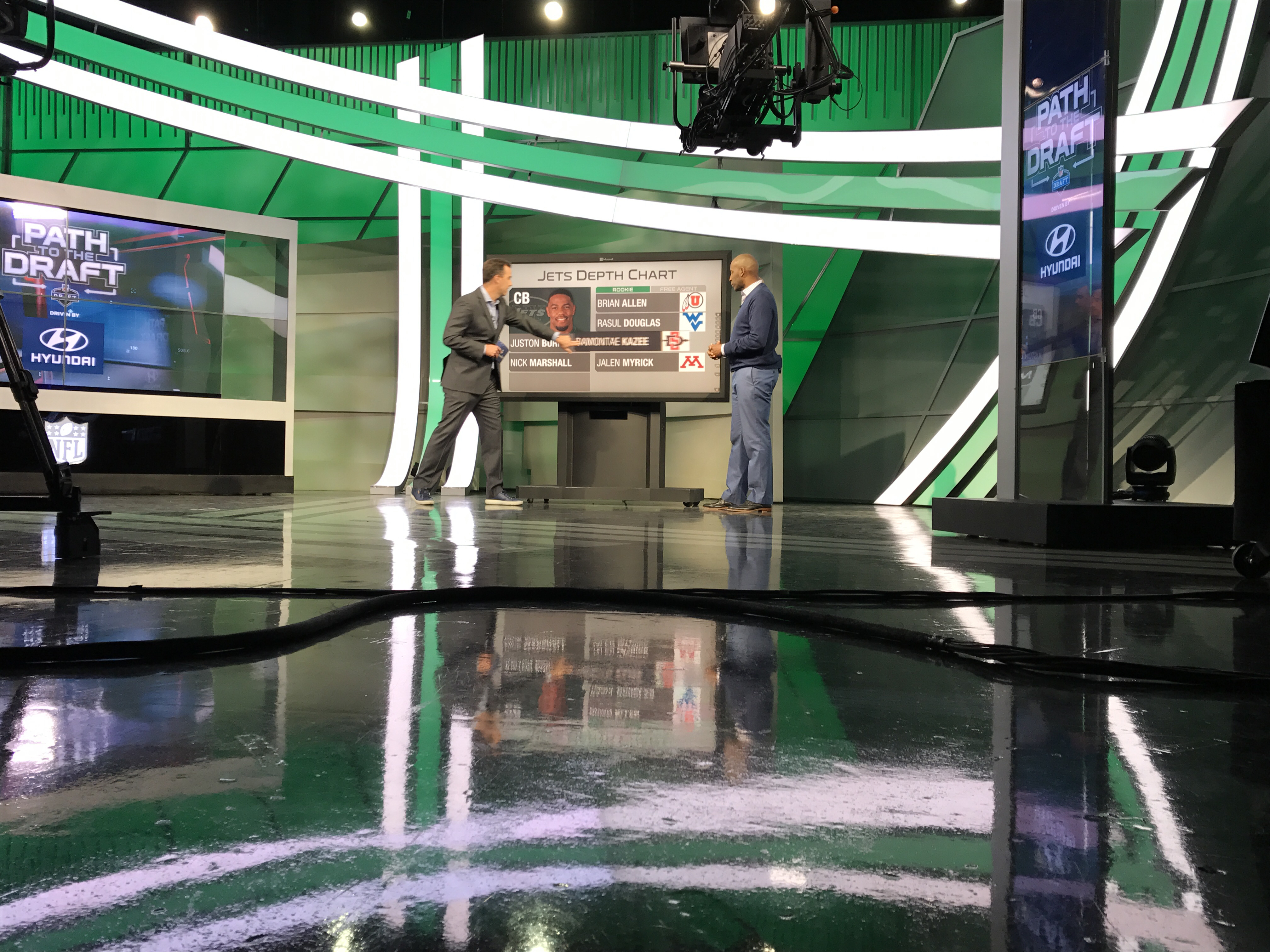
I worked with the NFL Network on a new touchscreen graphic for their draft analysts to project what players could be drafted by what teams.

NFL Draft

Here it is in action discussing moves the Miami Dolphins could make:

And the New York Jets:

Jeff Sessions: Wrong for Attorney General

Protecting and ensuring civil rights is important to me—which is why I believe Senator Jeff Sessions with his record of being on the wrong side of America’s ongoing civil-rights fight is the wrong person to lead the department of justice.

I wasn’t happy to learn Senator Dianne Feinstein, one of my California Democratic senators, was not committing to voting against him.

So, I wrote a script to use for a phone call and an email to her office.

If civil rights are important to you too, please call your US senators and urge them to vote no on Jeff Sessions for attorney general. Feel free to use my script or modify it to explain why you are against Sessions.

You can find contact information for your senators on this senate page. Californians: here’s Senator Feinstein’s contact information.

And if your senator (or senators) is on the judiciary committee tasked with recommending or not recommending his nomination to the full senate, I doubly urge you to contact your senator(s). Here’s the committee and their phone numbers:

Senate Judiciary Committee

Here’s my phone script:

Hello, my name is Joe Hribar, and I am one of Senator Feinstein’s constituents from Los Angeles. I am calling to urge Senator Feinstein to vote against Senator Jeff Sessions for attorney general.

In 1986, he was deemed too racist by the senate for a federal judgeship. Since then, he has remained on the wrong side of America’s ongoing civil-rights fight with his opposition to the Voting Rights Act, the Violence Against Women Act, and the Hate Crimes Prevention Act as well as his support of suppressive voter-ID laws and a religious test to ban Muslim immigrants.

Senator Sessions is the wrong person to be entrusted with protecting and ensuring civil rights, and I urge Senator Feinstein to vote no on him for attorney general.

Thank you for your time and attention.

And here’s my email:

Hello, my name is Joe Hribar, and I am one of Senator Feinstein’s constituents from Los Angeles. I am writing to urge Senator Feinstein to vote against Senator Jeff Sessions for attorney general of the United States.

Senator Sessions has a clear record of racist and anti-equality positions and is therefore the wrong person to lead the department of justice.

In 1985, he wrongly prosecuted three civil-rights activists (they were acquitted), including an aide of Martin Luther King, for voter fraud.

In 1986, he was rejected by the senate for a federal judgeship largely because of his racist past. As part of his hearing, Coretta Scott King wrote the senate in opposition to Senator Sessions stating he would “irreparably damage the work of my husband” and that “anyone who has used the power of his office as United States Attorney to intimidate and chill the free exercise of the ballot by citizens should not be elevated to our courts.”

The department of justice is responsible for enforcing the Voting Rights Act. Senator Sessions has called it a “piece of intrusive legislation”. When the US Supreme Court in 2013 gutted the VRA, Senator Sessions called it “good news, I think, for the South.”

He is a proponent of the widely debunked claim of voter fraud and supports suppressive voter-ID laws.

Additionally, he has supported a religious test to ban Muslim immigrants, he voted against the Violence Against Women Act and the extension of the Hate Crimes Prevention Act, and he has consistently received a “F” grade from the NAACP.

Senator Sessions is the wrong person to be entrusted with protecting and ensuring civil rights, and I urge Senator Feinstein to vote no on him for attorney general.

I will be watching the vote closely. Should Senator Feinstein decide to vote in favor of Senator Sessions, I will be an active and vocal supporter of her primary challenger next year.

Thank you for your time and attention.

Sincerely,
Joe Hribar
Los Angeles

Partly Sunny: Design Notes

When I set out to make Partly Sunny, my weather app for iPhone and iPad, there were a few design and technical solutions I knew I wanted to include: things like making custom icons and using specific APIs. These solutions would go toward building the weather app I wanted to use and would help differentiate Partly Sunny from other weather apps on the App Store.

What follows is a sort-of behind-the-scenes look at Partly Sunny. I’ll start with discussing some of the design solutions and show some draft designs, and in a subsequent post, I’ll discuss some of the technical solutions. Select any image below for a larger version.

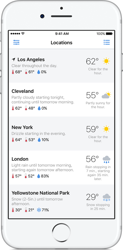
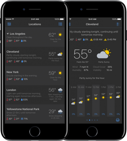
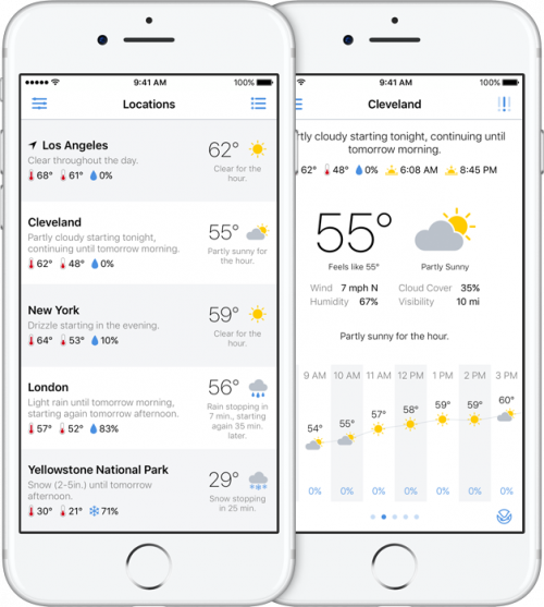
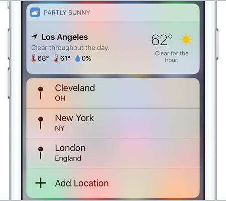
From the start, one thing I wanted to include in Partly Sunny was a view that gave summary information for both my current location and for any saved location. I wanted a way to quickly glance at the weather for these places. But I didn’t just want some basic information like the current temperature and an icon representing the current condition (e.g. “clear” or “light rain”). I wanted this view to be more useful, so in Partly Sunny, the list view includes the current temperature and condition for each location but also offers more: a sentence stating what’s happening over the next many hours at that location as well as the high and low temperatures and the chance of precipitation for the day.

locationsList

Whereas some weather apps might declare this to be too much information, I wanted this view to be useful for understanding what’s happening. A simple icon stating it’s clear right now doesn’t help in understanding a couple hours later it’s going to be pouring.

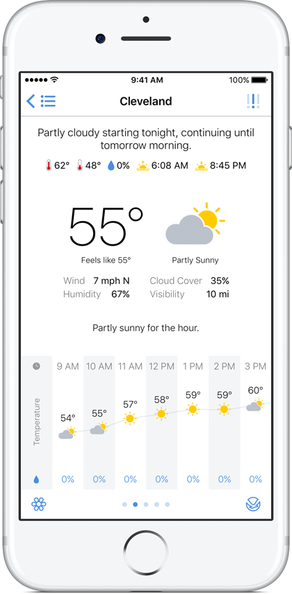
From this simpler-but-still-useful view, I wanted to be able to select any location to view more detailed information—what’s happening over the next hour, the next day, and the next week at that location.

locationView

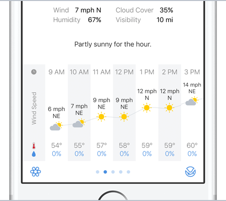
And the key to help visualize this information was graphing it. While this isn’t a new solution to weather apps, some do it and some don’t, and I wanted Partly Sunny to do it. So looking ahead in the hour-by-hour forecast, there’s a visual representation of how temperature, chance of precipitation, humidity, wind speed, and more are changing.

features_hourlygraph

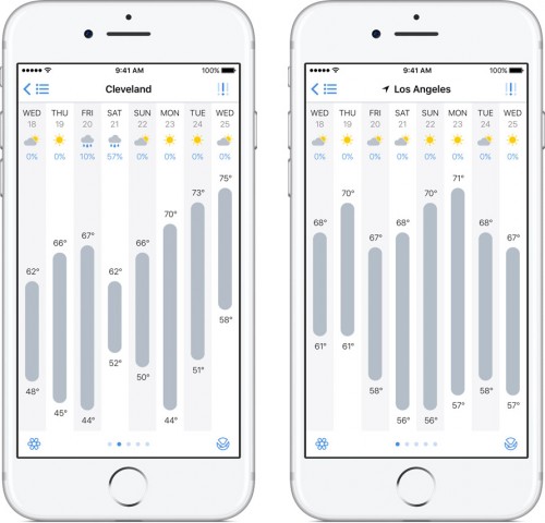
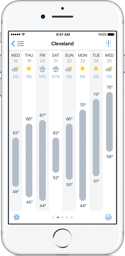
And looking ahead in the day-by-day forecast, there’s a visual representation of the high and low temperatures over the week. Reading, for example, that the high temperature will be 55° on Monday, 68° Tuesday, 75° Wednesday, 52° Thursday, and 48° Friday is one thing. Seeing it rising and falling on a graph is another.

dayByDay

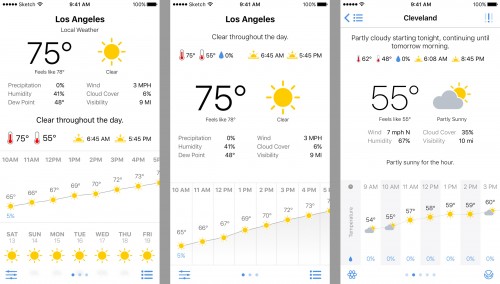
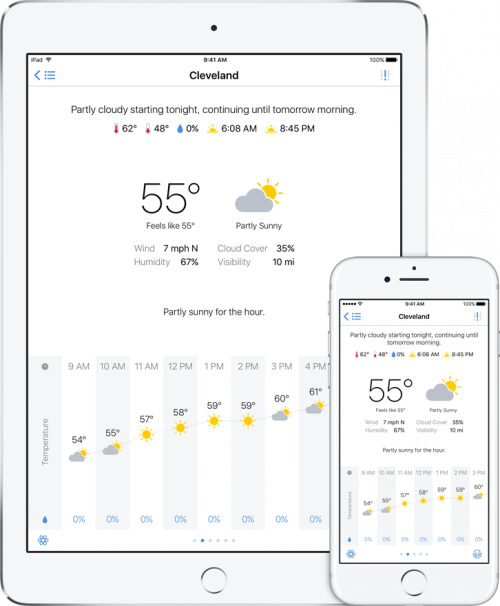
This experience was something I wanted to have on both iPhone and iPad. Some of the weather apps I had been using previously were iPhone only, and some of the iPad-friendly apps weren’t the best. So for when my iPad is in-hand and I want to check the weather, having Partly Sunny run natively on both iPhone and iPad giving me the same experience on both devices was a must-have.

iphone_ipad

Also a must-have was making custom icons. I know of several apps that use Climacons by Adam Whitcroft. They’re great icons, and I could have used them as well. But I wanted Partly Sunny to use its own icons. So I learned how to use Sketch and made my own. Here they are:

Icons

For the navigation bar, I made a system of icons using a dots-and-dashes theme.

Dots and Dashes

Sure, my icons aren’t going to win any design awards, but they’re unique to Partly Sunny, and that’s what I wanted.

Icon design wasn’t all I used Sketch for. I also, uh, sketched drafts of the various views in Partly Sunny. For example, here’s my first pass at the location view, a subsequent pass, and what it looks like in the app:

locationViewDrafts

The list view went through a few explorations and largely ended up with version 4:

listViewDrafts

Sketch was also helpful in working out another design solution I wanted to include: a dark theme. I’m a proponent of having dark themes for apps so that in lower-light environments, the UI isn’t blinding me (I still wish iOS had some kind of system-wide dark theme).

darktheme

Not all the design solutions in Partly Sunny were planned out from the start, of course, but these were many that were. My goal was to build the weather app that I wanted to use, and that goal included a few specific design and technical solutions. I hope those solutions are useful to you as well and help make Partly Sunny the weather app you want to use too!

Partly Sunny is available on the App Store for $2.99.

Next time, I’ll discuss some of the technical solutions built into Partly Sunny. Stay tuned!

Partly Sunny

For the past several months, I’ve been learning Apple’s Swift language and how to build iOS apps. Learning this has been something I’ve wanted to do for a while, so it’s been both a fun and rewarding challenge.

To bring together everything I’ve learned, I built a weather app—not because the App Store doesn’t already have enough of them but because the apps I like don’t do exactly what I want them to do. So I made my own because now I can.

Meet Partly Sunny:

intro

Partly Sunny shows your weather in quick glances and detailed looks.

Some of the features of Partly Sunny:

Locations List

Quick glances of what’s happening in the sky at your current location and your favorite locations.

locationsList_black

Location View

Detailed looks at what’s happening throughout the hour, the day, and the week at your locations.

locationView_black

Day-By-Day

Swipe up in location view to show a day-by-day graph with the week’s high and low temperatures plotted.

dayByDay_black

Day View

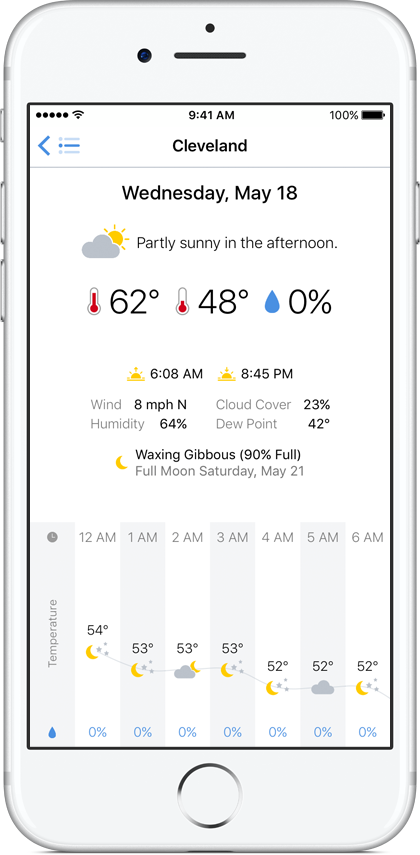
On the day-by-day graph, tap any day to see a detailed forecast for that day.

dayView_black

iPhone and iPad

Partly Sunny runs natively on both devices.

ipad_right

Dark Theme

Toggle between Partly Sunny’s light theme and dark theme in the app’s settings or with a handy gesture.

darktheme

Hour-by-Hour Graphs

Tap on any hour-by-hour graph and choose to plot temperature, chance of precipitation, cloud cover, humidity, wind speed, or more.

features_hourlygraph

Rain Graph

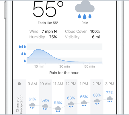
For U.S. & U.K. locations, a rain-intensity graph for the next hour will appear when it’s raining.

features_raingraph

Pollen & NOAA Links

For U.S. locations, links will appear for pollen forecasts and the local NOAA weather office for winter-weather predictions, tropical forecasts, marine forecasts, and more.

features_pollen

Widget

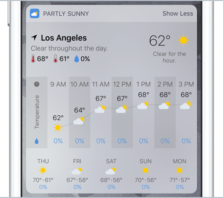
Partly Sunny includes a widget to show both a quick glance and a detailed look at your current location’s forecast.

features_widget

3D Touch

3D Touch the app icon for the widget and shortcuts. Peek and Pop in the locations list; the location view’s severe-weather alerts, pollen-forecast, and NOAA buttons; and the day-by-day graph.

features_3dtouch

Dark Sky

Partly Sunny forecasts are powered by Dark Sky to give you super-accurate data.

While you may not always enjoy the weather, hopefully you enjoy checking the weather with Partly Sunny.

Of course there are things I want to tweak and more features I want to add, but I’m proud of what I’ve accomplished so far. I set out to do a thing, and I did it.

You can visit Partly Sunny on the web at partlysunnyapp.com and follow @partlysunnyapp on Twitter.

Partly Sunny will be available on the App Store tomorrow is available on the App Store for $2.99.

Fired Up. Ready to Go.

(I tweeted all this earlier, but I’m including it here too.)

The election broke me. Twitter made me more depressed, so I took a break. But I’m back. And I’m ready to fight. I’m fired up & ready to go.

Perhaps you, like me, are looking for ways to start dealing with the reality of what’s coming. Let’s stick together and help one another.

It’s symbolic, yes, but it’s a start: wearing a safety pin in support of those who are afraid and possibly harassed.

But a pin isn’t all we should do. If we see casual racism around us, let’s help stop it.

All of us showing up, stopping Trump, and taking care of each other is important right now.

And while we work for change at the local level, let’s also work for it at a more national level by supporting new leadership at the DNC.

I’m with Bernie Sanders in supporting Keith Ellison to be the next DNC chair. I encourage you to support him too.

ellisonForDncChair

Things will be rough, but we’re all in this together. So let’s not give up. America is already great. Let’s keep it that way.

False Equivalence

(I tweeted all this earlier, but I’m including it here too.)

I’m not particularly fond of Hillary Clinton, but I get angry hearing people say she and Donald Trump are equally bad. Not even close.

Don’t believe me? Let’s start with this from conservative writer Conor Friedersdorf:

To regard [Clinton & Trump] as equivalently bad candidates for the presidency isn’t just absurd, it is reckless.

Still don’t believe me? Here’s Jamelle Bouie on Trump undermining US democracy & possibly inciting racial violence:

Violence and intimidation” incited by Trump “will be against the chief targets of [his] campaign: people of color.

Still don’t believe me? How about this from conservative writer and former-George-W.-Bush speechwriter David Frum. Frum on voting Clinton:

You’re not doing it for her. The vote you cast is for the republic and the Constitution.

Still don’t believe me? Here’s Seth Meyers:

One candidate is bad at email. The other is a racist, misogynist, xenophobic, ignorant, serial-lying, swindling, narcissistic man-baby.

Is either candidate a great choice? No. But they are nowhere close to being equally bad. And only one—Hillary—is qualified to be president.

Copying Efficiency in Workflow

Workflow by DeskConnect has become one of my most used and most indispensable iOS apps. With its powerful and efficiency-gaining functionality, Workflow is an app I use repeatedly throughout the day and take delight experimenting with.

If you haven’t used Workflow before, the app connects and combines apps and actions to automate tasks on iPhone, iPad, and Apple Watch. With the ability to create workflows ranging from choosing pre-written messages to send someone to changing the case of a text string to combining burst photos into GIFs to adding entries into Health.app, Workflow has hundreds of actions to create countless combinations however you see fit.

If you have used Workflow before, perhaps you’ve run into the same situation I have: you have a string of actions in one workflow you’d like to have in another workflow, and getting those actions in the other workflow requires you to recreate them one by one. Depending on how many there are, this can be rather vexing. What Workflow could use is the ability to copy actions from one workflow to another. How might that work? Like this.

Start with a new workflow:

New Workflow

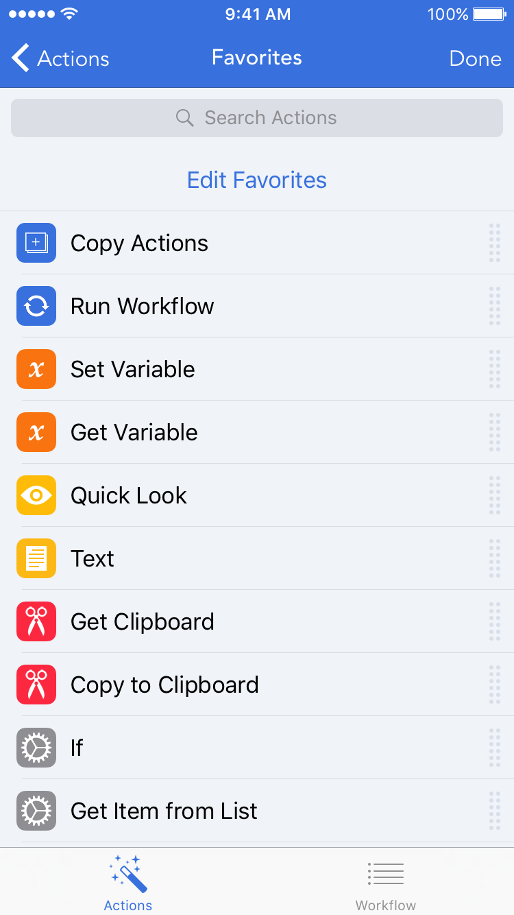
Like usual, you swipe right to reveal the actions view:

Favorite Actions

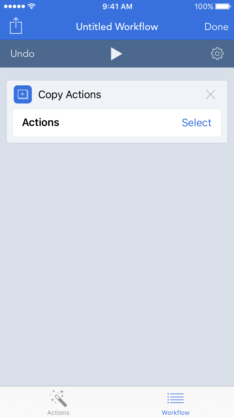
From there, you drag a new “Copy Actions” action to the workflow:

New Workflow With Copy

At first, this action doesn’t do anything as it awaits further, uh, action in case you want to set something else up first. When you’re ready to copy actions from another workflow, tap the “Select” button and you’re presented with a new view containing all your workflows:

My Workflows

Choose the workflow that has the actions you want to copy, and the workflow slides in from the right with its actions grayed out and selectable:

Copy Actions Unselected

From there, select the actions to copy:

Copy Actions Selected

Once you select all the actions you want to copy, press the “Copy Actions” button at the bottom, and the view disappears to reveal underneath the new workflow with the selected actions in place of the “Copy Actions” action:

New Workflow With Copied

And there we have an easy way to copy actions from one workflow to another that both maintains and builds upon the existing foundation and interactions in Workflow.

But why stop there? Perhaps you noticed another new action in the favorites list: “Run Workflow”. The block of actions copied above really could be a reusable workflow that is called from multiple other workflows. You could use the above method to copy the actions into those other workflows, but what happens when you want to update that reusable workflow? You’d have to update it in multiple places. Nah.

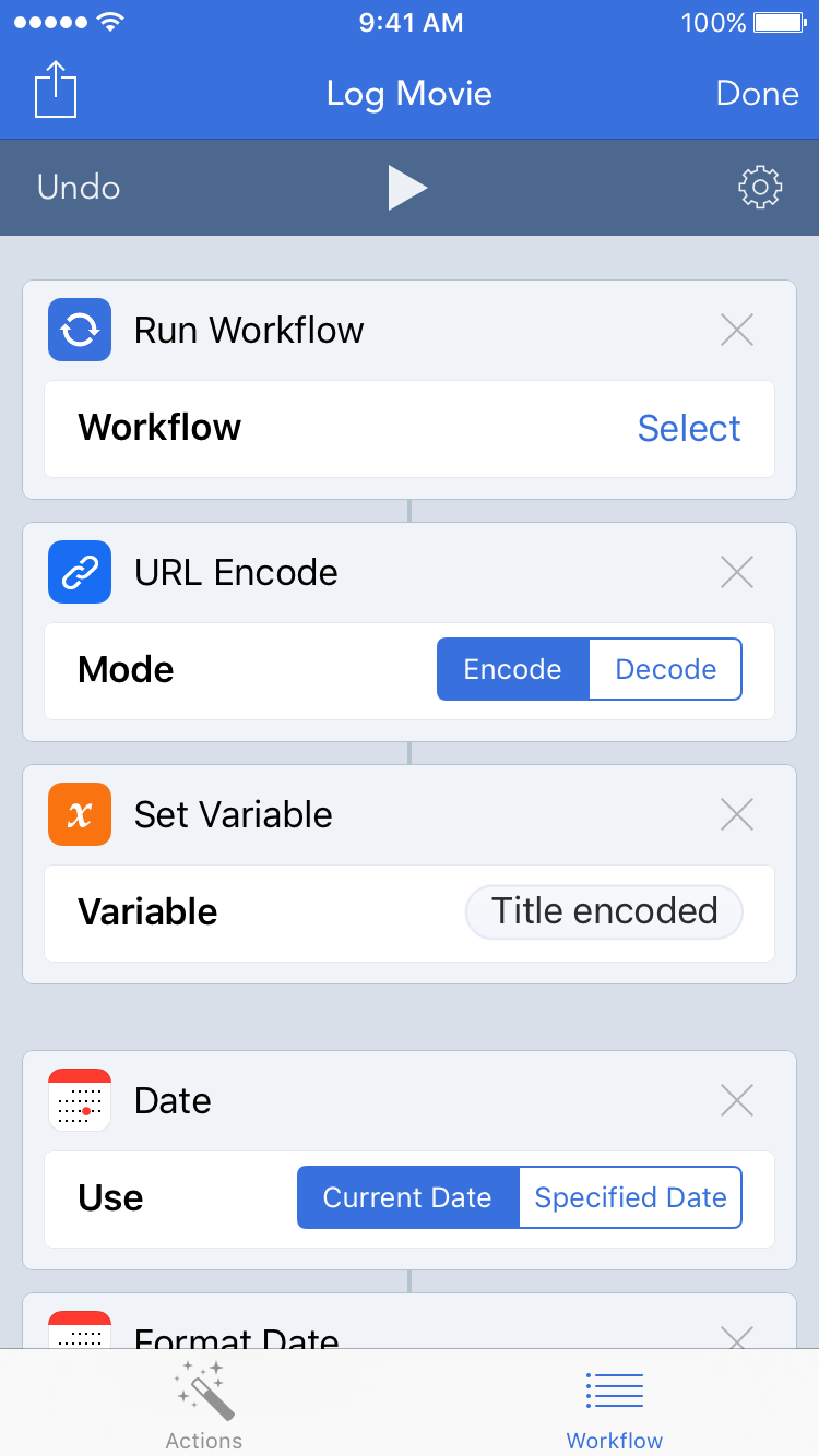
Instead, what Workflow could also use is a “Run Workflow” action that pauses the workflow it’s in, allows the designated workflow to run and optionally return something, and then continues the original workflow. How might that work? Like this.

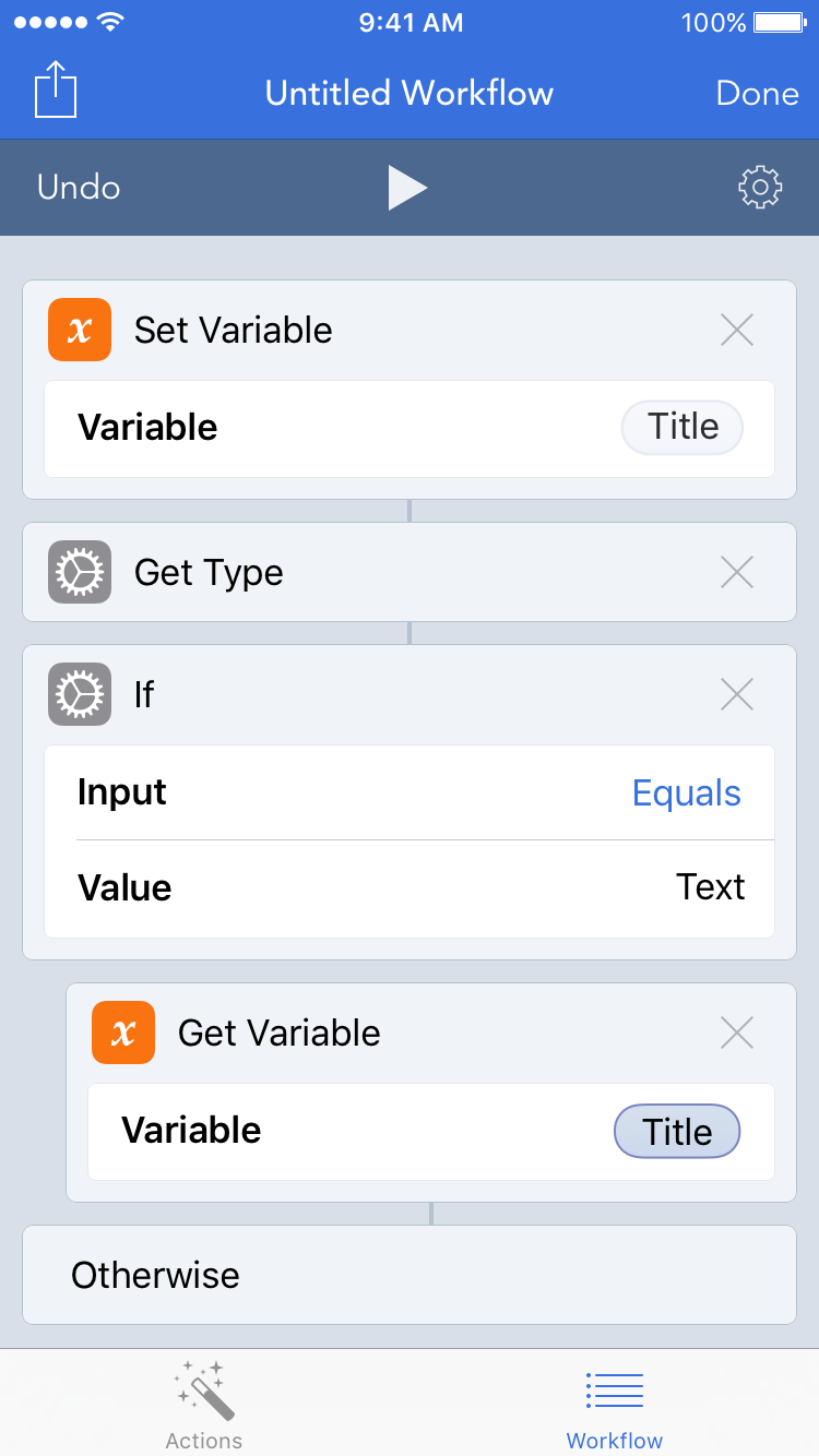
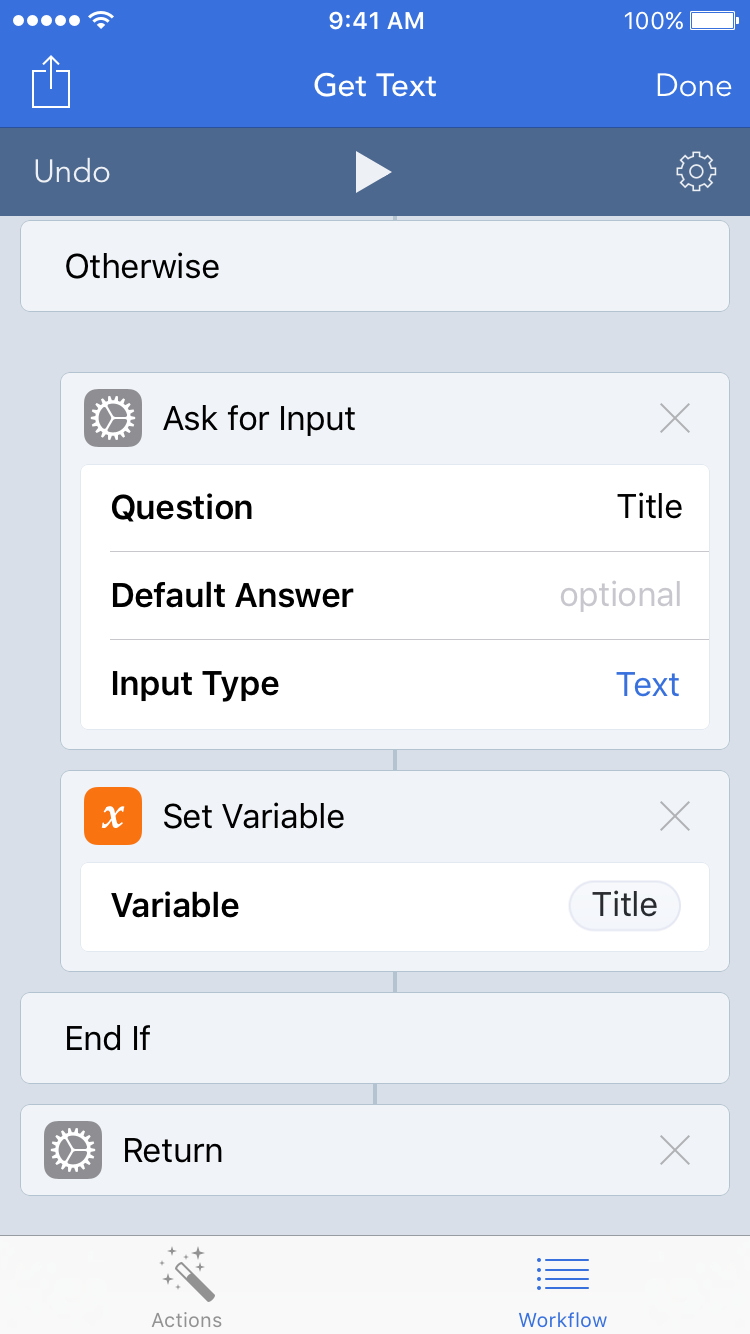
Using the actions above, create a new workflow that checks for input text or otherwise asks for input. Below that block of actions, drag a new “Return” action:

New Workflow With Return

In this case, the action would return text, but in other workflows, it could return an image, a URL, a date, and more.

Back in the original workflow, you can now delete that block of actions and replace it with a “Run Workflow” action:

Run Workflow Unselected

Like with the “Copy Actions” action, tap the “Select” button, and you’re presented with a new view containing all your workflows:

My Workflows

From there, select the workflow to embed, and the view disappears and updates the action:

Run Workflow Selected

When you run the workflow, it executes the embedded workflow to get or ask for text, returns the text, and proceeds with the rest of the workflow.

Now in the future if you want to build on this reusable workflow (for example by adding a string of actions to replace dumb quotes with smart quotes), you can make edits in one place and have all the other workflows that embed the reusable workflow enjoy those edits. That’s far more efficient.

And efficiency is what this is all about. Each new version of Workflow gets better and better with more actions to build more workflows to be more efficient. And I hope one day soon building workflows becomes a bit more efficient with the ability to copy actions from one workflow to another and the ability to embed one workflow in another. If I may quote Workflow, that’s powerful automation made simpler.

Copying Efficiency in Workflow

Favorite Film Scores of 2015

With the books closed on 2015, it’s time once again to share my favorite film scores of the year. As usual, while these may not be the best film scores of the year (although I wouldn’t be surprised if a couple of these earn Best Original Score nominations this month), they’re the scores I’ve had on repeat over the last year.

Previous entries: 2013, 2012, 2011.

Let’s begin our 2015 musical journey.

11. JUPITER ASCENDING — Michael Giacchino

Before the movie was released, I tweeted, “Michael Giacchino’s Jupiter Ascending score kiiinda makes me want to see that beautiful trainwreck of a film.” Well, I did end up seeing the film for its score. And the film did end up being a beautiful trainwreck. But the score certainly wasn’t. With its rich themes, large scope, and brimming excitement, this score launched a stellar year for Michael Giacchino who continues ascending in his own right.

10. ANT-MAN — Christophe Beck

I’ve written in the past lamenting over the lack of musical cohesiveness between the Marvel films and the disappointing thematic representation of the characters. And when Christophe Beck was announced as the composer of ANT-MAN, I tweeted, “Ant-Man has a composer, and it isn’t Brian Tyler. Will the Marvel scores continue to be a mess?”

While I’m not optimistic for what the future holds musically for the Marvel Cinematic Universe—especially since Brian Tyler, my pick as house composer, was sort-of-but-not-really replaced on AVENGERS: AGE OF ULTRON and Henry Jackman will most likely be back to rehash his abysmal CAPTAIN AMERICA: WINTER SOLDIER score for the next film—Christophe Beck did not disappoint with his score for ANT-MAN. Beck wrote a jazzy, snazzy caper score that was fitting for both the character and Alan Silvestri’s and Brian Tyler’s established musical world. Many of Beck’s scores tend to err on the generic side, but he wrote an inspired and enjoyable score for ANT-MAN.

9. WOLF TOTEM — James Horner

It’s difficult to reconcile 2015 will be the last year of new James Horner music (unless the story of him secretly composing music for Antoine Fuqua’s upcoming MAGNIFICENT SEVEN yields a surprise score later this year). Thankfully, 2015 included a score as good as this one from James Horner. With its beautiful and sometimes haunting melodies, lush orchestrations, and sweeping scope, this is James Horner at his best. It’s disappointing there won’t be more of this.

8. THE MARTIAN — Harry Gregson-Williams

Going into this movie and score, I wasn’t expecting much from the music given the rather derivative and uninspired scores for Ridley Scott’s recent films. After composing additional music for Scott’s last few movies, Harry Gregson-Williams was given the opportunity to compose the full score. And, unlike some of his previous ventures, fully compose he did. His score is contemplative, industrious, and, well, sciencey. He seems to have scienced the shit out of this score.

7. STEVE JOBS — Daniel Pemberton

A recurring theme in my list this year is enjoying scores by composers who have disappointed me in the past or by composers who are new to me. Daniel Pemberton falls into the latter category. Prior to this score and his MAN FROM U.N.C.L.E. score, I had not heard of him. But he’s now on my radar thanks to this eclectic score that delightfully took me by surprise. Given the varied styles running throughout the score, choosing one track to include here was difficult. The score has some electronic parts, some operatic parts, and some dramatic parts. And all of those parts form a rather pleasing whole.

6. MISSION: IMPOSSIBLE — ROGUE NATION — Joe Kraemer

As the JAMES BOND films have become more like the JASON BOURNE films, the MISSION: IMPOSSIBLE films have become more like the JAMES BOND films of yore: espionage, gadgets, and a grand, stylish orchestral score.

This film’s score is by Joe Kraemer who, like Daniel Pemberton, I was previously unfamiliar with but now eager to hear more from.

In addition to the bold, flavorful orchestrations, what makes this score great is that it honors its past with generous use of Lalo Schifrin’s original themes (the trill Kraemer inserts into the main theme in the first and last cues is rather tantalizing). The use of existing themes in a major franchise is refreshing as too often new-to-the-franchise composers don’t use other composers’ existing, established work for a franchise. For example, the post-John-Williams HARRY POTTER scores often seemed to forget the themes he composed. Sure, the later films were much darker, but a talented composer could take Williams’s themes and twist them into brooding, minor-key renditions. In the case of MAN OF STEEL, Hans Zimmer could have easily paid homage to John Williams’s work, but he didn’t. And in the case of Iron Man, he’s had three different themes from three different composers in three different films. So for Joe Kraemer to use Lalo Schifrin’s original themes not just bookending the film but all throughout is a welcomed change.

5. PAN — John Powell

PAN was going to fly right by me, but then I learned who was scoring the film: the semi-retired John Powell—one of my favorite film composers. Given his absence of late, it’s great to have a new John Powell score. It’s even better to have a new John Powell adventure score.

Strong thematic material, rich orchestrations, and sheer fun. These are all hoped-for things in a John Powell score. And he didn’t disappoint.

4. INSIDE OUT — Michael Giacchino

This score cruises through various emotions. Joy and sadness, of course, make appearances. As do excitement, hope, love, anxiety, and wonder. But even as Michael Giacchino writes for specific emotions, the score never feels disingenuous. As it runs through its ups and downs, the score feels authentic. And it doesn’t fail to put a smile on my face.

3. CREED — Ludwig Goransson

This score was a definite surprise for me. Prior to listening to it, I had not heard of Ludwig Goransson. But after this score, I’m interested in hearing more from him (the third instance of this on my list). The score is powerful, exciting, and a worthy successor to Bill Conti’s ROCKY scores. Though the score makes solid use of Conti’s original themes, the new themes Goransson composed are the stars and easily stand alongside the originals. They’re memorable, stirring, and noticeably come from the same family as Conti’s themes (especially noticeable when they’re used as counterpoint with Conti’s themes and vice versa). Overall, the music has a crisp and fierce sound. And it doesn’t fail to make me want to go out and find a punching bag.

2. STAR WARS: THE FORCE AWAKENS — John Williams

Without a doubt, this was my most anticipated score of the year. I was expecting a healthy dose of the Force theme—my favorite of the series—and I wasn’t disappointed. While I might have also hoped for a return to the greatness of his THE EMPIRE STRIKES BACK score, John Williams’s writing is in a different place these days, and this score has more in common with the prequel scores than the original scores.

But that doesn’t detract from the dazzling work on display here; John Williams composed an outstanding addition to the franchise. Rey’s theme, developed as the score progresses, appears in several different treatments and is gorgeous. That theme and the Resistance March won’t leave my head.

1. TOMORROWLAND — Michael Giacchino

As if Frank Walker’s jetpack were strapped to it, this score rocketed to the top of my list early and remained there all year. There was only one other score that could have knocked it from the top. But THE FORCE AWAKENS didn’t, and here sits TOMORROWLAND as my favorite score of the year.

This score works incredibly well in its film—and outside of it—evoking the same sense of futuristic nostalgia and hopeful optimism as the film. The themes are as catchy as they are inspired. And the track above, “Pin-Ultimate Experience”, is hands down my favorite track of the year.

Too bad TOMORROWLAND wasn’t a bigger commercial and critical success because both it and the score deserve more recognition. Perhaps, like with another Brad Bird film that enjoyed success after its run in theaters, the future will bring a return to TOMORROWLAND.

With three of his four scores this year making my list and the fourth (JURASSIC WORLD) just missing it, it’s clear 2015 was The Year of Michael Giacchino for me.

What else is clear from my list this year: there are still directors who desire bold, orchestral scores for their films. And there are composers who can still deliver those scores. So here’s to some more orchestral magic—and some more pleasant surprises—in 2016. Huzzah.

P.S.: if you’re so inclined, here are selections from each of my favorite scores. I hope you enjoy. I sure did.
Improving the iOS Incoming-Call Screen

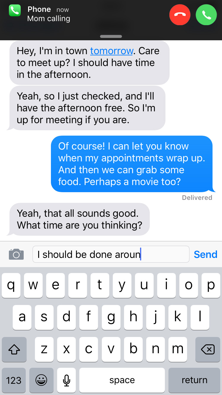
My friend is coming into town, and he messaged me to see about meeting up. So I start typing a response. Type type type. While I’m typing, I’m suddenly interrupted, I lose control of my screen, and I can’t finish what I was doing. What happened? I received a phone call.

Or maybe I’m looking up which train I need to take home to leave me enough time before I have to be on my way somewhere else. And bam. Incoming-call screen.

Or maybe I’m editing a video and trying to precisely trim the end of it. And bam. Incoming-call screen.

Whatever the task, the incoming call commandeers my screen and forces me out of the task I was performing.

Because the device is a phone and making and receiving calls is a primary function, let’s assume the incoming-call screen is here to stay. So how can the screen be just a bit less intrusive? I have an idea.

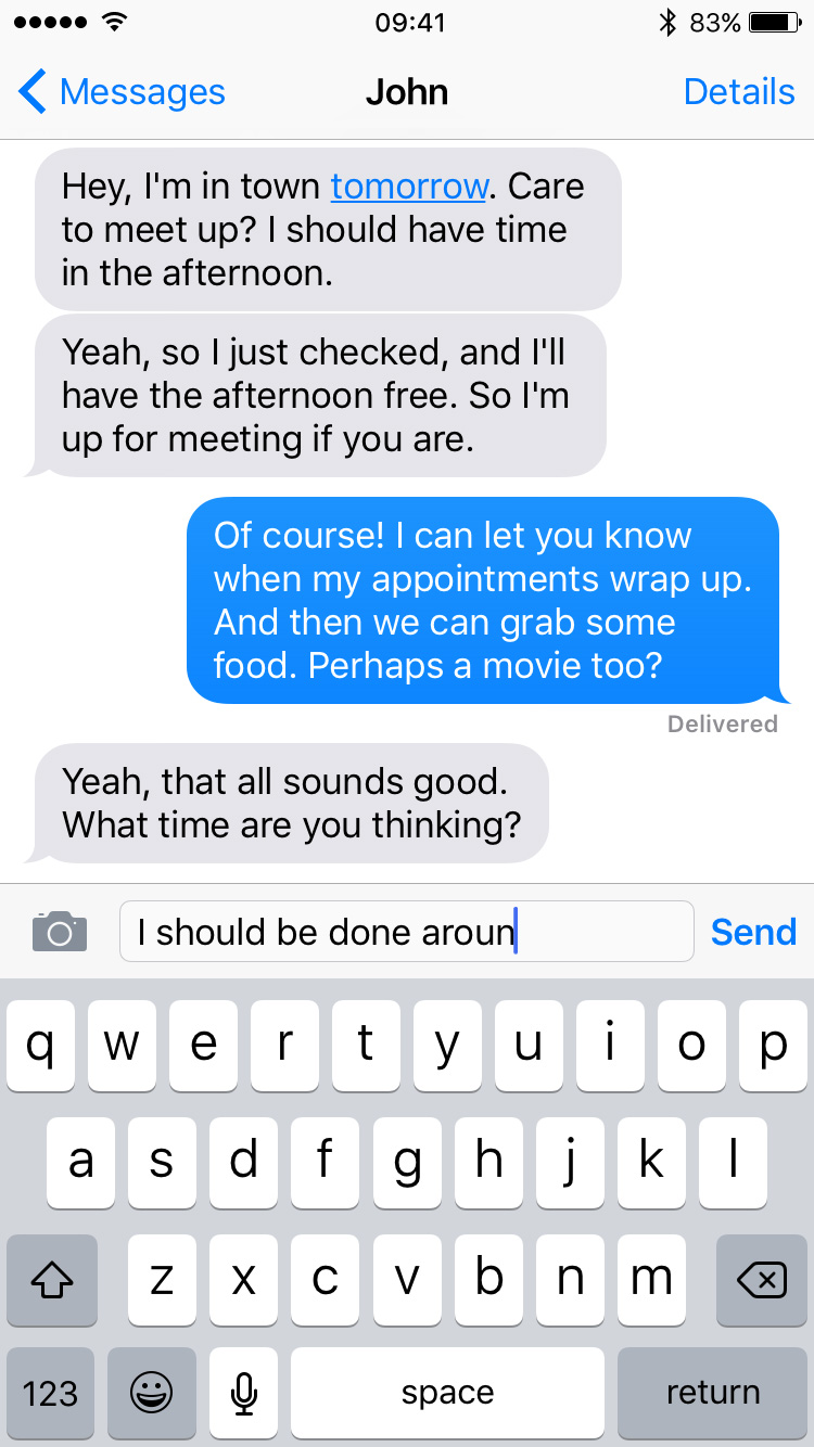
Let’s say my friend John Appleseed is coming into town and wants to meet up. A text conversation might go something like this:

JA: Hey, I’m in town tomorrow. Care to meet up? I should have time in the afternoon.

Yeah, so I just checked, and I’ll have the afternoon free. So I’m up for meeting if you are.

JH: Of course! I can let you know when my appointments wrap up. And then we can grab some food. Perhaps a movie too?

JA: Yeah, that all sounds good. What time are you thinking?

I begin typing my response:

chat

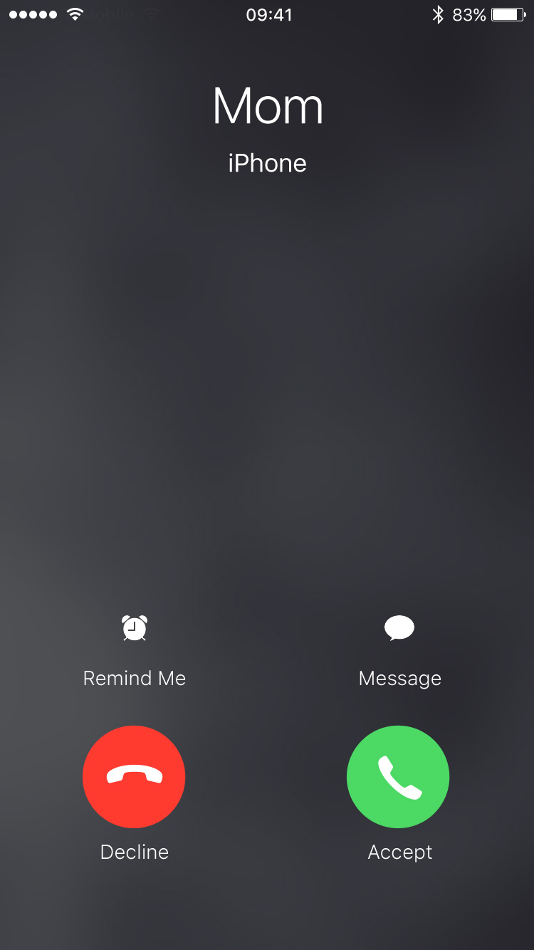
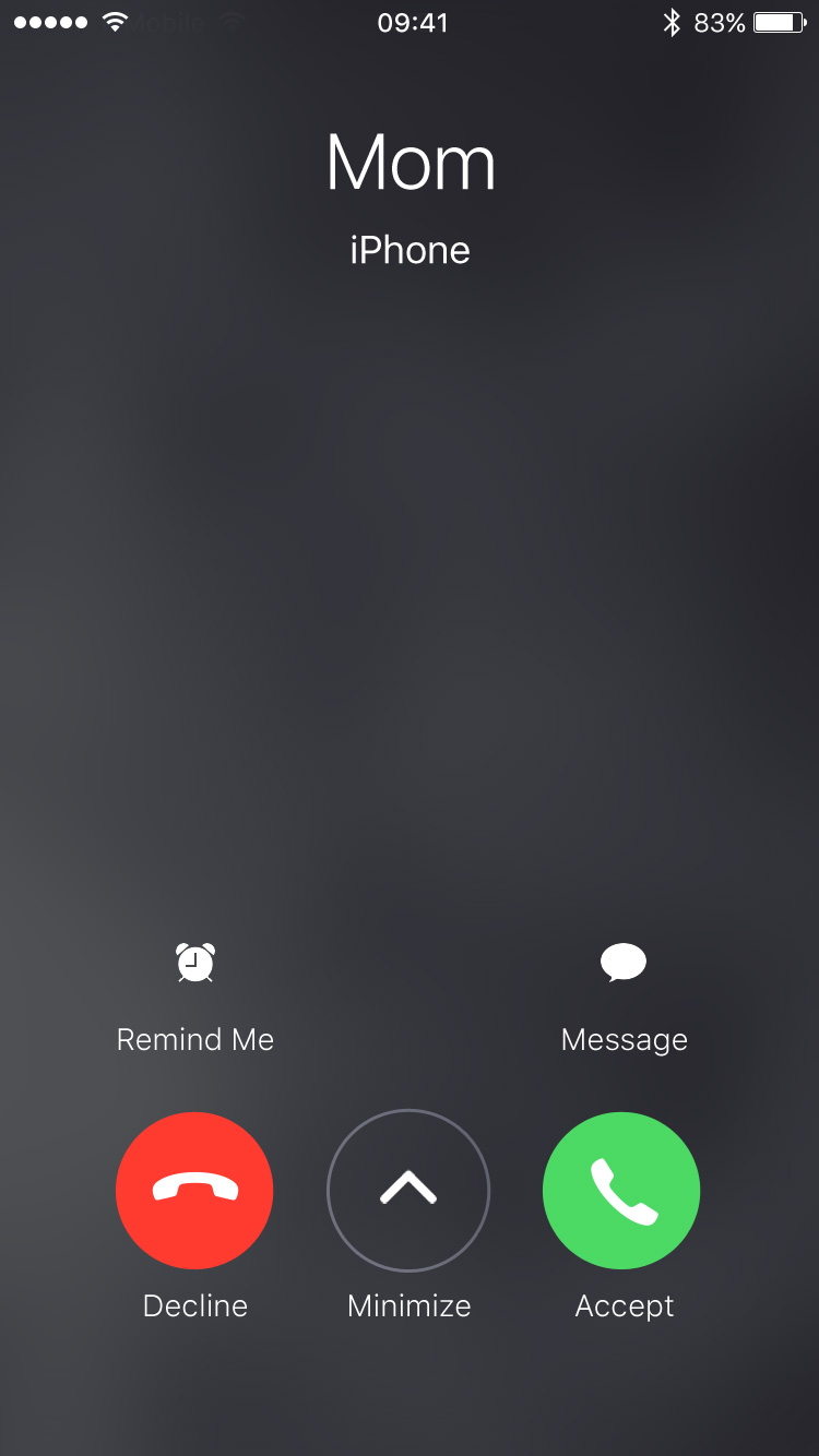
…and bam. Incoming-call screen. Mom is calling:

Current incoming-call screen

On the incoming-call screen, I have a few options to deal with the call. I can accept the call, I can decline the call and send the caller straight to my voicemail, I can send the caller a text message, and I can set a reminder (with the last two requiring further steps). With the hardware side buttons, I have another option: silence the ringer. Although my phone stops sounding or vibrating, the call continues and after a period of time automatically goes to my voicemail.

When I receive a call I can’t (or in some cases don’t want to) take, I choose the latter. With the ringer-silencing option, the caller may think I’m unavailable. Or if the caller is an unrecognized number like from a marketing call, the caller may think the number isn’t actively used. If I decline the call, it sends the caller directly to voicemail letting them know I’m on the other end and deliberately ignoring them.

Choosing the latter, though, means I have to stare at the incoming-call screen until the call automatically goes to voicemail when I just want to get back to the task I was performing.

But what if I could dismiss or minimize the incoming-call screen without taking or declining the call? That’s what I propose.

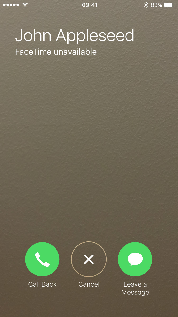
When a FaceTime call fails, iOS presents a screen with three buttons: “Call Back”, “Cancel”, and “Leave a Message”:

FaceTime unavailable

Let’s take that middle button and add it to the incoming call screen. So now when someone calls, the screen would look like this:

New incoming-call screen

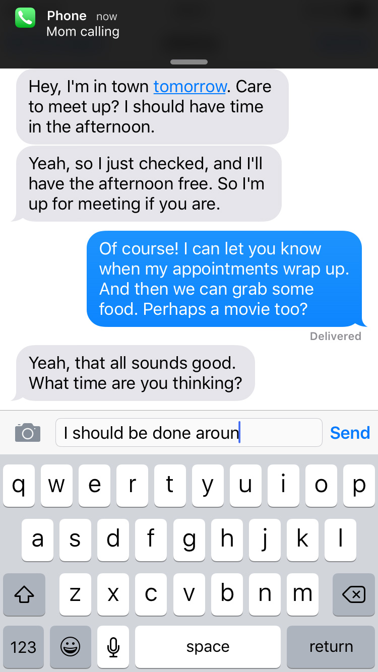
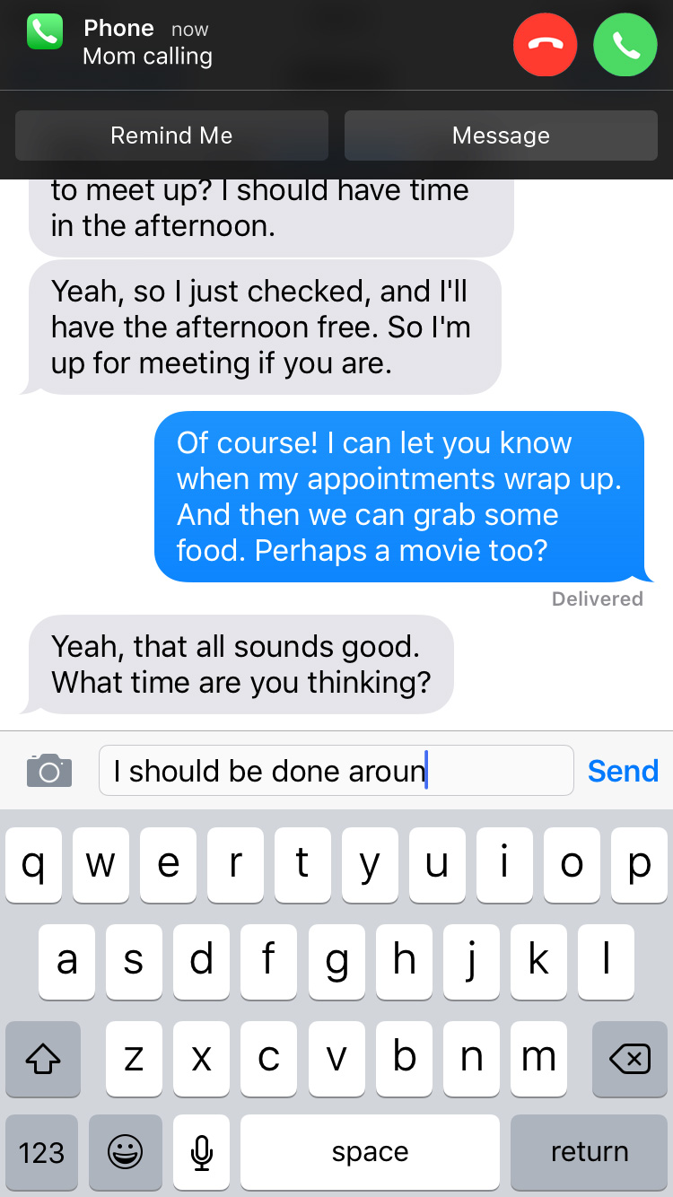
If I tap the new “Minimize” button, the screen would animate out of view while a notification banner would animate on:

chat

Like when I press the volume buttons on the side of my iPhone, the ringer would silence, and the call would continue until it automatically went to my voicemail. But unlike when I press the volume buttons, I could resume the interrupted task.

Because phone calls—and the incoming-call screen—get an intrusive level of priority, the banner notification would as well. While the call continued until it automatically went to my voicemail, the banner would remain at the top of the screen.

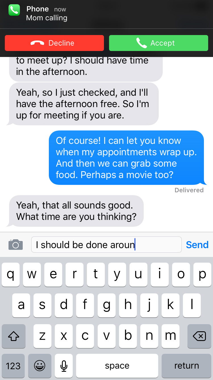
While other banner notifications can be swiped up to dismiss them, this one would remain pinned to the top. If I tapped the notification, I would return to the incoming-call screen. Though I wouldn’t be able to swipe up on the notification to dismiss it, I would be able to swipe down on it to reveal action buttons:

chat

Once the call automatically went to voicemail, the banner notification would disappear like normal as I continued my task.

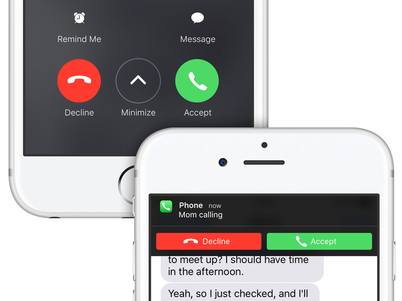
Ideally, I would like iOS to ditch the incoming-call screen altogether and just present an actionable banner notification when I receive a call (like other notifications, it would be customizable to appear as an alert box instead). Maybe the banner would look something like this:

chat

This way, there’s a far smaller interruption of my task. More of a distraction rather than a full interruption. The decline or accept buttons on the banner would do exactly that. If I couldn’t or didn’t want to take the call, I could still press the volume buttons on the side of my iPhone to silence the call and let it automatically go to voicemail. And if I swiped down on the banner, I could chose to be reminded or send the caller a message:

chat

But assuming the incoming-call screen is here to stay and an actionable banner notification isn’t in iOS’s future, this new workflow could be a way to dismiss the screen without telling the caller I’m ignoring them.

Because I promise I’m not ignoring you, mom.

incoming call screen

Improving iPad Multitasking

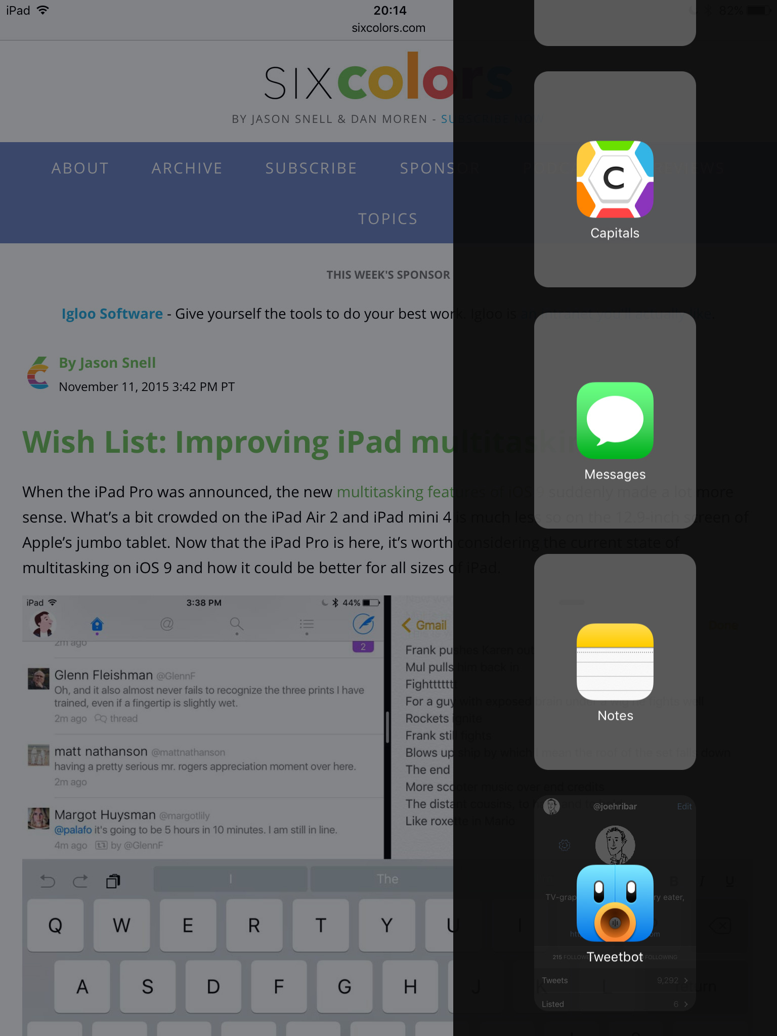
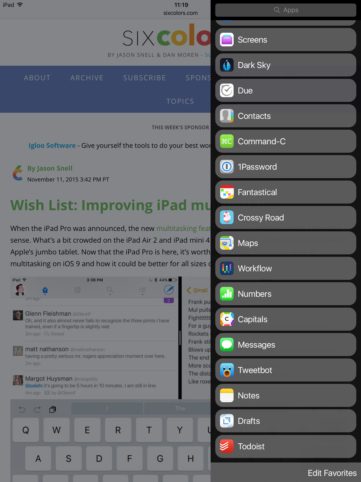
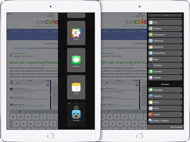
Multitasking on iPad received an enormous update in iOS 9 in the form of Slide Over and Split View. But however advanced and, well, pretty cool both are, the execution of Slide Over has puzzled me since I first played with it. The list of apps available for multitasking is presented in an excessively roomy fashion—meaning finding the app you’re looking for can be unnecessarily difficult.

Jason Snell wrote this week about a few ways to improve iPad multitasking. After reading the article and finding myself in agreement, I mocked up some ideas last night based on his suggestions. Let’s start.

Here’s what Slide Over looks like currently on an iPad mini.

Current Slide Over

There are four (FOUR!) apps visible in the menu. Finding the app you’re looking for can result in scroll after scroll after scroll.

Jason wrote, “A denser design that presented the app list in a more straightforward manner would be welcome, especially when the list is long.” So what might that look like?

Compact Slide Over

I made the buttons a comparable size to a list view for familiarity, but perhaps they could be a smidge bigger. Also, I’m designing for an iPad mini, and I realize what looks good on the mini might not look good on the pro, so perhaps some dynamic resizing could be in order depending on the device.

I think this is already an improvement. Sure the list is still long (a product of having so many great apps!), but the compact nature reduces the amount of scrolling necessary.

In addition to the “denser design”, there is a search bar at the top. Don’t want to scroll to find the app you’re looking for? Search for it instead.

Also of note is the button shape. I retained the rounded rectangles with the idea of keeping a similar shrink-down animation when closing an app in Slide Over.

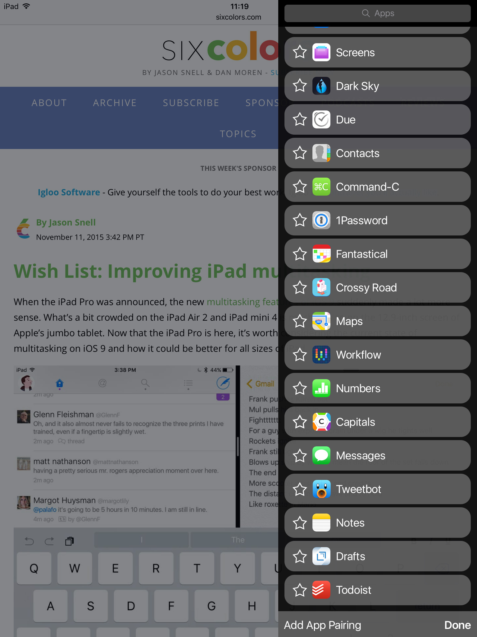
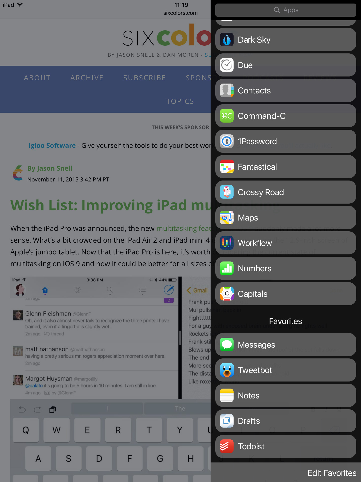
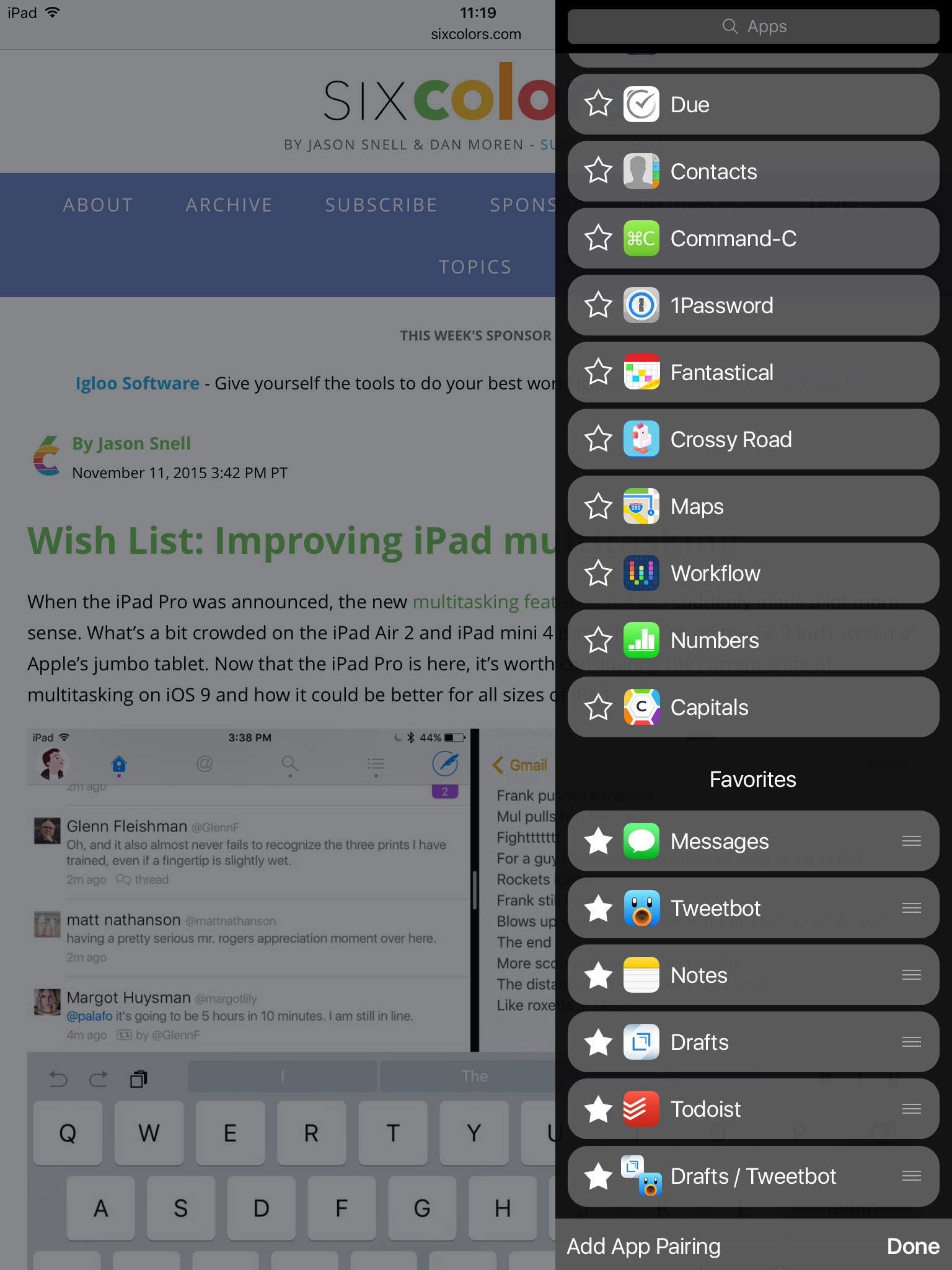
Now that more apps are visible, finding the app you want is easier. But what if there are a few apps you want quick access to in Slide Over. Why not pin them as Jason suggests? Tap “Edit Favorites” to enter edit mode. App icons and names slide over to reveal a star outline.

Add favorites

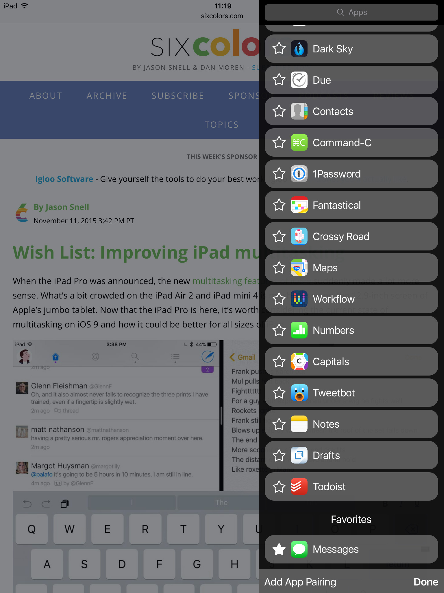
Tap the star, and the app animates into your favorites list.

Add favorites

(Since Twitter’s favorites and stars have recently found themselves unemployed, I put them to work here.)

Add favorites

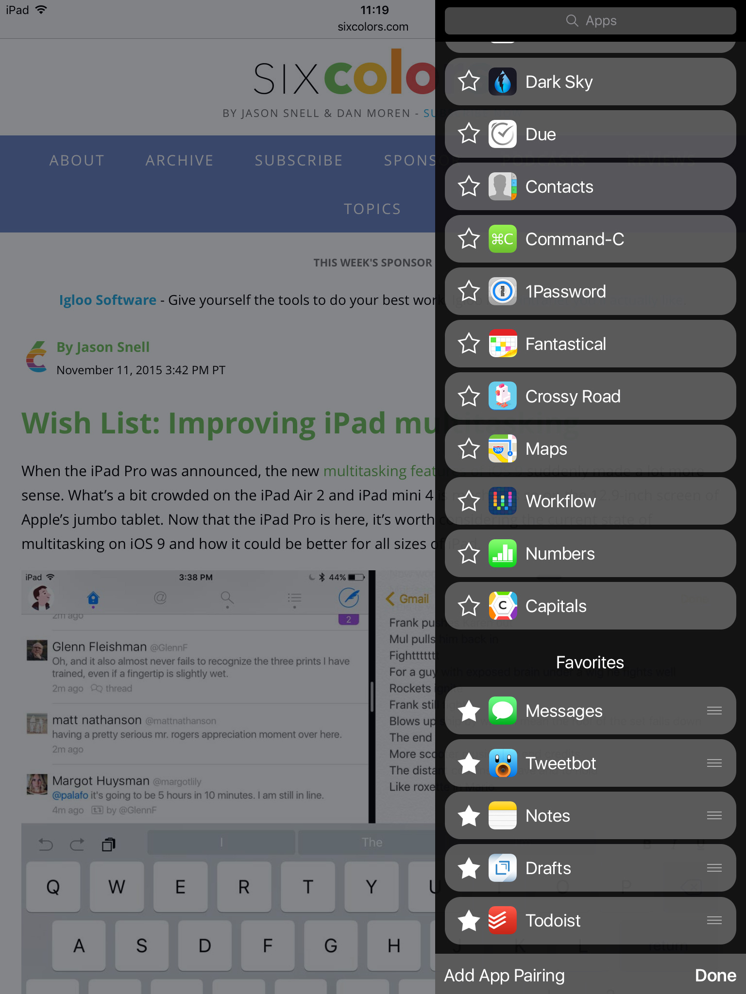
Grips on the right of the buttons give you the ability to reorder your favorites as you see fit. Tapping a star on a favorited app would animate it back to the list of unfavorited apps. Tap “Done” to exit edit mode.

Add favorites

Now we have a more compact design, the ability to search for an app, and the ability to pin apps for quick access.

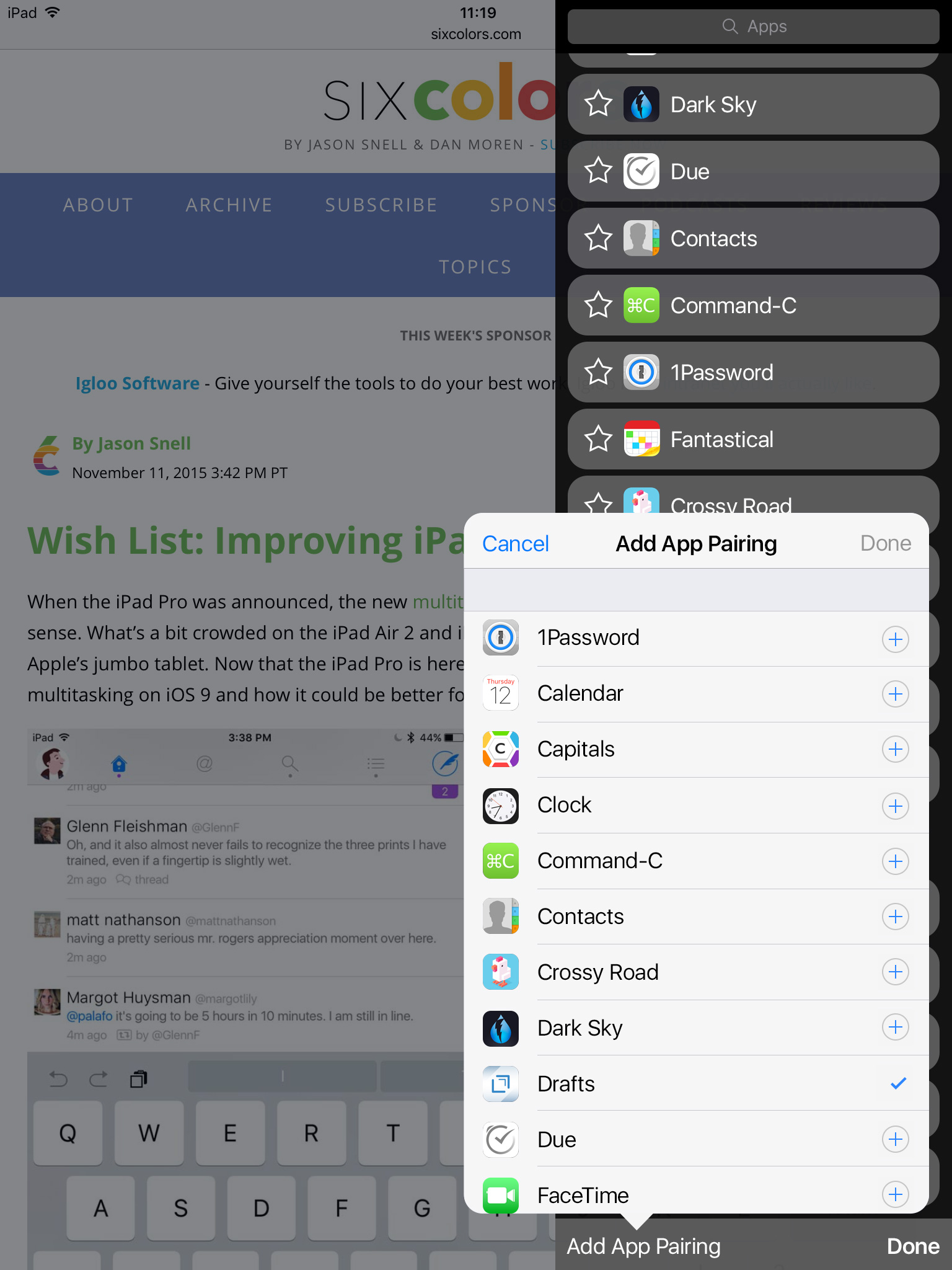
The final bit of functionality to add is the ability to save app pairings—app buddies as Jason called them. The idea here is to have quick access to two apps you like to use together in Split View. The current system, as he describes, can make getting those two apps together a pain. So how about favoriting an app pairing? In edit mode, tap “Add App Pairing” to open a popup with the list of available multitasking apps.

Add app pairing

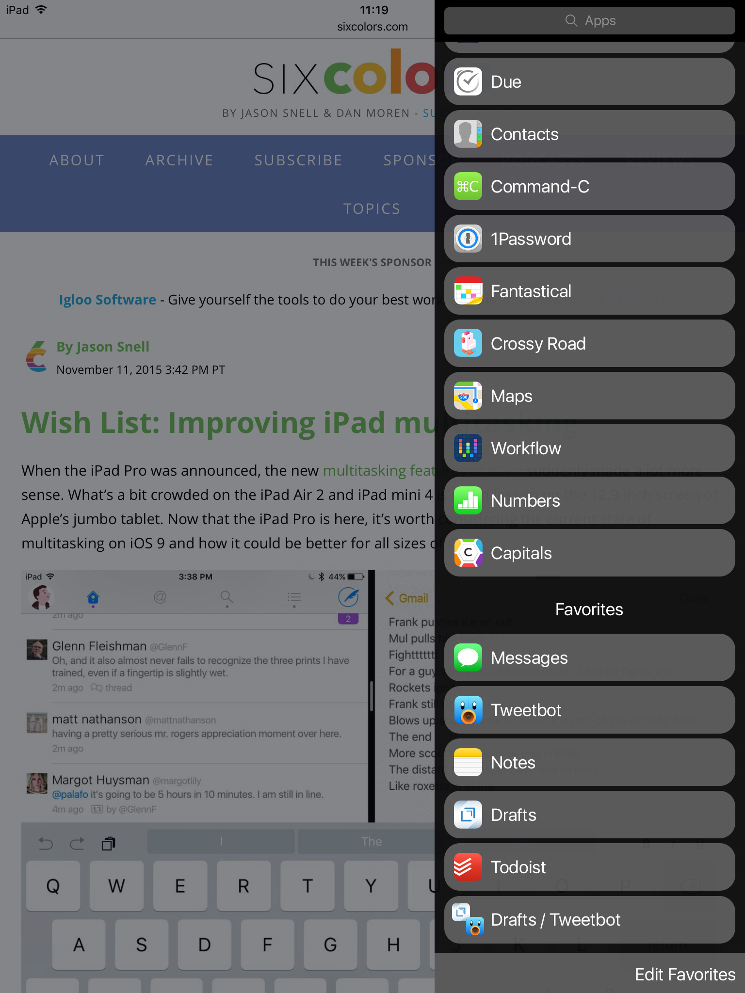
Select two apps, tap “Done”, and Split View will now remember you want those two apps together.

Add app pairing

I imagine when selecting a paired favorite from the list, an elegant animation would animate the current app off the screen and the two selected apps into position. And tapping on the star of an app pair would simply delete the pairing.

Slide Over redesigned

So there you have it. While iOS 9 introduced great new multitasking tools, selecting apps to multitask with can be a chore. But a few tweaks and some new bits of functionality could go a long way to improving iPad multitasking.

Slide Over redesigned

Singing the Apple Music Blues

Lost in recent Apple Music discussions is how the usability of navigating on-device music has been unnecessarily over-complicated. Apple’s focus on Apple Music the service has seemingly come at the expense of Apple Music the app.

Along with Apple Music the service, iOS 8.4 brought a new organization scheme to Apple Music the app. Previously, the bottom navigational tabs in the app were customizable. I could choose four of Playlists, Albums, Composers, Genres, Songs, Compilations, Artists, and Radio.

Customizable Tabs

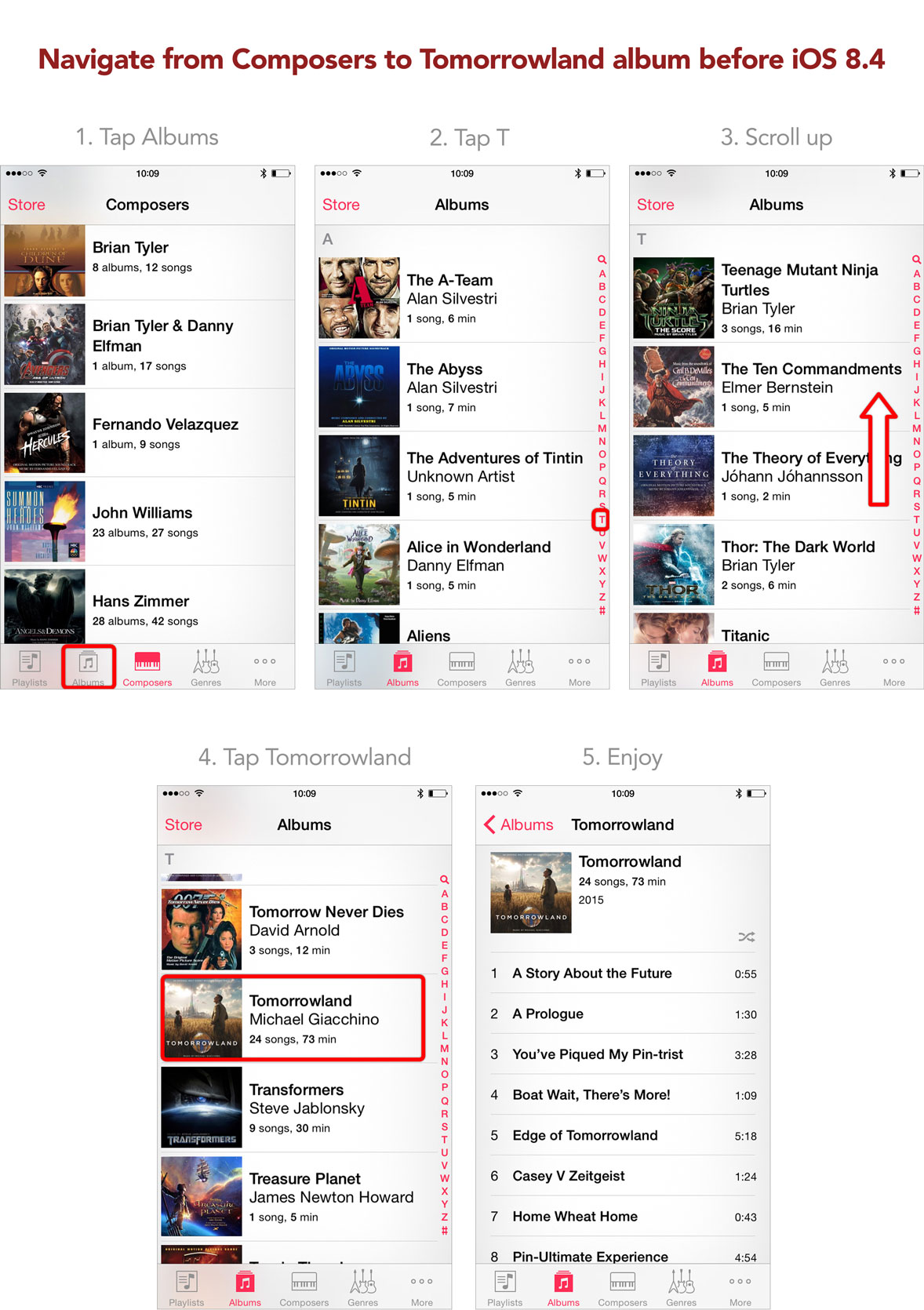
To jump from one list of items to another involved a single tap (provided both were present in the customizable tabs). For example, say I wanted to navigate from my list of composers to a specific album. Let’s say I want to listen to a track on the Tomorrowland score. Before 8.4, I would tap the Albums tab, tap the T in the letter slider along the righthand side, scroll to reveal Tomorrowland, and select the Tomorrowland album. Four steps.

Navigating in 8.3

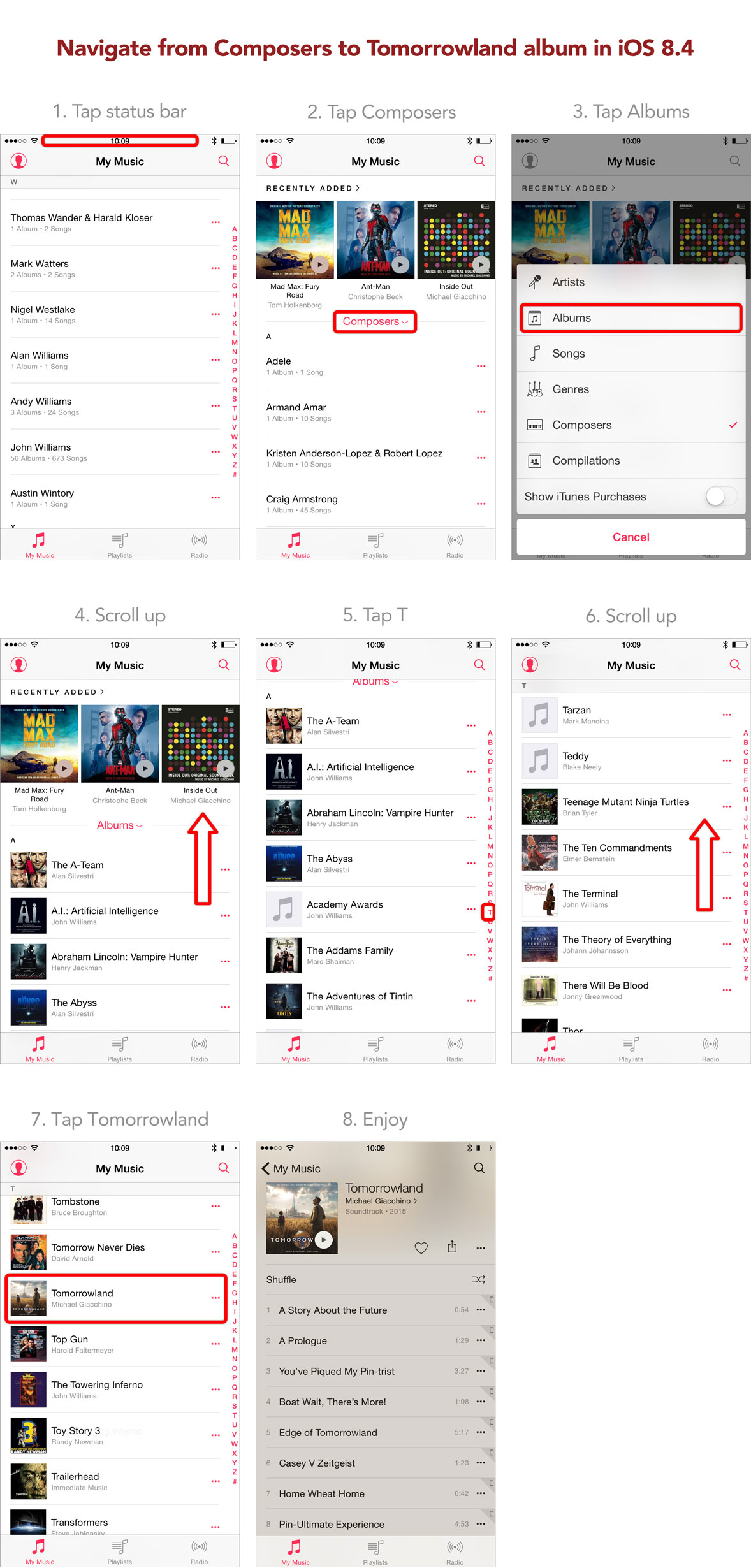
In 8.4, that process has become more complicated. To navigate from composers to Tomorrowland, I tap the status bar to scroll the list of composers to the top, tap the sort button, select Albums, scroll the Recently Added section out of the way, tap the T in the letter slider along the righthand side, scroll to reveal Tomorrowland, and select the Tomorrowland album. Seven steps.

Navigating in 8.4

The steps to navigate are nearly doubled. I could search for the album or track I want to listen to, but I shouldn’t have to rely on search to navigate. While Apple Music the service has made streaming favorite artists and albums easier, Apple Music the app has made navigating on-device artists and albums harder.

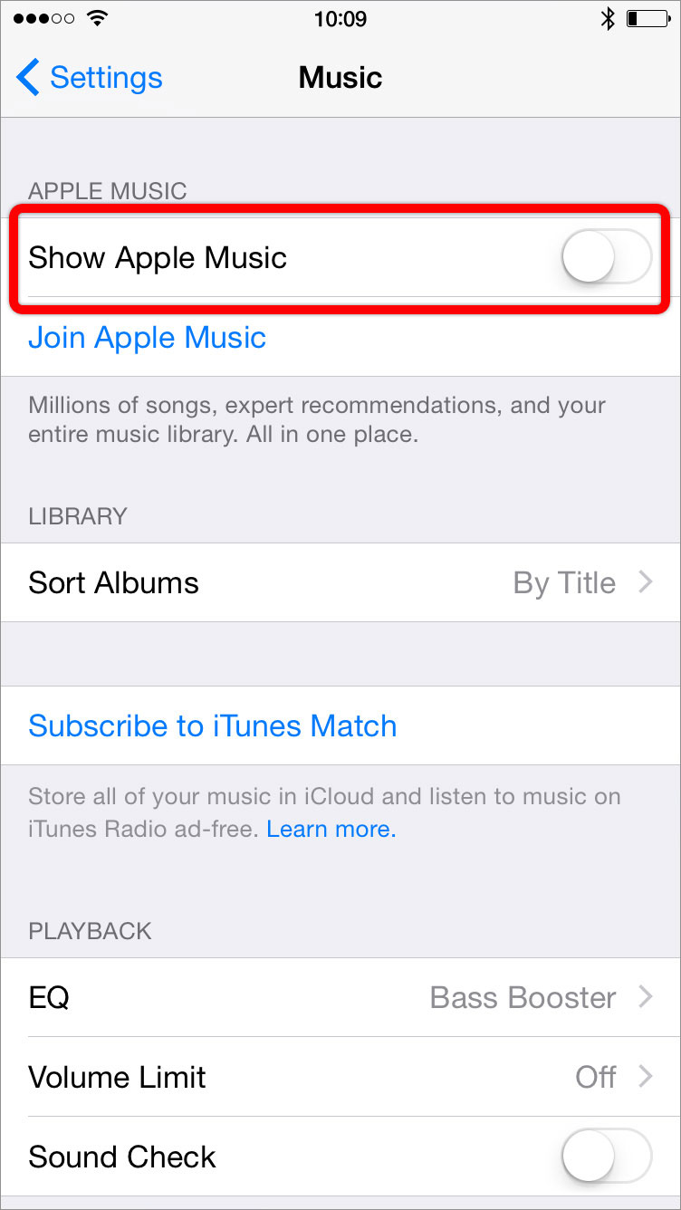
In Settings > Music, if I toggle off “Show Apple Music”, the “New” and “For You” tabs in Music are replaced with a Playlists tab.

Toggle off Show Apple Music

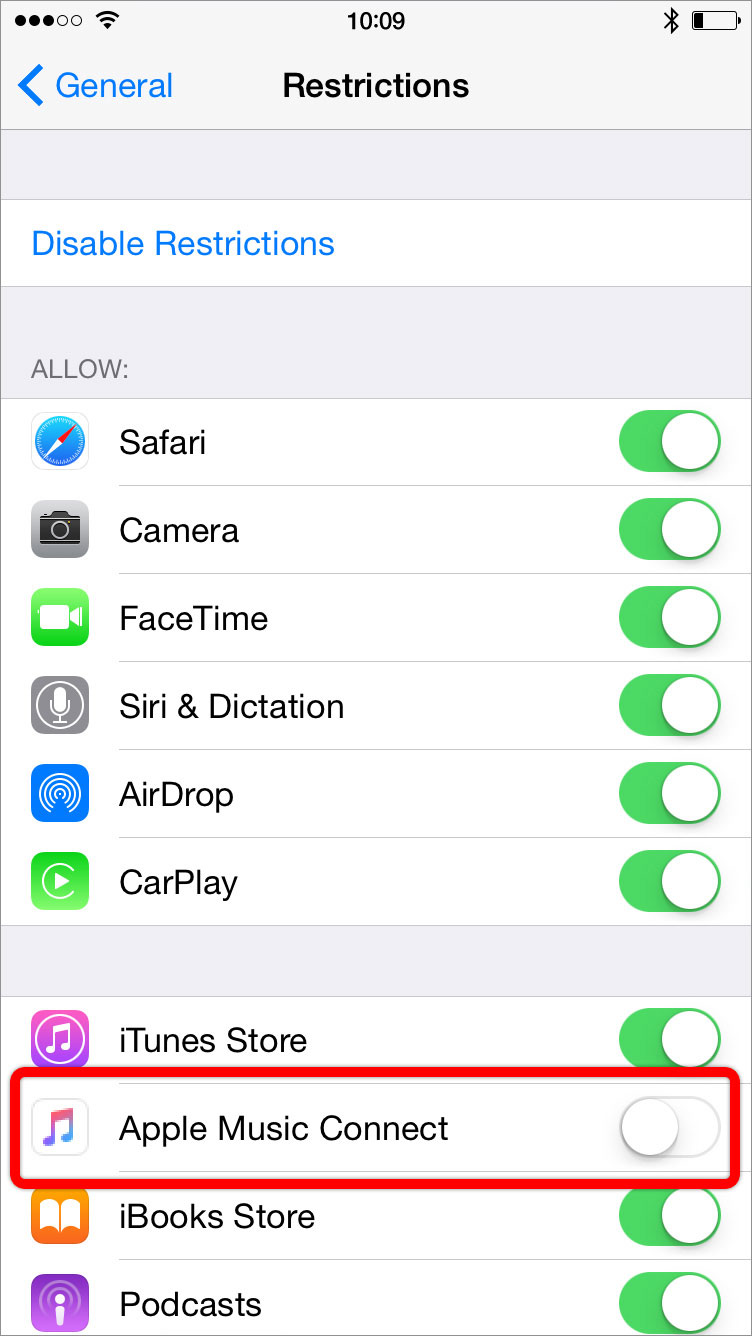
And in Settings > General > Restrictions, if I toggle off “Apple Music Connect”, the Connect tab in Music disappears.

Toggle off Apple Music Connect

Why make customizing this row of tabs buried and convoluted especially since in the previous version of the app this customization was forefront and simple?

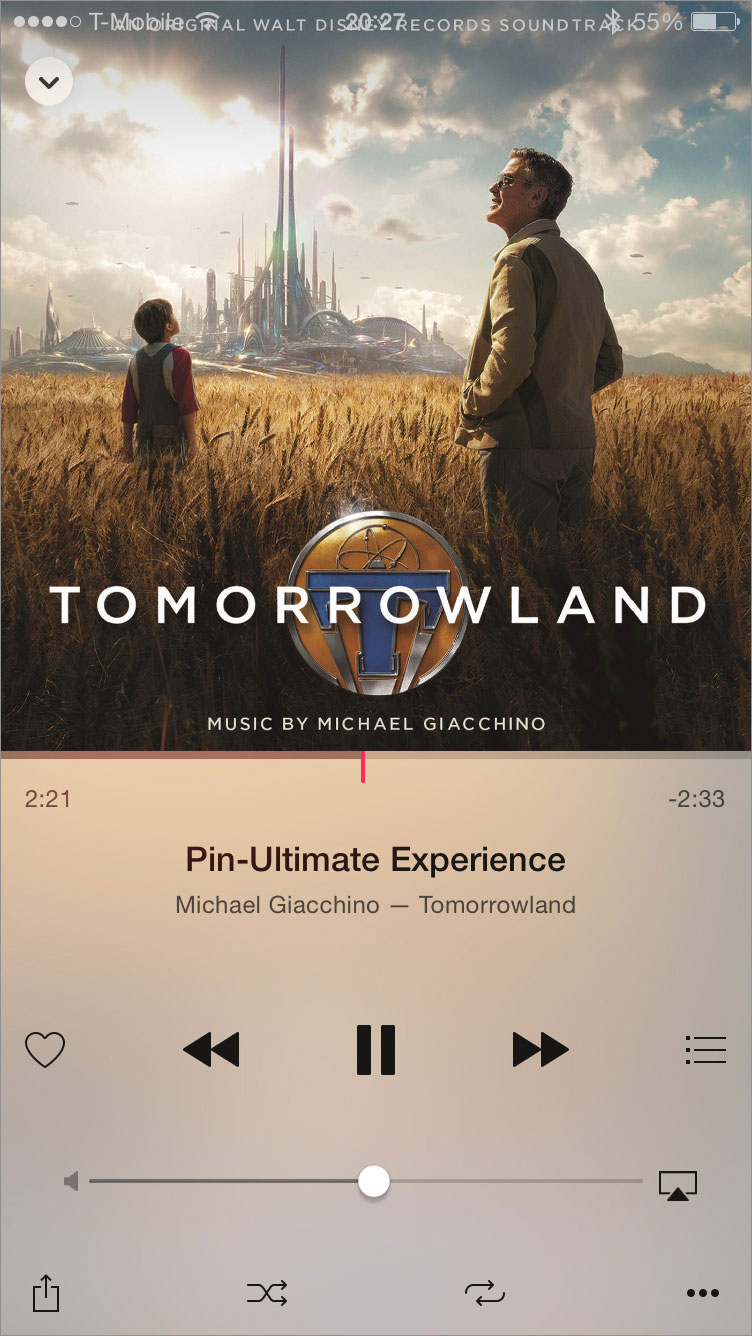
Navigating my music isn’t the only frustrating new thing about Apple Music the app. The Now Playing view features album art positioned flush against the top of the screen. This top-heavy design makes the whole view unbalanced. And the album art’s new position means the status bar covers the art—making for situations were the status bar is illegible.

Now Playing view

While the new Apple Music the app has become fraught with usability frustrations, the app does have two new features in particular that are welcomed additions.

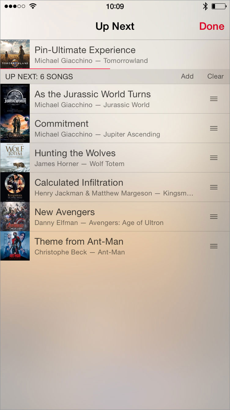
First is the Up Next feature similar to iTunes on the Mac to show all the upcoming tracks to play. This is especially helpful to create an on-the-go playlist that iPods of yesteryear could create. Here, I can reorder, remove, or add tracks to the currently playing list of tracks.

Up Next

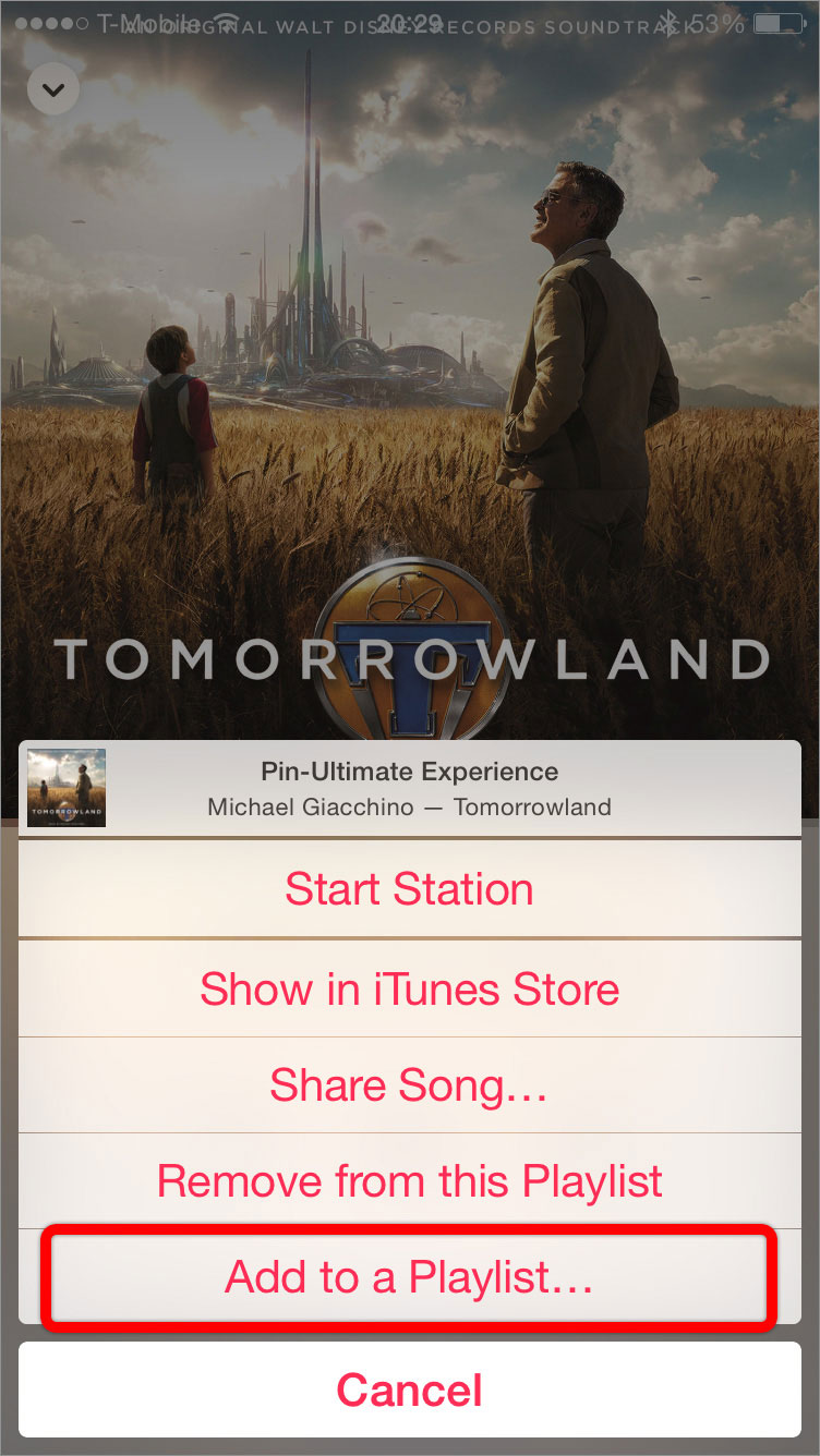
Also of note is the ability to add the currently playing track to a playlist. If I am listening to a particular track and think, “Gee, this would fit really well in X playlist”, I can immediately add the track to said playlist by tapping the ellipsis button and “Add to a Playlist…”. Previously, I would have to browse to the playlist, tap on Edit, tap +, and find the track in the library.

Add to Playlist

While these two new features are great usability additions to Apple Music the app, they don’t overcome the larger usability frustrations of the redesigned app. These frustrations are enough to have me experimenting with alternative music players. I’m hoping a future version of Apple Music the app restores easy customization of the tabs—and thus also restores the superior usability of the old app.

Nagle. Hribar. Oscars. Part III.

Who doesn’t enjoy a little friendly competition? Like last year and the year before, my friend @nagle and I made Oscar predictions. I’ll update this throughout the evening as winners are announced. Two years ago, I beat him by one point. Last year, we tied. This year, if the trend continues, he should beat me by one point. Given our predictions differ in two categories, that just might happen.

UPDATE: Another tie. Well done, sir. Well done.

Nagle: 20
Hribar: 20

Below is a breakdown of each category with the winners in bold.

—BEST PICTURE—
Nagle: Birdman
Hribar: Birdman

—ACTOR IN A LEADING ROLE—
Nagle: Eddie Redmayne (The Theory of Everything)
Hribar: Eddie Redmayne (The Theory of Everything)
—ACTOR IN A SUPPORTING ROLE—
Nagle: J.K. Simmons (Whiplash)
Hribar: J.K. Simmons (Whiplash)

—ACTRESS IN A LEADING ROLE—
Nagle: Julianne Moore (Still Alice)
Hribar: Julianne Moore (Still Alice)

—ACTRESS IN A SUPPORTING ROLE—
Nagle: Patricia Arquette (Boyhood)
Hribar: Patricia Arquette (Boyhood)

—ANIMATED FEATURE FILM—
Nagle: How to Train Your Dragon 2
Hribar: How to Train Your Dragon 2
Neither: Big Hero 6

—CINEMATOGRAPHY—
Nagle: Birdman (Emmanuel Lubezki)
Hribar: Birdman (Emmanuel Lubezki)

—COSTUME DESIGN—
Nagle: The Grand Budapest Hotel
Hribar: The Grand Budapest Hotel

—DIRECTING—
Nagle: Birdman (Alejandro Iñárritu)
Hribar: Boyhood (Richard Linklater)

—DOCUMENTARY FEATURE—
Nagle: Citizenfour
Hribar: Citizenfour

—DOCUMENTARY SHORT SUBJECT—
Nagle: Crisis Hotline
Hribar: Crisis Hotline

—FILM EDITING—
Nagle: Boyhood
Hribar: Boyhood
Neither: Whiplash

—FOREIGN LANGUAGE FILM—
Nagle: Ida
Hribar: Ida

—MAKEUP AND HAIRSTYLING—
Nagle: The Grand Budapest Hotel
Hribar: The Grand Budapest Hotel

—MUSIC (ORIGINAL SCORE)—
Nagle: The Theory of Everything (Jóhann Jóhannsson)
Hribar: The Grand Budapest Hotel (Alexandre Desplat)

—MUSIC (ORIGINAL SONG)—
Nagle: “Glory” from Selma
Hribar: “Glory” from Selma

—PRODUCTION DESIGN—
Nagle: The Grand Budapest Hotel
Hribar: The Grand Budapest Hotel

—SHORT FILM (ANIMATED)—
Nagle: Feast
Hribar: Feast

—SHORT FILM (LIVE ACTION)—
Nagle: The Phone Call
Hribar: The Phone Call

—SOUND EDITING—
Nagle: American Sniper
Hribar: American Sniper

—SOUND MIXING—
Nagle: Whiplash
Hribar: Whiplash

—VISUAL EFFECTS—
Nagle: Interstellar
Hribar: Interstellar

—WRITING (ADAPTED SCREENPLAY)—
Nagle: The Imitation Game (Graham Moore)
Hribar: The Imitation Game (Graham Moore)

—WRITING (ORIGINAL SCREENPLAY)—
Nagle: The Grand Budapest Hotel (Wes Anderson, Hugo Guinness)
Hribar: The Grand Budapest Hotel (Wes Anderson, Hugo Guinness)
Neither: Birdman

Nagle. Hribar. Oscars.

Who doesn’t enjoy a little friendly competition? Like last year, my friend @nagle and I made our Oscar predictions. The final score:

Nagle: 20
Hribar: 20

Below is a breakdown of each category with the winners in bold. Until next year!

BEST PICTURE
Nagle: 12 Years a Slave
Hribar: 12 Years a Slave

ACTOR IN A LEADING ROLE
Nagle: Matthew McConaughey (Dallas Buyers Club)
Hribar: Matthew McConaughey (Dallas Buyers Club)

ACTOR IN A SUPPORTING ROLE
Nagle: Jared Leto (Dallas Buyers Club)
Hribar: Jared Leto (Dallas Buyers Club)

ACTRESS IN A LEADING ROLE
Nagle: Cate Blanchett (Blue Jasmine)
Hribar: Cate Blanchett (Blue Jasmine)

ACTRESS IN A SUPPORTING ROLE
Nagle: Lupita Nyong’o (12 Years a Slave)
Hribar: Lupita Nyong’o (12 Years a Slave)

ANIMATED FEATURE FILM
Nagle: Frozen
Hribar: Frozen

CINEMATOGRAPHY
Nagle: Gravity (Emmanuel Lubezki)
Hribar: Gravity (Emmanuel Lubezki)

COSTUME DESIGN
Nagle: The Great Gatsby
Hribar: 12 Years a Slave

DIRECTING
Nagle: Gravity (Alfonso Cuarón)
Hribar: Gravity (Alfonso Cuarón)

DOCUMENTARY FEATURE
Nagle: The Act of Killing
Hribar: The Act of Killing
Neither: 20 Feet from Stardom

DOCUMENTARY SHORT SUBJECT
Nagle: The Lady in Number 6
Hribar: The Lady in Number 6

FILM EDITING
Nagle: Captain Phillips
Hribar: Gravity

FOREIGN LANGUAGE FILM
Nagle: The Broken Circle Breakdown
Hribar: The Great Beauty

MAKEUP AND HAIRSTYLING
Nagle: Dallas Buyers Club
Hribar: Dallas Buyers Club

MUSIC (ORIGINAL SCORE)
Nagle: Gravity (Steven Price)
Hribar: Gravity (Steven Price)

MUSIC (ORIGINAL SONG)
Nagle: “Let It Go” from Frozen
Hribar: “Let It Go” from Frozen

PRODUCTION DESIGN
Nagle: The Great Gatsby
Hribar: The Great Gatsby

SHORT FILM (ANIMATED)
Nagle: Get a Horse
Hribar: Get a Horse
Neither: Mr. Hublot

SHORT FILM (LIVE ACTION)
Nagle: Helium
Hribar: The Voorman Problem

SOUND EDITING
Nagle: Gravity
Hribar: Gravity

SOUND MIXING
Nagle: Gravity
Hribar: Gravity

VISUAL EFFECTS
Nagle: Gravity
Hribar: Gravity

WRITING (ADAPTED SCREENPLAY)
Nagle: 12 Years a Slave (John Ridley)
Hribar: 12 Years a Slave (John Ridley)

WRITING (ORIGINAL SCREENPLAY)
Nagle: Her (Spike Jonze)
Hribar: Her (Spike Jonze)

And the Oscar for Best Picture Goes To

After 12 Years a Slave to arthritis, Philomena, once an accomplished ballroom dancer, succumbed to the Gravity of Her situation and stopped dancing. Today, though, she was feeling the itch to dance again as she journeyed from Nebraska to the Dallas Buyers Club of New and Used Dance Shoes to meet some old friends.

Acquainted with the aged former star, the pilot of the flight she was on exclaimed as she boarded, “Why if it isn’t The Wolf of Wall Street on my flight today.” (She earned her nickname because the dance studio she belonged to was in the financial district and competitors said the unassuming woman who dominated the competitions was like a wolf in sheep’s clothing.) She replied, “Oh, Captain Phillips! So nice to see you again.”

After the flight, he asked for a dance. As they spun around while dancing the American Hustle, she started leading him. Noting his surprise, she whispered in his ear, “I’m the captain now.”

Once again this year, I did my Oscars homework and watched each of the films nominated for Best Picture prior to the Oscars telecast. And like last year, I posted a review on Letterboxd after viewing each film.

Here are my reviews of the nine nominated films ranked by my level of enjoyment of them.

9. 12 Years a Slave:

A well-made, difficult-to-watch look into this dark and disgusting chapter of American history. Well made, but not something I ultimately enjoyed. The cast—particularly Chiwetel Ejiofor, Michael Fassbender, and Lupita Nyong’o—was superb.

One point in particular, though, left me wanting. After being subjected to horror after horror, I wanted something more substantial in an ending. While Solomon’s actual story may have been this anti-climactic, I felt the resolution seemed too enabled by a deus ex machina in Brad Pitt’s character.

Other aspects, while not leaving me wanting, left me puzzled. For example, the woefully miscast Brad Pitt. I understand he was a producer on this film, but what was he doing in the film. The scene with Alfre Woodard seemed like it didn’t belong in the film. Was it the content of the scene? Was it the scene stylistically didn’t seem to fit? Several places during the film, the camera held on something or someone for just too long. Is this just Steve McQueen’s style? Was this to make a point of something? Was it to make the audience uncomfortable? And there’s Hans Zimmer’s score. I didn’t think the score was effective, and I am dumbfounded regarding the praise it has received. The score is barely there and barely musical, and the parts that are approachable are a(nother) rehash of his score for The Thin Red Line.

Ultimately, the film was a mixed success for me. As a film exploring this repulsive time in American history, the film succeeds. As an acting vehicle for Ejiofor, Fassbender, and Nyong’o, the film succeeds. But as a cinematic story and experience, too many elements kept me from fully embracing the film.

8. The Wolf of Wall Street:

As mentioned before, I have difficulty enjoying films that in any way sensationalize or trivialize the debauchery and douchebaggery of Wall Street. This film was no exception. Add to that the plodding nature of this film—and the ridiculous runtime—and you get a film I did not enjoy.

7. Dallas Buyers Club:

Another Best Picture nominee where performances in the film outshine the film itself. This film is all about Matthew McConaughey’s performance with a bonus in Jared Leto’s. Both are surely deserving of the accolades that have come and will be coming their way.

6. American Hustle:

A stellar, electric cast in a stylish-and-frenetic-but-sometimes-dragging caper.

5. Nebraska:

The message I took from this bleak-yet-funny film: get to know your loved ones while you still can.

4. Captain Phillips:

Knowing the outcome of this story arrested some of the suspense, but not knowing or forgetting many of the details boosted the suspense. And the end. Well done everybody.

3. Philomena:

Heartwarming and bittersweet. Dame Judi was a treat. (I’ll avoid any commentary on the Catholic Church because I have nothing nice to say.)

2. Gravity:

Wow.

Beautiful yet frightful. Expansive yet sparse. Vast yet claustrophobic. And all around, a visual masterpiece.

And might it be a sonic masterpiece as well? Both the sound effects (no sound in space until POV shots where we hear what the characters would hear in their suits) and the score were superbly rendered. Before I heard Steven Price’s excellent score, he was unknown to me, but now I look forward to hearing more from him.

Both the film and the score will be present on my end-of-the-year favorites list.

1. Her:

What defines love? Who determines who or what is capable of love? Or capable of being loved? These questions and more are posed by Spike Jonze’s terrific film. Both introspective and extrospective, the film is firmly rooted in all things melancholy—never does it become sappy, but never does it become depressing. But that melancholy is contrasted (complemented?) by the warmth of the production design (it’s almost like the these contrasting feelings are a play on Louis CK’s “Everything’s amazing and nobody’s happy”). And, much to its credit, never does the film overtly take a stance on our technological fate: the film doesn’t make technology the savior nor the destructor.

What the film does, though, is examine relationships of all kinds—coworkers, friends, strangers, lovers—and posit we all are looking to connect to someone—or something—else. How do we find that connection? How do we keep that connection? Where do we go if we lose that connection?

These are the questions I found myself asking after seeing the film. But I suppose the biggest question I came away with was where do I download the Samantha voice for my iPhone?

Unlike the last two years, my favorite film of the year—Her—is amongst these nine nominees, but I still want to point out one of my favorites which you should all see:

The Way, Way Back:

My first 2013 film I can describe as thoroughly charming. And let me throw in heartwarming and comical. Sam Rockwell was a definite standout of this film. But Allison Janney was my highlight. The first several minutes of her performance exemplify why I love watching her.

And while I did love watching her and watching Her, it will be a film I did not love watching that will win Best Picture today: 12 Years a Slave. While I did not enjoy it, I can’t argue it is both worthy and well-made.

My Top-Five Eight-Favorite Film Scores of 2013

As 2013 comes to a close, I present to you my annual end-of-the-year list of my favorite film scores of the year. As with my previous lists, these scores likely won’t be considered the best scores of the year (and only three of these will receive an Oscar nomination next month for Best Original Score), but they’re the scores I had on repeat throughout the year.

And if you’re so inclined, here are my favorite scores of 2012 and my favorite scores of 2011.

Guilty Pleasure of the Year:
The Lone Ranger
Hans Zimmer and Geoff Zanelli

As usual with a Zimmer score, there are cues that were obviously mail-ins that have no originality or brains. But then there are several cues that drip fun as they either pay homage to western scores of yore or aptly plow forward with the steady, propulsive determination of a locomotive.

And then there’s the cue “Finale” from Geoff Zanelli. This cue, which is easily the most fun cue of 2013, is a rollicking ten-minute arrangement of Rossini’s “William Tell Overture” infused with Zimmer and Zanelli’s themes from the film. Tremendous.

5. The Book Thief
John Williams

A no-nonsense Williams score showing off what he does best. Nothing novel here, but great to hear new Williams material—and a score that doesn’t eschew proper orchestral and thematic developments—in his semi-retired state (especially for a non-Spielberg film).

5. Escape from Tomorrow
Abel Korzeniowski

Abel Korzeniowski has been producing some gorgeous scores in the last few years, and Escape from Tomorrow is one of them. What’s interesting about this score is the sort-of classical approach the music takes on for a film that’s somewhat experimental.

4. Iron Man 3 and Thor: The Dark World
Brian Tyler

I wrote last year lamenting over the lack of musical cohesiveness between the Marvel films and the disappointing thematic representation of the characters.

Enter Brian Tyler. For both Iron Man and Thor, Tyler not only created a theme that aptly represents the characters but crafted a score that kept up with the film. Starting with a solid orchestral foundation (something not always present in previous Marvel scores), Tyler added something extra for each: Iron Man got a slight rock edge to his theme, and Thor got a heavy dose of what can only be described as epicness. (Thor 2 also featured a delicious quoting of Alan Silvestri’s Captain America theme (a theme that pleasingly now appears in three Marvel films).)

As both scores showed, Brian Tyler’s musical style excellently suits the Marvel universe. For that reason and for the sake of musical consistency, he should be Marvel’s house composer going forward.

3. Star Trek Into Darkness
Michael Giacchino

Michael Giacchino returned to the Star Trek world with a score that’s sharper, more driving, and more percussive than his original. And once again, a highlight of the film and score involves the Enterprise rising from something as Giacchino’s main theme is unleashed in all its glory.

2. Saving Mr. Banks
Thomas Newman

For a charming, magical film, Thomas Newman created a charming, magical score. All of Newman’s usual, eclectic orchestral mannerisms and colors abound in this delight of a score.

1. Gravity
Steven Price

My surprise of the year. Prior to seeing Gravity, I had not heard of Steven Price. I went into the film not expecting much more than a typical, simplistic Zimmer-derivative score for this blockbuster. I was wrong. Steven Price delivered a masterful score that expertly charted and complemented the chaos and emotions of the film. With no sound effects for the destruction in space, the film relied on the score to ratchet up the tension. And because of the skeleton cast, the film also relied on the score to ease that tension that might otherwise have been eased through multi-character banter or interaction. All this is capped off with the final cues where Price unleashes the full force of the orchestra and his main theme to craft a powerhouse of an ending. Thanks to his Gravity score, Steven Price is no longer an unknown for me. And thanks to this score, I look forward to hearing more from him in the future.

And speaking of hearing more in the future, here’s to more orchestral magic—and some more pleasant surprises—in 2014.

Yeah, Bitch! Lists!

Prior to the start of Breaking Bad’s second half of season five next month, I wanted to rewatch the entire series to be as fresh as possible with the show’s past events as I watched the final episodes. But I didn’t get started early enough, and by now, that’d just be crazy.

So instead, I looked through several best-of lists and compiled this list of best/most-popular episodes (thanks to @nagle for checking the list and catching one I left off). And for continuity, I included all episodes of the first half of season five. This will be my watchlist in anticipation of Heisenberg’s return.

And if you’d like to work through this list as well, you have, as of today, 28 days to watch 29 episodes. Tight but doable. I am the danger (to your free time).

1.1: “Pilot”
1.3: “…And the Bag’s in the River”
1.6: “Crazy Handful of Nothin’”
2.2: “Grilled”
2.6: “Peekaboo”
2.8: “Better Call Saul”
2.9: “4 Days Out”
2.12: “Phoenix”
2.13: “ABQ”
3.3: “I.F.T.”
3.6: “Sunset”
3.7: “One Minute”
3.10: “Fly”
3.12: “Half Measures”
3.13: “Full Measure”
4.1: “Box Cutter”
4.8: “Hermanos”
4.10: “Salud”
4.11: “Crawl Space”
4.12: “End Times”
4.13: “Face Off”
5.1: “Live Free or Die”
5.2: “Madrigal”
5.3: “Hazard Pay”
5.4: “Fifty-One”
5.5: “Dead Freight”
5.6: “Buyout”
5.7: “Say My Name”
5.8: “Gliding Over All”

Ostinatos, Kryptonite, and Hans Zimmer

For a film-score fan like me, a film’s musical accompaniment has the ability to foster increased enjoyment of its film. For example, the delightful How to Train Your Dragon. Add in John Powell’s should-have-won-an-Oscar score, and it’s now the utterly delightful How to Train Your Dragon.

Of course, the opposite is true: a film’s score can tarnish or even sink the enjoyment of a film for me. In the case of the former, the later Harry Potter films with their disappointing scores lacking appropriate thematic development and eschewing musical continuity; in the case of the latter (and no pun intended), Titanic with its score’s amateurishly cheap-sounding vocals attempting to ripoff Enya and exceedingly grating overuse of that damn song’s melody.

The former is also the case for Man of Steel (coincidentally partly for the same reasons as the later Potters). The film itself was fairly underwhelming (save for a terrific cast) while simultaneously being over the top. Add in Hans Zimmer’s disappointing score, and the film struggles to earn a three-star rating from me.

Calling Hans Zimmer’s Man of Steel score a disappointment, though, is being kind. His score is overly simple, thoroughly generic, and astoundingly devoid of any intelligent ideas.

Once again, Zimmer scores the film he wants to score and ignores what other composers have established for the genre and, in this case, franchise. I’d be more forgiving of Zimmer’s blatant disregard for a film’s musical genre (see: the Pirates of the Caribbean series, Gladiator, Man of Steel, etc.) if the music were actually good (see: Pirates 3, Gladiator). Zimmer’s music used to be a novelty; now it’s just the mark of a lazy composer unwilling (incapable?) of composing anything else.

Jonathan Broxton at Movie Music UK has a thorough review that I’m in agreement with. I’ll add this:

I understand John Williams’s iconic theme for Superman couldn’t be used in this reboot/reimagining of Superman. It simply wouldn’t fit.

But given Zimmer’s affinity for ostinatos, he could have—no, should have—used the Williams Superman ostinato. Here’s the ostinato driving the main titles as arranged by John Ottman for Superman Returns:

The most frustrating part of Zimmer not using Williams’s Superman ostinato? It would have easily fit. Slow it down slightly, and it could have easily been layered underneath Zimmer’s Superman “anthem” heard here:

The track already has ostinatos underneath. Why not replace one of them with Williams’s? Here’s the ostinato paired with Ottman’s Lex Luthor theme (again from Superman Returns):

Sure, the bright-sounding trumpets wouldn’t work with Zimmer’s style for the score, but he could have kept the rhythm and changed the orchestration. John Powell in the two non-Superman superhero films he has scored used the ostinato. Here it is starting at 0:24 in this cue from X-Men: The Last Stand:

…and here it is throughout the first part of this cue from Hancock:

Why couldn’t Zimmer in an actual Superman film use it? Pride? Laziness?

Whatever the reason, Zimmer’s Man of Steel is an enormous missed opportunity and joins the increasing list of his recent scores that have lost most of the intelligence and inspiration that his past scores like The Lion King, The Last Samurai, and even Pirates 3 exhibited—scores, unlike Man of Steel, that he clearly approached not just as a job but as an opportunity.

Curiously, his score for The Lone Ranger sounds more inspired and fits the genre and franchise far better than his Man of Steel score. Not surprisingly, it’s also his most enjoyable and entertaining score in years. But will it prove to be an outlier amongst his recent bland efforts or the beginning of a course correction? Can Zimmer break free from the shackles of his kryptonite: his laziness? I hope so.

Apple “No’s” Best

Here’s a post about something Apple has done recently that isn’t regarding pastel colors or flat design. Apple’s new “Designed by Apple in California” ad:

This is it.
This is what matters.
The experience of a product.
How it makes someone feel.
When you start by imagining
What that might be like,
You step back.
You think.

Who will this help?
Will it make life better?
Does this deserve to exist?
If you are busy making everything,
How can you perfect anything?

We don’t believe in coincidence.
Or dumb luck.
There are a thousand “no’s”
For every “yes”.
We spend a lot of time
On a few great things.
Until every idea we touch
Enhances each life it touches.

We’re engineers and artists.
Craftsmen and inventors.
We sign our work.
You may rarely look at it.
But you’ll always feel it.
This is our signature.
And it means everything.

Designed by Apple in California.

I cringed when I read that for the first time. Certainly not over the sentiment. Over the apostrophe. Did Apple commit the grammar sin of using an apostrophe for pluralization? No, and here’s why.

Apostrophes are used for omissions (e.g. “can’t”, short for “cannot”, or “Oakland A’s”, short for “Oakland Athletics”) and possession (e.g. “the dingo’s last meal”). Not, not, NOT for pluralization (e.g. “1900’s”, “DVD’s”, or “the Hribar’s”). So what’s going on with that “no’s”?

Turns out, if you have more than one “no”, you have “noes”. And that means the apostrophe isn’t an attempt at pluralizing “no”—it’s omitting the ‘e’ in “noes”.

So, technically, “no’s” is correct. I’m guessing someone at Apple decided “no’s” looked less awkward than “noes”.

While “no’s” still does look awkward and the line probably could’ve been rewritten to avoid the issue altogether, the apostrophe usage in the ad is technically correct.

And thus concludes your grammar lesson for the day.

Oscars Scorecard

Because I like to win things, I kept score between my friend Jon Nagle’s picks and my picks. The final results:

Nagle: 18
Me: 19

We wagered Best-Picture-nominee-themed art pieces. If I won, he would customize a Munny (like these of his) themed to the Best Picture nominee of my choice (like he did here when I tied him in his Oscars contest in 2010). And if he won, I would take and print a series of abstract photos around Hollywood representing each of the nine nominees.

I had a higher score which gave me the win, but because it was the result of a tie in the Sound Editing category, I will grant him his photo series. So, we’re both winners! Look for updates on the prizes in the future.

Below is a breakdown of each category. Winners in each category are in bold.

BEST PICTURE
Nagle: Argo
Me: Argo

ACTOR IN A LEADING ROLE
Nagle: Daniel Day-Lewis, Lincoln
Me: Daniel Day-Lewis, Lincoln

ACTOR IN A SUPPORTING ROLE
Nagle: Robert De Niro, Silver Linings Playbook
Me: Tommy Lee Jones, Lincoln
Neither: Christoph Waltz, Django Unchained

ACTRESS IN A LEADING ROLE
Nagle: Emmanuelle Riva, Amour
Me: Jennifer Lawrence, Silver Linings Playbook

ACTRESS IN A SUPPORTING ROLE
Nagle: Anne Hathaway, Les Misérables
Me: Anne Hathaway, Les Misérables

ANIMATED FEATURE FILM
Nagle: Wreck-It Ralph
Me: Brave

CINEMATOGRAPHY
Nagle: Life of Pi, Claudio Miranda
Me: Life of Pi, Claudio Miranda

COSTUME DESIGN
Nagle: Anna Karenina
Me: Anna Karenina

DIRECTING
Nagle: Ang Lee, Life of Pi
Me: Steven Spielberg, Lincoln

DOCUMENTARY FEATURE
Nagle: Searching for Sugar Man
Me: Searching for Sugar Man

DOCUMENTARY SHORT SUBJECT
Nagle: Inocente
Me: Open Heart

FILM EDITING
Nagle: Argo
Me: Argo

FOREIGN LANGUAGE FILM
Nagle: Amour
Me: Amour

MAKEUP AND HAIRSTYLING
Nagle: Les Misérables
Me: The Hobbit: An Unexpected Journey

MUSIC (ORIGINAL SCORE)
Nagle: Life of Pi, Mychael Danna
Me: Life of Pi, Mychael Danna

MUSIC (ORIGINAL SONG)
Nagle: Skyfall, Adele
Me: Skyfall, Adele

PRODUCTION DESIGN
Nagle: Anna Karenina
Me: Anna Karenina
Neither: Lincoln

SHORT FILM (ANIMATED)
Nagle: Paperman
Me: Paperman

SHORT FILM (LIVE ACTION)
Nagle: Curfew
Me: Curfew

SOUND EDITING
Nagle: Life of Pi
Me: Zero Dark Thirty
Neither (tie): Skyfall

SOUND MIXING
Nagle: Les Misérables
Me: Les Misérables

VISUAL EFFECTS
Nagle: Life of Pi
Me: Life of Pi

WRITING (ADAPTED SCREENPLAY)
Nagle: Argo, Chris Terrio
Me: Argo, Chris Terrio

WRITING (ORIGINAL SCREENPLAY)
Nagle: Amour, Michael Haneke
Me: Django Unchained, Quentin Tarantino

And the Oscars Go To

Wednesday brought my (I-wish-it-were-an-Oscar-category) Best Title Design nominees.

Yesterday brought my Best Picture reviews and prediction.

Today brings the rest of my predictions. And in some cases, I’ve noted who I would have voted for, too. Let’s see how I do tonight.

BEST PICTURE
Will win: Argo
My vote: Lincoln

ACTOR IN A LEADING ROLE
Will win: Daniel Day-Lewis (Lincoln)
My vote: Daniel Day-Lewis

ACTOR IN A SUPPORTING ROLE
Will win: Tommy Lee Jones (Lincoln)
My vote: Tommy Lee Jones

ACTRESS IN A LEADING ROLE
Will win: Jennifer Lawrence (Silver Linings Playbook)
My vote: Jennifer Lawrence

ACTRESS IN A SUPPORTING ROLE
Will win: Anne Hathaway (Les Misérables)
My vote: Sally Field (Lincoln)

ANIMATED FEATURE FILM
Will win: Brave
My vote: Frankenweenie

CINEMATOGRAPHY
Will win: Life of Pi (Claudio Miranda)
My vote: Skyfall (Roger Deakins)

COSTUME DESIGN
Will win: Anna Karenina

DIRECTING
Will win: Steven Spielberg (Lincoln)
My vote: Steven Spielberg

DOCUMENTARY FEATURE
Will win: Searching for Sugar Man

DOCUMENTARY SHORT SUBJECT
Will win: Open Heart

FILM EDITING
Will win: Argo

FOREIGN LANGUAGE FILM
Will win: Amour
My vote: Amour

MAKEUP AND HAIRSTYLING
Will win: The Hobbit: An Unexpected Journey
My vote: The Hobbit: An Unexpected Journey

MUSIC (ORIGINAL SCORE)
Will win: Life of Pi (Mychael Danna)
My vote: Lincoln (John Williams)

MUSIC (ORIGINAL SONG)
Will win: Skyfall (Adele)
My vote: Skyfall

PRODUCTION DESIGN
Will win: Anna Karenina
My vote: Lincoln

SHORT FILM (ANIMATED)
Will win: Paperman
My vote: Paperman

SHORT FILM (LIVE ACTION)
Will win: Curfew

SOUND EDITING
Will win: Zero Dark Thirty

SOUND MIXING
Will win: Les Misérables

VISUAL EFFECTS
Will win: Life of Pi
My vote: Life of Pi

WRITING (ADAPTED SCREENPLAY)
Will win: Argo (Chris Terrio)
My vote: Lincoln (Tony Kushner)

WRITING (ORIGINAL SCREENPLAY)
Will win: Django Unchained (Quentin Tarantino)
My vote: Django Unchained

And the Oscar for Best Picture Goes To

After eating the last slice and musing about the Life of Pi from baking to digesting, Lincoln, noting the time was now Zero Dark Thirty, retired to his study and consulted his Silver Linings Playbook on dealing with the Beasts of the Southern Wild. “Les Misérables in the South”, he thought to himself, “went and had Django Unchained. Should I profess my Amour or tell them, ‘Argo fuck yourselves’?”

Last year, I was inspired by my friend Jon Nagle to watch each of the films nominated for Best Picture prior to the Oscar telecast. I did the same this year. And like last year, I posted a review on Letterboxd after viewing each film.

Here are my reviews of the nine nominated films ranked by my level of enjoyment of them.

9. Les Misérables:

I dreamed a dream this film wasn’t nominated for Best Picture and I wouldn’t have to watch it in the lead up to the Oscars. Alas, my dream turned into a nightmare as I sat in the darkened theater besieged by monotonous, plodding, and sometimes-difficult-to-understand lyrical talking interspersed with fleeting bursts of melody.

I imagine some producers saw Hugh Jackman and Anne Hathaway’s Oscar number a few years back and decided to find a big Hollywood musical to shoehorn them into. Because shoehorned they were. Tom Hooper confines most of the performances into closeups not giving the performers room to, well, perform. Perhaps this was a decision to make the depressing characters and film feel more intimate and thus more relatable, but the closeups make the characters and film feel confrontational and forced.

That this is a musical makes the film already pretty unbearable for me. Add some grating performances and highly questionable directorial decisions, and the result is a film that is, well, pretty miserable.

8. Zero Dark Thirty:

Zero (fun in a) Dark (theater for at least) Thirty (minutes too long). Even without the torture controversy, this film just isn’t that great. The film is overly long, not compelling (save for the last act during the mission), and not well acted. Jessica Chastain plays a stiff, one-note, and one-dimensional character who isn’t at all engaging.

I applaud Kathryn Bigelow for attempting this monstrous project squeezing ten years of activity into two-and-a-half hours and for not grossly and jingoistically portraying the mission, but the film just doesn’t work.

But I fault her for being manipulative (did we really need the real-life phone calls from 9/11 opening the film? We all know why we were hunting bin Laden. And to follow that up with a torture scene as to suggest, “Remember what they did? So torturing them is okay, right?”) and confusing (can she and Mark Boal call this a “journalistic” film and then claim the right to take artistic liberties regarding torture and waterboarding and their successes? Where was the debate on using torture? Where were the failures and false positives?).

I hope the controversy surrounding the film goes beyond just the film’s depiction of torture and extends to the U.S.’s use of it; we could use the discussion and revelations. But torture aside, I apparently saw a different film than everyone else.

7. Django Unchained:

This film has style, it has wit, and it has charm. It also has a sagging second act and gratuitous violence in the third that treks deep into over-the-top territory for me. With Christoph Waltz’s stellar performance, the first act, however, was a five-star film; it sadly wasn’t matched by what followed.

6. Life of Pi:

This is easily one of the most visually masterful films I have ever seen. First, there’s Richard Parker. I don’t recall one instance in the film where I could point to and say, “Oh yeah, right there. He’s obviously digital.” Of course he’s digital. But the effects are so polished I couldn’t tell. Second, the seascapes, the clouds, the shipwreck, the storm, the jellies. Everything is absolutely stunning.

The one aspect, and I guess this is pretty important to the story, I didn’t find stunning was the religious and spiritual aspect of the film. I was left confused at the end of the film—confused as to what the story was saying about religion. Do I accept the the fantastical, embellished story simply because it’s “the better story”? Or do I accept the more logical, plausible story even though it doesn’t make for a tale for the ages? When it comes to deistic matters, I subscribe to the latter, so the parallels to religion at the end of this film made me wonder if I had just seen anything of substance.

Still, I can take the film for what it is: a visually beautiful story. A story. And nothing more.

5. Amour:

“It’s beautiful.”
“What is?”
“Life.”

So too is this film. The film is a beautifully constructed essay authentically examining love and devotion and features equally beautiful and engaging performances. The film is both heartwarming and heartwrenching, for as beautiful as the film is, it’s also exceptionally depressing.

As the film depicts a couple’s love and devotion being fiercely challenged, the film simultaneously challenges the audience to learn something by stepping into each role in the film. Perhaps we’re Eva and have parents (or grandparents) in a similar situation and should be more attentive to their situation. Or perhaps we’re Georges caring for our love and seeking inspiration to keep going. Or perhaps we’re imagining if we were Anne. Would there be a Georges in our life to wholeheartedly care for us?

That, for me, is the mark of a truly powerful film. Not only does the film exist as art, it exists as inspiration to pause and reflect on our lives. And that is a beautiful thing.

4. Beasts of the Southern Wild:

Definitely the biggest surprise for me amongst the Best Picture nominees, this film is a powerhouse of a film and a testament to humble, imaginative filmmaking with Benh Zeitlin’s superb debut direction and Quvenzhané Wallis’s captivating debut performance.

Intentionally or not, the film presents and flirts with many themes. This multi-layered film mentions the themes so you’re aware of them but never takes a stand. There’s the abject poverty, the multi-cultural community in the south never mentioning race, said community’s libertarian-esque refusal of government meddling, governmental disaster prevention and response, and global warming. While watching the film, I expected a commentary on one or more of these themes, but none came. And I’m glad.

Why? Because the film is firmly rooted in a child’s perspective of the world—rooted in the Now—social commentary would have been out of place. This film is entirely from Hushpuppy’s perspective, and reasons for why things are or why things did or didn’t happen are only given from her point of view. We’re never given a sense of when or where exactly this film takes place, a concrete reason for her mother’s disappearance, or an explanation of her father’s illness or where he disappeared to. Those answers may matter to us or to adults in the community, but not to Hushpuppy. That they are never presented makes the film more wondrous.

So too does Dan Romer and Zeitlin’s score for the film. Infused with bayou flavors and dreamy textures, the score is every bit as enchanting as the film is, and the piece leading into and playing over the end credits is infectiously delightful.

And “infectiously delightful” aptly describes the film, too, for now we all know “once there was a Hushpuppy, and she lived with her daddy in The Bathtub.”

3. Argo:

A tantalizing blend of heart-pounding tension and knee-slapping hilarity delivered by a solidly effective cast and director. Ben Affleck is proving himself as a star director with each new film. If for no other reason, see this film for Alan Arkin and Bryan Cranston.

2. Lincoln:

Is it presumptuous of me to say this film will win a River-Queen-load of awards? From acting to directing to writing to costuming, this film, which both entertains and educates, is expertly and lovingly crafted.

Part of the expertise exhibited by Steven Spielberg is crafting a film that is remarkably restrained. Given the subject matter—the greatest American president—one might expect a grand, historical epic charting how a tall-in-stature but short-in-experience man becomes that great president and how the trials and tribulations of the events he was thrust into defined the man. Instead, we are treated to a smaller, more scope-focused, and more intimate film about how the man defined the events thrust upon him. And the film is all the better because of that focus and restraint.

Restrained, too, is John Williams’s score. Often heard are complaints his music dominates—negatively—scenes it accompanies. But in Lincoln, he, like Spielberg, gets out of the way of sorts. Large parts of the film are left unscored. And when his music is heard, it is to gently and, in many cases, elegiacally reinforce the moment on screen—until the end when the score lets loose.

That focus and restraint from Spielberg and Williams allows something else to shine through: the acting. Daniel Day-Lewis has been called the “greatest living actor” for good reason. On display in this film is proof why. From his mannerisms to his wit to the way he physically carries the character on screen, Day-Lewis is every bit as good as expected. And then some. He breathes life into a historical force we only know from photos and text in history books in a way that made me think, “Gee, I wouldn’t mind having a White House Honey Ale with this man.”

Day-Lewis’s isn’t the only great performance. Also great were Sally Field and Tommy Lee Jones. Her shared time with Day-Lewis and his time apart were notable and not to be overlooked. (A side note about casting. The supporting cast is a treasure trove of b- and c-list television actors. One in particular—a certain British accountant playing a certain U.S.General—entirely caught me off guard to the point I missed everything he said when he was introduced. After the initial shock wore off, I determined I wouldn’t mind seeing him in his own film.)

What I saw in this film were parallels to our time. Besides the political horse-trading and bitter divisiveness—and abject name calling!—legislation had to be passed to course-correct the legal status of a particular set of people. Almost 150 years later, the story hasn’t changed. Furthermore, both times feature a president, from Illinois, who, as he looks at the long game, is accused of being overly deliberative and not adequately leading.

These parallels give the film an almost timeless feeling. So too does the title character. While the film takes place in a time when the United States was ruled by men of whiskers, the moral fortitude of its title character is bound by no age. And as that title character, Daniel Day-Lewis gives a masterful performance—a performance that, like Lincoln, now belongs to the ages.

1. Silver Linings Playbook:

While the story may be wholly predictable, the stellar performances are far from it. Jennifer Lawrence may have been a girl on fire earlier in the year, but here, she’s ablaze. And she’s not the only one. Bradley Cooper, Robert De Niro, and Jacki Weaver all deliver tremendous performances most definitely deserving of their Oscar nominations. The film tackles love, loss, and family strife in both a realistic and humorous way. This is a loving, engaging romantic comedy-drama starring Jennifer Lawrence and featuring a pleasant score from Danny Elfman. For me, what’s not to like.

Of the nine films nominated, I enjoyed Silver Linings Playbook the most. But if I had a vote for Best Picture, I would cast it for Lincoln. Come Oscar night, though, neither of these films will win Best Picture. Argo will.

And like last year, my favorite film of the year isn’t amongst these nine nominees:

Safety Not Guaranteed:

What a charming, quirky, heartwarming, and heartfelt movie. From the beginning I was enchanted as I watched these characters unfold and was left guessing as to what each character’s fate would be. Aubrey Plaza, in an extension of her Parks and Recreation role, is a partner any of us can hope for in whatever our mission is.

And speaking of Best Picture winners, here’s Nelson Carvajal’s mashup of past winners. Tomorrow it’ll be time to take off the nominees and cap the piece with Argo.

And the Oscar for Best Title Design Goes To

With the Oscars coming up this weekend, time to once again trot out my I-wish-it-were-an-Oscar-category category. A song during a film’s title sequence can be nominated for an Oscar, but the title sequence itself cannot.

In other words, there should be an Academy Award for Best Title Design.

Makeup artists, film editors, and song composers receive awards for their artistry, but creators of title sequences are overlooked by the Academy.

Who amongst the many great title sequences of 2012 could be nominated? Here are my nominees:

The Avengers
Designed by: Method Design
Watch it.

Beauty is Embarrassing
Designed by: Neil Berkeley
Watch it.

Crave
Designed by: Raleigh Stewart
Watch it.

Silent Hill Revelation
Designed by: Kook Ewo
Watch it.

Skyfall
Designed by: Daniel Kleinman
Watch it.

Since I’m picking nominees, I might as well pick a winner, too. The Oscar goes to… Daniel Kleinman for Skyfall. This was Kleinman’s sixth Bond title sequence. As usual, he takes a central aspect of the film and constructs a magnificent title sequence around it using ideas and imagery from the film. The striking images, the driving forward motion, and the superb connection to the film make Kleinman’s title sequence this year’s best.

For more kick-ass title sequences, check out my Letterboxd list of some of the most outstanding title sequences for film.

Now, if we could only find out who wins for Best Title Design on Sunday….

Favorite Film-Score Cues of 2012

We’re already 11% through 2013, and I’m just getting around to posting something 2012 related. Oops.

Anyway, for your enjoyment, I made a playlist of my favorite film-score cues of 2012. The tracks are sequenced for musical flow (they aren’t ranked in any way). You can head over to the playlist’s page on YouTube and press the “Play all” button or press play on the embed below to listen to the playlist. Enjoy.

The track listing:

  1. “Sab Than Pursues the Princess”
    John Carter
    Michael Giacchino
  2. “Grand Bazaar, Istanbul”
    Skyfall
    Thomas Newman
  3. “Saving New York”
    The Amazing Spider-Man
    James Horner
  4. “Imagine the Fire”
    The Dark Knight Rises
    Hans Zimmer
  5. “Re-Animation”
    Frankenweenie
    Danny Elfman
  6. “The Premiere”
    Hitchcock
    Danny Elfman
  7. “Cristeros”
    For Greater Glory
    James Horner
  8. “Cleared Iranian Airspace”
    Argo
    Alexandre Desplat
  9. “The Peterson House and Finale”
    Lincoln
    John Williams
  10. “Tsimtsum”
    Life of Pi
    Mychael Danna
  11. “Life”
    Prometheus
    Harry Gregson-Williams and Marc Streitenfeld
  12. “Apotheosis”
    Journey (video game)
    Austin Wintory
  13. “Time Machine”
    Safety Not Guaranteed
    Ryan Miller
  14. “With a Beat”
    Silver Linings Playbook
    Danny Elfman
  15. “A Promise”
    The Avengers
    Alan Silvestri
  16. “Mysterious Island Main Titles”
    Journey 2: The Mysterious Island
    Andrew Lockington
  17. “Calling the Guardians”
    Rise of the Guardians
    Alexandre Desplat
  18. “Merida’s Home”
    Brave
    Patrick Doyle
  19. “Cloud Atlas Finale”
    Cloud Atlas
    Tom Tykwer, Johnny Klimek, and Reinhold Heil
  20. “Once There Was a Hushpuppy”
    Beasts of the Southern Wild
    Dan Romer and Benh Zeitlin

My Top-Five Eight-Favorite Film Scores of 2012

Updated 31 Jan 2013 to add Beasts of the Southern Wild to the list

Here we are at the end of 2012—which means I present to you my now annual end-of-the-year list: my favorite film scores of the year. Like last year’s list, these probably wouldn’t be widely considered the best scores of the year (only one of these will receive an Oscar nomination), but they’re the scores I had on repeat the most this year.

(One note: some of these embedded tracks are a little long if you’re just looking to breeze through some samples, but I tried to pick out the best, most-representative tracks from the scores.)

Here we go.

5. The Dark Knight Rises by Hans Zimmer

I loathe what Hans Zimmer has done to the film-score industry: the over-simplification of music, the jettisoning of unique thematic identities, and the proliferation of ghost writers. And he’s become lazy: several of his latest scores—even, to an extent, this one—make him seem like he’s just out to collect a paycheck (see especially Pirates of the Caribbean 4). But, yes but, when he puts forth even some effort, the results can be enjoyable. As they are here. Last year, my guilty-pleasure-score-of-the-year went to one of Zimmer’s goons. This year it goes to him.

4. Safety Not Guaranteed by Ryan Miller

If you told me at the start of the year this list would include the sophomore film score from the lead singer of an alternative-rock band, I would have thought you were crazy after my, umm, distaste of a certain Oscar-winning (ugh) film score from the lead singer of another band. But, here it is. Miller’s score is just as quirky and charming as the film. I just wish there was more: the score is only about 15 minutes long. Still, an unexpected and enjoyable effort. Rarely do I finish watching a film and feel compelled to immediately purchase the score. That happened here.

4. The Avengers by Alan Silvestri

This score is a definite improvement over his Captain America: The First Avenger score, but it lacks the same punch that made, say, Back to the Future and The Mummy Returns so enjoyable. Don’t get me wrong; this score is still enjoyable, but it’s borderline Alan Silvestri on autopilot—though Alan Silvestri on autopilot is still better than a slew of other composers doing their “best” work.

What could have made this a better score are themes for the individual Avengers. This is more of a complaint against Marvel than it is Silvestri, though. In the five films leading up to The Avengers, there were five different composers with five different musical styles (Iron Man even had a different theme in both his films). As cohesive as the films were from character to character and director to director, there should have been more cohesion with the music. If the same composer couldn’t have scored each film, then at least a similar musical style should have been used. And with that similar musical style, each Avenger should have received a strong theme. Then, in The Avengers, when the character was introduced and did something heroic, their theme could have played. Instead, only Captain America (since that was Silvestri’s project) and Black Widow (I guess since she was such a strong character in the film) have individual themes. And when these two characters do something heroic, their theme plays. The other characters, though, have no individual musical identity here. Curiously, Thor had a strong theme in his individual outing, but it isn’t used in The Avengers. And lastly, after Silvestri’s back-to-back scoring duties for Marvel, I thought he would become their resident composer, but Iron Man will receive his third composer for his third film—and likely his third theme. Anyway, I’ve gone off on a tangent. Back to the list.

4. Beasts of the Southern Wild by Dan Romer & Benh Zeitlin

Speaking of charming scores from newcomer film composers, Dan Romer and Benh Zeitlin’s score for Beasts of the Southern Wild is a late—but welcomed—addition to my list. Even with some buzz throughout 2012, somehow this score escaped me. But after the film was nominated for Best Picture, I checked out the score, and I’m glad I did. Infused with bayou flavors and dreamy textures, the score is enchanting and even a bit uplifting. And the last track (embedded above) is infectiously delightful. I haven’t seen the film yet, but I hope it’s every bit as splendid as its score.

3. For Greater Glory by James Horner

Gone are the days where I would berate and bemoan James Horner for self-plagiarism. Here’s a score that is littered, peppered, and otherwise filled with self-references, recycled ideas, and his damned four-note danger motif he’s been using since his Willow score in 1988 (in this regard, his scores are sometimes the musical equivalent of taking the ingredients of a taco and making an enchilada instead: something different, but still kinda the same thing). But it all comes together in a surprisingly refreshing way—refreshing not in the sense Horner is doing much that is new, but refreshing in that here’s an “old school” film composer still creating evocative orchestral film music.

3. The Amazing Spider-Man by James Horner

Apparently I have something wrong with me. This list not only includes more than one “non film composer”, but it includes TWO James Horner scores. Whoa. Where For Greater Glory is something of a greatest hits for Horner, The Amazing Spider-Man is something unique—and, again, refreshing—in his filmography. Horner clearly had fun with this score. Not only are there very few self-references (maybe just one?), his main theme (at 6:32 in the clip above) excellently mirrors Spider-Man as it ascends and descends just like the character swinging through the city.

2. John Carter by Michael Giacchino

Most of my favorite film composers started composing far earlier than when I started listening, but with Michael Giacchino, I’ve been able to follow along with his growth and rise in the film-score industry. Listening to his evolving sound and his quest to find his own musical voice has been enjoyable. In his earliest scores, he evoked other composers (John Williams in Medal of Honor (video game), Ron Goodwin in Secret Weapons Over Normandy (video game), and John Barry in The Incredibles), but thanks to his work on six seasons of Lost, he found his own voice. And that voice is on full display with this score that’s filled with orchestral adventure and fantasy. His work on Lost may be his biggest achievement in terms of the amount of music and themes, but his work here may be his biggest achievement in terms of the level of symphonic epicness. Too bad the film did so poorly because this score deserves some greater recognition.

1. Lincoln by John Williams

Last year, I said Williams’s War Horse was his best dramatic score since Schindler’s List, but this score supplants it. The film was terrifically spotted. Large parts of the film were left unscored, and many parts with music were accompanied by a restrained score, but when the film needed that classic Williams lyricism, the score expertly rose to the occasion. From the period-inspired theme to the folksy, jaunty piece to the masterful dramatic swells, he writes at a level both technically and lyrically unmatched by his decades-younger peers. About War Horse last year, I wrote, “No other score reached the emotional and orchestral heights both in and out of the film like War Horse did. I hope to say the same about Williams’s Lincoln this year.” Well, I can. Without hesitation.

And like his two scores last year and Giacchino’s John Carter and Horner’s The Amazing Spider-Man this year, this score serves as something of a giant middle finger to Hans Zimmer and the film-score industry as it drifts toward the Zimmer-ification of film scoring. Eschewing Zimmer tendencies, these scores harken back to the grand symphonic romps of yesteryear. And for someone like me, that is indeed quite a treat.

Here’s to more orchestral magic in 2013.