WALL-E

wall-e

This weekend, I watched Disney/Pixar’s latest film WALL-E for the first time.   What a phenomenal film. Pixar proves once again what a powerhouse they are.

First, the visuals.   Absolutely breathtaking.   Several shots in the film were hard to separate as 3D-generated they looked incredibly realistic.   The lighting, the shading and textures of the models, the reflections, the depths of field, and more all combined to create this incredibly realistic fictional world.   What a talented group of visual artists Pixar has working for them.   One particular shot I remember being so amazingly realistic-looking is an extreme close up of the top, front of WALL-E’s unresponsive eyes as EVE leaned in toward him.   Outstanding work.   I can’t use enough adjectives to describe the visual work on this film.

A significant portion of the film and its characters are voiceless (well at least without a human voice). Not having characters with speaking voices could prove to be tragic if special care were not taken to ensure proper communication cues were present as replacements, cues such as animation conveying excitement, sadness, etc.   We could tell what kind of mood EVE was in by the shape of her eyes.   But complementing and perhaps surpassing the visual cues were the auditory ones.   The sounds each robot made, from short beeps and blips to more emotion-filled sounds of longing and excitement, gave the audience a method to connect with the characters through personification. Ben Burtt, the veteran Hollywood sound designer, gave voices to the robots and made their world just a little more believable.

So much of the film was magical.   From EVE and WALL-E’s dance in space to WALL-E showing EVE the bubble wrap to the loyal band of “broken” robots who had uses for their malfunctions after all to the little lunch box WALL-E transports his keepsakes in.

But, like in any film, the key component to a magical film is the story, and WALL-E had a fantastic story, one of hope and love.   The hope lies in the state Earth is in, a state thanks to humanity’s carefree laziness, consumerism, materialism, and ignorance of self- and communal-health.   What today may be a cool new thing will be the downfall of us and everyone around us tomorrow.   Even after we wander past what is reasonable, healthy, and judicious, there is still a little green hope waiting to bring us back.   The lesson here for us real humans, though, isn’t that we should wait for our wasteful ways to one day be rectified by something outside of our doing, but instead for us to alter our self-made path to destruction now while we still have the chance.   Hope, then, is something we can find in ourselves.

What else we can find in ourselves in love.   Love for ourselves, love for someone else, and love for each other.   I don’t think I’m giving anything away here by saying the romantic component of WALL-E revolves around the relationship between WALL-E and EVE.   The love and longing WALL-E feels toward EVE reflects the most basic of human feelings the need to love and be loved; the need for a companion.   Once we find that perfect love, we will stop at nothing to pursue (clasping onto the spaceship), help (with EVE’s directive), and protect (from the rain and elements) said love.

These two themes of hope and love allow us to connect with the characters and reflect on our own lives through the characters.   Even the quirks of the robots give us the ability to see bits of ourselves (who doesn’t love popping bubble wrap or collecting little trinkets?).

Finally, I, along with every other Mac geek around, gleefully smiled when WALL-E made his reboot sound the sound of a powering-up Apple computer.

WALL-E is an exceedingly outstanding film, from the visual and aural presentation, to the basic building blocks of a solid, successful story.   While the film is comprised of artificial beings in an artificial world, the characters’ passions and emotions are those humans encounter every day, and they invite us to reflect in our own realistic world of hope and love.

What Apple Learned from Kodak

apple kodak

I saw this article linked on Alex Bitterman’s blog: Helen Walters and Bill Buxton at BusinessWeek writes about what Apple learned from Kodak:

What Apple did was learn from history, and adopt, adapt, and assimilate past success to current context. That is simply good, intelligent design in action. It is also a very good lesson: an obsession with the new and original, without a deep literacy and appreciation for the past, leads to a path of missed opportunities.

Very interesting read.

Title Sequence: Delicatessen

http://www.youtube.com/watch?v=qwfdVBk6SSQ

Designed by: Unknown
Year: 1991

Rockin’ Out with the Trans-Siberian Orchestra

While I was back home in Ohio over the holiday break, I had the privilege of attending a Trans-Siberian Orchestra concert.   Although the concert was nearly three hours long, one word sums it up: wow.

As long as you’re a fan of their music, or of rock music in general, the show is massively enjoyable.   Their energetic takes on traditional Christmas music as well as their own compositions rocked the arena I saw them at.   So much energy and excitement flowed through the audience.

Just as good as their music was the light, laser, and pyrotechnic show they put on, all synced to the music.   The constant flashes, floodlights, and flames strongly complemented the music and performance and added to the energy produced by the musicians.

Much to my delight, they played my favorite piece of theirs, made my favorite in part by this video:

http://www.youtube.com/watch?v=4j9kB5_VKuw

If you enjoy the music of the TSO and have the opportunity to attend a concert, I highly recommend attending.   You won’t be disappointed.

The Count(down)

My favorite Sesame Street character when I was little.   And tonight, we can say, “Thrrrrrrrrrreeeee, twwwwoooooo, onnnnnne.   Happy New Year. Ah ah ah ah ah.”

http://www.youtube.com/watch?v=3xeAeVraDaU

Have a healthy, happy, and safe new year!

New CNN Graphics Are Just Ok

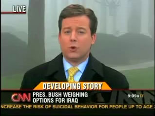
Earlier this month, CNN launched new lower-third graphics for all of their shows.   On CNN, lower-third graphics (so named because they occupy the lower-third region of the television screen) display what story is being shown as well as the name and titles of anchors, reporters, interviewees, etc., the location of the report, and any other flags, such as breaking news, developing story, etc.   The new graphics on CNN give a unified look across each show, but while they are an improvement on the old look, they have faults of their own.

To start off, here are the old lower third graphics (via Media Matters):

old cnn lower-third

old cnn lower-third

One of my biggest issues with these graphics was when the story topic was long and would run into the show logo on the right there were visual proximity issues:

old cnn lower-third

And here are the new graphics (all via Newscaststudio.com):

new cnn lower-third

Here are the graphics in action:

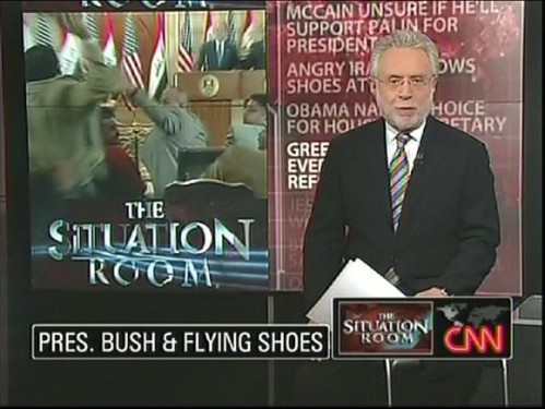
As you can see, the CNN logo has moved to the bottom right corner to the left of the show logo, a story topic is now only one line, and, as you’ll see below, a story flag color change occurred.   What makes the new graphics partly successful is the simplicity a bordered, solid black rounded rectangle, and the animation is quick and simple, too.   What makes the new graphics undesirable, however, is much more.

(But before I list the faults of the new graphics, I first have to issue a disclaimer.   Anything I may say is wrong with the graphics could very well been proposed or discussed internally at CNN but shot down by the creative team or some higher-up-the-totem-pole executive.   A coworker of mine recently completed work on a major update to a popular weekly sports event, and there were some creative elements that were ridiculed in online forums.   What forum users suggested had internally been suggested to higher-ups by my coworker but were dismissed.   So, for all I know, anything I comment on here may very well have been discussed at CNN.)

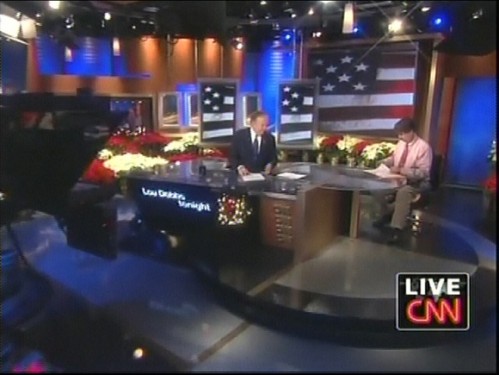
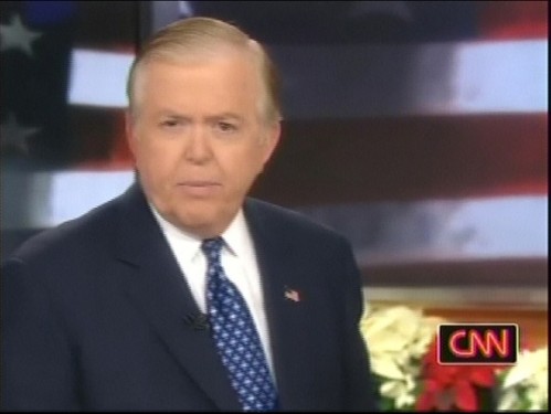
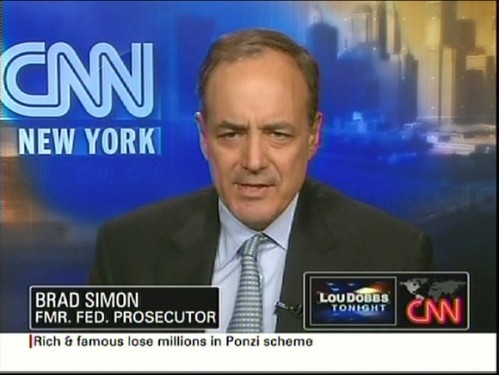
First, the show logo and CNN logo bug is too huge.   Do we need to be constantly reminded what show were watching?   I’m assuming veteran watchers of Larry King Live or The Situation Room or Lou Dobbs Tonight know what show they’re watching by a) the host of the show and b) the time the show is airing.   Taking out the show logo would give story titles and other information more horizontal room to be displayed.   What happens now is any text is horizontally-scaled to fit inside the space allotted.   For example, in the Wolf Blitzer “Pres. Bush & Flying Shoes” image above, if president were spelled out instead of abbreviated, since the text would be longer, it would horizontally-scale to fit inside the same black rectangle.

Second, the CNN logo carrier (black, rounded rectangle) needs some work.   Here is the CNN logo with “Live”:

cnn live

The left edge of the ‘L’ hangs slightly over the left edge of the ‘C.’   The discrepancy is hard to see in this image, but on TV, it’s definitely there.   And because of this hang-over, when the “Live” text disappears, there’s another discrepancy:

cnn logo

The CNN logo carrier shrinks down to the logo’s size (plus padding), but there is more padding on the left side of the logo than there is on the right side.   If you look at the previous image with the “Live” text and compare with the above image, you can see the padding on the left and right of the CNN logo is the same in both images.   If the “Live” text were scaled down to fit exactly over the CNN logo, the padding could be uniform on both sides whether or not the “Live” were there.

Third, the displaying of someone’s name and title, for example being interviewed for a story or for commentary, can be excessive. Here’s someone’s name and title displayed:

fonted

If the story caption is displayed, for instance the “Pres. Bush & Flying Shoes” text, and the next shot is a commentator, the story caption wipes off and the person’s name and title wipes on.   After a while, the name and title wipes off and the story caption wipes back on.   This part is fine.   Where the problem creeps in is when the person commenting has more than one title.   For instance, a show I was watching last week had someone on who was a “CNN Contributor,” “Republican Strategist,” and the author of some book (the YouTube clip above has this many-titles problem, too).   Well, the director of the show thought, rightfully, all three titles needed displaying.   So, the story caption wiped off, his name and the first title wiped on and off, his name and the second title wiped on and off, his name and the third title wiped on and off, and finally, the story caption wiped back on.   The amount of animation for the small change of text (the name was the same each time) was excessive.   Even just animating from the story caption to a commentator’s name and title back to the story caption is a bit much.   Adding one or two extra titles is way too much.

To fix this excessiveness, the carrier for the story caption and the name and title of a commentator should never fully wipe off if it merely is switching text inside of it.   Instead, text should wipe off like it currently does but the carrier should remain with the same dimensions.   Once the text is fully animated off, the carrier should morph to the size of the new text and then the new text should wipe on.   Let’s look at an example to make this clearer.   Let’s say our story caption is “Pres. Bush & Flying Shoes” and we want to then display “Brad Simon / Fmr. Fed. Prosecutor” next.   The name/title text is horizontally shorter than the story caption.   The caption text would wipe off, but the carrier would remain the same size.   When the caption text finished wiping off, the carrier would adjust its horizontal and vertical size to fit the invisible name/title text.   When this animation finishes, the name/title text would wipe on.   This approach would give greater fluidity to the transitions and eliminate the excessive animation that is currently in place.   This approach would also eliminate the noticeable hitch when a carrier wipes off and a new carrier of a different vertical size wipes on.

Because CNN uses the real-time 3D rendering program Viz Artist to create their graphics, these new graphics likely employ the Viz technology called Transition Logic.   Basically, Transition Logic allows certain elements to remain or animate into new elements when other elements change.   So, using Transition Logic, the approach outlined above could be accomplished with a Noggi geometrical shape adjusted to be a rounded rectangle and with a center point in the lower left corner.   The width and height properties of the Noggi plugin could be adjusted and animated using Viz scripts (I know this because I’ve done it before).

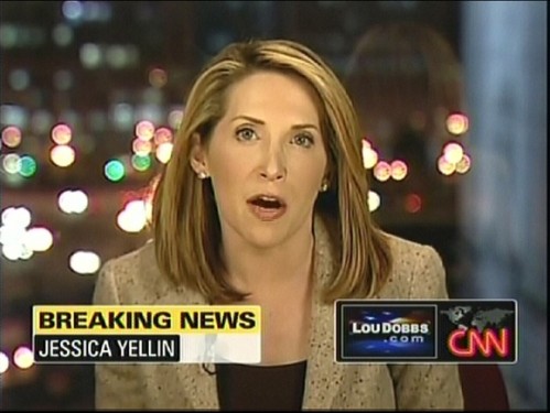
Finally, this isn’t really a problem but rather a curiosity:

breaking news

The “Breaking News” text now receives a yellow background, changed from red in the older graphics.   I’m curious how the creative decision came to be to change the color.   Red is now for “Developing Story.”   Red seems like a more urgent color for a more urgent breaking story, not an ongoing, developing story.

In addition to the new lower-third graphics, the bottom of the screen received a major update.   Instead of the egregiously annoying news ticker that served to only distract viewers from watching, listening, and focusing on the story being aired, there is a “flipper” that displays more information on the current story and periodically switches to updates on top stories.   A fabulous and much needed change.

Overall, the new CNN lower-third graphics are an improvement on their predecessors.   The simplicity of the design and animations are excellent examples for other broadcast graphics developers.   But while they enjoy success in their simplicity, they have several faults that detract from an overall success.

2008: Year in Review

JibJab’s annual report:

Here’s 2007.

Title Sequence: Panic Room

Designed by: Picture Mill
Year: 2002

An update of the titles from North By Northwest.

“Food Fight”

A phenomenal video by Stefan Nadelman outlining the history of world-wide warfare from World War II to the present represented entirely by food.

http://media.mtvnservices.com/mgid:hcx:content:atom.com:b601d887-24fe-4a03-8ff2-da62a621658f

A guide to the various food items.

(Nod: The Daily Dish)

“Make It Last All Year”

From The Muppets Christmas Carol, “It Feels Like Christmas” by Paul Williams:

It’s in the singing of a street corner choir
It’s going home and getting warm by the fire
It’s true
Wherever you find love
It feels like Christmas
A cup of kindness that we share with another
A sweet reunion with a friend or a brother
In all the places you find love
It feels like Christmas
It is the season of the heart
A special time of caring
The ways of love made clear
It is the season of the sprit
The message if we hear it
Is make it last all year

http://www.youtube.com/watch?v=pR_8kmOmxyk

Happy Holidays

Wishing you and yours a very joyous and safe holiday season and all the best in the new year!

From Shrek the Halls, here’s Puss in Boots’s tale of Santa Nicolas:

http://www.youtube.com/watch?v=Tq4lgWnCj80

Fun with Legos

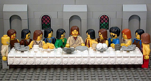
The Bible according to Legos:

lego last supper

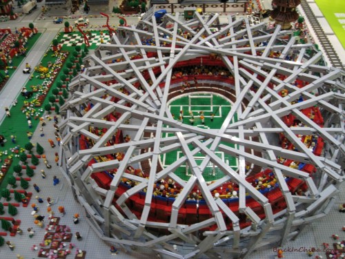
The 2008 Beijing Olympics Games recreated with Legos, complete with the Bird’s Nest and the Water Cube:

lego beijing olympics

lego beijing olympics

Here is some other Lego coolness I posted a while back:

Title Sequence: EuroTrip

http://www.youtube.com/watch?v=Fhodii_JD2I

Designed by: Prologue Films
Year: 2004

Why I Moved to the Desert

…otherwise known as winter sucks.   Or happy first day of winter for me.

Winter Storm Austin yes, they name their winter storms in Connecticut like hurricanes and tropical storms; they even get special graphics on the news:

winter storm austin

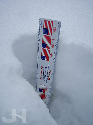
Anyway, Austin moved through New England on Friday dumping about 8.5 inches where I am.   Last night and today, Winter Storm Brooke is adding a few more inches.   And the snow may have some freezing rain mixed in later today and tonight.   Awesome.   I love winter.

I went to the grocery store earlier, but that probably wasn’t the best idea in the world given the road conditions.   But at least today I didn’t get stuck at two intersections like I did Friday evening returning from work.

I’m up to just over 10 inches of snow:

winter6

My footprint, err, leg print, I guess:

winter3

And here’s a play on my favorite beach/feet pictures, but not as fun for me.   I’d rather have my feet in the sand:

winter2

These cars haven’t moved in a few days.   Smart people:

winter1

Somewhere here, there’s a road:

winter4

Ahh winter, how I love thee:

winter5

So what if the summers in the desert were unbearable.   At least in the winter you don’t have to clean your car off several times a day because there’s no such thing as scraping sunshine off your car….

Title Sequence: Bunny Lake Is Missing

http://www.youtube.com/watch?v=x5IvsLn5EWg

Designed by: Saul Bass
Year: 1965

Senator Clinton Is Officially Saxbe-Fixed

CNN is reporting President Bush signed the bill cutting the salary of the secretary of state so Senator Clinton can get around Article I, Section 6 of the U.S. Constitution.   With that, Clinton’s Saxbe Fix is finalized.   Now we just need one for Senator Ken Salazar (nominated for Secretary of the Interior), Representative Ray LaHood (nominated for Secretary of Transportation), and Representative Hilda Solis (nominated for Secretary of Labor).   Whew.   Anyone else?

40 Inspirational Speeches in 2 Minutes

The Race That Won’t End

Election 2008 still isn’t over.   At least not for Minnesotans. Incumbent Senator Norm Coleman and Democratic challenger Al Franken are battling each other in a recount that doesn’t seem to end.   In question now are absentee ballots that may or may not have been unfairly rejected on election night.   The Coleman campaign, citing the Constitution’s Equal Protection clause, says they shouldn’t be counted until there is a uniform process for counting them.   I absolutely agree.   One county shouldn’t be using a different set of standards to count ballots than another county is using.

Today, we received some more news. From CNN:

Minnesota’s Supreme Court Thursday barred officials from including rejected absentee ballots in the recount of the state’s hotly contested U.S. Senate race unless both of the candidates and elections officials agree the ballot was improperly rejected.

What are the odds both of the candidates agree on which ballot to count and which one not to?   And this question begs another.   How long will this last?   And will there be a victor come 3 January when the new Congress is sworn in?   One possibility in this mess: Article I, Section 5, Paragraph 1 of the U.S. Constitution:

Each House shall be the judge of the elections, returns and qualifications of its own members, and a majority of each shall constitute a quorum to do business; but a smaller number may adjourn from day to day, and may be authorized to compel the attendance of absent members, in such manner, and under such penalties as each House may provide.

Emphasis mine.   So the Senate has the power to intervene in the Coleman/Franken race.   Will they?

Oh, and as an aside, a recount is one very strong reason why we shouldn’t popularly elect the president.   A national recount in a close election would be a nightmare.   But this is a discussion topic for a different day.

$23,743

Watch this:

Seriously? I can (almost) understand a bid of $23,745 being an exact bid because it’s more of a round number (5s, 10s), but 43? It just seems too random to be real.   How does someone bid $23,743?   For the price to be that exactly right, seems pretty suspicious.   Thoughts?

Secretary of the Interior Ken Salazar Unconstitutional, Too

The LA Times is reporting Colorado Senator Ken Salazar will be nominated by President-elect Barack Obama to be Secretary of the Interior (nod: FiveThirtyEight).   From the LA Times:

If confirmed, Salazar would head a department with a broad portfolio, including managing the troubled Bureau of Indian Affairs. Salazar, 53, would also oversee the nation’s national parks and other large swaths of public lands, making him the country’s foremost landlord. And he would be responsible for the Bureau of Land Management, which sets policy for oil and gas drilling, mining and other resource extraction on public land.

But guess what?   Senator Salazar will be another senator appointed to a civil office that received a pay raise while the senator was serving his or her term.   So, like Senator Hillary Clinton, Senator Salazar is constitutionally ineligible from becoming a cabinet secretary.   But I imagine, also like Senator Clinton, Congress will issue a Saxbe Fix for him.

So isn’t it about time we discuss changing Article I, Section 6?   I’m not saying remove it, but at least add language to the effect of “unless Congress shall by law provide for a Senator or Represenatative to be appointed to the civil office” etc. so the Saxbe Fix isn’t so questionable any more.

Title Sequence: Handmade Nation

Designed by: Unknown
Year: 2009

The ‘O’

Logo Design Love writes about some of the Obama logo ideas that were part of the development process getting to the final logo.

The three finalists:

Finalist #1:

obama logo finalist 1

The masked imagery is interesting, but still weak, and that image reminds me of the default desktop on Windows XP.   Clearly, though, the designers smartly realized early on the ‘O’ would go a long way.

Finalist #2:

obama logo finalist 2

The bubbles are a very interesting concept but seem wildly out of place in a political campaign.   This reminds me of the Charles Schwab “Talk to Chuck” commercials with the big quote balloons.   I can imagine these Obama balloons animating in a similar fashion.

One of the problems with #1 and #2 is the lack of the strong symbolism that people can subconsciously buy into like any great marketing brand/logo (Nike’s swish, Apple’s apple, McDonald’s golden arches, etc.).   A strong symbol that transcends ordinary design in the field and becomes instantly recognizable without any supporting text.   That leads us to…

Finalist #3:

obama logo finalist 3

Designer Sol Sender notes:

Originally the stripes were kind of symmetrically expressed across the horizon, and as we went into final refinements we felt that giving it a little bit more dimension, a little bit more motion, ways to enter into it a little bit more for the viewer was a better way to go.

And, of course, the final design:

obama logo

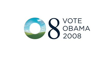
I can’t imagine an Obama campaign without that logo.   Like the campaign itself, the logo and graphic design of the campaign were a successful and remarkable exercise in discipline.   The logo skillfully symbolizes his theme (sunrise: a new day), America (flag allusion, rolling hills), and himself (the letter ‘O’).   Fantastic.

(Nod: Brand New)

Where Are All the Acorns?

Interesting article on CNN:

Up and down the East Coast, residents and naturalists alike have been scratching their heads this autumn over a simple question: Where are all the acorns?

Oak trees have shed their leaves, but the usual carpet of acorns is not crunching underfoot.

In far-flung pockets of northern Virginia, Maryland, Pennsylvania, West Virginia and other states, scientists have found no acorns whatsoever.

The reason?

Virginia extension agent Adam Downing said acorn production runs in cycles, so a lean year is normal after a year with a big crop.

“It fits with the physiology of seed reproduction. The trees are exhausted, energy wise, from last year,” Downing said.

But even he is surprised at the complete absence of nuts in parts of Virginia.

“There are plenty of acorns in most of the state, but zero acorns in some pockets,” he said.

Downing said recovery from last year’s big crop, combined with a much wetter-than-usual spring, probably accounts for the acorn absence. Meteorologists say the Washington-Baltimore area saw about twice as much precipitation last May as normal.

Where are all the acorns? Perhaps in Nevada.

Congress Saxbe-Fixes Senator Hillary Clinton

In regards to the constitutionality of Senator Hillary Clinton becoming secretary of state, people on the left, I think, might be quick to dismiss this case as silly and simply politically-driven, and people on the right might be quick to dismiss this case because it would widely be viewed as politically driven if they (other Senators charged with confirming Clinton) challenged her nomination based on the constitutionality of it (not to mention having a past lack of concern with the Bush Administration’s, shall we say, cavalier attitude to certain parts of the Constitution).

For a recap, here’s Article I, Section 6, Paragraph 2 of the U.S. Constitution:

No Senator or Representative shall, during the time for which he was elected, be appointed to any civil office under the authority of the United States, which shall have been created, or the emoluments whereof shall have been increased during such time: and no person holding any office under the United States, shall be a member of either House during his continuance in office

So, no senator or representative can be appointed to a civil office (e.g. a cabinet position) during their current Congressional term if that office received a pay increase during their term in Congress.   As I wrote last month, the Office of the Secretary of State received a pay raise this year, during Senator Clinton’s current Senate term.   Thus, according to Article I, Section 6, she is ineligible.

Congress, however, has dealt with this problem before in what has been called “the Saxbe Fix.”   President Nixon appointed Ohio Senator William Saxbe to be attorney general, but the office received a pay increase while he was serving his Senate term.   In response, Congress lowered his pay to the level before he began his term.   This again happened in 1993 when President Clinton appointed Texas Senator Lloyd Bentsen to be secretary of the treasury.   This past Wednesday, Congress took up the issue again and passed S.J. 46, a joint resolution lowering the salary of the secretary of state to the January 2007 level before Senator Clinton was sworn in to her current Senate term.   Here’s the text of the resolution, now in President Bush’s hands:

  • (a) In General- The compensation and other emoluments attached to the office of Secretary of State shall be those in effect January 1, 2007, notwithstanding any increase in such compensation or emoluments after that date under any provision of law, or provision which has the force and effect of law, that is enacted or becomes effective during the period beginning at noon of January 3, 2007, and ending at noon of January 3, 2013.
  • (b) Civil Action and Appeal-
    • (1) JURISDICTION- Any person aggrieved by an action of the Secretary of State may bring a civil action in the United States District Court for the District of Columbia to contest the constitutionality of the appointment and continuance in office of the Secretary of State on the ground that such appointment and continuance in office is in violation of article I, section 6, clause 2, of the Constitution. The United States District Court for the District of Columbia shall have exclusive jurisdiction over such a civil action, without regard to the sum or value of the matter in controversy.
    • (2) THREE JUDGE PANEL- Any claim challenging the constitutionality of the appointment and continuance in office of the Secretary of State on the ground that such appointment and continuance in office is in violation of article I, section 6, clause 2, of the Constitution, in an action brought under paragraph (1) shall be heard and determined by a panel of three judges in accordance with section 2284 of title 28, United States Code. It shall be the duty of the district court to advance on the docket and to expedite the disposition of any matter brought under this subsection.
    • (3) APPEAL-
      • (A) DIRECT APPEAL TO SUPREME COURT- An appeal may be taken directly to the Supreme Court of the United States from any interlocutory or final judgment, decree, or order upon the validity of the appointment and continuance in office of the Secretary of State under article I, section 6, clause 2, of the Constitution, entered in any action brought under this subsection. Any such appeal shall be taken by a notice of appeal filed within 20 days after such judgment, decree, or order is entered.
      • (B) JURISDICTION- The Supreme Court shall, if it has not previously ruled on the question presented by an appeal taken under subparagraph (A), accept jurisdiction over the appeal, advance the appeal on the docket, and expedite the appeal.
  • (c) Effective Date- This joint resolution shall take effect at 12:00 p.m. on January 20, 2009.

To my point about people on the left blowing this situation off, Greg Sargent at TPM Election Central, a branch of left-leaning Talking Points Memo, had this to say last week:

Is Hillary really Constitutionally ineligible to be Obama’s Secretary of State, as some right-wingers are claiming?

Well, as I wrote here and last month, yes, she really is constitutionally ineligible, but I’m hardly a right-winger.   And he called the Emoluments Clause (Article I, Section VI) a “frivolous legal technicality.”   So I guess that would make the Constitution is a frivolous legal document as well?

For people on the left, complaining about the current president violating the Constitution while giving the president-elect a pass seems to make the former moot, no?   They’d argue that the former’s violations were detrimental to the rule of law, separation of powers, etc., but that the latter’s violation was okay because nobody got hurt from it and you’re willing to look the other way?

I’m not saying Senator Clinton shouldn’t be secretary of state.   Although I’m no fan of the Clintons, she’s an ambitious, smart person and has strong connections with and a strong rapport amongst world leaders.   But as I wrote last month, I’m fairly certain no one could argue Senator Clinton is receiving this appointment out of some corrupt practice, which the Emoluments Clause was to protect against.   Nor can anyone argue she’s taking this office for the money.   The Saxbe Fix ought to be enough to get her by the Emoluments Clause.

But the Saxbe Fix isn’t enough for the conservative no-fans-of-the-Clintons Judicial Watch.   Manu Raju at Politico reports Judicial Watch

is considering litigation to prevent Hillary Clinton from becoming the next Secretary of State, saying Congress’ action Wednesday to clear a legal hurdle for her nomination runs counter to the Constitution.

I’m not sure what standing they would have to base their case on before the appointment and confirmation, but after is a different story.   Eugene Volokh quotes Michael Stokes Paulsen’s 1994 Is Lloyd Bentsen Unconstitutional? article:

A person adversely affected by a Treasury Department regulation promulgated by Secretary Bentsen say, for example, new Treasury or IRS regulations implementing President Clinton’s tax hikes would have standing to sue to have such regulations overturned on the ground that the Secretary of the Treasury was illegally appointed.

Likewise, someone could use this argument against a Secretary Clinton.   And I find it interesting that Congress built in a “Civil Action and Appeal” section to the joint resolution.

But before someone could bring a case against her appointment, she has to be appointed, and this week Congress cleared the way for said action.   We’ll see what comes next.   Again, though, this side-stepping of the Constitution is dangerous.   Adhere to the document or take the necessary steps to change it.   There shouldn’t be some dubiously-questionable middle ground like the Saxbe Fix.

Tilt-shift Fakery with Photoshop

Tilt-shift photography is a technique where the photographer manipulates the camera lens to make life-size objects appear miniature.   Here are a couple examples via Smashing Magazine:

tilt-shift example

tiltshift example

If you don’t have the camera equipment or the know-how to create actual tilt-shift photographs, you can use the lens blur filter in Photoshop to create a faked-yet-realistic alternative.   TUAW walks you through the easy-to-do tutorial.   Warning: if you decided to try this out, prepare to be lost experimenting for hours!

I tried this on, umm, a LOT of my photos. :-)   The trick is to select the right photo.   Some work and some don’t.   I found that aerial shots worked the best, but many landscape photos work well also.   And to really see the effect, make sure you use a large photo.

Before tilt-shift fakery:

tilt-shift1_before1

After (larger version):

tilt-shift1d

And here are a bunch more.   Stonington, CT (larger version):

tilt-shift2

Place de Trocadéro, Paris (larger version):

tilt-shift3

Cimetière du Père-Lachaise, Paris (larger version):

tilt-shift4

Catalina Island, CA (larger version):

tilt-shift5

Chase Field, Phoenix, AZ (larger version):

tilt-shift6

NYC (larger version):

tilt-shift7

Petrified Forest, AZ (larger version):

tilt-shift8

Paris (larger version):

tilt-shift9

In most of these, if I really wanted to fake the effect, I should have tweaked some elements in each. For instance, in the NYC one, the light posts and a couple of the taller people shouldn’t have their tops blurred since they’re on the same depth plane, but for this exercise that’s okay.

Seriously, though, try this out. Turning your photos into miniatures is fun!