NBC Goes Inside the Obama White House

oval office

If you didn’t get a chance last week to watch NBC’s Brian Williams’s two-part special going inside the Obama White House, you can catch the video online via MSNBC here.   Also while you’re there, be sure to check out the awesome interactive tour of the White House.

(Photo: Antoine Sanfuentes / NBC News)

Up With Easter Eggs

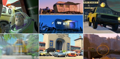
In their latest film Up, the Pixar team continues their tradition of including a healthy dose of easter eggs throughout the film.   Slashfilm has compiled a list of easter eggs in Up, including the ever-present Pizza Planet truck originally from Toy Story.   The truck in past films, clockwise starting top-left: Toy Story, A Bug’s Life, Monsters Inc., Toy Story 2, Ratatouille, Cars, and Finding Nemo (click for larger version):

pizza planet truck in past films

And here’s the truck in Up:

pizza planet truck in up

AT&T Fail

iphone 3gs

As expected, today Apple announced a new iPhone, one that boasts faster operation and data speeds, a built-in compass, voice activation, a 3-megapixel camera with auto focus, and video recording and editing capabilities.

Since the rumor mill was churning out its speculations, I speculated on whether or not I would pony up the cash for a new model even though I purchased myPhone 3G in February.   Based on what I saw on the features list, I’m definitely interested in an upgrade.   For as much as I use the iPhone camera, a better camera with focusing and white balance abilities is a huge plus.   And who doesn’t like a faster device?

But then I heard about the fine print: there is a set of prices for new AT&T customers and a set of prices for existing AT&T iPhone 3G customers.   Those of us already in contracts with the carrier would have to pay $200 more for the particular model of iPhone we would purchase.   The same 16 GB iPhone 3GS that would cost a new customer $199 would cost me $399.

iphone pricing

Any chance of Apple or AT&T getting me to fork over more cash for a new iPhone are nil now.   What percentage of existing iPhone 3G customers does Apple and AT&T expect to pay twice the retail price of the phone to upgrade?   I assume this decision is that of AT&T.   I’m not a business major, but this decision seems like it is slamming the door on a potentially huge stream of additional revenue for both Apple and AT&T if many existing iPhone 3G customers like me are unwilling to pay the doubled price for the new phone.   Instead of forcing us to pay the additional price, which will likely be unlikely for many or most iPhone 3G owners, why not extend our contracts two years from whatever point we are in our contract and allow us to pay the normal price for the phone?   We’re still locked into a contract, but now the contract is even longer, so that’s additional monthly revenue for AT&T, no?

I imagine there will be a significant amount of pushback from iPhone 3G owners.   As a result, perhaps this policy will fall.

Furthermore, what’s with AT&T not offering MMS (multimedia messaging) until late summer and no date for tethering ability?

Those small digs at AT&T from Apple today during the keynote were well deserved.   What a spectacular fail for AT&T today.

Soundtrack Review: Up

up logo

Michael Giacchino is back with his second feature film score of the year, this time composing the score for Disney/Pixar’s latest film Up. Giacchino again soars with his musical accompaniment to the endearing and delightful story of love, loss, companionship, and adventure.

Giacchino’s score for Up marks his third score for a Pixar film, following The Incredibles and Ratatouille. For The Incredibles, Giacchino wrote a super-hero-esque-slash-John-Barry-scoring-James-Bond-sounding score, and for Ratatouille, Giacchino wrote a charming-and-heartfelt-yet-energetic score. Up falls more closely with the mood set in Ratatouille, so if you enjoyed the latter, you’ll likely enjoy the former.

Throughout the score are two prominent themes: Carl’s theme for the Ed-Asner-voiced crotchety old man and Muntz’s theme for the Christopher-Plummer-voiced, old-time explorer/hero character. Carl’s theme is a delightful waltz usually orchestrated very lightly save for a few heroic outbursts. The theme gets generous use in the track “Married Life”:
/swf/audioPlayer2.swf

The theme also gets an energetic rendition in “Memories Can Weigh You Down”:
/swf/audioPlayer2.swf

And an all-out orchestral rendition in “Up with End Credits”:
/swf/audioPlayer2.swf

Muntz’s theme, performed with lyrics in “The Spirit of Adventure,” is, appropriately, more adventurous than Carl’s theme.   The theme:
/swf/audioPlayer2.swf

And the song, which, appropriately, sounds like it was recorded in the 1930s:
/swf/audioPlayer2.swf

In “Walkin’ the House,” we’re given a motif for the adventurers’ walk through the jungle.
/swf/audioPlayer2.swf

The track “Canine Conundrum” is the first to feature the music for Muntz’s dogs. This music is part savage- and Conan-the-Barbarian-sounding, and for some reason is strangely familiar to me. I can’t, though, pinpoint why the music is familiar-sounding; perhaps this is an homage to something else I know?
/swf/audioPlayer2.swf

More comes later in “Seizing the Spirit of Adventure”:
/swf/audioPlayer2.swf

Giacchino supplies listeners with a healthy dose of action material for Up, including “Escape from Muntz Mountain” (with a short muted-trumpet burst of Carl’s theme:
/swf/audioPlayer2.swf

And “The Small Mailman Returns”:
/swf/audioPlayer2.swf

And as is his usual custom, Giacchino treats us to a wonderful end credits suite of the film’s themes and motifs followed by the aforementioned “The Spirit of Adventure.”   Curiously, the track title of the end credits suite follows the naming convention of his two previous Pixar-film scores: melding the title of the film with “credits.”   The end credits track title in The Incredibles was “The Incredits”; in Ratatouille, “End Creditouilles”; and in Up, “Up with End Credits.”   Another naming convention tradition he maintains here is naming a track “<#> <object> Dash.”   In The Incredibles was “100 Mile Dash”; in Ratatouille, “100 Rat Dash”; and in Up, “Three Dog Dash.”   Very nice, Michael, very nice!

Michael Giacchino’s score for Up soars with energy, charm, and fun like his previous Pixar scores. The fun-factor in the music is definitely a reflection of the fun Giacchino must have had composing this decidedly feel-good music. Another terrific score from Michael Giacchino.

4/5

Can’t Resist the Tangy Zip of a Redesign

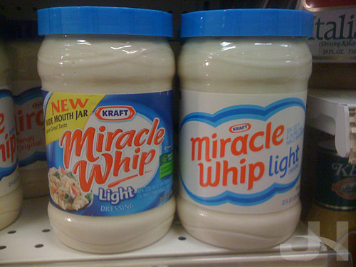
On Brand New last week, I read Kraft is continuing their apparently on-going product redesign campaign (following, so far, Wheat Thins, Toasted Chips, and their shredded cheese line), this time with Miracle Whip.   So while I was at the grocery store, I stopped for a few snaps.   Below, the old logo and packaging on the left, the new on the right:

miracle whip old and new packaging

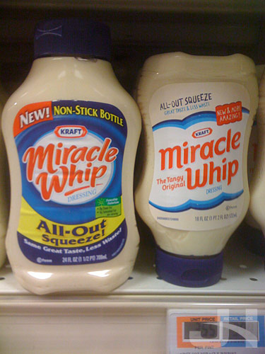
And the squeeze bottles:

miracle whip old and new packaging

Wow, what a transformation.   All the excessive text and over-designed elements have been jettisoned in favor of simpler, clearer designs and messaging.   Compared to the old design, the new Miracle Whip design has an almost retro feel to it, from the lack of crazy swirls and over-scripted word mark to the sparse background and simplified design elements.   But compared to other recent redesigns, this new packaging follows the trend of less-is-more.

Curious, too, is the treatment of the “NEW!” messaging on the new design versus the old design.   The old packaging has a bold and distracting “new” message, whereas the new design has a “new” message that better coheres with the design as a whole.

Several of these redesigns I’ve wrote about here make a great study in American packaging design.   We’ve become accustomed to the over-designed, compete-for-your-attention mess that is much of American packaging design.   Look at the old Baked! packaging as an example, the old Miracle Whip packaging as another, or many other brands at the grocery store.   This type of design is what we’ve come to expect from package design more is more.   Product packaging attempts to fit every possible bit of information and marketing ploy on them.   Marketers, executives, and designers somewhere, though, realized what a mess the American shopping experience has become and decided to change it.   In a packaging world where each package design tried to out-design the competitor, these new, simpler, and clearer designs come along and say, “Yeah, you have seventeen more typefaces and eighty-three more colors and text bursts than I do, but you all look the same.   Here I am ready to quietly stand out.”   And stand out they do compared to the over-designed chaos at the grocery store.

This new Miracle Whip packaging is another successful redesign from the Kraft Foods family.   What Kraft brand is next?

miracle whip new packaging

Balls to the Wall

A manager in my department at work mentioned I was “balls to the wall” this week.   I knew the phrase meant going all-out, full-throttle, etc., but I was curious about the origin of the phrase.   Did the phrase really have something to do with male anatomy as I thought?   Or was my mind thinking on a high-school level?

Turns out the answer is no to the first question.   According to Slate Explainer,

The expression comes from the world of military aviation. In many planes, control sticks are topped with a ball-shaped grip. One such control is the throttle to get maximum power you push it all the way forward, to the front of the cockpit, or firewall (so-called because it prevents an engine fire from reaching the rest of the plane). Another control is the joystick pushing it forward sends a plane into a dive. So, literally pushing the balls to the (fire)wall would put a plane into a maximum-speed dive, and figuratively going balls to the wall is doing something all-out, with maximum effort. The phrase is essentially the aeronautical equivalent of the automotive “pedal to the metal.”

Interesting bit of trivia.   But about the second question, pilots go balls to the wall in the cockpit.   Turns out the answer is yes.

Soundtrack Review: Angels & Demons

angels and demons logo

Ron Howard and Tom Hanks are back in this The Da Vinci Code sequel (even though the novel Angels & Demons was released first), and they again bring along Hans Zimmer and his usual band of goons to provide the score.   Zimmer’s score for The Da Vinci Code was terrific; the score included tension, elegy, brooding gothic chants, and a magical theme for the revelation scene at the end of the film.   For his Angels & Demons score, Zimmer brings all that and more to create a score more enjoyable and better composed than his The Da Vinci Code score.

One’s enjoyment of this score, however, is likely predicated on one’s opinion of the composer.   Zimmer, much like composer James Horner, instantly sparks controversy amongst film score collectors.   Zimmer often is heavy on synth sounds and frequently employs the use of ghostwriters while taking full credit for his scores.   Most of his Angels & Demons score is purely orchestral, but a few tracks employ synth textures that, fortunately, do not detract from the score.   And of course, Zimmer’s happy band of goons (this time it’s Lorne Balfe, Geoff Zanelli, and Atli Örvarsson) assist him here as usual.

The score opens with an exciting and frenetic action-packed choir piece humorously titled “160 BPM,” as in 160 beats per minute, or the tempo of the piece.   A definite highlight of the score, this track serves as a fantastic opening and sets the mood for a great listen.   The track has an almost-dueling quality to it with the different layers of chorus as bells punctuate the action and organ undertones propel the energy.   This music accompanies Robert Langdon’s pursuits around Rome and is thus split-up throughout the film.   Only during the end credits do we hear this extended piece.
/swf/audioPlayer2.swf

Following said explosive opening, the score slows down a bit with “God Particle,” in which we’re treated to a lovely rendition of the “Chevaliers de Sangreal” theme from The Da Vinci Code.   This is the first track to feature violin solos by Joshua Bell, and he doesn’t disappoint (this is the actual musical opening of the film).
/swf/audioPlayer2.swf

In the film, there is a soft, religious-toned choir interlude between the Bell solo and the rest of the track, but sadly this piece is left off the album.   The track continues with a markedly different mood, one of more technical-ish sounding tones and textures but concludes with a haunting piano solo of the “Chevaliers de Sangreal” theme.

Next is another highlight of the score, the nine-minute track “Air” that accompanies the second Illuminati killing to great effect (nerd alert: there’s a close-up shot of a car headlight in the film, and when the headlight turns on, a sudden and forceful burst of choir fills the theater with masterful visual and aural effect).   Part brooding, part propulsive, part haunting, this track returns to the excitement that began with the opening track and features some familiar-sounding material from The Da Vinci Code.
/swf/audioPlayer2.swf

“Air” is followed up with “Fire,” another solid track.   Two great additions here are the choir and the tolling church bells that chillingly break the silence throughout the brooding and action.
/swf/audioPlayer2.swf

“Black Smoke” gives us some more action with some synth layers.
/swf/audioPlayer2.swf

We then get to another highlight, “Science and Religion.”   This over-twelve-minute piece features gorgeous religious-esque choir and is nothing like the mood of the preceding tracks.   The music features Joshua Bell again to terrific effect as he accompanies the camerlengo’s flight and aftermath.
/swf/audioPlayer2.swf

In “Immolation,” the mood becomes frighteningly dark with this brooding piece…
/swf/audioPlayer2.swf

…but in the penultimate track, “Election by Adoration,” the mood lightens up, and we hear another motif from The Da Vinci Code score, again performed by Bell.
/swf/audioPlayer2.swf

Finally, in the ultimate track, “503,” we get the “Chevaliers de Sangreal” theme unleashed to beauteous heights not achieved elsewhere on the album.   This track is extremely gratifying yet blisteringly disappointing.   Joshua Bell returns with a dazzling violin solo, and the magic captured in “Chevaliers de Sangreal” is back, but the track is frustratingly short.   Part of the magic of “Chevaliers de Sangreal” was the extended build-up to the climax of the piece, but with the brevity of “503” and the quicker tempo, some of that magic is lost.   Still, though, if you appreciate a) the theme and b) Bell’s gorgeous performance, you’ll have this track on repeat.
/swf/audioPlayer2.swf

“503” isn’t the only thing that is frustratingly short.   If you enjoy this score as much as I did and do, you’ll want more.   While we aren’t likely to get any kind of officially-sanctioned expanded score, we have as a consolation prize a downloadable-track titled “H20.”   This track fits nicely after “Fire” and has a very trying, strained performance of the “Chevaliers de Sangreal” theme.   Even though the track only adds just under two minutes to the score, the track is a nice addition if you’re looking for more music.
/swf/audioPlayer2.swf

More music aside, with Angels & Demons, Hans Zimmer proves once again how good he really can be when he tries.   All the magic and heights he achieved with his The Da Vinci Code score are matched and surpassed with his Angels & Demons score.   For Zimmer-detractors, this score isn’t worth much, but for Zimmer-enthusiasts, those who enjoyed The Da Vinci Code score, or those who appreciate orchestral music of the dark-and-brooding-yet-action-packed-and-divine variety, you’ll enjoy Hans Zimmer’s part-angelic and part-demonic Angels & Demons score.

4.5/5

(P.S.: back on 15 May I mentioned I had listened to “503” 42 times.   Well, that number is now at 97!)

You’ve Got a Friend in 2010

The good thing about a private movie screening is no previews, but the bad thing is no previews, so I missed out on seeing this teaser trailer attached to Up:

http://www.youtube.com/watch?v=VXJEDUainX4

In Toy Story 3, all the original cast returns, sans Slinky Dog’s Jim Varney who died.

Also due out next year is the latest installment of Shrek: Shrek Forever After.   Again, all the original cast returns, which is great for continuity as well as hearing those characters again that we have grown fond of.   An interesting addition in Shrek Forever After, though, is the voice of Rumpelstiltskin: Paul McCartney.   As with the previous Shrek films, I’m looking forward to some heartly laughs.

Disney/Pixar Soar Again with Up

I saw Disney/Pixar’s latest film Up tonight at a private screening for ESPN employees.   A few notes:

Pixar once again proved what a powerhouse they are in film making.   Not only does Up prove their superior animation and technical abilities, Up proves again their superior (and more important) story-telling abilities.   Watching these characters, you can’t help but feel their emotional struggles throughout the film.   The story is one of humor, sadness, joyousness, and overall feelgood-ness.   I never thought I would root for a crotchety old man.   Like past Pixar films, Up appeals to both little kids and big kids.   No matter your age, you will be touched by this film.

“Finger Painting”

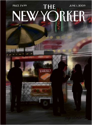
The latest cover for The New Yorker magazine wasn’t designed in Photoshop, and it wasn’t created with paper and drawing materials; it was created with an iPhone.   Jorge Colombo used the app Brushes to create the cover:

new yorker cover

Said Colombo:

I got a phone in the beginning of February, and I immediately got the program so I could entertain myself.

Thanks for entertaining the rest of us, too.   The best part, though, is that the app records your brushstrokes.   Watch Colombo create the cover:

http://c.brightcove.com/services/viewer/federated_f8/1827871374

(Nod: TUAW)

“Cavs Win!”

Local Cleveland newscast WEWS makes it on SportsCenter.   Classic:

NBA Mock Draft With ESPN’s Magic Box

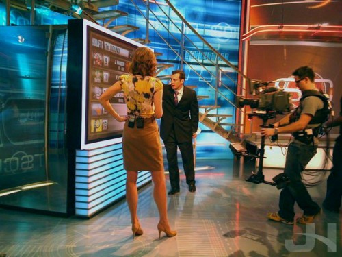
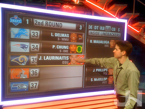
I was on-hand yesterday to observe Doug Gottlieb making his NBA Draft predictions on SportsCenter using the Perceptive Pixel box.   This graphic is a modified version of the graphic I developed for the NFL Draft.

doug gottlieb with the perceptive pixel box

Here’s the video of his top seven picks (don’t mind the small technical difficulty I fixed it in time for the next segment):

http://www.youtube.com/watch?v=alYFDma97YY

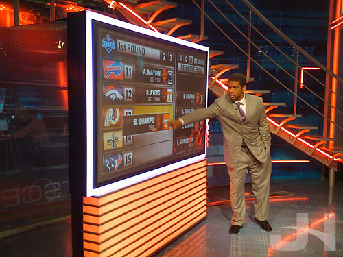
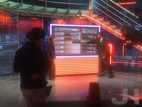
Speaking of the NFL Draft, I snapped some photos during the NFL Draft with Michael Smith using the Perceptive Pixel box, but I never posted them.   Well, here they are:

michael smith with the perceptive pixel box

michael smith with the perceptive pixel box

michael smith with the perceptive pixel box

And here’s one of me with my project:

me with the perceptive pixel box

To Boldly Go

space shuttle atlantis

Alan Taylor at Boston.com posted some great photos of the Space Shuttle Atlantis launch and the crew’s Hubble Space Telescope repair mission.

(Nod: Ed)

Tales from myPhone, Episode 3

flags at espn

On the Bristol ESPN campus, there’s a flagpole outside the cafe that normally flies a red ESPN flag.   On certain occasions, the pole flies a special flag; for instance, when Disney President Bob Iger recently visited, a Disney flag flew.   Well, for an unknown reason today, four alphabet signal flags were flying.   I assumed they spelled out ESPN, but I had to verify.   Enter myPhone and the app Wikipanion, a mobile-formatted version of The Wiki.   From the international maritime signal flags page, I confirmed the flags spelled ESPN.   Not sure why, though.   I don’t think Captain Jack Sparrow was sailing with the Black Pearl through Bristol today.

Birthday Road Trip: Mystic & Stonington, CT

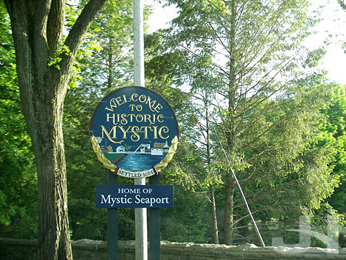
For my birthday, I took a road trip to my two favorite places in Connecticut: Mystic and Stonington.   I wanted to get dinner in Mystic and catch the sunset on my beach in Stonington.

mystic, ct

The restaurant in downtown Mystic I ate at:

mystic, ct

I had penne pasta with grilled chicken, Italian sausage, and brocolini in a garlic butter sauce.   Delicious!

mystic, ct

View up the river from the drawbridge:

mystic, ct

Sunset in Stonington:

stonington, ct

For several days, I was looking forward to a sunset on the coast:

stonington, ct

The last little bit of sun:

stonington, ct

All gone:

stonington, ct

Back in Mystic:

mystic, ct

…as darkness falls across the land:

mystic, ct

Until next time!

Angels & Demons & Hans & Joe

I purchased Hans Zimmer’s score for Angels & Demons on Tuesday, and in three days, I’ve managed to listen to “503,” the closing track on the album, 41 42 times. I’d say I like the album. After I’ve seen the film this weekend, I’ll post my thoughts on the score. Stay tuned. :-)

Progressively Bad

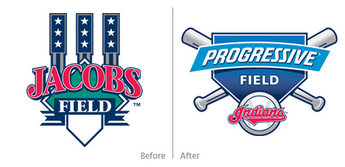
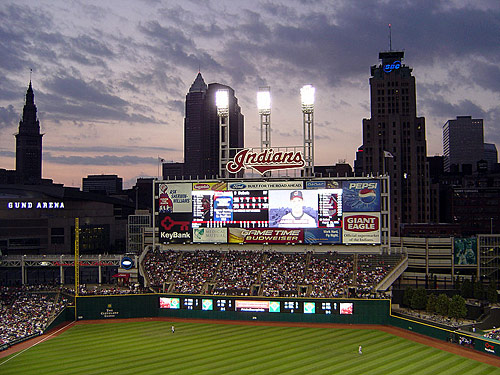
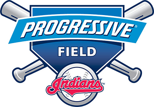
I was poking around Chris Creamer’s excellent website sportslogos.net the other day, and I browsed to the Cleveland Indians page.   For many MLB teams, Chris includes the logo for the team’s stadium if it has one.   Not being in Cleveland and not seeing Indians games on television, I wasn’t aware of the logo for Jacobs Field when it became Progressive Field last year.   Chris Creamer made me aware aware that the Progressive Field logo is an outstanding example of mundane inadequacy and mediocrity.

jacobs field, progressive field logos

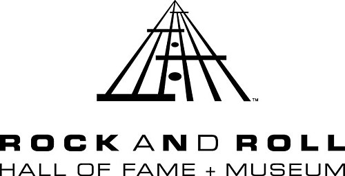
The logo for Jacobs Field does one very important thing: it clearly and uniquely represents the venue.   A unique architectural feature of the stadium is represented in the Jacobs Field logo.   This representation makes the logo a distinctive representation for Jacobs Field and Jacobs Field only.   The Rock & Roll Hall of Fame logo is similar in that it uses the facade of the building as its logo (which simultaneously represents an abstracted musical staff):

rock hall logo

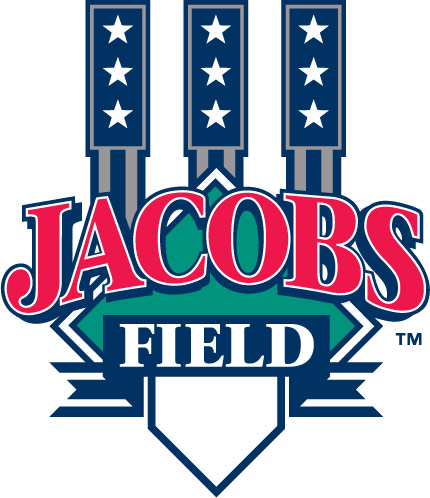
Both the Jacobs Field logo and the Rock Hall logo go beyond a simple graphic representation of their respective structures’ architecture and instead employ an abstraction of some architectural elements.   This abstraction gives both logos a stronger and more creative presence. The Jacobs Field logo:

jacobs field logo

…abstracts the three left-center field scoreboard lights (image from The Wiki):

jacobs field scoreboard

And what does the Progressive Field logo have to offer in terms of unique representation of said venue?   The logo offers as much uniqueness as a seasonal cold offers happiness and cheer.   This logo could be for any baseball field even a local little league field.   Nothing about the Progressive Field logo is unique.   Swap the Indians logo for any other team’s logo, and you have yourself a new logo.

Furthermore, the Progressive Field logo looks like it was designed by a high-school student.   For such a professional use and venue, this logo is beyond amateur. In fact, this logo actually would be a better fit for a local little league field since the logo exudes as much talent and professionalism compared to the Jacobs Field logo as a little league team does compared to a major league team. The gradients are cheap, the strokes excessively heavy, and each element, together and separate, is so uninspired.

progressive field logo

What a disappointment. As if changing the name of the field wasn’t bad enough, we get this mundane work of mediocrity. The logo for the Cleveland Indians stadium has become progressively bad.

Soundtrack Review: Star Trek

star trek logo

Composer Michael Giacchino provided the score for the latest Star Trek film, and he did a terrific job.   On a personal note, seeing Giacchino attached to such a high-profile film pleases me, as I was an early fan upon hearing his score for his first Medal of Honor video game.   I’ve followed his musical career closely as he has developed with additional video game scores, TV scores, and now film scores.   His music has evolved over his several projects in his thus-short career, and when he’s needed, Giacchino doesn’t disappoint and that goes for his latest score, Star Trek.

I concede, though, I was at first slightly disappointed with Giacchino’s Star Trek score.   Prior to purchasing his score, I had been repeatedly listening to James Horner’s fantastic score for Star Trek II: The Wrath of Khan.   Horner’s Trek score is easily one of his best, with its high-octane, seafaring-esque attitude.   Then I listened to Giacchino’s score for the first time, and not having a stirring, captivating main title composition was disappointing.   The main title composition unleashes the main theme and sets the mood for the remainder of the score.   Jerry Goldsmith did this wonderfully with his Star Trek: The Motion Picture score, as did Horner with his Trek 2 score.   Added to the absence of the hit-you-over-the-head main title music in Giacchino’s score on first-listen was that his Trek theme didn’t really get started until track 4, “Hella Bar Talk,” where the theme is in a more muted, reflective mood.   I recall during my first listening thinking, “Where’s the theme?”   But then I arrived at “Enterprising Young Men” where the theme is unleashed in all its glory.   Once I heard the theme in this track, I was satisfied (and hit repeat on this track), and the disappointment of not having a strong main title cue subsided (little did I know at the time that this track doubles as the film’s title music). “Enterprising Young Men”:
/swf/audioPlayer2.swf

Giacchino’s Trek theme is unlike Goldsmith’s and Horner’s, but not in an unfortunate or unsatisfactory way.   Instead of a major-key, brass fanfare, we’re treated to a more introspective-yet-powerful theme, heard as a beautiful horn solo in the first track “Star Trek” and in other renditions and orchestrations throughout the remainder of the score, including the aforementioned “Enterprising Young Men” cue with its exciting brass rendition.   For any listener, the success of this score may depend on whether or not you enjoy his Trek theme because of its generous use throughout the score. “Star Trek”:
/swf/audioPlayer2.swf

Doubling as Kirk’s theme, Giacchino’s Trek theme gets a healthy and musically pleasing workout throughout the score.   In between the various renditions, though, are a full library of other themes, motifs, and set pieces.   Spock gets a theme, which is a light, other-worldly theme performed by what may be an erhu.   Spock’s Theme:
/swf/audioPlayer2.swf

The bad guys get a bad-bad-brass-heavy motif that’s as propulsive as it’s thudding.   Giacchino also ensures his action music is always tight and never boring, with the track “Nero Fiddles, Narada Burns” a standout:
/swf/audioPlayer2.swf

And “Nero Death Experience”:
/swf/audioPlayer2.swf

What I find most impressive about the album is the “End Credits” track, where Giacchino assembles a nine-minute montage of the film’s themes and motifs mixed with an exciting rendition of the Alexander Courage Star Trek theme:
/swf/audioPlayer2.swf

Modern film scores and films have lost the art of creating a separate and original composition for the end credits.   Most films these days simply mix preexisting cues together to form an end credits suite.   Gone are the days of John Williams’s Star Wars scores where he exceptionally weaved together his themes in custom-composed end-credit compositions.   Giacchino has thankfully brought this practice back, not only with his Star Trek end credits composition, but with compositions for the end credits of The Incredibles and Ratatouille.   In addition, the Star Trek “End Credits” track features an awesome few seconds that use Courage’s Trek theme as counterpoint to Giacchino’s Trek theme:
/swf/audioPlayer2.swf

What I find least impressive about the album is the length: about 44 minutes.   The film is just over two hours, so clearly there is missing music, including the exciting fight scene on the drill platform and the terrific musical moment with the USS Enterprise rising above the clouds on Titan.   I have no doubt an expanded album is up someone’s sleeve somewhere.   And I’ll be happy to purchase it.

With his Star Trek score, Giacchino finally finding his own musical voice is evident.   In a handful of cues on the album, a few seconds of the music sound like it could either be from one of his Lost or Medal of Honor scores.   This doesn’t mean he is merely copying himself, but rather he has developed specific musical styles and textures.   Hearing these textures in multiple scores signifies Giacchino’s personal development as a composer in his own right.   In many of his earlier scores, though, he sounded like another composer: John Williams in the original Medal of Honor score, John Barry in The Incredibles, Ron Goodwin in Secret Weapons Over Normandy, etc.   Not until his later Medal of Honor scores and his work for Lost did Michael Giacchino start wholeheartedly sounding like Michael Giacchino and not another composer (both situations are a testament to his skills: on one hand the ability to incorporate other composers’ sounds; on the other his development as his own composer).

Michael Giacchino’s Star Trek score is Michael Giacchino’s Star Trek score and no other composer’s.   As a result, I can see diehard fans of the Star Trek scores of past, particularly Goldsmith’s The Motion Picture and Horner’s The Wrath of Khan scores, being disappointed with this score.   Giacchino’s score, though, aptly fits this more character-driven film.   Giacchino has created his own world of Star Trek music, a world I am delighted to boldly go through with each repeated listen.   Bravo, Michael!

4.5/5

iMat

For the iPhone enthusiasts, an iPhone doormat:

unlock_mat

Can this mat really unlock your door?   Perhaps there’s an app for that.

This mat will go along with your other Apple novelties.

(Nod: Just Another iPhone Blog)

More Angels & Demons & Hans!

An extended preview of the upcoming film Angels & Demons featuring music by Hans Zimmer with violin solos by Joshua Bell.   The soundtrack is released on Tuesday!

http://movies.apple.com/movies/sony_pictures/angelsanddemons/angelsanddemons-video_h.480.mov

(Nod: Cinemusic)

Serena Serves HP Coolness

This isn’t new, but here’s an awesome HP ad designed by Stardust featuring Serena Williams:

(Nod: Bella)

Road Trip: Mystic & Stonington, CT

While my mom and grandma were visiting, in addition to road-tripping to Newport, Rhode Island, we road-tripped to Mystic and neighboring Stonington, Connecticut.   Of the several places I’ve visited in CT, Mystic and Stonington are by far my favorite.   Mystic is more of a tourist-focused-yet-charming-and-enjoyable town, and Stonington is a quiet-little-delightful coastal town.

Downtown Mystic:

mystic, ct

View across the Mystic River:

mystic, ct

mystic, ct

A tree in bloom:

mystic, ct

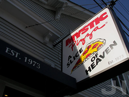
And you can’t stop in Mystic without getting some yummy pizza:

mystic, ct

After Mystic, we made our way to a beach in Stonington.   Driving through Stonington:

stonington, ct

At the beach, this seagull was enjoying some dinner:

stonington, ct

Waiting for the sunset:

stonington, ct

Coastal wildlife:

stonington, ct

Ahh, salty sea breeze and a pleasant sunset.   Terrific!

stonington, ct

After watching the sunset, we made our way back to Mystic.   A quaint little house in Stonington:

stonington, ct

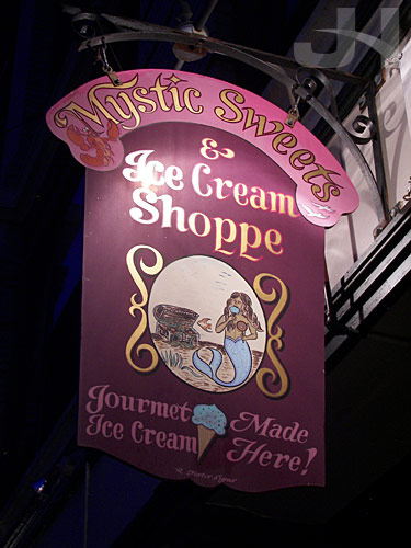
Back in Mystic, we grabbed some ice cream and enjoyed it along the river.   Splendid trip!   Can’t wait to go back!

mystic, ct

The Flavia Water Cooler

Last month after I wrote about the Flavia coffee redesign, I received an email from a representative of Mars Drinks commenting on my post. The representative also sent me some marketing information about a study they conducted “on the affect of Flavia on workplace productivity.” A couple points in the study jumped out at me. The first (reprinted with permission):

Workers Who Have FLAVIA Feel More Valued: when FLAVIA was added to the workplace, 50% of respondents said it made them feel more valued and appreciated.

I don’t drink coffee, but I find this statement accurate. When I worked at Kodak, the coffee drinkers had to pool their money together to buy their own office coffee because Kodak did not provide coffee. At ESPN, though, we are provided with complimentary coffee and tea, and even though I don’t drink the coffee, having my employer provide this seemingly small amenity does indeed make me feel more valued and appreciated.

Even more, though, I agree with this statement from the study:

FLAVIA: The New Watercooler: The FLAVIA machine has become the new face-to-face touch point in the office, with 54% of respondents saying that FLAVIA had a positive impact on how often they interacted with their colleagues.

I can’t count the number of times that coworkers and I met in the break room at the Flavia machine to talk either business or pleasure while they were making coffee. Either we deliberately say let’s go take a walk, which means let’s go get a coffee (or water for me), or I run into coworkers in the break room because they’re getting their coffee fix, but the break room and the Flavia machine in our office indeed is a casual and oft-used gathering place for us.

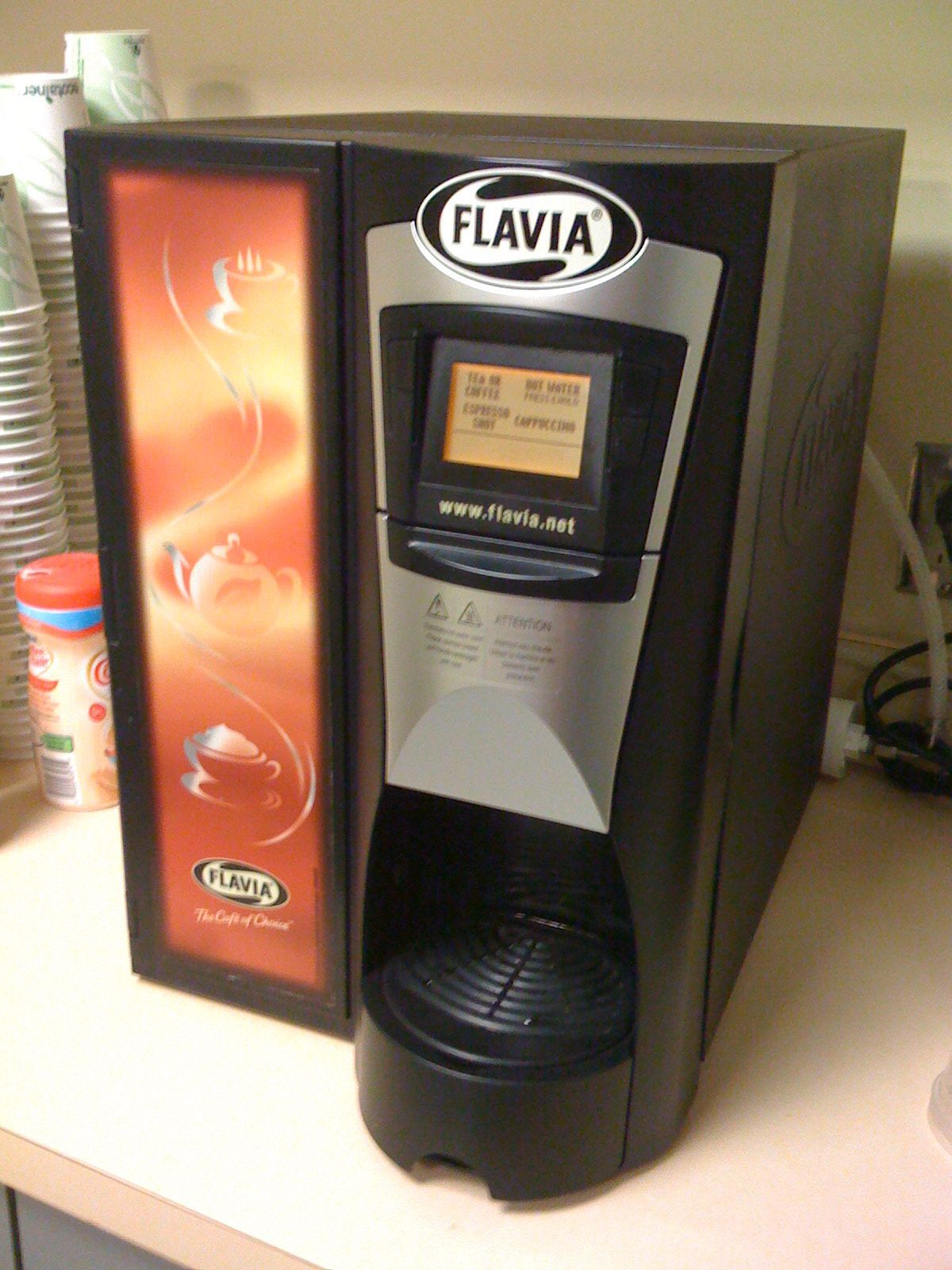
And here it is, our Flavia machine:

flavia machine

Obama’s First 100 Days

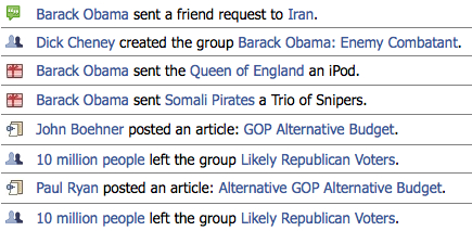
…according to Facebook.   Christopher Beam and Chris Wilson at Slate imagine President Obama’s Facebook news feed for his first 100 days.   Terrific.

obama_facebook

(Nod: The Daily Dish)

Road Trip: Newport, RI

In keeping up with my goal to take a road trip every month in conjunction with my mom and grandma visiting, I ventured to Newport, RI last week.   I only wish we had more time there because a) I love coastal towns and b) Newport is a beautiful place.   I’ll just have to go back!   Here are some snaps from Newport.

Crossing the Narragansett Bay via the Pell Bridge:

newport, ri

I imagine summer buzzes with nautical activity:

newport, ri

Streets of Newport:

newport, ri

Across the bay:

newport, ri

I discovered my shoes aren’t waterproof:

newport, ri

Coastal wildlife:

newport, ri

Catching the sunset:

newport, ri