One thing I love to do with my Mac is change the icons from the folder icons to the device icons to the application icons. I especially love when I can update my icons with a unified look.
This week, icon powerhouse The Iconfactory released a new, massive set of free iPhone-inspired icons and extras designed by Louie Mantia and David Lanham. The icons are outstanding and look great on my Mac, giving my system icons and my application icons a terrific, unified look. Here are a few of my favorites:
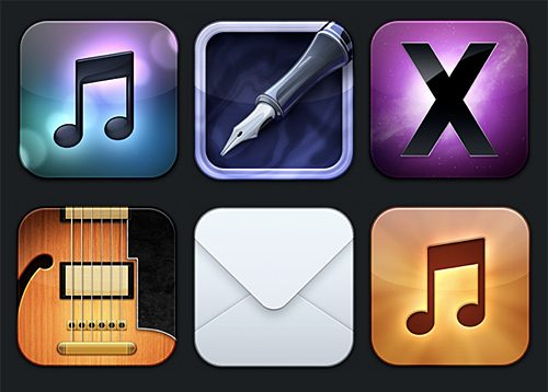 In the top row are the icons for iTunes, Pages, and the system folder; in the bottom row are the icons for GarageBand, Mail, and the music folder.
- the iTunes icon uses the familiar double eighth note of the default iTunes icon and places it over a beautiful, blurred gradient that evokes the light effect from a CD
- the Pages icon uses a fountain pen similar to the default Pages icon, and the background of this icon evokes an ink well complete with ripple-effect
- the system folder icon uses the branding of Mac OS X Snow Leopard
- the GarageBand icon is a lovely cropping of a guitar similar to the default guitar icon
- the Mail icon is a stunningly simple crop of an envelope; and
- the music folder icon is a fiery update of the iPod touch music icon
Just as the default Snow Leopard icons are painstakingly created with amazing detail, so too are the Flurry icons. Again, the iTunes icon:

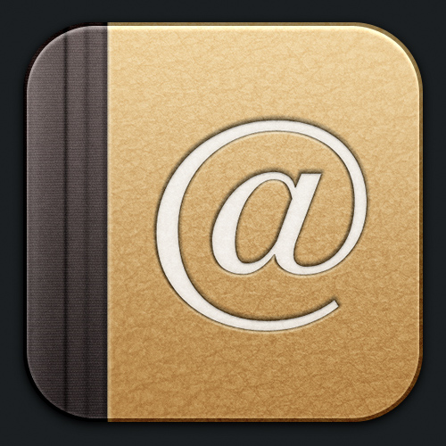
Address Book icon:
Pages icon:
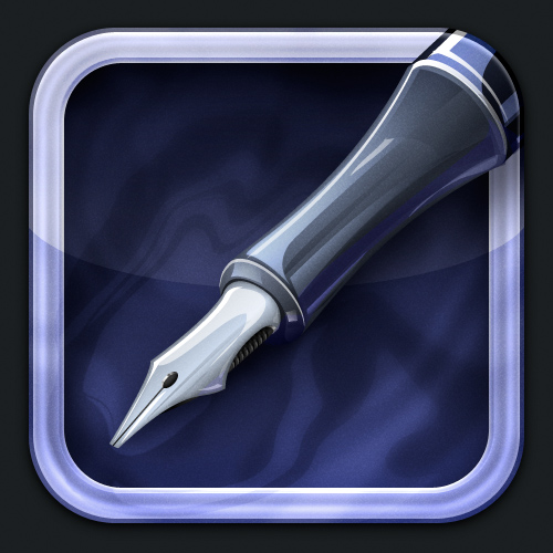
Public folder icon:

Music folder icon:

Trash icon:

GarageBand icon:

System folder icon:
They even managed to make a System Preferences icon that is better than the iPhone Settings icon:
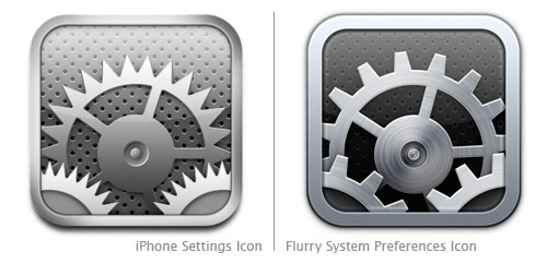
Overall, the Flurry icon set is outstanding. Well done, Louie Mantia and David Lanham!
This commercial debuted last week and is easily one of the funniest, most intelligent “This Is SportsCenter” commercials yet:
http://www.youtube.com/watch?v=z4x6jtK8BW8I probably wouldn’t have appreciated it as much had I not recently road-tripped to Boston and been at the Old North Church.
This isn’t new, but I think it’s brilliant. Jonathan Jarvis is responsible for this tremendous motion graphics information graphic titled “The Crisis of Credit” in which he explains the underlying reasons for the credit crisis with simple, slick, and stunning visuals and animations. He writes:
The goal of giving form to a complex situation like the credit crisis is to quickly supply the essence of the situation to those unfamiliar and uninitiated. This project was completed as part of my thesis work in the Media Design Program, a graduate studio at the Art Center College of Design in Pasadena, California.
“The Short and Simple Story of the Credit Crisis”:
Here’s another fantastic motion graphics piece by Jarvis:
The New Mediators is a design practice that helps to clarify complicated situations. By designing graphic language systems that function across print, video, interactive and performance formats, it proposes a new role for designers and a new approach to transparency in an increasingly complex world.
New Mediators are practitioners who combine methods from design, journalism, and narrative analysis. The result is designed transparency information that is not only made available, but accessible, relevant and beautiful.
This introductory animation attempts the method advocated by the New Mediators to explain the project itself.
The New Mediators:
A very slick motion graphics piece by Fairly Painless Advertising and Imaginary Forces for careers at Herman Miller:
(Nod: Motionographer)
A nice illustration/animation piece with an interesting message (check the subtitles):
(Nod: Motionographer)
The New York Times last week released an awesome, and I do mean awesome, interactive graph of how people spend their day. You can break-down the graph by group (e.g. men, women, age, etc.) and isolate specific activities (e.g. work, sleep, computer use, etc.). I learned that at 11:10pm, 1% of Americans are using their computer and 66% are sleeping. I’m about to join the latter.
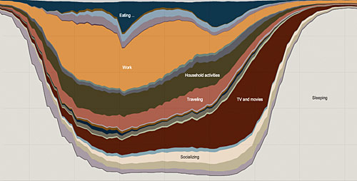
(Nod: Lifehacker)
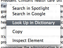
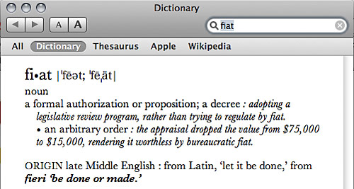
I learned something new about my Mac tonight. While I was reading an article online, I wanted a quick way to look up the meaning of “fiat.” I knew that in Safari, if you highlight a word and right-click, an option in the resulting menu allows you to look that work up in the native dictionary app:
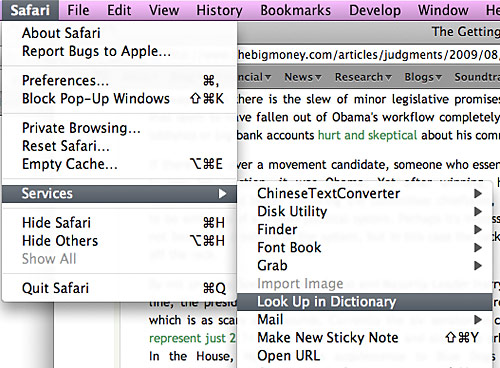
Also, with a highlighted word in Safari, you can choose Safari > Services> Look Up in Dictionary:
But I’m using Firefox, and in Firefox, neither of these options are available. I learned by experimenting, though, that I could highlight a word and then drag it to the dictionary app icon in my dock. The dictionary opens up and reveals the definition of my word. I love finding little usability gems. Put this one on the list.
I was first introduced to someecards a couple years ago by a friend in grad school (thanks Gloo!), but I was recently reminded of them by a CNN article highlighting funny-haha websites. Someecards are like your normal ecards, but the sayings on their ecards are part-funny and part-biting-satire with a healthy dose of inappropriateness thrown in and an occasional sprinkle of political wit.
From their website:
Someecards.com is possibly to probably the best site on the Web for free, funny ecards. We have greeting cards for every occasion-from important to utterly pointless. Send greetings for apology, birthday, baby, breakup, congratulations, encouragement, farewell, flirting, friendship, get well, sympathy, thanks, thinking of you, wedding, workplace, and holidays like Mother’s Day, Father’s Day, Valentine’s Day, Thanksgiving, and Christmas. We suggest you e-mail them to friends, family, coworkers, loved ones, liked ones, and anyone else with fingers.
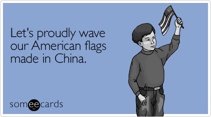
This one from Independence Day:
This one from around Michael Jackson’s, Farrah Fawcet’s, and Ed McMahon’s death (not to mention the world events the ecard speaks of):

This one is a popular birthday ecard:

This one a popular workplace ecard:

This one from last year’s presidential election:

This one from a recent Appalachian Trail hiking trip:

And finally this one about Obama:

Also check out Western Spaghetti by the same artist.
JibJab does their first Obama video. Cue the hilarity:
http://aka.zero.jibjab.com/client/zero/ClientZero_EmbedViewer.swf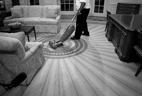
If you didn’t get a chance last week to watch NBC’s Brian Williams’s two-part special going inside the Obama White House, you can catch the video online via MSNBC here. Also while you’re there, be sure to check out the awesome interactive tour of the White House.
(Photo: Antoine Sanfuentes / NBC News)
The latest cover for The New Yorker magazine wasn’t designed in Photoshop, and it wasn’t created with paper and drawing materials; it was created with an iPhone. Jorge Colombo used the app Brushes to create the cover:
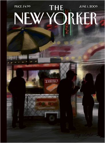
I got a phone in the beginning of February, and I immediately got the program so I could entertain myself.
Thanks for entertaining the rest of us, too. The best part, though, is that the app records your brushstrokes. Watch Colombo create the cover:
http://c.brightcove.com/services/viewer/federated_f8/1827871374(Nod: TUAW)
This isn’t new, but here’s an awesome HP ad designed by Stardust featuring Serena Williams:
(Nod: Bella)
…according to Facebook. Christopher Beam and Chris Wilson at Slate imagine President Obama’s Facebook news feed for his first 100 days. Terrific.
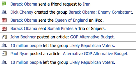
(Nod: The Daily Dish)
Last night while poking around Facebook, I discovered the Pirate language setting. Yo ho ho.
The language page in U.S. English:
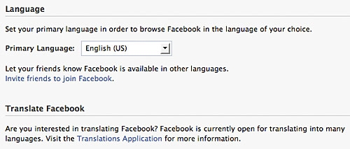
And in Pirate English:
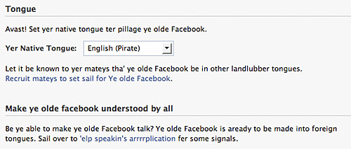
The normal menu:
![]()
The pirate menu:
![]()
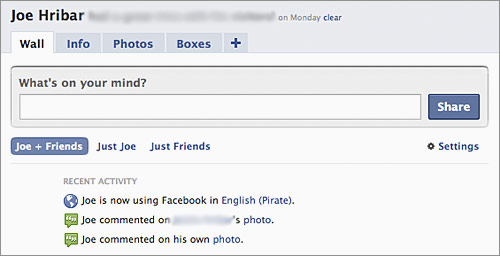
My normal profile:
My pirate profile:
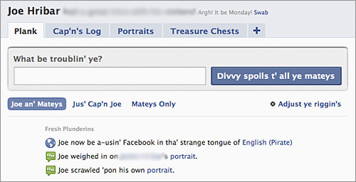
Kudos to whomever translated Facebook to pirate. Amazing! Drink up me hearties!
Browsing The Internets in the age of pop-up ads was massively annoying. Now that most ads get blocked and website advertisers know this, they, with the help of the websites they target, have moved their ads to the web pages, often cluttering page content and causing annoyances and distractions with their animated advertisements as they fight for your visual attention. Enter Adblock Plus.
Adblock Plus is an extension for Firefox that does essentially what pop-up blockers do it blocks ads. But instead of blocking external page ads, Adblock Plus blocks embedded page ads.
Once activated and your country chosen, Adblock Plus claims to block 99% of ads on every website you browse. You can, however, chose to disable the blocker for a specific page or domain (other than webmaster testing purposes, not sure why you’d want to).
I installed Adblock Plus today, and I’m already amazed at the results. You know those ads on Facebook?
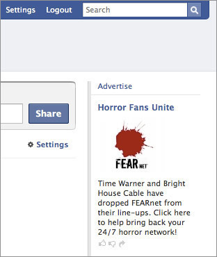
Adblock removes them:

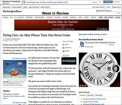
The New York Times with ads:
And without ads:

Dictionary.com:
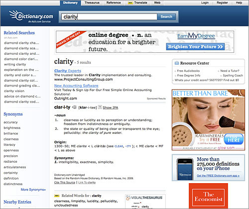
No more ads!:
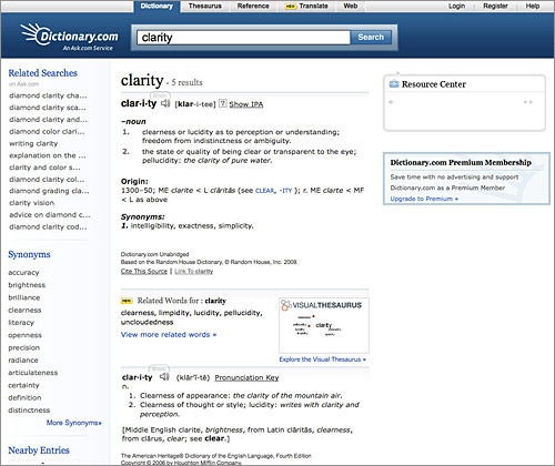
Adblock Plus changes web-browsing experiences and allows actual page content to be seen and focused on. Definitely a must-have Firefox extension!
(Nod: Lifehacker)
If you’ve spent any time driving on America’s Interstate System, you’re no doubt accustomed to the system of signs informing you of upcoming exits, mileage distances, speed limits, local services, etc. Until this decade, these signs have used a typeface in the Federal Highway Administration’s (FHWA) sanctioned series of fonts. The typeface, referred to as Highway Gothic, was developed in the 1940s and today is still used on the vast majority of road signs.
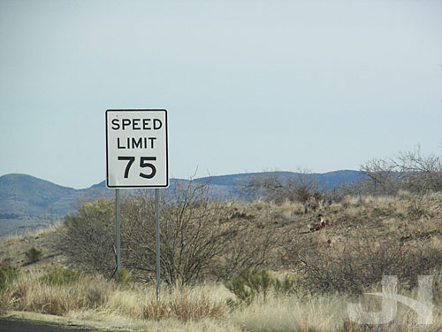
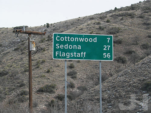
In 2004, the FHWA approved the use of Clearview, a new typeface to eventually replace Highway Gothic on road signs across the country. This isn’t new news, but my recent trip to Arizona reminded me of the typeface switch.
Clearview was developed as a custom typeface by Don Meeker, an environmental graphic designer, and James Montalbano, a type designer. Joshua Yaffa at The New York Times wrote a must-read piece (if you’re a type, design, or sign buff) about the typeface and its development.
Much of the signage that uses Highway Gothic is in all-caps, which renders text harder to read, especially at 65+ miles per hour. In addition, the counter-spaces (the hole in the ‘e’ or ‘a’) are small and make the letters harder to read. At night, the reflectivity of the signs often cause the letters to blur past recognition for some drivers when head lights shine on the signs.
Clearview aims to change all that with larger counters, larger x-heights, and mixed-case words.
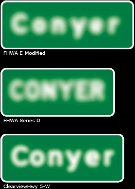
Example of halation (over-glow of reflected sign) with mixed-case Highway Gothic, upper-case Highway Gothic, and mixed-case Clearview (image from Clearview site):
The development team recommends Clearview be adopted for all signage, not just guide signs. Examples of suggested signage modifications, Highway Gothic on the left, Clearview on the right (images from Clearview site):
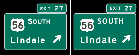
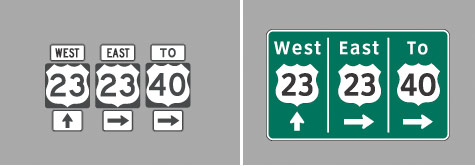

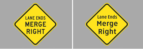
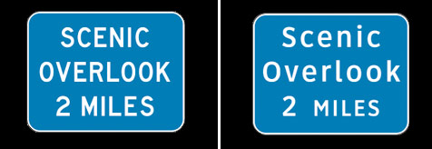
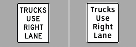
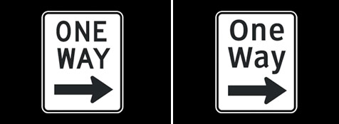
Seeing the two typefaces compared, I don’t think there is a comparison. The clarity achieved with Clearview is astounding, and Clearview even manages to be a little more friendly at the same time (which when you’re a lost motorist looking to find your way, that friendliness might not be such a bad thing).
I mentioned earlier I was reminded of the switch to Clearview during my recent trip to Arizona. On the intersections with traffic lights, the city of Phoenix has installed large, easy-to-see-and-read back-lit street signs above the road. The typeface they use? Clearview:
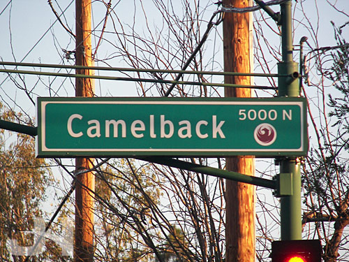
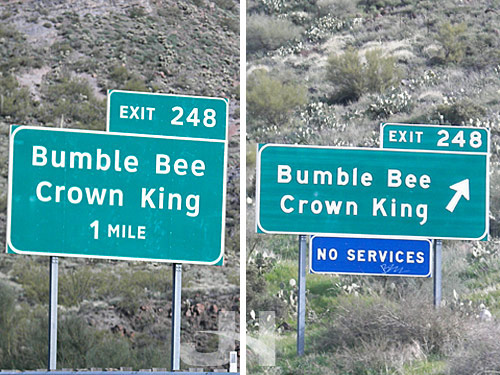
Arizona has a good deal of newer highway and road construction projects, and in many cases, the signs use Clearview.
Comparison shot: new Clearview sign on the left, older Highway Gothic sign on the right:
Here in Connecticut, we’re still using Highway Gothic, but I eagerly await the arrival of signs of clear viewing.
Yes, that’s right, I wrote that.
So maybe their operating system sucks. And their browser, well, yeah, there are no words. But they are still capable of developing good and interesting ideas. Working with animation studio Oh, Hello, Microsoft gives us their vision of the future. And I like it. A lot. The interface designs are strikingly simple, the animations sleek and smooth, and the touch-based interactions fantastically envious.
Watch the video here at Oh, Hello.
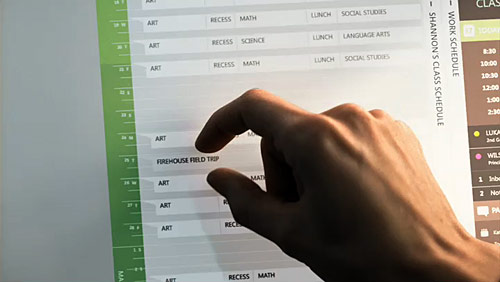
(Found on Motionographer. Nod: Jeremy)
I’m late in commenting on this, but last month, SportsCenter on ESPN launched a new touchscreen graphic on their in-studio Perceptive Pixel touchscreen. While they have been using their touchscreen since sometime in December, most notably with a telestrator graphic, this NFL Draft graphic marks their first appropriate (and cool) use of the technology. I imagine we’ll be seeing more of this as the draft approaches.
16 February:
http://espn.go.com/broadband/player.swf?mediaId=391085711 March:
http://espn.go.com/broadband/player.swf?mediaId=3970534Using the same design and animation concepts from their New Year’s commercial, Pepsi launched a new commercial to coincide with the presidential inauguration Tuesday:
http://www.youtube.com/watch?v=zraEXjaBp68Via The Daily Dish, a cool website from Big Spaceship featuring some great creativity and animation in Flash preloaders: Pretty Loaded.
(Nod: The Daily Dish)
