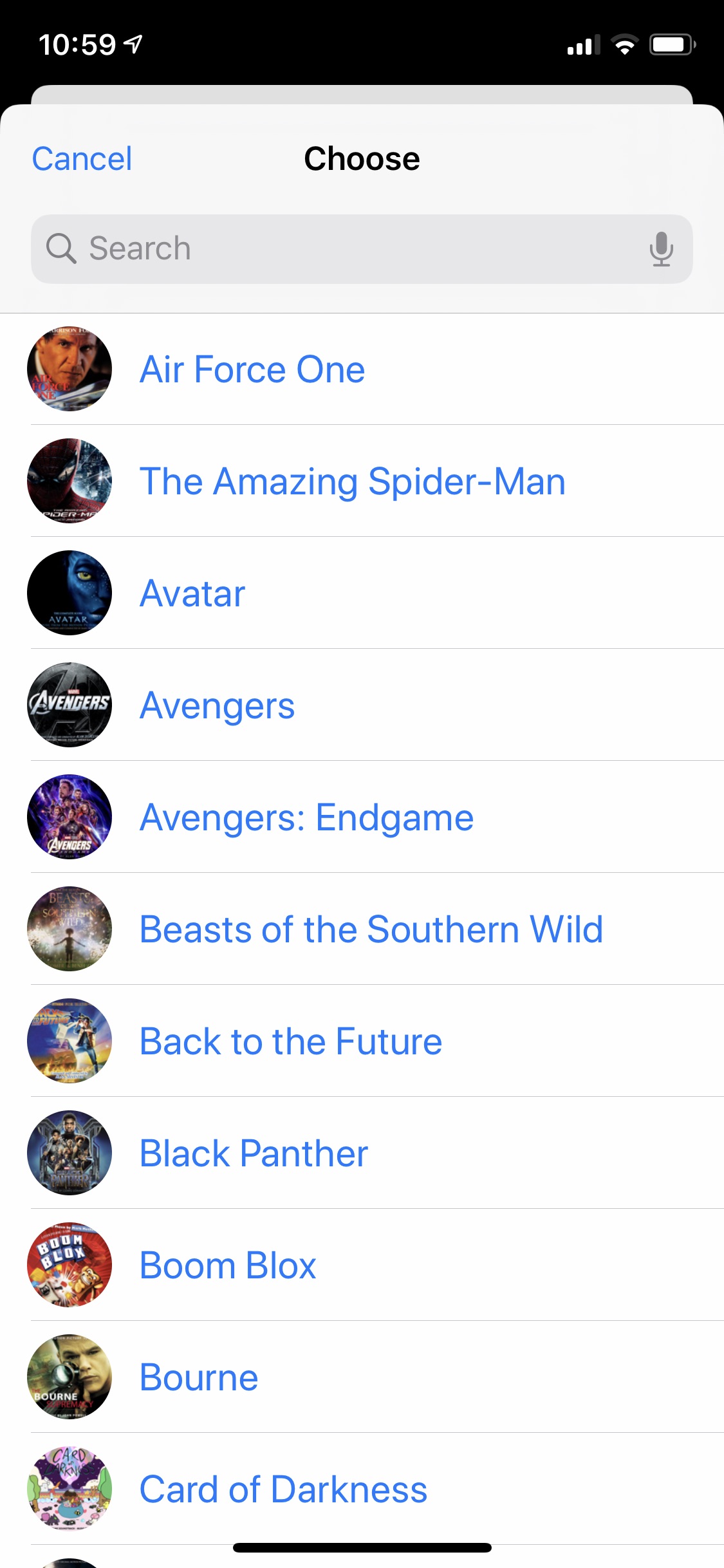
I haven’t posted about my iPhone Home screen since last December because not much had changed since then. My arrangement is pretty similar, and the apps on it are nearly all the same.
After listening to the Thanksgiving episode of Connected where Federico Viticci, Myke Hurley, and Stephen Hackett mentioned some apps they were thankful for, I thought about doing the same with some utility apps I use frequently but aren’t prominently displayed on my Home screen. Then I decided to do that plus a Home screen post. And then I started experimenting with having launchers from Shortcuts app on my Home screen. So this post will cover all those things!
My Home Screen
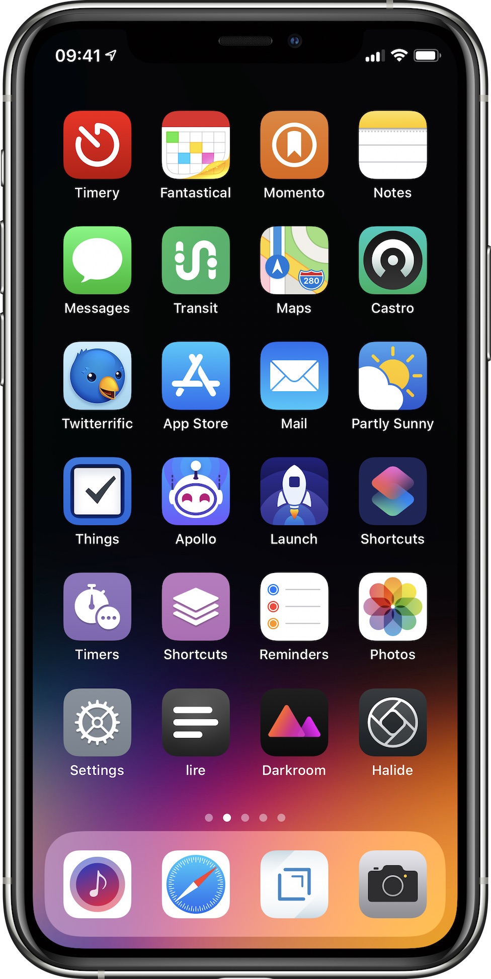
Here’s my Home screen as of December 2019. A while back I was inspired by the iOS Setups subreddit to arrange my apps by color, and I’ve stuck with it. I tried earlier this year going back to an arrangement where similar types of apps were grouped together, but I quickly reverted because color order is much more visually pleasing to me. So here it is (select to view a larger version):
These are the apps I use the most or I want easy access to. My wallpaper is “gradient special edition 1” by AR72014. I like how the icons pop against the black background, but I like the color emanating from the dock. Below are a few notes on why I use these apps and what I like about them.

Timery
I use Toggl to track my time on various things. Originally, I used various Workflow workflows to interface with the Toggl API, but I eventually outgrew them, so I made Timery and released it earlier this year. It started as an app for me, but I’m so pleased to hear how it’s helped so many others besides me, and I continue to be blown away by the response to it. From starting favorite timers with one tap to managing time entries, projects, and tags to using Siri and Shortcuts to automate tasks, my goal was to make time tracking with Toggl easy.
Fantastical
I don’t usually have many calendar entries, but when I need to add one, I enjoy Fantastical’s, well, fantastic natural-language parsing. And I like seeing both my calendar events and my reminders in the same view.

Momento
This is a journaling app that collects manual thoughts and media and also automatically imports tweets, Instagram and Facebook posts, and other social-media feeds. I’ve been using Momento for almost ten years now, and looking back at memories and what I was doing, thinking, and even tweeting years ago is something special.
Notes
I don’t do a whole lot of writing, so Notes is good enough for me. I appreciate my notes being available on all my devices and the easy sharing of notes if I ever need to.

Transit
Despite living in the sadly car-centric Los Angeles, I regularly use the public transportation system, and I use Transit to help me navigate. Many public transit lines run infrequently or have earlier-than-ideal-end-of-service times, and Transit has some key features to help with that: its active-trip mode lets me know when to get off, whether or not I’ll make a connection, and what my ETA is so I can plan accordingly if necessary.
Maps
Since I rarely drive, I mostly use Maps to look up points of interest and for checking traffic on major streets to help plan which public transit routes to take. But on those rare occasions I do drive, I appreciate the lane guidance and speed-limit icons as well as the turn-by-turn haptic feedback that I get on my Apple Watch. Also, I really dig the iOS 13 dark mode map.

Castro
I’ve been using this as my podcast app for a while now. One thing in particular I appreciate is in the chapter list for episodes, I can tap the chapters to jump around as well as deselect them to skip certain chapters (especially useful to queue up what I’m listening to before I go for a run).

Twitterrific
I started using Twitterrific as an experiment a while ago, and it stuck. Some of the things I like about it: muffling people or things (unlike muting, which can be done too, I can still see a muffled person tweeted or a muffled thing was tweeted about, but if I don’t want to actually see the tweet, I don’t have to), synced feeds between my iPhone and iPad, permanent chronological feed, customizable tabs, and being able to create my own themes for the app. I’ve made a light theme, a dark theme, and a black theme to suit my tastes. Plus the icon is so darn cute.
Mail
There are no perfect mail apps because perfect for one person is terrible for someone else. But Mail is good enough for me. While some of the interactions have degraded a bit in iOS 13 (I’m looking at you, swipe actions) and there is still room for improvement, I still would rather have my mail not routed through some third-party company’s servers.

Partly Sunny
This is my weather app that shows quick glances and detailed looks at weather. I like having both a visual and textual representation of weather (having both graphs and written summaries), so both exist throughout the app. I’ve tried to design everything so the details are there if you want them but don’t get in the way if you don’t.

Things
I feel like every few years I reach a point with my to-do app of choice where I’ve put too many things in it that for one reason or another I keep putting off, and then I have to manage my to-do app more than I should. Eventually I give up and move to a new app. I’ve been using Things for a while, and have been enjoying it (though I wish I could complete a recurring to-do before it’s due!), but I think I’m at that point with it. iOS 13 came along with the big Reminders update, and I’m now experimenting with using Reminders as my to-do app. I still really like Things and its design, so I’m not sure how this will play out. Perhaps I use Things more for project tasks and Reminders more for day-to-day stuff. We’ll see!

Apollo
With its many customization options, gestures, and the jump bar, Apollo is such a delight to use (it’s easy to tell much thought and love has been poured into the app). And it feels at home on iOS (always a bonus for me when apps do).

Launch Center Pro
Though Shortcuts, widgets, and Home screen quick actions have largely taken over what I previously used Launch Center Pro for over the years, it’s still great for launching into deeper parts of apps. And usually a few times a day I’m launching other apps from the app-icon widget.
Shortcuts
Shortcuts is so integral to my day-to-day iOS usage I can’t imagine iOS without it now. From previewing my day and the weather tomorrow to adding reminders to adding device frames for screenshots to presenting menus to start time tracking and check my tracked times, the automations I’ve set up save me so much time and effort.

Timers
As mentioned at the start of this, I’m experimenting with having launcher shortcuts on my Home screen. This particular shortcut shows me a menu of projects I choose from, and depending on my choice, it runs other shortcuts to show another menu of things I work on for the chosen project. Once I’ve made my selections, this shortcut system uses my selections to fill in parameters (huzzah to iOS 13 Shortcuts parameters!) in a Timery action to start a time entry. This shortcut as well as the other two use icons from the MacStories Shortcuts Icons.

Shortcuts
Another shortcut launcher. This one presents a menu of other shortcuts I use frequently. When I select one, it runs that shortcut.
Reminders
As discussed with Things, I’m experimenting with Reminders in iOS 13. While of course there are still improvements that can be made (I’d like to see better organizing & grouping in the Today list and have more robust Reminders actions in Shortcuts (why can’t I set a due date without a time?) for example), this is a big and welcomed change from the previous version of the app.

Settings
Another shortcut launcher. This one is adapted from Federico Viticci’s Settings launcher he built after finding the URL schemes to launch into specific menus and submenus throughout Settings. My tweak (more on this below) is to show icons in the menu Shortcuts presents.

lire
My RSS client of choice. I’m partial to lire because of its text previews in each subscription’s list. Plus it feels right at home on iOS.
Darkroom
A polished, powerful photo editor. I appreciate being able to copy the edits from one photo to another so if I’m editing multiple photos taken in the same environment, I don’t have to make my adjustments on the first and then repeat them all on the others.

Halide
A polished, powerful manual camera app. One of my favorite features is when in manual-focus mode, I can turn on highlighting of what’s in focus in the frame—immensely helpful when I’m trying to compose a shot with a particular thing in focus. Something I like about Halide in particular over other manual camera apps is that it doesn’t overwhelm me. Some manual camera apps have so much going on they become intimidating or convoluted. But Halide keeps things simple while still being powerful.
And in my Dock:
Marvis
I maintain a local library synced from my Mac, and since the focus of Apple’s Music app is on Apple Music, it isn’t for me. I want faster access to playlists, albums, etc.—what used to be in tabs in Music. So I’ve been using a third-party music app for several years. I had been using Cs Music Player (formerly Cesium), and I still like it. For the past couple months or so, I’ve been trying out Marvis. I particularly like the home screen with its customizable content and layout. From changing how views are displayed to how lists are sorted and what metadata is displayed, customization is at the forefront in the app.
Safari
If you hadn’t gathered from Notes, Maps, and Mail, I’m all-in on the Apple ecosystem, and that, of course, includes my browser. The privacy focus, content blockers, Keychain sync and auto-fill, 1Password auto-fill, synced bookmarks, showing open tabs across my devices, and more keep me on Safari.

Drafts
This is my go-to app for jotting down a quick note or writing longer texts that I later plan on doing something with or sending somewhere else. I often write tweets and tweet threads in it, and I wrote most of this post in it too. And I love having my drafts available on Mac now too.

Camera
I’ve kept this in my dock for easy access since iPhone X moved Control Center to the top of the screen. If my phone is unlocked and I want to quickly take a photo, it’s far easier to hit the icon in the dock than reaching up for the icon in Control Center.
A Few More
These apps aren’t on my Home screen, but I use them frequently and am thankful they exist.
1Password
You’re using a password manager with unique passwords for all your logins, right? If you aren’t already, please do! The system integration since iOS 12 allowing easy filling of passwords has been such a great improvement.

Adaptivity
A great resource for iOS developers & designers as well as for people who are iOS curious. Check sizes & margins, see how things change in Slide Over & Split View, check system colors, search & inspect all the SF Symbols, and more.
Dark Noise
A really good-looking ambient-noise app with great Shortcuts support. The shortcut I run before bed starts the “Airplane Interior” noise for my flight to dreamland every night. And the shortcut I run when my flight lands in the morning stops the noise.

GIFwrapped
I don’t have that large of a GIF (not pronounced like the peanut butter) library, but GIFwrapped shows me my collection for easy sharing and allows me to search for new ones to share or add to my library.

Guardian
Third-party analytics and tracking libraries are a real problem on iOS, and for Apple’s (laudable) stance on user privacy, I’m genuinely surprised they haven’t done more to limit these libraries (I think they should). Enter Guardian which is both a VPN and a firewall. Traffic to these nefarious third-party libraries is blocked so they aren’t invisibly collecting information about me. The app maintains a list of things it blocks, and looking at the ever-growing number of things in it is eye-opening. I’m very eager to see how the app develops in the future.
Metapho
This app allows me to easily remove location information from photos if I want to before sharing them. And if the location or the date & time are wrong on a photo (like if I saved a photo from somewhere and it uses the date I saved it instead of the date it was taken), I can easily edit them to the correct information.

Picsew
This is a great app to stitch together multiple screenshots into one long one. The very tall screenshots later in this post of a long shortcut were stitched together from several using Picsew. Once the app generates what it calls the “scrollshot” from the multiple images, it can delete them from the photos library too so they aren’t cluttering my Photos library.
Toolbox Pro
A wonderful utility that takes advantage of iOS 13 shortcuts with parameters and output details to add power-user actions to Shortcuts that aren’t natively available. With Toolbox Pro, it feels like they are! The app has helped making the menus each of my shortcut launchers present.
Shortcuts Launchers
Let’s talk more about those shortcut launchers and take a peek inside.
I’m thankful iOS 13 improved running shortcuts saved to the Home screen where it no longer launches a new tab in Safari first and then Shortcuts like it did in iOS 12. Now, shortcuts on the Home screen launch straight into Shortcuts. It’s a small thing but a definite improvement.
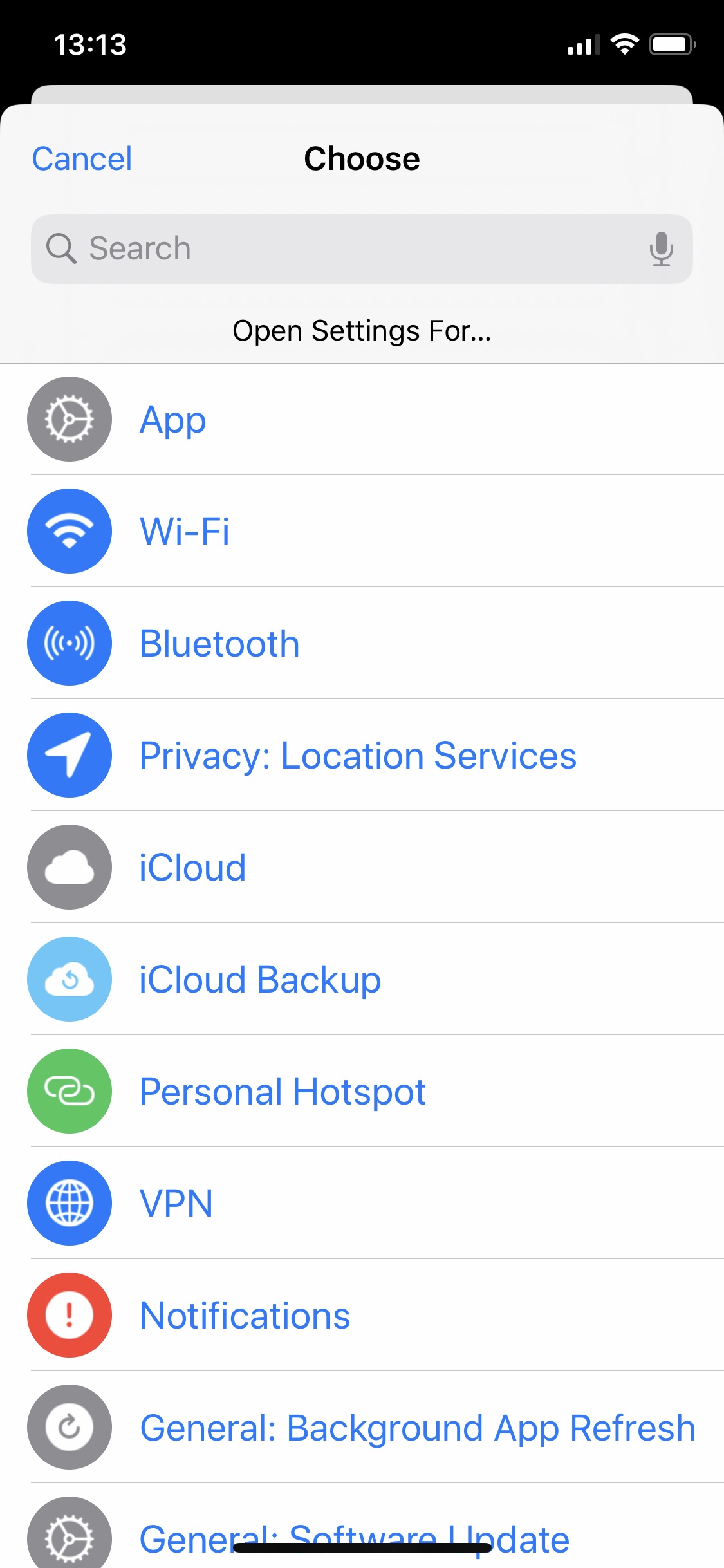
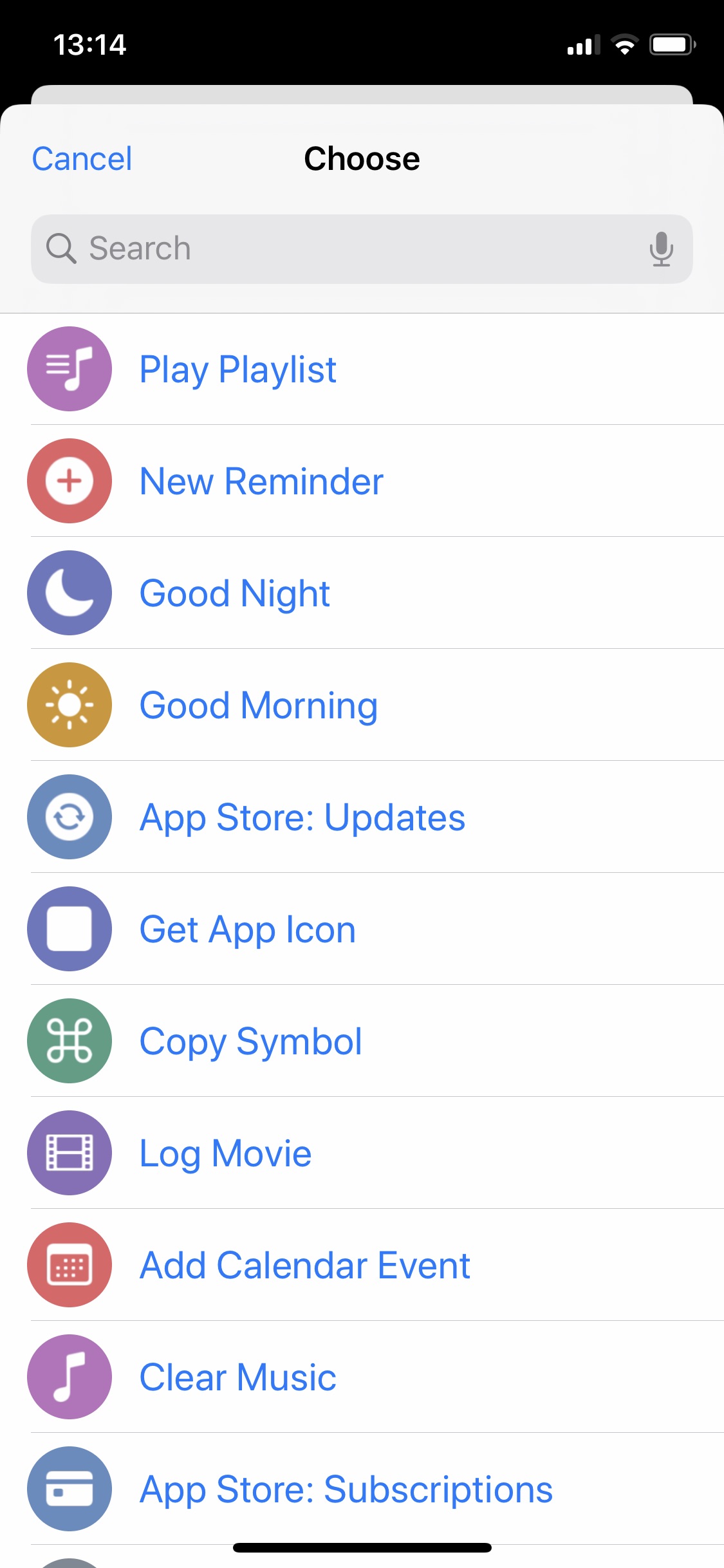
Let’s look at the Settings launcher as an example. Here’s the menu the shortcut presents:
As mentioned above, this launcher is adapted from Federico Viticci’s Settings launcher that uses Settings URL schemes to deep dive into specific menus and submenus. It still works the same where when I run it, I get a menu of Settings options, I choose the thing I want to open settings for, and Shortcuts jumps over to Settings app into that thing saving me the steps of digging around to find the thing. My addition to Federico’s shortcut is having an SF Symbol and a color accompanying each option.
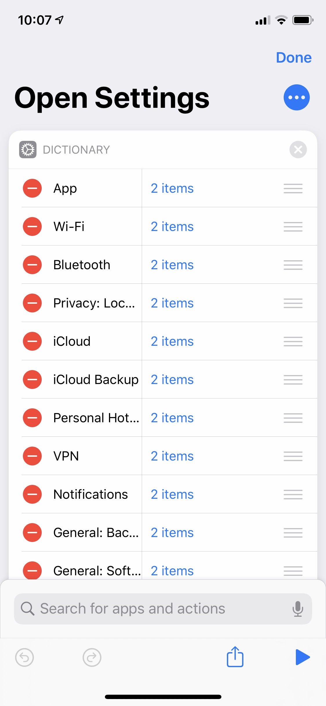
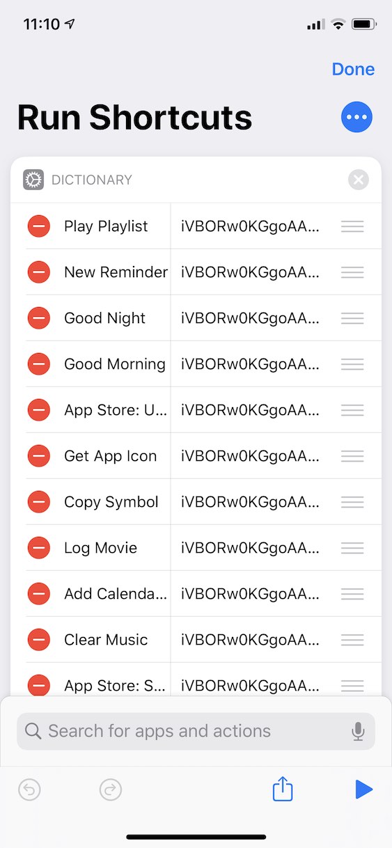
So how does it work? The shortcut starts with a dictionary of things to choose from. The keys are the text that appears in the list to choose from, and each value is an array of one or two strings.
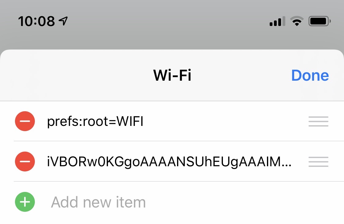
The first item in the array is the URL scheme for the setting. The second is a base64-encoded icon I generate with another shortcut (more on this below).
This dictionary is sent to another shortcut which processes the dictionary, generates the actual menu, and returns it to the Settings launcher shortcut. The menu is presented, I choose the thing, and off I go to Settings.
Generating the Menu
Shortcuts doesn’t have a native way of generating a rich menu, but if you give the Choose from List action a list of contacts, it uses the contact’s photo in the list item. So what the menu really is is a list of contacts.
To generate the menu (the list of contacts), I use another shortcut dedicated to processing the dictionary and generating the menu. Thanks to the Run Shortcut action, I can break out this set of actions as a reusable shortcut for all of my launchers since these steps are the same for all of them.
The shortcut takes each key/value pair from the dictionary above and creates a vCard with them. (A vCard is the file format for a contact card. It can contain a name, address, phone number, photo, etc.) The text is the “name” of the contact, and the icon is the photo. If the dictionary value has more than one item in it (in the case of the Settings launcher, it has two as described above), it uses the last item in the list; otherwise it uses the only item. The shortcut puts together the list of “contacts” and returns it to the Settings launcher shortcut to choose from.
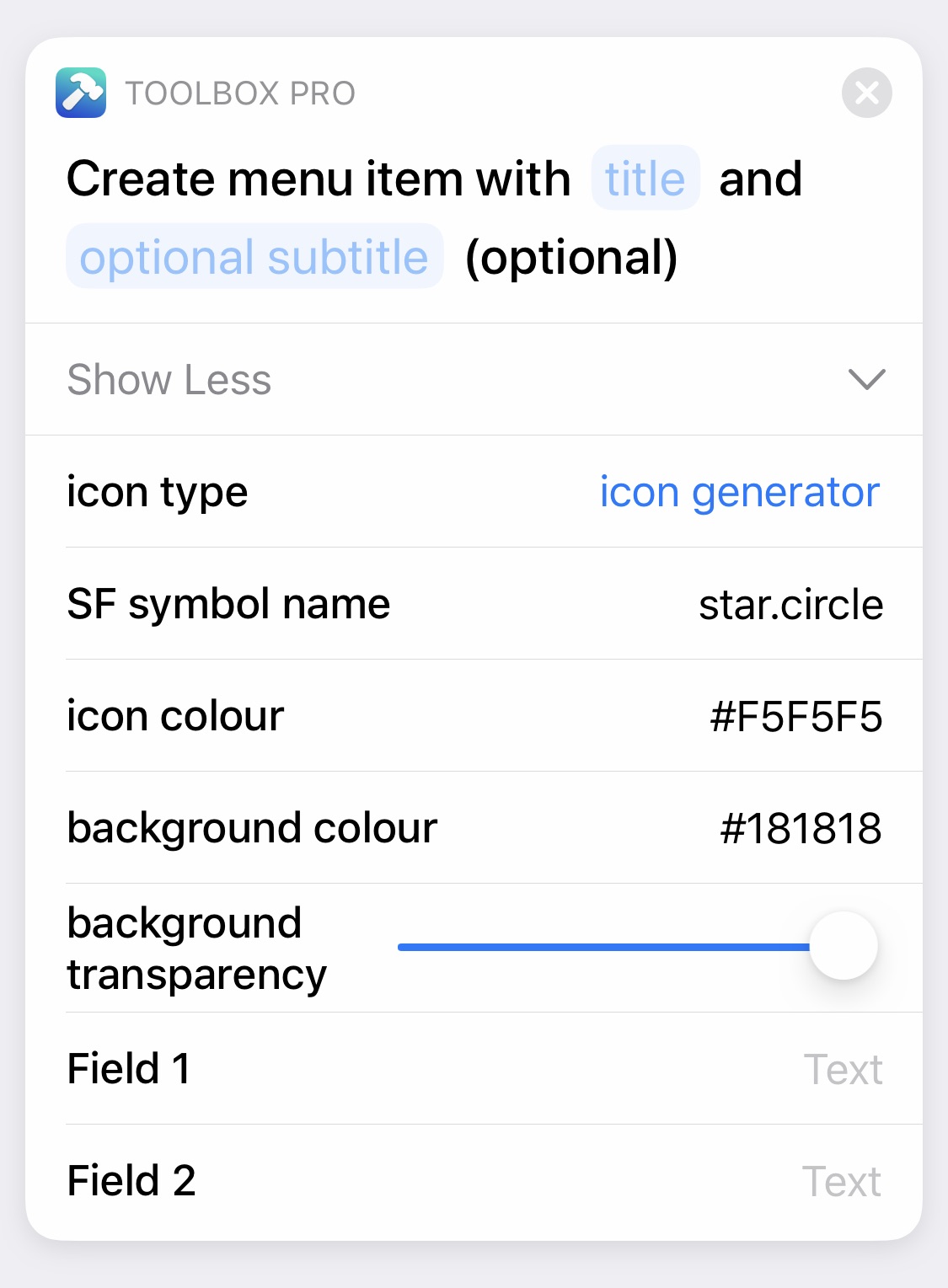
One of the actions in Toolbox Pro is a Create Menu Item that puts a visual editor on top of vCard generation: you can specify the title and the SF Symbol & colors, and the action generates a menu item.
I originally was using this solution in my launcher setup instead of manually generating vCards, but there’s a slight delay while the menu is being generated each time I run the shortcut (I assume because Toolbox Pro has to create the image (symbol on a color) and then base64 encode it for the vCard for every item in the list). With many list items in my launchers, I wanted my launchers to be a little snappier, so I use a pre-generated and encoded image. (This isn’t me knocking the excellent work developer Alex Hay has done. Just explaining for anyone wondering why I don’t just use Toolbox Pro actions to make the menus!) So how do I generate the images? With a different action from Toolbox Pro!
Generating the Icons
To generate and encode each setting’s icon, I manually run a separate shortcut that takes advantage of the Create Icon action of Toolbox Pro.
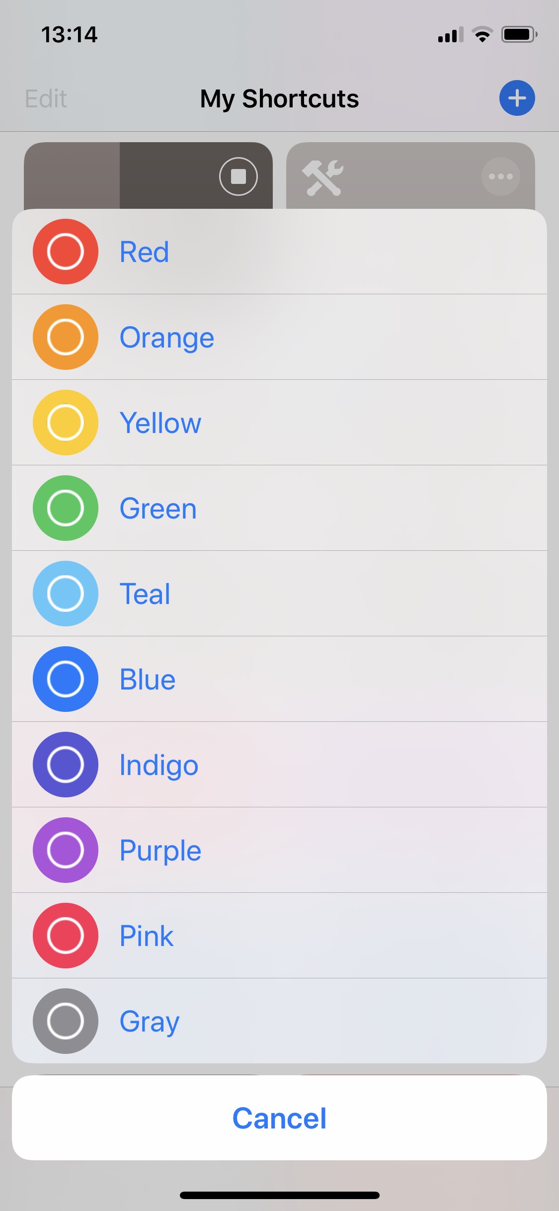
The shortcut asks for the name of an SF Symbol, presents a list of system color options, and then uses the advanced mode of the Create Icon action to generate the image. I mask it to an icon shape (I like how the icon shapes look when the launcher shortcut is run in the widget), encode it, and copy it to the clipboard. Then I go back to my launcher shortcut and paste the output into the corresponding dictionary item.
Because the launcher icons don’t dynamically change, I can generate them once when I’m initially building or editing the launcher; they don’t need to be regenerated every time I run the shortcut.
To get the name of an SF Symbol, I use Geoff Hackworth’s excellent Adaptivity. I find the symbol I want, copy the name, and run the icon-generating shortcut.
The list of color options to choose from that this shortcut presents was generated with a similar method. All the icons and menus!
For the icon size, I settled on 130×130. This size allows the icons to not be too small and thus too fuzzy on a retina screen while not being too large and possibly slower to decode with long lists.
Other Launchers
Similar to my Settings launcher, I have a shortcuts launcher that launches other frequently used shortcuts of mine.
It’s built similarly where it presents a list with icons generated like the Settings launcher above though it uses Shortcuts colors instead of system colors. Instead of a dictionary of arrays, the shortcut has a dictionary of text since there aren’t any URL schemes involved.
I also have a music launcher that presents a list of playlists to choose from. The icons in this case are generated from album art instead of SF Symbols, but the presenting and launching mechanics are the same.
The Shortcuts
If you want to try these out at home, here are links to each of the shortcuts mentioned above. If you have ideas on how to improve them, please let me know!
- Settings launcher
- Menu generator (needed for the Settings launcher)
- System-color icon generator
- Shortcuts-color icon generator
- Toggl-color icon generator
- Album art icon generator
My Home Screen
So that’s my Home screen and how I’m experimenting using shortcuts launchers on it. I’m curious to see where I go with this and what other shortcuts I may add to my Home screen.
Thanks for coming along on this experiment with me thus far. I hope this has inspired you to try one of these apps if you haven’t already or to tinker with these shortcuts to develop launchers and menus of your own.
Please come find me on Twitter and let me know what your Home screen looks like!
