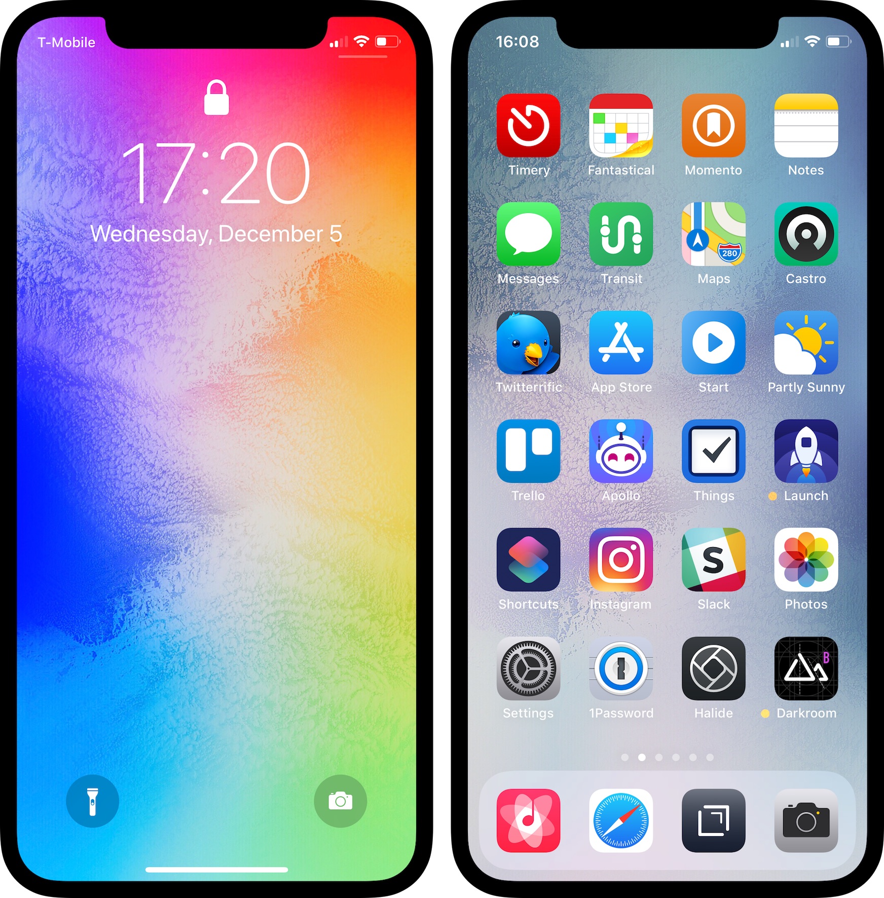
It’s been a while since my last home-screen-update post, and quite a bit has changed. Here’s what my home screen looked like in May and in January.
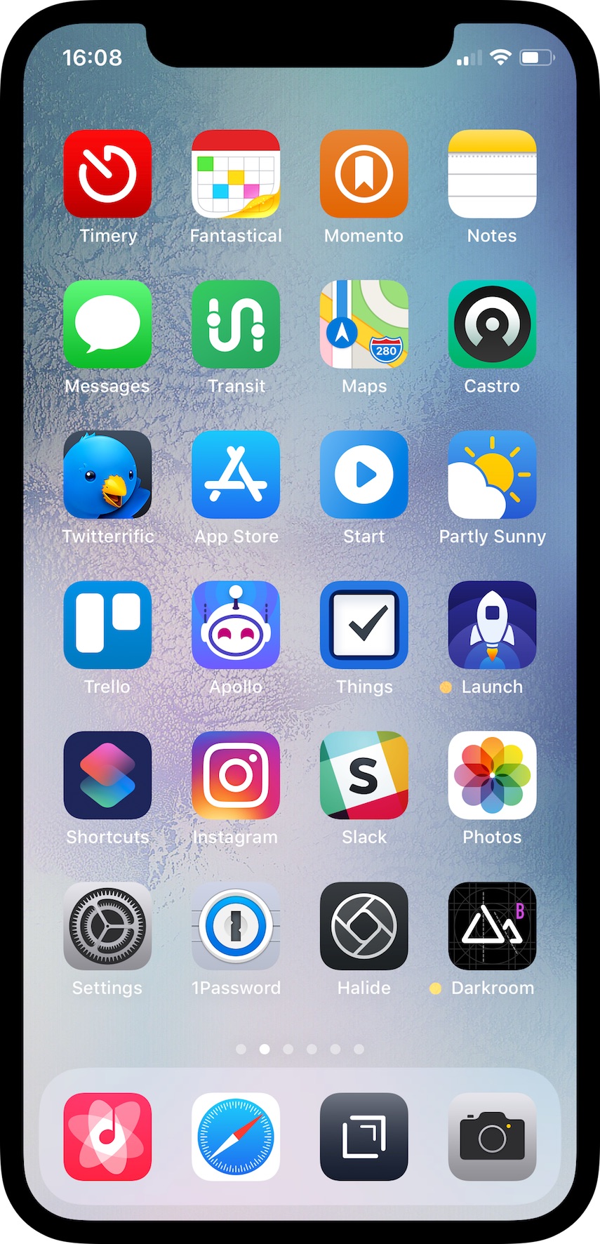
I was inspired by various posts in the iOS Setups subreddit with home screens organized by color. Here’s my current home screen (select to view a larger version):
These are the apps I use the most or I want easy access to. I’m currently using a wallpaper from AR72014. This is a slightly desaturated version of Colorful Sky V3. The subtle color and textures are pleasing and allow the icons to pop. Below are a few notes on some of the apps I have on my home screen.
Timery
I use Toggl to track my time on various tasks and projects. I wrote previously how I used Workflow to start and stop time entries because the official Toggl app isn’t for me. Wanting more functionality like editing or deleting time entries, I decided to make my own Toggl app since their API is rather robust. I’ve been hard at work on Timery for the last several months, and it should be ready soon!
Fantastical
I don’t usually have many calendar entries, but when I need to add one, I enjoy Fantastical’s, well, fantastic natural-language parsing. (If you’re on iPad, here’s the iPad version.)
Momento
This is a journaling app that collects manual thoughts and media and also automatically imports tweets, Instagram and Facebook posts, and other social-media feeds. I’ve been using Momento for several years now, and looking back at memories and what I was doing, thinking, and even tweeting years ago is something special.

Transit
I enjoy trying different apps to see how they solve the same problems, and transportation apps are no exception. In Los Angeles where many public-transportation lines run infrequently or have earlier-than-ideal-end-of-service times, Transit has some key features for me: its active-trip mode lets me know when to get off, whether or not I’ll make a connection, and what my ETA is.
Castro
I switched to Castro after their big 3.0 update, and I’m really enjoying the app. Many design aspects and interactions are clever and just fun. The drag & drop support inside the app is particularly clever and fun.
Twitterrific
I’ve been an avid Tweetbot user since the first version came out. But I’m using Twitterrific now because certain things about Tweetbot 5 drove me away. There are certain things Tweetbot does better than Twitterrific, and there are certain things Twitterrific does better than Tweetbot. Perhaps more on this another time. But for now, I’m using Twitterrific and enjoying it. As I said, I enjoying trying different apps.
Start
This is a shortcut from Shortcuts saved to my home screen. It presents a menu of apps and tasks, and for the selected item, it starts an associated Toggl timer with Siri Shortcuts from my Timery app and then opens the app.
Partly Sunny
I’m the developer and designer behind this app that shows your weather in quick glances and detailed looks. If you just want a quick glance at what’s happening, Partly Sunny can show that. If you want a more detailed look at what’s happening in the next hour, day, or week, Partly Sunny can show that too. Whichever you prefer, everything is meant to feel at home on iOS. Some of the key features include: customizable hourly graphs; customizable conditions in current, hourly, and daily forecasts; interactive radar; a widget; and a dark mode.
Trello
Trello helps me organize Partly Sunny and Timery to-do lists, feature requests, and bug reports as well as plan out future updates. I’ve been using it beyond project tracking too. For the 365-day photo project I’m doing this year, I have a Trello board to save sort-of photo drafts; if I see something interesting I want to revisit for a future photo, I add a photo of it to a Trello board so I don’t forget about it.

Apollo
With its many customization options, gestures, and the jump bar, Apollo is such a delight to use (it’s easy to tell much thought and love has been poured into the app). And it feels at home on iOS (always a bonus for me when apps do).
Things
Earlier this year, I started using Things to keep track of my to-dos. Its design is striking for two reasons: it’s beautiful and it’s calming—meaning it doesn’t stress me out to use it. Plus, it doesn’t shame me for not completing a task the previous day. The cost of the apps may be a dealbreaker for many (there’s a separate app for iPad), but Things is more than enjoyable and useful enough to justify the price.
Launch Center Pro
I used this app frequently before 3D Touch Shortcuts, widgets, and another launching app largely replaced it. But earlier this year I came back to it after I realized there’s still a place for it, and I’m excited what version 3.0 will bring. Launch Center Pro is still great for launching into deeper parts of apps and sending text input to process. Plus, many times throughout the day I’m launching other apps from Launch Center’s 3D Touch app-icon widget.
Shortcuts
This is an indispensable app for connecting and combining apps and actions to automate tasks—thus saving me time and effort. I have shortcuts for sharing photos, adding calendar entries and reminders, adding Trello cards and attachments, adding Apple device frames to screenshots, parsing email receipts, and more. Sure, I could do all those things without Shortcuts, but Shortcuts makes those things easier. Plus, I love making shortcuts. I wish I could find a job as a “Senior Shortcut Builder”.
1Password
If you aren’t already using a password manager to create and store passwords, you really should. 1Password has been my password manager of choice for a long time now, and I’m excited to have it more integrated and easier to use in iOS 12. Having 1Password directly integrated into iOS password suggestions is so convenient.
Halide
A polished, powerful manual camera app. One of my favorite features is when in manual-focus mode, I can turn on highlighting of what’s in focus in the frame—immensely helpful when I’m trying to compose a shot with a particular thing in focus. Something I like about Halide in particular over other manual camera apps is that it doesn’t overwhelm me. Some manual camera apps have so much going on they become intimidating or convoluted. But Halide keeps things simple while still being powerful.
Darkroom
A polished, powerful photo editing app to complement Halide (the two apps have buttons in each that launch the other). I’ve been using this to make my daily photos pop just a bit more. Plus, the depth-editing features are helpful to make Portrait Mode photos really shine.
And in my Dock:
Cesium
Since iOS 9, the default iOS Music app hasn’t been for me. Thankfully, Cesium exists with its customizable tabbed navigation, powerful list sorting and grouping, track details, dark theme, and more. (I’m using an alternate icon to match the iOS 7 Music app color.)
Drafts
This app is great for when I need to jot down a quick note. From there, I can decide what to do with it later or immediately perform an action or set of actions on the text and send it somewhere else like a message, a tweet, or elsewhere with a URL scheme. Drafts 5 brought a powerful new scripting environment giving me further options for processing text—and giving me opportunities to brush up on my Javascript.
As a complement to my wallpaper, my lock screen uses Colorful Sky by AR72014.
So that’s my home screen setup. December 2018 edition. As I said last time, I like to tinker, so no doubt this will get tweaked soon. What does your home screen look like? Come find me on Twitter and let me know!
