Partly Sunny: Design Notes

When I set out to make Partly Sunny, my weather app for iPhone and iPad, there were a few design and technical solutions I knew I wanted to include: things like making custom icons and using specific APIs. These solutions would go toward building the weather app I wanted to use and would help differentiate Partly Sunny from other weather apps on the App Store.

What follows is a sort-of behind-the-scenes look at Partly Sunny. I’ll start with discussing some of the design solutions and show some draft designs, and in a subsequent post, I’ll discuss some of the technical solutions. Select any image below for a larger version.

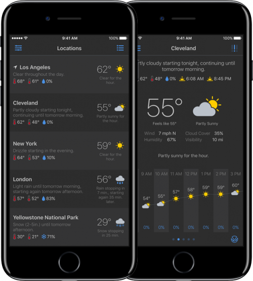
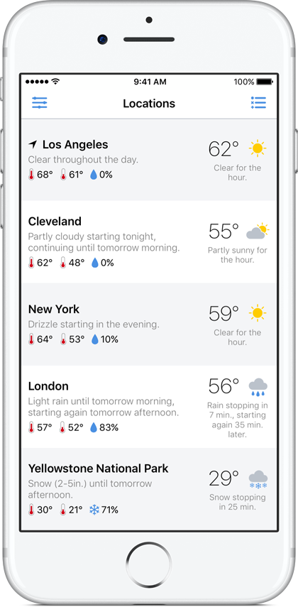
From the start, one thing I wanted to include in Partly Sunny was a view that gave summary information for both my current location and for any saved location. I wanted a way to quickly glance at the weather for these places. But I didn’t just want some basic information like the current temperature and an icon representing the current condition (e.g. “clear” or “light rain”). I wanted this view to be more useful, so in Partly Sunny, the list view includes the current temperature and condition for each location but also offers more: a sentence stating what’s happening over the next many hours at that location as well as the high and low temperatures and the chance of precipitation for the day.

locationsList

Whereas some weather apps might declare this to be too much information, I wanted this view to be useful for understanding what’s happening. A simple icon stating it’s clear right now doesn’t help in understanding a couple hours later it’s going to be pouring.

From this simpler-but-still-useful view, I wanted to be able to select any location to view more detailed information—what’s happening over the next hour, the next day, and the next week at that location.

locationView

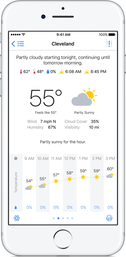
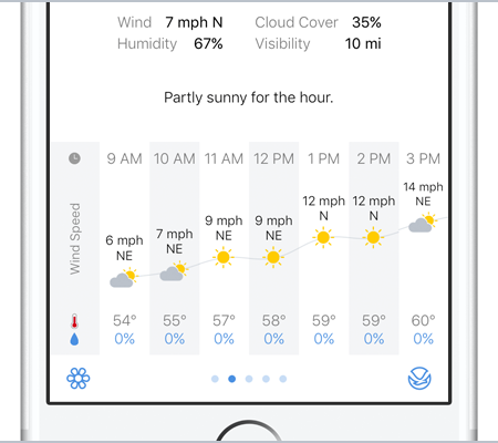
And the key to help visualize this information was graphing it. While this isn’t a new solution to weather apps, some do it and some don’t, and I wanted Partly Sunny to do it. So looking ahead in the hour-by-hour forecast, there’s a visual representation of how temperature, chance of precipitation, humidity, wind speed, and more are changing.

features_hourlygraph

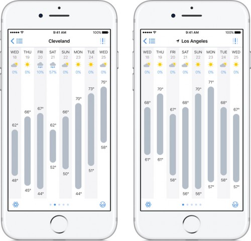
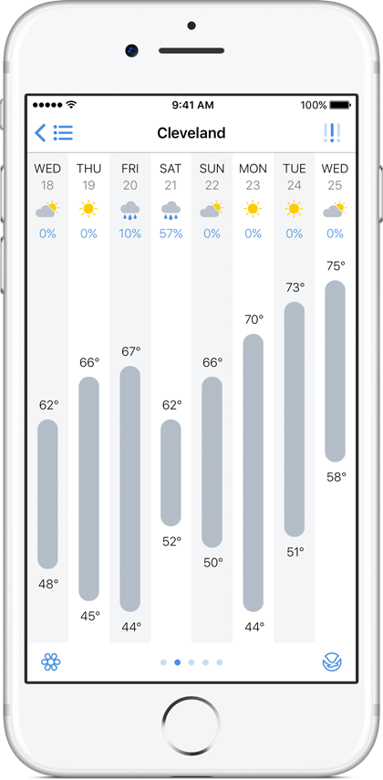
And looking ahead in the day-by-day forecast, there’s a visual representation of the high and low temperatures over the week. Reading, for example, that the high temperature will be 55° on Monday, 68° Tuesday, 75° Wednesday, 52° Thursday, and 48° Friday is one thing. Seeing it rising and falling on a graph is another.

dayByDay

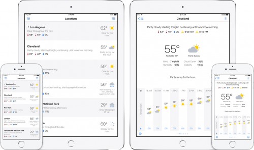
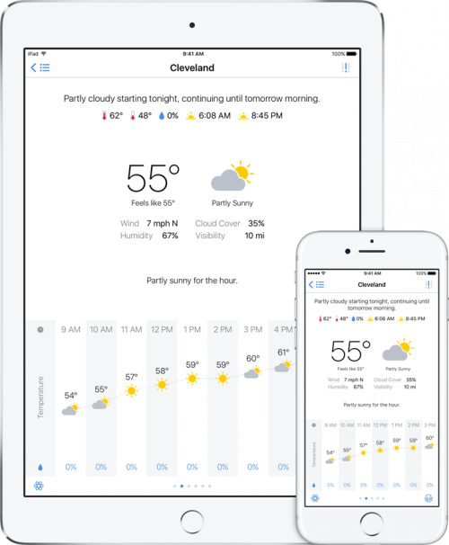
This experience was something I wanted to have on both iPhone and iPad. Some of the weather apps I had been using previously were iPhone only, and some of the iPad-friendly apps weren’t the best. So for when my iPad is in-hand and I want to check the weather, having Partly Sunny run natively on both iPhone and iPad giving me the same experience on both devices was a must-have.

iphone_ipad

Also a must-have was making custom icons. I know of several apps that use Climacons by Adam Whitcroft. They’re great icons, and I could have used them as well. But I wanted Partly Sunny to use its own icons. So I learned how to use Sketch and made my own. Here they are:

Icons

For the navigation bar, I made a system of icons using a dots-and-dashes theme.

Dots and Dashes

Sure, my icons aren’t going to win any design awards, but they’re unique to Partly Sunny, and that’s what I wanted.

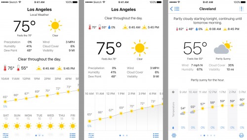
Icon design wasn’t all I used Sketch for. I also, uh, sketched drafts of the various views in Partly Sunny. For example, here’s my first pass at the location view, a subsequent pass, and what it looks like in the app:

locationViewDrafts

The list view went through a few explorations and largely ended up with version 4:

listViewDrafts

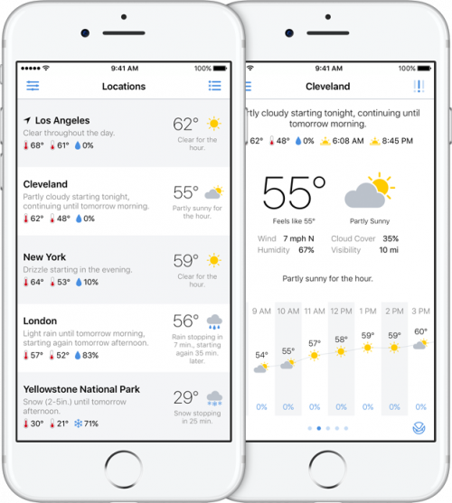
Sketch was also helpful in working out another design solution I wanted to include: a dark theme. I’m a proponent of having dark themes for apps so that in lower-light environments, the UI isn’t blinding me (I still wish iOS had some kind of system-wide dark theme).

darktheme

Not all the design solutions in Partly Sunny were planned out from the start, of course, but these were many that were. My goal was to build the weather app that I wanted to use, and that goal included a few specific design and technical solutions. I hope those solutions are useful to you as well and help make Partly Sunny the weather app you want to use too!

Partly Sunny is available on the App Store for $2.99.

Next time, I’ll discuss some of the technical solutions built into Partly Sunny. Stay tuned!
Partly Sunny

For the past several months, I’ve been learning Apple’s Swift language and how to build iOS apps. Learning this has been something I’ve wanted to do for a while, so it’s been both a fun and rewarding challenge.

To bring together everything I’ve learned, I built a weather app—not because the App Store doesn’t already have enough of them but because the apps I like don’t do exactly what I want them to do. So I made my own because now I can.

Meet Partly Sunny:

intro

Partly Sunny shows your weather in quick glances and detailed looks.

Some of the features of Partly Sunny:

Locations List

Quick glances of what’s happening in the sky at your current location and your favorite locations.

locationsList_black

Location View

Detailed looks at what’s happening throughout the hour, the day, and the week at your locations.

locationView_black

Day-By-Day

Swipe up in location view to show a day-by-day graph with the week’s high and low temperatures plotted.

dayByDay_black

Day View

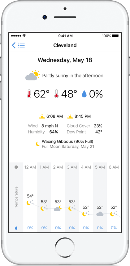
On the day-by-day graph, tap any day to see a detailed forecast for that day.

dayView_black

iPhone and iPad

Partly Sunny runs natively on both devices.

ipad_right

Dark Theme

Toggle between Partly Sunny’s light theme and dark theme in the app’s settings or with a handy gesture.

darktheme

Hour-by-Hour Graphs

Tap on any hour-by-hour graph and choose to plot temperature, chance of precipitation, cloud cover, humidity, wind speed, or more.

features_hourlygraph

Rain Graph

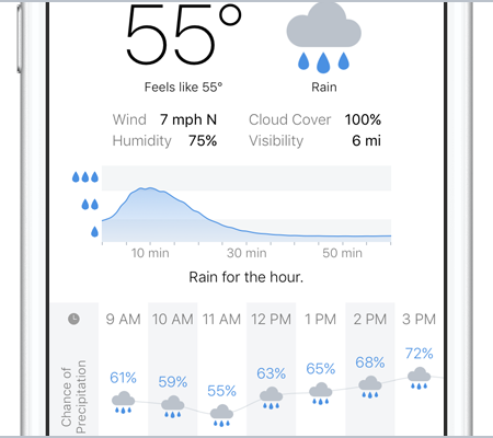
For U.S. & U.K. locations, a rain-intensity graph for the next hour will appear when it’s raining.

features_raingraph

Pollen & NOAA Links

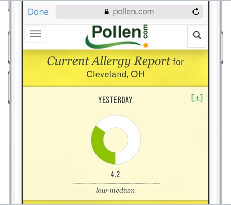
For U.S. locations, links will appear for pollen forecasts and the local NOAA weather office for winter-weather predictions, tropical forecasts, marine forecasts, and more.

features_pollen

Widget

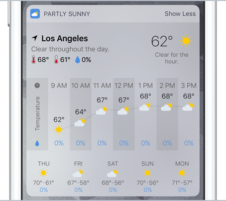
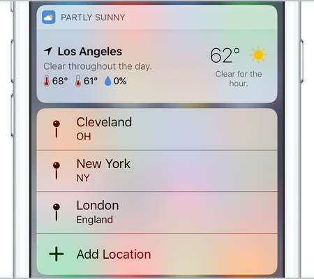
Partly Sunny includes a widget to show both a quick glance and a detailed look at your current location’s forecast.

features_widget

3D Touch

3D Touch the app icon for the widget and shortcuts. Peek and Pop in the locations list; the location view’s severe-weather alerts, pollen-forecast, and NOAA buttons; and the day-by-day graph.

features_3dtouch

Dark Sky

Partly Sunny forecasts are powered by Dark Sky to give you super-accurate data.

While you may not always enjoy the weather, hopefully you enjoy checking the weather with Partly Sunny.

Of course there are things I want to tweak and more features I want to add, but I’m proud of what I’ve accomplished so far. I set out to do a thing, and I did it.

You can visit Partly Sunny on the web at partlysunnyapp.com and follow @partlysunnyapp on Twitter.

Partly Sunny will be available on the App Store tomorrow is available on the App Store for $2.99.

Fired Up. Ready to Go.

(I tweeted all this earlier, but I’m including it here too.)

The election broke me. Twitter made me more depressed, so I took a break. But I’m back. And I’m ready to fight. I’m fired up & ready to go.

Perhaps you, like me, are looking for ways to start dealing with the reality of what’s coming. Let’s stick together and help one another.

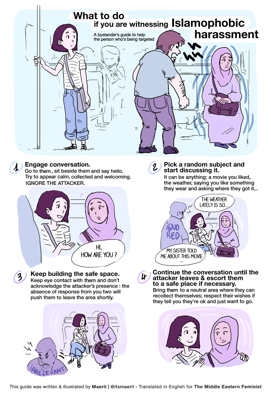
It’s symbolic, yes, but it’s a start: wearing a safety pin in support of those who are afraid and possibly harassed.

But a pin isn’t all we should do. If we see casual racism around us, let’s help stop it.

All of us showing up, stopping Trump, and taking care of each other is important right now.

And while we work for change at the local level, let’s also work for it at a more national level by supporting new leadership at the DNC.

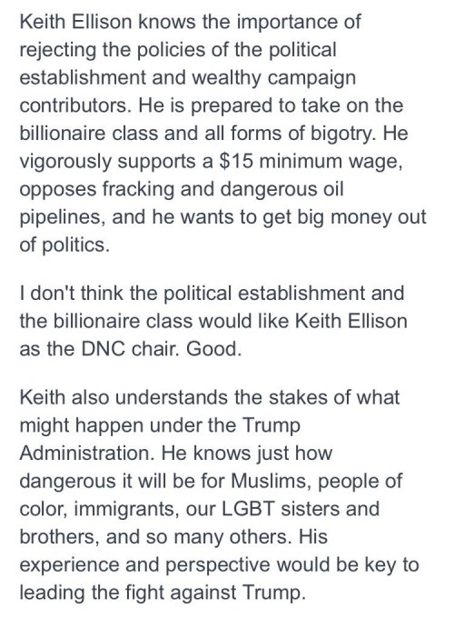
I’m with Bernie Sanders in supporting Keith Ellison to be the next DNC chair. I encourage you to support him too.

ellisonForDncChair

Things will be rough, but we’re all in this together. So let’s not give up. America is already great. Let’s keep it that way.

False Equivalence

(I tweeted all this earlier, but I’m including it here too.)

I’m not particularly fond of Hillary Clinton, but I get angry hearing people say she and Donald Trump are equally bad. Not even close.

Don’t believe me? Let’s start with this from conservative writer Conor Friedersdorf:

To regard [Clinton & Trump] as equivalently bad candidates for the presidency isn’t just absurd, it is reckless.

Still don’t believe me? Here’s Jamelle Bouie on Trump undermining US democracy & possibly inciting racial violence:

Violence and intimidation” incited by Trump “will be against the chief targets of [his] campaign: people of color.

Still don’t believe me? How about this from conservative writer and former-George-W.-Bush speechwriter David Frum. Frum on voting Clinton:

You’re not doing it for her. The vote you cast is for the republic and the Constitution.

Still don’t believe me? Here’s Seth Meyers:

One candidate is bad at email. The other is a racist, misogynist, xenophobic, ignorant, serial-lying, swindling, narcissistic man-baby.

Is either candidate a great choice? No. But they are nowhere close to being equally bad. And only one—Hillary—is qualified to be president.