A is for Avengers, and A is for Awesome

Joss Whedon is to the Avengers universe as Christopher Nolan is to the Batman universe. This film is everything you could want in a superhero film and so many things you could want in any other film: likable characters, snappy dialogue, plenty of laughs, memorable moments, killer special effects, and loads of action. The last act of the film is relentless with its propulsive action sequences—but never overbearing as Whedon skillfully manuevers through each sequence.

What else Whedon skillfully does is bringing all these characters—most of them with their own movie or movies—together in a cohesive and successful way. Mashing this many strong personalities together could be a disaster for a not-too-careful writer and director. But Whedon—and the cast—make this work.

And work the characters do. The underlying plot is fairly simple, but never is that a detraction as it allows the characters to really shine throughout the film. No Avenger is relegated to the sideline; all are given adequate screentime making them all seem equally important. Giving each character his or her due also means giving pairs and groups of characters so many rich and humorous moments together. I was expecting all the action the characters bring, but I wasn’t expecting all the laughs.

Equally rich was the music. Alan Silvestri delivers a roaring, macho, and heroic theme and score. While not as blatantly—and laughably—heroic as his Captain America theme, Silvestri’s Avengers theme excellently fits the group: strong, stated, and fit for the challenge without ever taking itself too seriously.

But what should be taken seriously is how great a film this is. A is for Avengers, and A is for Awesome. And that’s exactly what The Avengers is.

Backboard Dribbble App Is Good But Could Use an Assist

(Note: I think this is the first time I’ve really reviewed an iPhone app. I don’t plan on making this a habit, but I had a few things to say that didn’t fit in a tweet or two.)

If you aren’t familiar with Dribbble, it’s a website/network for designers to showcase small screenshots (called “shots”) to get feedback (and depending on your popularity large amounts of praise, too) from others. In addition, the site is a great source for inspiration and for seeing what cool things others are working on.

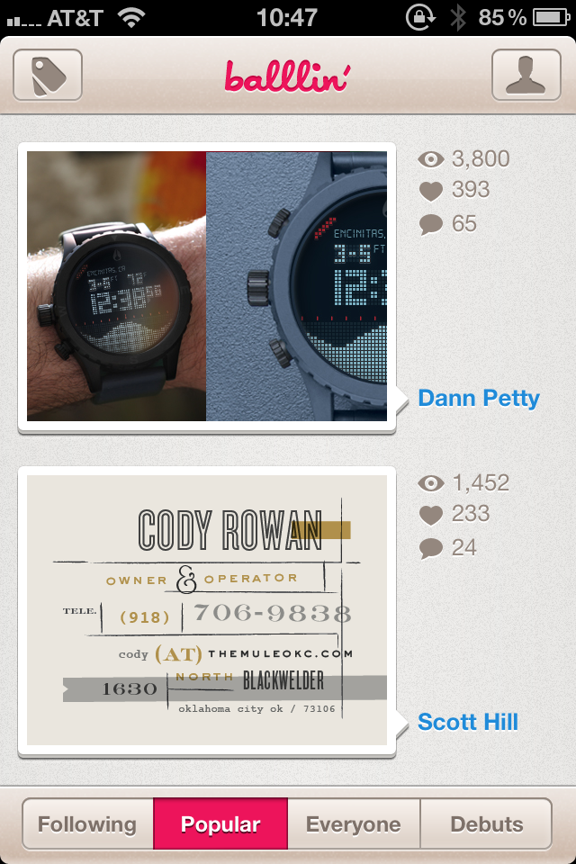
Dribbble doesn’t have its own native iPhone app, so numerous third-party developers have stepped in to fill the void. The Dribbble app I’ve been using is Balllin’; the app looks great and is easy to use.

This week, I tried out Backboard. Like Balllin’, the app looks great. Backboard also makes some improvements on user interaction with its reliance on gestures over buttons (I’m a sucker for gesture UI).

What I like about Backboard:

THE DESIGN. (I’m a sucker for minimal design, too.) The design of the app is simple and flat and as a result allows the artwork it features to shine with no distracting or unnecessary chrome.

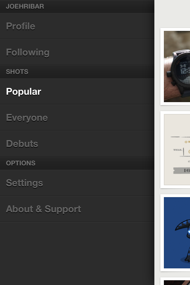
THE GESTURES. When in a list, swipe right to reveal the menu of lists. When on a shot page, swipe right to return to the list. No buttons taking up precious screen real-estate and browsing time (like in Balllin’).

THE LARGE SHOT. Tap a shot in a list to see a larger version on the shot page (much larger than is available on the shot page in Balllin’). (In both apps, rotating iPhone displays the shot fullscreen.)

What I don’t like about Backboard:

ALL THE TAPS. With simplicity exuding from so many other aspects of the app, liking or commenting on a shot is anything but simple. When in a list, if I want to like a shot, I have to tap FIVE times to like it. 1: tap the shot in the list to go to the shot page. 2: tap the shot image on the shot page to reveal the iOS arrow-actions button. 3: tap the action button. 4: tap “View on Dribbble” from the slide-up menu to launch the in-app browser. 5: tap like on the mobile page. If Dribbble ever opens their API to allow third-party apps to access liking and commenting, this process could be simpler. But it could be simpler before that as Balllin’ demonstrates: liking a shot in Balllin’ only takes THREE taps.

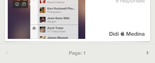
PAGINATION (aka more taps). There is no continuous-scrolling in a list. Instead, at the bottom of a list are buttons for the previous and next pages. Again, if the app is otherwise touting simplicity, this seems out of place. Or if the pagination must stay, why not continue with the gesture theme and allow swiping left or right on the page bar to switch pages?

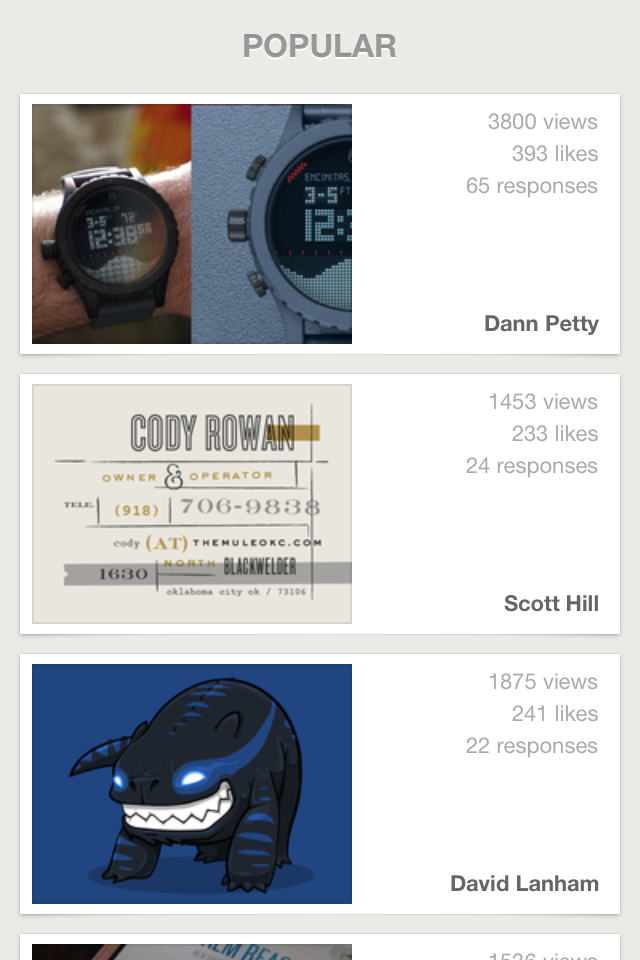
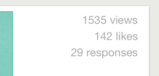
ICON INCONSISTENCY. When in a list, views, likes, and responses are written out:

When on a shot page, views and likes are icons:

Why not have the icons on the list view, too (again for simplicity)?

In the end, the app’s minimal design and gesture-based UI allow me to overlook the annoyances for now, and I hope future updates make this a slam-dunk Dribbble app. If you’re looking to draft a new iPhone Dribbble app and you appreciate clean design and gestures, take a shot at Backboard.

Moving On

Four years ago tomorrow, I started at ESPN. Today, though, is my last day. Next month, I’m heading west to Los Angeles for a new job with Reality Check Systems.

My departure from ESPN is bittersweet as I am saddened to leave many of the people I met here. Over my four years with the company, I have met and collaborated with a great number of talented, enthusiastic people—developers, designers, producers, directors, studio crew, and on-air personalities. Together, we achieved successes on-screen and behind the scenes—from integrating touchscreen graphics in live SportsCenter broadcasts to creating efficiencies in the graphics-development process that saved developers time and improved our on-air product.

As I look back on what I accomplished and how I grew at ESPN, I remain proud of what I achieved and pleased to have worked with so many great people. As I depart for new experiences and new challenges, I sincerely thank those I worked with for all their hard work and for challenging me to stay hungry and stay foolish.