iOS linen doesn’t really bother me; it’s Apple’s favorite texture right now, and that’s fine. What does bother me is inconsistency in visual and interaction design.
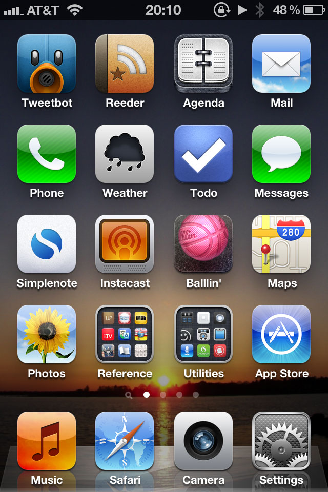
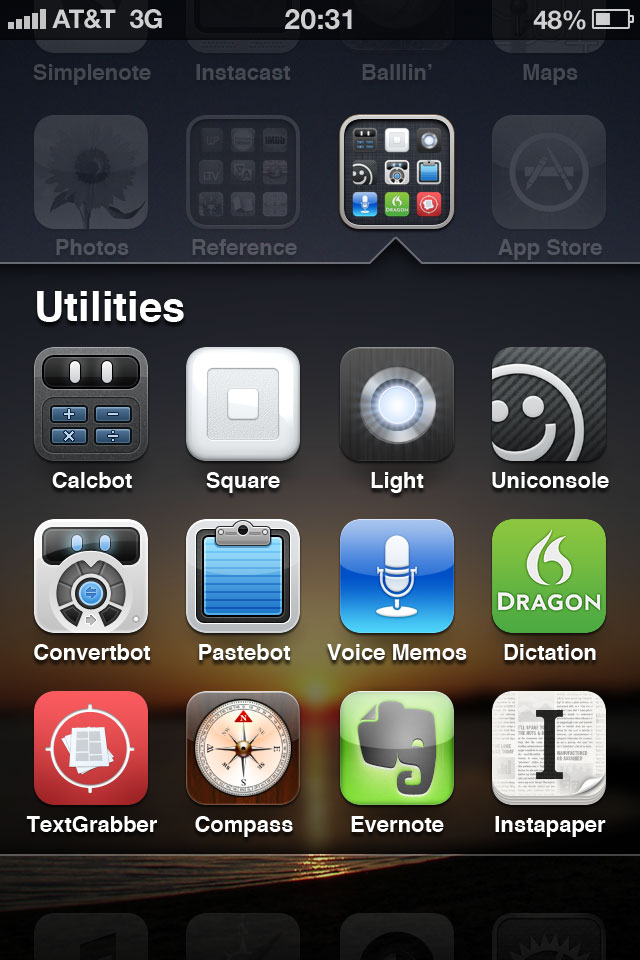
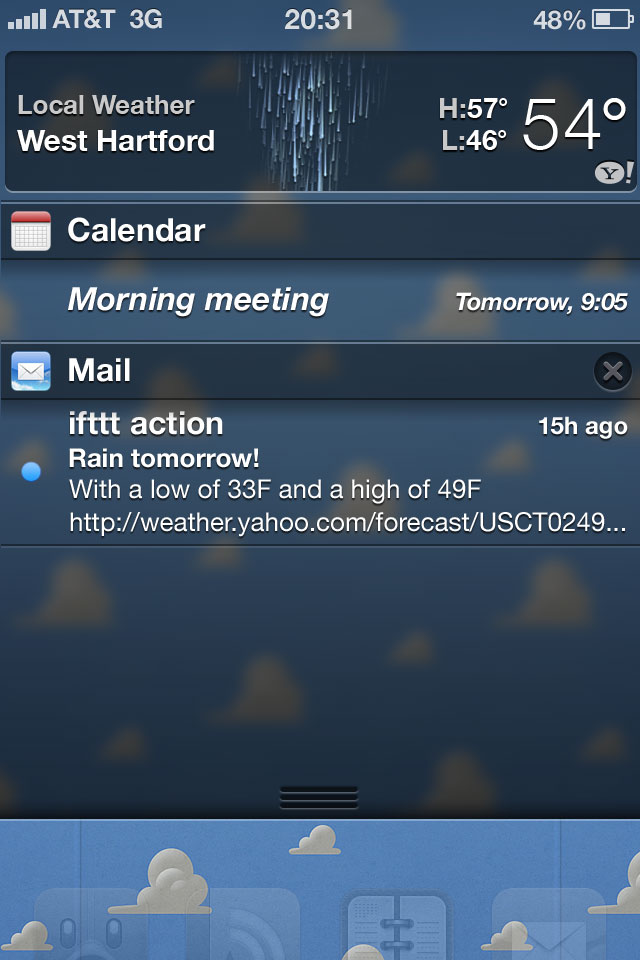
Say this is my home screen with one of my photos (click on any photo for a larger version):

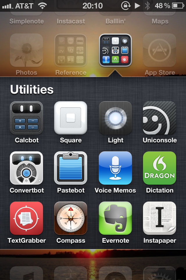
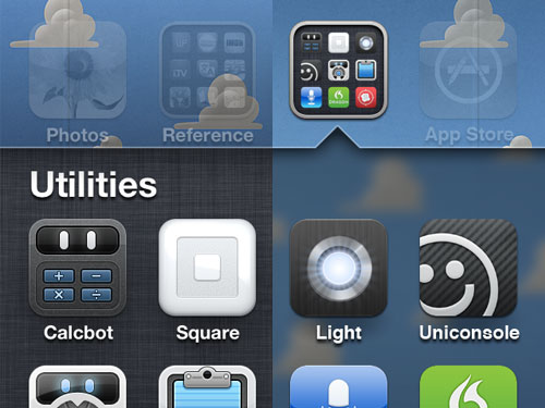
When I open the Utilities folder, something heinous happens:

My wallpaper gets split and filled with linen. Because my wallpaper and my apps are treated as the same layer in the home-screen hierarchy, both the wallpaper and the apps divide and split apart when opening a folder; revealed underneath is the layer with the folder apps and linen.
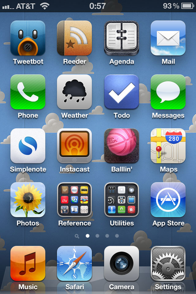
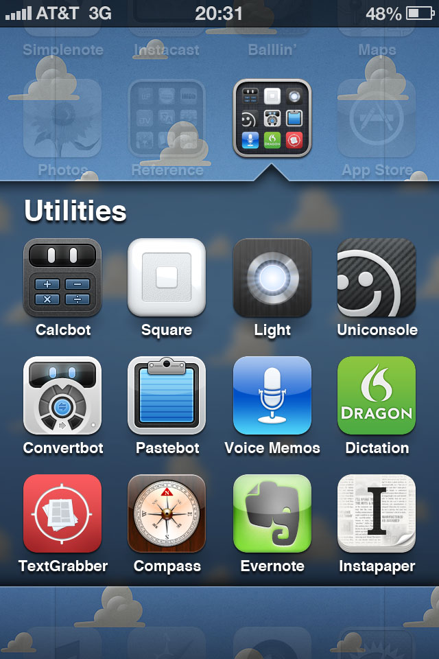
Here’s another example with a nice wallpaper by Louie Mantia:

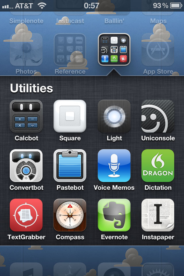
Folder opened:

Visually, I have two issues with this. First, I don’t want my wallpaper split in two. Second, I don’t want additional colors (or texture) introduced behind my apps. I want a consistent wallpaper behind my apps.
So here’s what I propose: introducing three layers instead of two and saying goodbye to linen. Instead of the top layer consisting of the home-screen apps and wallpaper and the bottom layer consisting of the folder apps and linen, the top layer will consist of home-screen apps, the middle layer folder apps, and the bottom layer wallpaper.
When a folder opens, instead of the wallpaper splitting and moving up and down from the break, the wallpaper will remain stationary. The apps will still split as they do now to reveal the folder apps, but replacing the linen behind the apps will be a blurred section of the wallpaper:

With this functionality, the wallpaper doesn’t split in two, and the wallpaper color scheme stays intact.

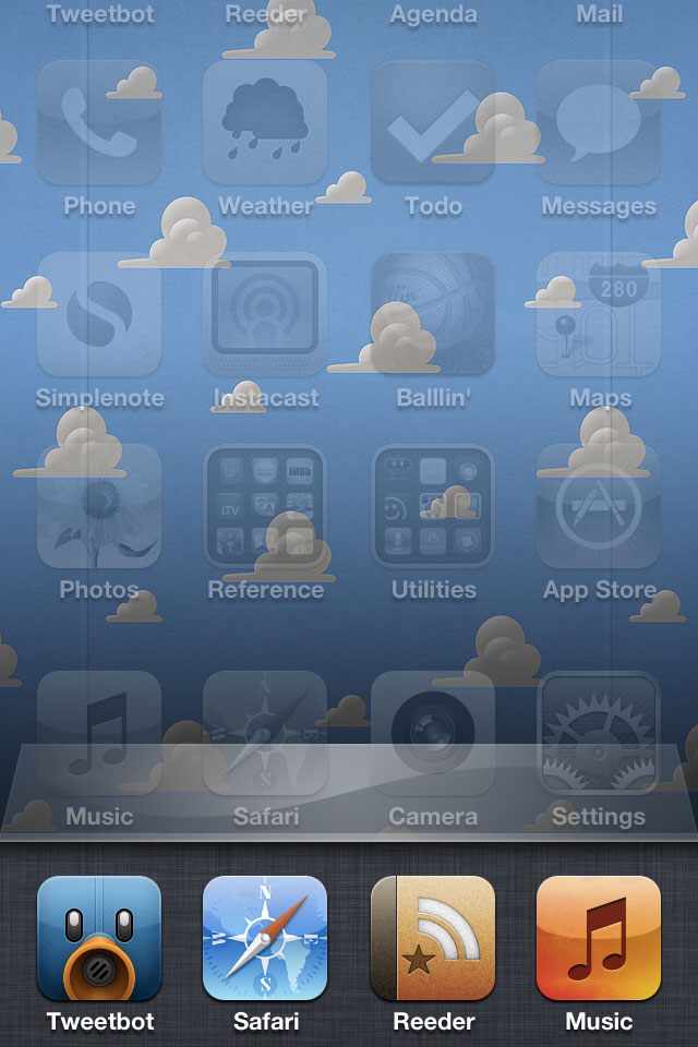
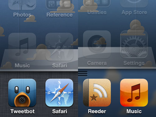
But what about other instances of linen? This solution works with both the multitasking drawer and Notification Center. Currently when the multitasking drawer opens, everything above it slides up to reveal the apps and, of course, more linen:

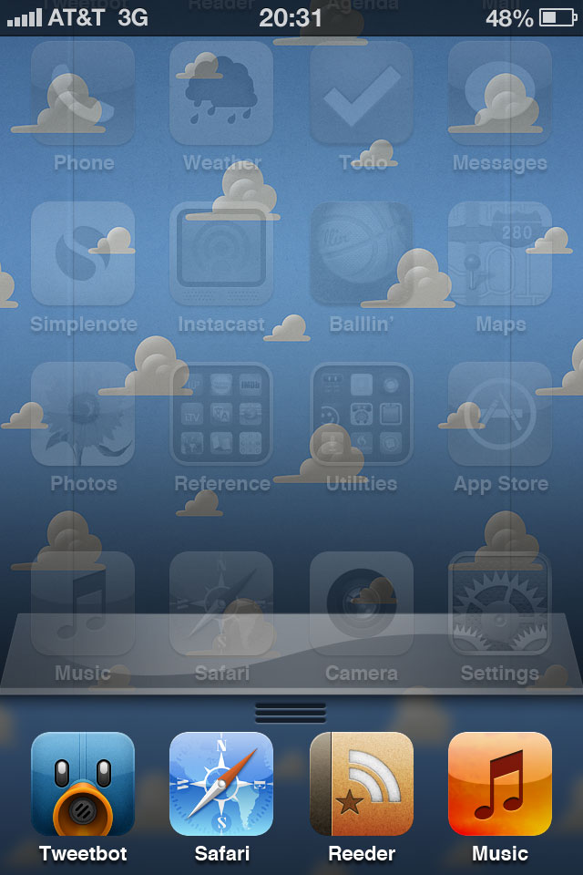
In my proposal, when the drawer opens, the apps will slide up, but the wallpaper will remain stationary just like when a folder opens. And instead of linen behind the drawer, there will be a blurred section of the wallpaper.

(What’s that grip for? I’ll come back to that shortly).
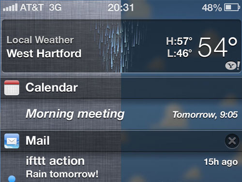
Notification Center will display similarly. Instead of linen in the background, you guessed it: blurred wallpaper.

But this treatment for Notification Center only works if the functionality of Notification Center changes as well. Instead of pulling down over the home screen, Notification Center will push down the home screen just like how the multitasking drawer pushes up the home screen. Just as I do now, I will swipe down from the top bar to open Notification Center, and all the home-screen apps will move down with Notification Center. (As Neven Mrgan pointed out, the current Notification Center grip needs some work; I used his solution.)
And since I can swipe down to open Notification Center, I should be able to swipe up to open the multitasking drawer hence the grip above. Max Rudberg has an example video of this. Swiping up takes far less effort than double clicking the home button and will be consistent with how to open Notification Center. (One additional note, for consistency, I also propose to keep the top bar visible when the multitasking drawer is open. Currently, when the multitasking drawer is open, the top bar slides up with the apps and wallpaper and is not visible, but when a folder is open, the apps and wallpaper slide under the top bar keeping it visible.)
So there’s my proposal: greater visual consistency in the wallpaper and improved behavioral and gestural consistency in the multitasking drawer and Notification Center. As a result, no more linen.
But if you really like that linen texture, you could always make it your wallpaper; it might even look nice blurred.
Some side-by-side comparisons:


(Many thanks to Teehan+Lax and their iOS 5 GUI PSD for help with the Notification Center and multitasking drawer images.)

