
One thing I love to do with my Mac is change the icons from the folder icons to the device icons to the application icons. I especially love when I can update my icons with a unified look.
This week, icon powerhouse The Iconfactory released a new, massive set of free iPhone-inspired icons and extras designed by Louie Mantia and David Lanham. The icons are outstanding and look great on my Mac, giving my system icons and my application icons a terrific, unified look. Here are a few of my favorites:
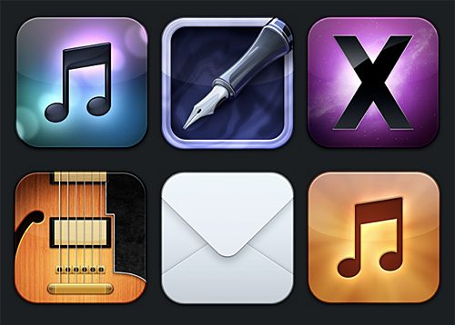 In the top row are the icons for iTunes, Pages, and the system folder; in the bottom row are the icons for GarageBand, Mail, and the music folder.
- the iTunes icon uses the familiar double eighth note of the default iTunes icon and places it over a beautiful, blurred gradient that evokes the light effect from a CD
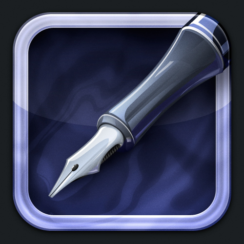
- the Pages icon uses a fountain pen similar to the default Pages icon, and the background of this icon evokes an ink well complete with ripple-effect
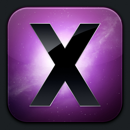
- the system folder icon uses the branding of Mac OS X Snow Leopard
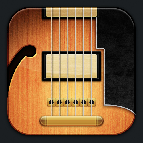
- the GarageBand icon is a lovely cropping of a guitar similar to the default guitar icon
- the Mail icon is a stunningly simple crop of an envelope; and
- the music folder icon is a fiery update of the iPod touch music icon
Just as the default Snow Leopard icons are painstakingly created with amazing detail, so too are the Flurry icons. Again, the iTunes icon:

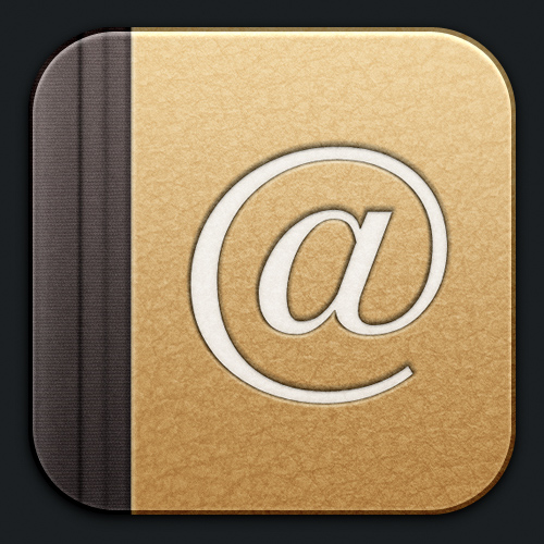
Address Book icon:
Pages icon:
Public folder icon:

Music folder icon:

Trash icon:

GarageBand icon:
System folder icon:
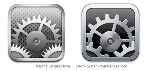
They even managed to make a System Preferences icon that is better than the iPhone Settings icon:
Overall, the Flurry icon set is outstanding. Well done, Louie Mantia and David Lanham!