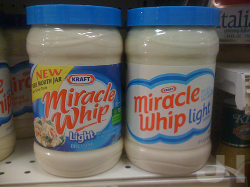
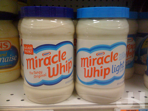
On Brand New last week, I read Kraft is continuing their apparently on-going product redesign campaign (following, so far, Wheat Thins, Toasted Chips, and their shredded cheese line), this time with Miracle Whip. So while I was at the grocery store, I stopped for a few snaps. Below, the old logo and packaging on the left, the new on the right:

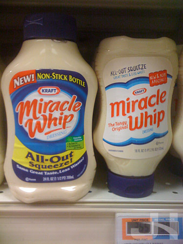
And the squeeze bottles:

Wow, what a transformation. All the excessive text and over-designed elements have been jettisoned in favor of simpler, clearer designs and messaging. Compared to the old design, the new Miracle Whip design has an almost retro feel to it, from the lack of crazy swirls and over-scripted word mark to the sparse background and simplified design elements. But compared to other recent redesigns, this new packaging follows the trend of less-is-more.
Curious, too, is the treatment of the “NEW!” messaging on the new design versus the old design. The old packaging has a bold and distracting “new” message, whereas the new design has a “new” message that better coheres with the design as a whole.
Several of these redesigns I’ve wrote about here make a great study in American packaging design. We’ve become accustomed to the over-designed, compete-for-your-attention mess that is much of American packaging design. Look at the old Baked! packaging as an example, the old Miracle Whip packaging as another, or many other brands at the grocery store. This type of design is what we’ve come to expect from package design more is more. Product packaging attempts to fit every possible bit of information and marketing ploy on them. Marketers, executives, and designers somewhere, though, realized what a mess the American shopping experience has become and decided to change it. In a packaging world where each package design tried to out-design the competitor, these new, simpler, and clearer designs come along and say, “Yeah, you have seventeen more typefaces and eighty-three more colors and text bursts than I do, but you all look the same. Here I am ready to quietly stand out.” And stand out they do compared to the over-designed chaos at the grocery store.
This new Miracle Whip packaging is another successful redesign from the Kraft Foods family. What Kraft brand is next?
