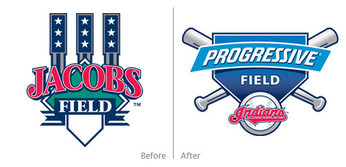
I was poking around Chris Creamer’s excellent website sportslogos.net the other day, and I browsed to the Cleveland Indians page. For many MLB teams, Chris includes the logo for the team’s stadium if it has one. Not being in Cleveland and not seeing Indians games on television, I wasn’t aware of the logo for Jacobs Field when it became Progressive Field last year. Chris Creamer made me aware aware that the Progressive Field logo is an outstanding example of mundane inadequacy and mediocrity.
The logo for Jacobs Field does one very important thing: it clearly and uniquely represents the venue. A unique architectural feature of the stadium is represented in the Jacobs Field logo. This representation makes the logo a distinctive representation for Jacobs Field and Jacobs Field only. The Rock & Roll Hall of Fame logo is similar in that it uses the facade of the building as its logo (which simultaneously represents an abstracted musical staff):
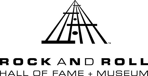
Both the Jacobs Field logo and the Rock Hall logo go beyond a simple graphic representation of their respective structures’ architecture and instead employ an abstraction of some architectural elements. This abstraction gives both logos a stronger and more creative presence. The Jacobs Field logo:
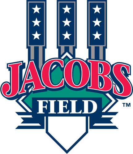
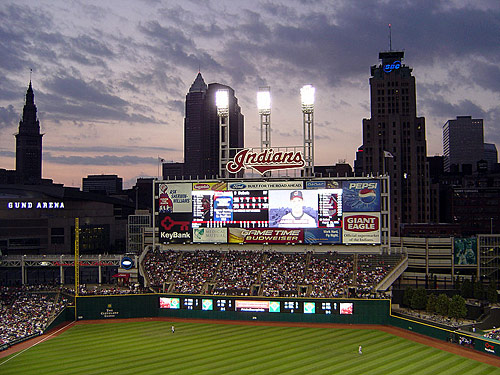
…abstracts the three left-center field scoreboard lights (image from The Wiki):
And what does the Progressive Field logo have to offer in terms of unique representation of said venue? The logo offers as much uniqueness as a seasonal cold offers happiness and cheer. This logo could be for any baseball field even a local little league field. Nothing about the Progressive Field logo is unique. Swap the Indians logo for any other team’s logo, and you have yourself a new logo.
Furthermore, the Progressive Field logo looks like it was designed by a high-school student. For such a professional use and venue, this logo is beyond amateur. In fact, this logo actually would be a better fit for a local little league field since the logo exudes as much talent and professionalism compared to the Jacobs Field logo as a little league team does compared to a major league team. The gradients are cheap, the strokes excessively heavy, and each element, together and separate, is so uninspired.
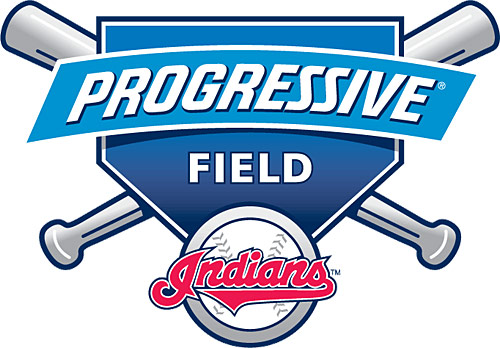
What a disappointment. As if changing the name of the field wasn’t bad enough, we get this mundane work of mediocrity. The logo for the Cleveland Indians stadium has become progressively bad.