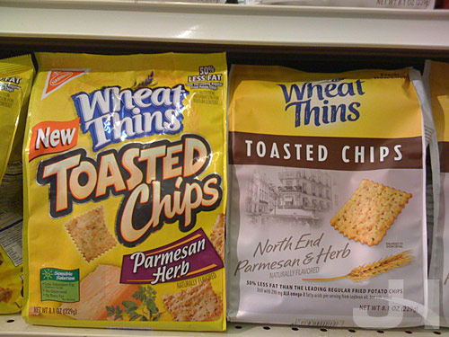
I assume when Nabisco, a Kraft Foods family member, rolled-out the Wheat Thins redesign, their Toasted Chips line was also redesigned. Below, the old design on the left and the new design on the right:

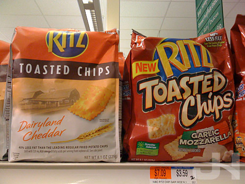
New on the left, old on the right:


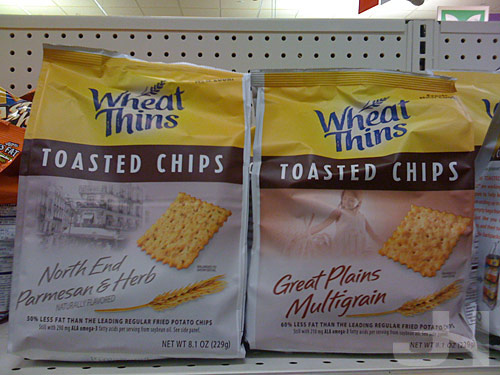
New design:

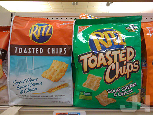
Much like the Snapple and Baked Lays redesigns, the Toasted Chips redesign steps-up the classiness of the packaging. The photography and branding of each variety (“North End,” “Great Plains”) are a little curious as they don’t offer much, but the photography is nicely placed and unified with the other elements.
A few other curiosities: why does the sour cream and onion Ritz Toasted Chips packaging not feature green anymore? Where did the Nabisco logo in the upper-left corner of the old design go?
Also, the bags appear to be made of a different material, and as a result are less shiny.
Overall, though, the new packaging is classier and simpler than the old packaging and is another welcomed step away from the over-designed boisterousness that plagues so much of American packaging design.