I went grocery shopping today, and I’d say at least half of my time at the store was occupied by taking pictures of products. While I work on more in-depth posts, here’s this post for now of some miscellaneous snaps I took.
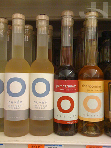
The simple design of O Olive Oil is stunning:
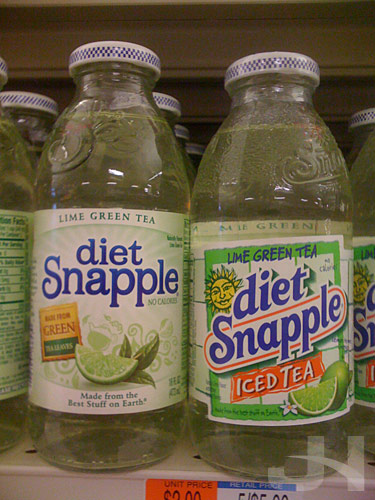
My favorite shots at the store are the comparisons:
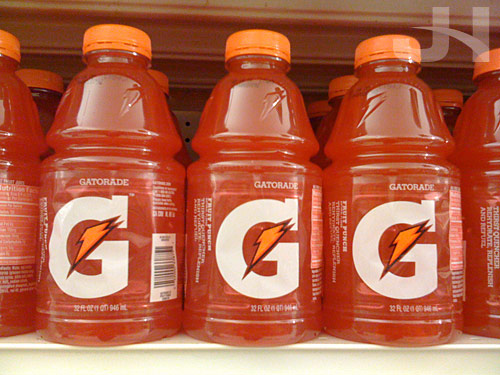
The new Gatorade packaging:
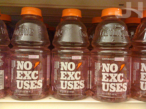
I find this Gatorade packaging curious. While I like the idea of breaking up the text, I wonder if the phrase “No Excuses” was divided appropriately because if you just glance at the bottles quickly, you may read “No Uses”:
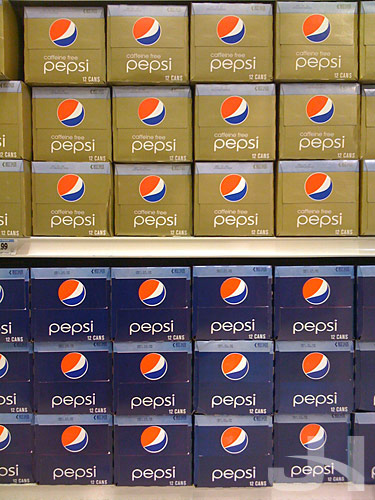
I’m still loving the Pepsi redesign:
More later! :-)