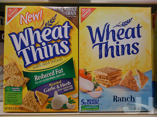
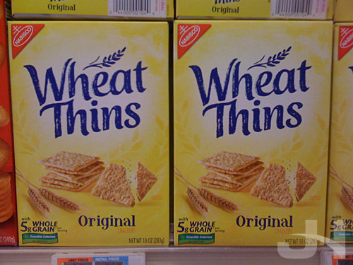
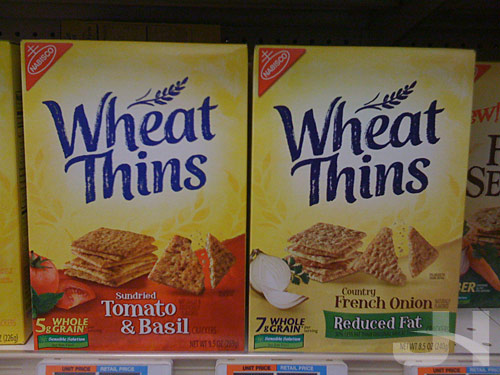
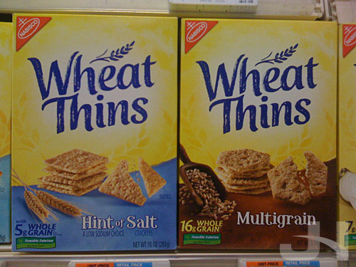
Apparently I missed this packaging and logo redesign when it happened (and I can’t find a press release or other information about it), but the Nabisco brand Wheat Thins is sporting a new logo and packaging design. I snapped these at the grocery store this morning:
Old packaging on the left, new packaging on the right:


Another brand turning to a simpler, cleaner design, offering American consumers a welcomed break from the over-designed mess that is much of our visual stimuli on our products and our media.