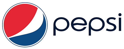
As I was looking at the new Pepsi logo this afternoon, the gears in my little brain starting turning, and I arrived at an interesting thought. Here’s the new Pepsi logo:
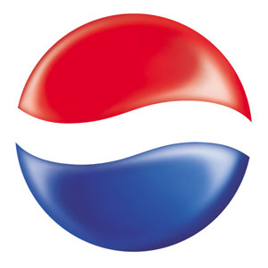
I was looking particularly at the ‘e’ in the logo and wondering about the wave. Here’s the old Pepsi globe; notice the wave:
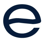
What if the wave in the ‘e’ of the new wordmark:
Was flipped horizontally to become a subtle reference to the old globe:
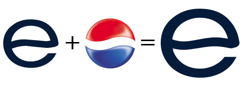
So then, the Pepsi wordmark would be:
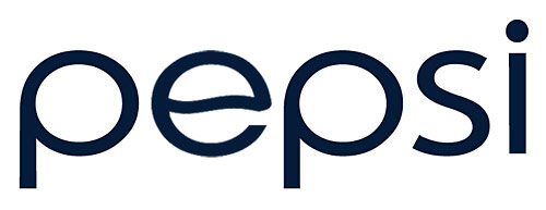
The current wave in the ‘e’ is curious as to its purpose. Why not make it a straight bar instead? But if the wave should stay, why not give it a real purpose? Just a thought.