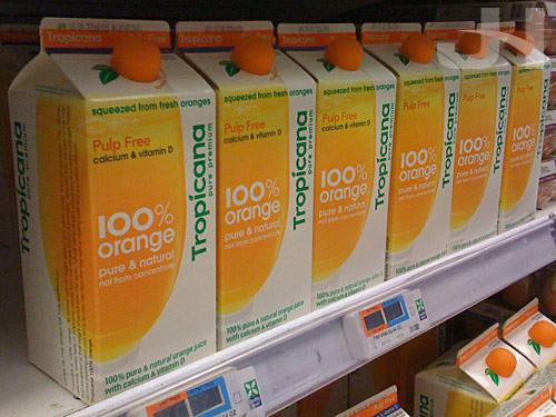
I’m very late in commenting on this story, but Tropicana recently announced it was un-designing its juice cartons. What a shame. When I wrote about the redesign back in January, I said:
The cleaner designs of Tropicana and Pepsi and specifically the minimal design of the Pepsi containers are a very welcome change in beverage packaging, proving once again less really is more.
But now those new, beautiful juice cartons are being replaced with the old, uninspired designs that preceded them. Were the new designs perfect? No, probably not. But completely scrapping them in favor of the original designs takes seventeen steps backward.
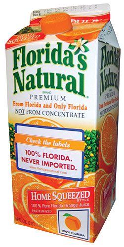
What set these new (I guess I should refer to them as the old designs now?) designs apart from other orange juice packages was that they were fresh and simple with their approach. Some people have argued the redesign made the cartons look generic, but I think other orange juice cartons are generic-looking because they all are variations on the same design with only slightly-modified elements lousy font for the logo, check; the logo maybe in an upward arc, check; illustrated orange, check; plastered-on pulp- or squeezed-type text, check; multitude of extraneous other text, check. Instead of harmoniously- and smartly-designed packages, other cartons have become exercises in how much the “designer” can fit onto the carton. Take this Florida’s Natural carton (from Global Package Gallery), for instance. Just on the front, how many times does the word “Florida” appear?

Matt Everson at Astuteo makes the case that the new Tropicana cartons failed and details eight reasons why. The first reason he lists is labeling, writing:
ORIGINAL: Text labeling appears along the top sealed edge and across the front, all knocked out of a large, tactfully positioned block of color indicating the type of juice. Product variations are easily distinguished at a glance.
REDESIGN: Text labeling of the juice type along the top and across the front is inconsistent – one is reversed and one positive – and the thin colored stripe is far less noticeable requiring a greater investment of time and concentration on the part of the shopper.
I’ve seen this argument elsewhere also, and it really bothers me. For people to complain that they now have to actually read the carton is befuddling. Shouldn’t that be a prerequisite before buying something anyway? Or do people prefer to close their eyes and just grab something off the shelf, whatever it might be. Are we now in the business of advocating laziness?
So with the old designs, locating the correct carton maybe took two seconds, but with the new cartons, locating the correct juice now takes five seconds? The new cartons clearly state in a specific color-coded fashion what type of Tropicana orange juice you’re looking at. But this isn’t enough for the average, lazy, too-hurried-to-actually-read-what’s-in-front-of-them, always-complaining-they’re-soooo-busy American who prefers this text to be blazoned across the carton in a manner that screams, “hey you moron, I’m ‘no pulp.'”
Maybe, though, the distaste I have for undesigning the Tropicana cartons and the reasons people cite as failures of the redesigns invoke larger questions and complaints I have about modern American culture, a culture that advocates multi-tasking, rushing through the day, and spending less time and focus on our tasks.
But I suppose that discussion is for another day. Today, though, I can say I switched to Tropicana orange juice because I appreciated the package design immensely. Once the superior redesigns disappear, maybe I’ll keep a carton around and keep filling it up with juice from the sub-standard, generic undesigns.