Logo Design Love writes about some of the Obama logo ideas that were part of the development process getting to the final logo.
The three finalists:
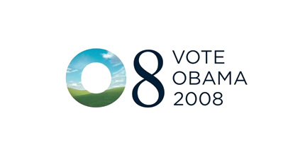
Finalist #1:

The masked imagery is interesting, but still weak, and that image reminds me of the default desktop on Windows XP. Clearly, though, the designers smartly realized early on the ‘O’ would go a long way.
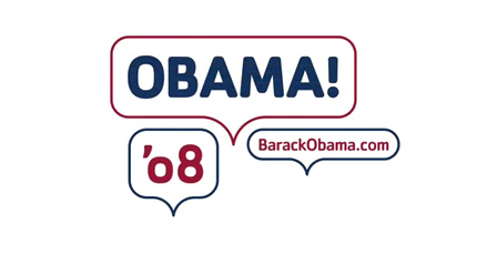
Finalist #2:

The bubbles are a very interesting concept but seem wildly out of place in a political campaign. This reminds me of the Charles Schwab “Talk to Chuck” commercials with the big quote balloons. I can imagine these Obama balloons animating in a similar fashion.
One of the problems with #1 and #2 is the lack of the strong symbolism that people can subconsciously buy into like any great marketing brand/logo (Nike’s swish, Apple’s apple, McDonald’s golden arches, etc.). A strong symbol that transcends ordinary design in the field and becomes instantly recognizable without any supporting text. That leads us to…
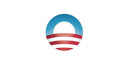
Finalist #3:

Designer Sol Sender notes:
Originally the stripes were kind of symmetrically expressed across the horizon, and as we went into final refinements we felt that giving it a little bit more dimension, a little bit more motion, ways to enter into it a little bit more for the viewer was a better way to go.
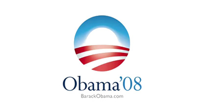
And, of course, the final design:

I can’t imagine an Obama campaign without that logo. Like the campaign itself, the logo and graphic design of the campaign were a successful and remarkable exercise in discipline. The logo skillfully symbolizes his theme (sunrise: a new day), America (flag allusion, rolling hills), and himself (the letter ‘O’). Fantastic.
(Nod: Brand New)